


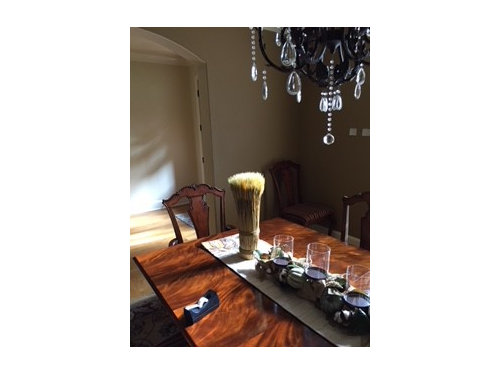
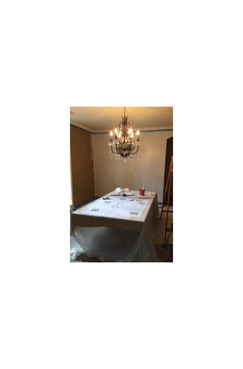
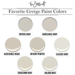
Help w/ paint colors in formal dining room with antique white shutters
feliciaj2
5 years ago
Featured Answer
Sort by:Oldest
Comments (11)
 PRO
PROFlo Mangan
5 years agoRelated Professionals
Decatur Painters · Spring Painters · Ballwin Painters · Sun City Center Painters · Tinton Falls Painters · Harwich Flooring Contractors · Monroe Flooring Contractors · Poughkeepsie Flooring Contractors · Owensboro Furniture & Accessories · Fayetteville Architects & Building Designers · Haslett Kitchen & Bathroom Designers · Terryville Kitchen & Bathroom Designers · Savannah Furniture & Accessories · Great Falls General Contractors · Roseburg General Contractors- PRO
Flo Mangan
5 years ago - PRO
Flo Mangan
5 years ago - PRO
Flo Mangan
5 years ago 
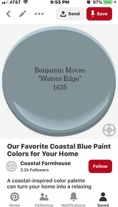
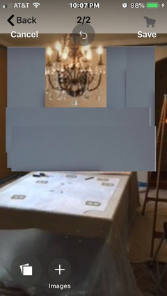
lynartist
5 years agolynartist
5 years ago


Related Stories
REMODELING GUIDESRoom of the Day: Antiques Help a Dining Room Grow Up
Artfully distressed pieces and elegant colors take a formerly child-focused space into sophisticated territory
Full Story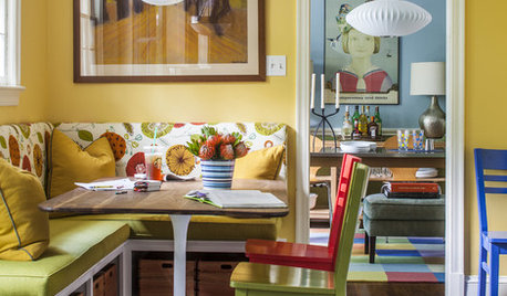
COLORColor Feast: 6 Deliciously Uncommon Dining Room Color Combos
Give your mealtime space a generous helping of hues paired in a most refreshing way
Full Story
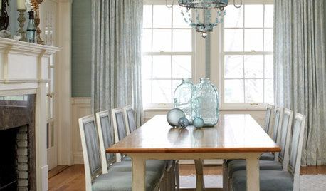
DINING ROOMSColor Feast: When to Use Gray in the Dining Room
The right shade of gray pairs nicely with whites and woods to serve up elegance and sophistication
Full Story
COLORColor Feast: When to Use Red in the Dining Room
It awakens appetites and spurs conversations, but too much is like a second helping of pie. Find the perfect balance of dining room red here
Full Story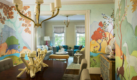
WALL TREATMENTSRoom of the Day: Original Mural Brings Joy to a Formal Dining Room
French inspiration gives traditional style a twist in this Victorian-era home
Full Story
COLORPaint-Picking Help and Secrets From a Color Expert
Advice for wall and trim colors, what to always do before committing and the one paint feature you should completely ignore
Full Story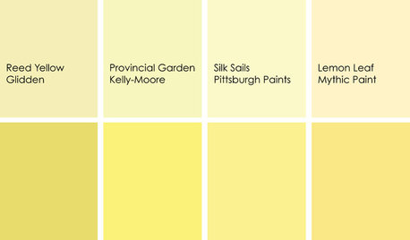
DECORATING GUIDESColor Feast: When to Use Yellow in the Dining Room
Make mealtimes a cheery affair with swaths of this sunshiny hue on your dining room walls, furniture or ceiling
Full Story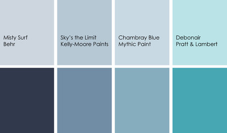
DECORATING GUIDESColor Feast: Yes, You Can Use Blue in the Dining Room
The sky's the limit for beautiful blues in your home's dining spaces; here's how to make it work
Full Story
COLORPick-a-Paint Help: How to Quit Procrastinating on Color Choice
If you're up to your ears in paint chips but no further to pinning down a hue, our new 3-part series is for you
Full Story
COLORPick-a-Paint Help: How to Create a Whole-House Color Palette
Don't be daunted. With these strategies, building a cohesive palette for your entire home is less difficult than it seems
Full Story


lynartist