


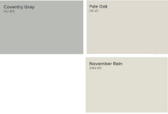
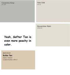
Please help, drowning in paint samples! Anything similar to Pale Oak?
TJ K
3 years ago
Featured Answer
Sort by:Oldest
Comments (25)
 PRO
PROLori A. Sawaya
3 years ago PRO
PROBeverlyFLADeziner
3 years agoRelated Professionals
Buckhall Painters · Franklin Painters · Rosemont Painters · San Anselmo Painters · Addison Flooring Contractors · Naugatuck Flooring Contractors · University Park Flooring Contractors · Potomac Furniture & Accessories · Carpinteria Furniture & Accessories · Ridgewood Window Treatments · Four Corners Architects & Building Designers · Midland Furniture & Accessories · Owasso Furniture & Accessories · Medford General Contractors · Plano General Contractors
TJ K
3 years ago
freedomplace1
3 years agolast modified: 3 years agofreedomplace1
3 years agoTJ K
3 years agoTJ K
3 years agofreedomplace1
3 years agolast modified: 3 years ago
Jennifer Hogan
3 years agolast modified: 3 years agoTJ K
3 years agoTJ K
3 years ago
Design Girl
3 years agofreedomplace1
3 years agofreedomplace1
3 years ago- PRO
BeverlyFLADeziner
3 years ago TJ K
3 years agofreedomplace1
3 years agofreedomplace1
3 years agolopipopi
3 years agoTJ K
3 years ago- PRO
Patricia Colwell Consulting
3 years agolast modified: 3 years ago Laurie
3 years ago


Related Stories

COLORPick-a-Paint Help: How to Quit Procrastinating on Color Choice
If you're up to your ears in paint chips but no further to pinning down a hue, our new 3-part series is for you
Full Story
MOST POPULARCrowd-Pleasing Paint Colors for Staging Your Home
Ignore the instinct to go with white. These colors can show your house in the best possible light
Full Story
COLORPick-a-Paint Help: How to Create a Whole-House Color Palette
Don't be daunted. With these strategies, building a cohesive palette for your entire home is less difficult than it seems
Full Story
COLORPaint-Picking Help and Secrets From a Color Expert
Advice for wall and trim colors, what to always do before committing and the one paint feature you should completely ignore
Full Story
EXTERIORSHelp! What Color Should I Paint My House Exterior?
Real homeowners get real help in choosing paint palettes. Bonus: 3 tips for everyone on picking exterior colors
Full Story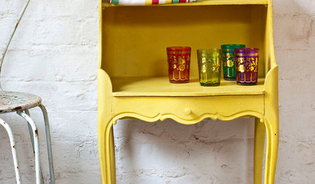
PAINTINGWhat to Know About Milk Paint and Chalk Paint — and How to Use Them
Learn the pros, cons, cost and more for these two easy-to-use paints that are great for giving furniture a vintage look
Full Story
GRAYDesigners Share Their Favorite Light Gray Paints
These versatile neutrals can help create a range of moods in any room
Full Story
KITCHEN CABINETSPainted vs. Stained Kitchen Cabinets
Wondering whether to go for natural wood or a painted finish for your cabinets? These pros and cons can help
Full Story
DECORATING 101How to Choose a Paint Color You Can Live With
See 8 tips and tricks that can help you commit to a color you’ll love
Full Story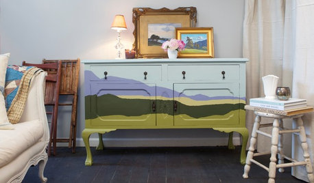
DIY PROJECTSUpcycle Furniture Finds With Paint
There are products out there designed to help you transform your thrift-store scores
Full Story


Jennifer Hogan