


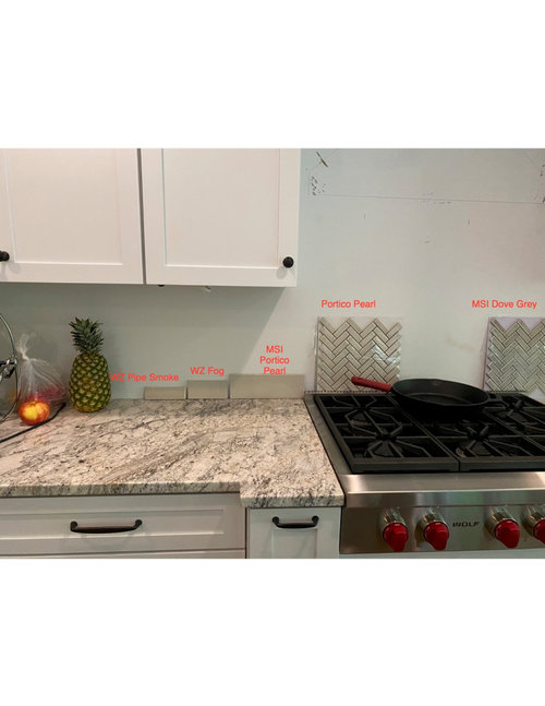
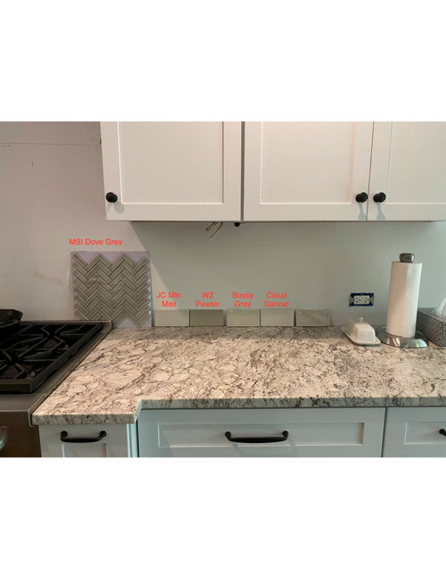
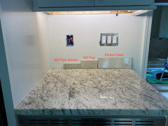
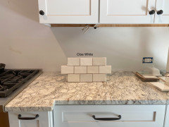
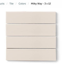
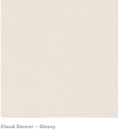
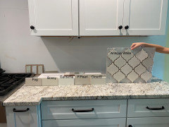
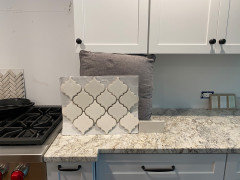
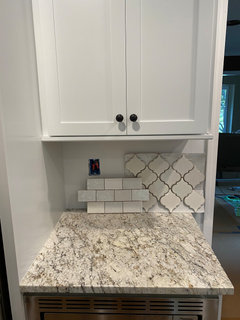
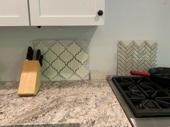
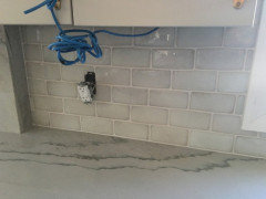
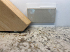
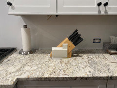
Looking for input on backsplash samples
A T@Home
3 years ago

Featured Answer
Sort by:Oldest
Comments (58)

A T@Home
3 years agoRelated Professionals
Fort Smith Interior Designers & Decorators · Cedar Rapids Furniture & Accessories · Franklin Furniture & Accessories · Irmo Furniture & Accessories · Riverhead Window Treatments · Shiloh Window Treatments · Everett Kitchen & Bathroom Designers · St. Louis Kitchen & Bathroom Designers · Pooler General Contractors · Browns Mills General Contractors · Endicott General Contractors · Shaker Heights General Contractors · Fremont Kitchen & Bathroom Remodelers · Ridgefield Park Kitchen & Bathroom Remodelers · Parsippany Cabinets & CabinetryA T@Home
3 years agoA T@Home
3 years agoA T@Home
3 years ago
ulisdone
3 years agoA T@Home
3 years agoA T@Home
3 years agoA T@Home
3 years agoA T@Home
3 years ago
eam44
3 years agolast modified: 3 years agoA T@Home
3 years agoeam44
3 years agoA T@Home
3 years agolast modified: 3 years agolmp1959
3 years agoA T@Home
3 years agosalonva
3 years agoA T@Home
3 years agoA T@Home
3 years agoeam44
3 years agolast modified: 3 years ago
cawaps
3 years agoeam44
3 years agoA T@Home
3 years agoeam44
3 years agoA T@Home
3 years agosalonva
3 years agoA T@Home
3 years agochocolatebunny123
3 years agoeam44
3 years agolast modified: 3 years agoA T@Home
3 years agochristine rivellini
3 years agoA T@Home
3 years agoA T@Home
3 years agoeam44
3 years agoA T@Home
3 years agoA T@Home
3 years agoA T@Home
3 years agoA T@Home
3 years agoA T@Home
3 years agoA T@Home
3 years agoeam44
3 years agolast modified: 3 years agoA T@Home
3 years agoeam44
3 years agoA T@Home
3 years agoA T@Home
3 years agoeam44
3 years agolast modified: 3 years agosalonva
3 years agonataliepearson10
2 years ago


Related Stories
DIY PROJECTSDIY Backsplash Makeover: Get a New Tile Look for Less Than $50
Give old tile a painted faux-stone facade for a brand-new look at a superaffordable price
Full Story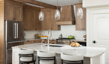
KITCHEN BACKSPLASHESWhere to Start and Stop Your Backsplash
Consider these designer tricks to work around cabinets, windows and other features for a finished look in your kitchen
Full Story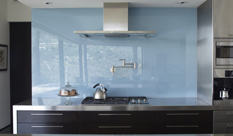
KITCHEN DESIGNThe Future of Backsplashes
Grout is out. Continuous sheets of glass, stone, metal and porcelain are saving cleaning time and offering more looks than ever
Full Story
MATERIALS10 Modern Marble Looks
Marble has broken free of the standard kitchen countertop slab and is showing up on bathtub backsplashes, modern dining tables and more
Full Story
KITCHEN DESIGN8 Mirror Types for a Fantastic Kitchen Backsplash
Create the illusion of more space, add bling or just go for an unexpected look with a mirrored backsplash that suits your kitchen's style
Full Story
KITCHEN DESIGNCountertop and Backsplash: Making the Perfect Match
Zero in on a kitchen combo you'll love with these strategies and great countertop-backsplash mixes for inspiration
Full Story
KITCHEN BACKSPLASHESWhy You Should Embrace a Solid Slab Backsplash
The effect is stunning, and yet the cost can be minimal. Here’s what to know about using full slabs of stone in your kitchen
Full Story
TILE5 Head-Turning Tile Styles for Backsplashes and More
If plain subway tile would derail your bold decorating vision, these dashing tiles can help you arrive at a brilliant solution
Full Story

eam44