


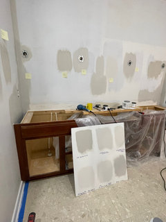
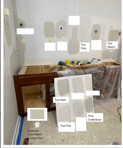
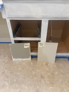
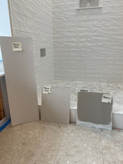
Need help with P A I N T choices
Karen Barden
29 days ago

Featured Answer
Sort by:Oldest
Comments (27)
 PRO
PROPatricia Colwell Consulting
29 days agolast modified: 29 days agoRelated Professionals
Linton Hall Kitchen & Bathroom Remodelers · River Edge Architects & Building Designers · Spring Valley Architects & Building Designers · Atlantic Beach Furniture & Accessories · De Luz General Contractors · Lewisburg General Contractors · Medway General Contractors · Palestine General Contractors · Tamarac General Contractors · Greensboro Painters · Columbia Heights Painters · Naples Painters · South Gate Cabinets & Cabinetry · Easton Flooring Contractors · Federal Way Flooring ContractorsKaren Barden
29 days agoKaren Barden
29 days agokandrewspa
29 days ago
apple_pie_order
29 days agochispa
29 days agochispa
29 days agoeld6161
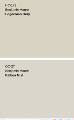
29 days agolast modified: 29 days ago PRO
PROBeverlyFLADeziner
29 days agolast modified: 29 days agoKaren Barden
29 days agoKaren Barden
29 days ago
barncatz
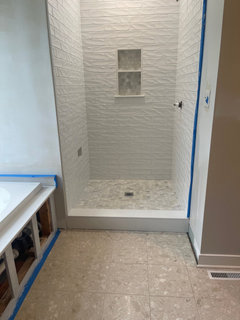
29 days agolast modified: 28 days agohoussaon
29 days agolast modified: 29 days ago
la_la Girl
28 days agolast modified: 28 days ago
Lyn Nielson
28 days ago- PRO
BeverlyFLADeziner
28 days ago MarleneM
28 days agoKaren Barden
28 days agoapple_pie_order
28 days agobarncatz
28 days agolast modified: 28 days ago
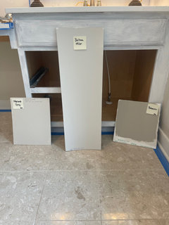
Boxerpal
28 days agolast modified: 28 days agoKaren Barden
28 days agoBoxerpal
28 days agoMarleneM
28 days ago- PRO
Georgica Macovei
28 days ago Karen Barden
27 days ago


Related Stories

COLORPick-a-Paint Help: How to Quit Procrastinating on Color Choice
If you're up to your ears in paint chips but no further to pinning down a hue, our new 3-part series is for you
Full Story
BATHROOM DESIGNWhich Flooring Should I Choose for My Bathroom?
Read this expert advice on 12 popular options to help you decide which bathroom flooring is right for you
Full Story
ORGANIZINGDo It for the Kids! A Few Routines Help a Home Run More Smoothly
Not a Naturally Organized person? These tips can help you tackle the onslaught of papers, meals, laundry — and even help you find your keys
Full Story
PETSHow to Help Your Dog Be a Good Neighbor
Good fences certainly help, but be sure to introduce your pup to the neighbors and check in from time to time
Full Story
MOST POPULAR9 Real Ways You Can Help After a House Fire
Suggestions from someone who lost her home to fire — and experienced the staggering generosity of community
Full Story
DECLUTTERINGDownsizing Help: How to Edit Your Belongings
Learn what to take and what to toss if you're moving to a smaller home
Full Story
SMALL SPACESDownsizing Help: Storage Solutions for Small Spaces
Look under, over and inside to find places for everything you need to keep
Full Story
HOME TECHTurn 'Obsolete' Tech Into Fun Home Help
Here's how to put your old Mac, Atari or Newton to work around the house
Full Story
DESIGNING A BUSINESSDesigning a Business: How to Avoid Client Choice Overload
Design business coach Chelsea Coryell shares an efficient strategy for creating the best design solutions for a client
Full Story


JJ