


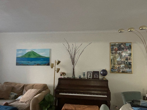
my living space doesn’t sing
Caryn Schulman
20 days ago
Sort by:Oldest
Comments (6)
Related Stories
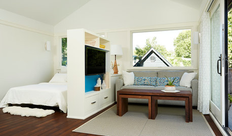
SMALL SPACESHouzz Tour: 380-Square-Foot Loft Doesn’t Waste an Inch of Space
This above-garage loft in Minneapolis serves as a guest house for mom, a rental unit and a temporary home for its owner
Full Story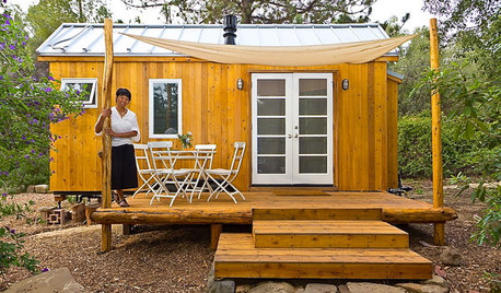
LIFEYou Said It: ‘Just Because I’m Tiny Doesn’t Mean I Don’t Go Big’
Changing things up with space, color and paint dominated the design conversations this week
Full Story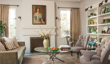
LIVING ROOMSNew This Week: 5 Fully Decorated Living Rooms That Don’t Go Overboard
See how designers filled these recently uploaded spaces with the right amount of furniture and accessories
Full Story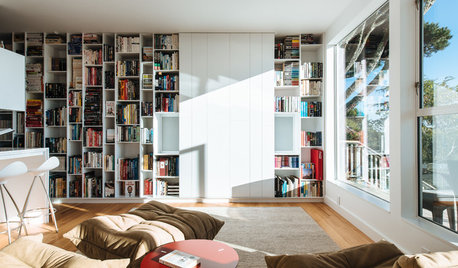
LIVING ROOMSLiving Rooms That Don’t Revolve Around the TV
In these spaces, the television takes a back seat to conversation, relaxation and aesthetics
Full Story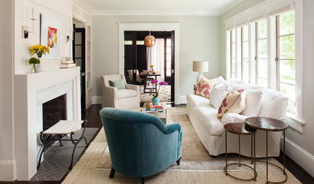
STANDARD MEASUREMENTSHow Much Space You Need (and What to Do if You Don’t Have It)
Get tips on allowing ample room for traffic flow through kitchens, dining rooms, living rooms and other areas
Full Story
DECORATING PROJECTSRedecorating Lite: 6 Quick Updates to Liven Up Your Living Spaces
If a full redecorating project isn’t in your budget, consider these inexpensive ideas to give your room new life
Full Story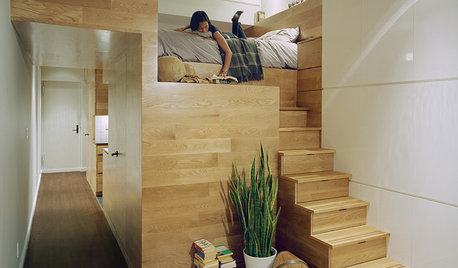
THE HARDWORKING HOMESmall-Space Living: 8 Stylish Multitasking Studios
These chic studio homes show how small spaces can be big on style
Full Story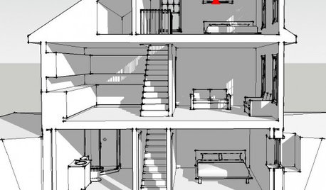
ATTICSMore Living Space: Making Room for Family
8 considerations for remodeling an attic or basement to create additional living space
Full Story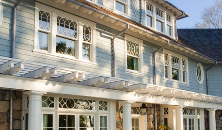
TRADITIONAL HOMESHouzz Tour: New Shingle-Style Home Doesn’t Reveal Its Age
Meticulous attention to period details makes this grand shorefront home look like it’s been perched here for a century
Full Story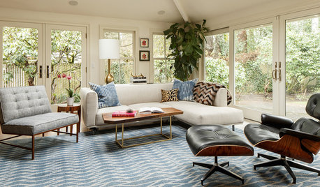
ROOM OF THE DAYRoom of the Day: Stylish Living Space With a Midcentury Twist
Contemporary decor and modern touches combine to make a well-loved great room in Portland, Oregon
Full Story

kandrewspa
Boxerpal
Related Professionals
Westbury Interior Designers & Decorators · Terryville Kitchen & Bathroom Designers · Boston Furniture & Accessories · Walnut Creek Furniture & Accessories · Discovery Bay Furniture & Accessories · Urbandale Furniture & Accessories · Wellesley Furniture & Accessories · Murraysville General Contractors · Broadview Heights General Contractors · Goldenrod General Contractors · Hartford General Contractors · Las Cruces General Contractors · Norman General Contractors · Saginaw General Contractors · Summit General Contractorschloebud
BeverlyFLADeziner
deegw
apple_pie_order