


Bathroom of the Week: Serene Retreat for Empty Nesters
A designer balances clean lines with subtle curves in a minimalist room warmed by walnut vanities

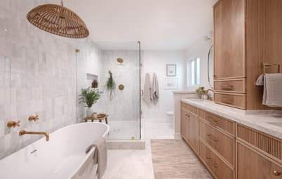
This Minneapolis couple had lived in their home for more than 20 years and renovated most of the rooms over time. However, they didn’t get around to their own primary bathroom until their children had flown the nest. “Walking through their house, I could see that my clients liked a very clean, monochromatic and minimalist look warmed by walnut wood,” interior designer Colleen Slack says. She reworked the bathroom’s layout and finishes to create a more functional and serene oasis that suited their personal style.
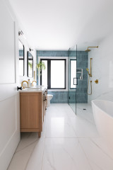
After: “The goal was to make it feel comfortable with the materials and layout,” Slack says. “We wanted it to be uncluttered and have breathing room.” The materials are a mix of walnut, gray tile and white walls.
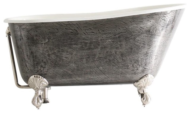
The niches had been boxed in, so when Slack had them removed, she was able to push those walls back. “This allowed for space to walk around the new freestanding bathtub,” she says. It also gave the vanities more breathing room.
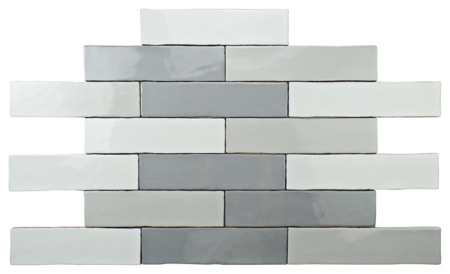
Slack created balance in the new design. For example, while there are many clean, straight lines on elements like the tile and window frames, she threw in some curves for softness. And here, with such a symmetrical composition, she subtly threw it off by installing the freestanding tub faucet asymmetrically. The running bond pattern in the gray porcelain floor tiles also adds subtle asymmetry.
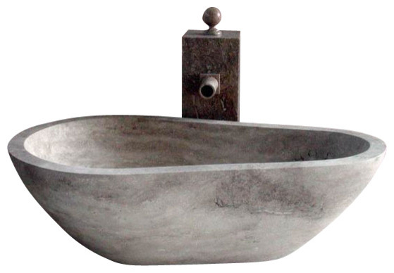
Paint colors: Reserved White (walls) and Extra White (ceiling), Sherwin-Williams; bathtub: 71-by-32-inch oval, Miseno
Browse white freestanding bathtubs in the Houzz Shop
The niches had been boxed in, so when Slack had them removed, she was able to push those walls back. “This allowed for space to walk around the new freestanding bathtub,” she says. It also gave the vanities more breathing room.
Slack created balance in the new design. For example, while there are many clean, straight lines on elements like the tile and window frames, she threw in some curves for softness. And here, with such a symmetrical composition, she subtly threw it off by installing the freestanding tub faucet asymmetrically. The running bond pattern in the gray porcelain floor tiles also adds subtle asymmetry.
Paint colors: Reserved White (walls) and Extra White (ceiling), Sherwin-Williams; bathtub: 71-by-32-inch oval, Miseno
Browse white freestanding bathtubs in the Houzz Shop
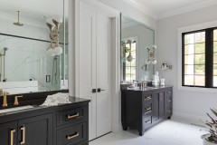
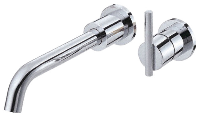
“The homeowners had a lot of brushed nickel throughout their house, so we used that in the room,” Slack says. “The faucets we chose are very streamlined but have some curves that add softness.”
Before: The room was quite expansive, but everything was shoved up against the walls, creating a clunky look. This photo illustrates how much room the niches took up. They butted up against the window frames and the vanities on both sides of the room.
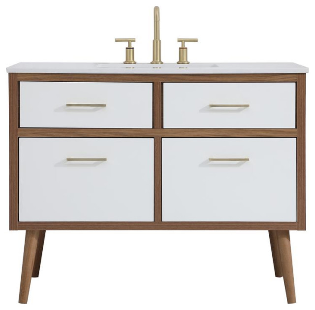
After: Now there’s some space between the vanities, the walls and the bathtub. Wall-mounted vanities create additional breathing room underneath. “Floating the vanities brought in a modern feel and another layer of spaciousness and openness,” Slack says.
The custom vanities are walnut with a clear varnish. The countertops are low-maintenance white quartz with subtle marble-look veining. “The faucets are streamlined but have a slight curve,” Slack says. “I picked up on this with the curves of the towel bars and the curves of the mirrors. The curves of the walnut mirror frames were just right and worked with the subtle curves in the faucets. Too many straight lines would have made this room look too sterile.”
Hire a cabinet pro
The middle vanity drawer has a U-shaped cutout to accommodate the P-trap. “Having drawers under the sink, even with the U shape, makes storage so much better than cabinet doors would have,” Slack says. It’s also a more ergonomic choice for aging in place.
Mixing warm and cool tones was another careful balance. The walnut provides lots of warmth against the cooler white tones. The gray tiles in the room have both warm and cool undertones. “I used Reserved White by Sherwin-Williams on the walls,” Slack says. “It’s not crisp, it’s not warm, it’s not peachy or beige — it’s just right.”
Here’s a close-up look at one of the hand towel rings Slack mounted on the sides of the vanities. This photo also shows the veining pattern in the quartz.
Here’s a close-up look at one of the hand towel rings Slack mounted on the sides of the vanities. This photo also shows the veining pattern in the quartz.
Before: “The water here is hard, and this glass showed every spot,” Slack says.
After: “We added half walls to the sides of the shower so that there would be less glass to clean,” Slack says. “And we used a water-spot-resistant treatment on the glass to make cleaning it easier with that hard water.”
This was a case where aging in place was worth discussing but wasn’t a top priority for the homeowners. Slack tucked a corner bench on the vanity side of the shower. It’s hidden from view but there in case the couple ever need it.
“I talk to all my clients about safety bars and where they will need to go,” she says. “For example, it’s important to place one next to a bench to help you get up.” While these clients opted not to install them right now, Slack blocked the proper support for safety bars in the places where they should be placed if they’re needed in the future.
New to home remodeling? Learn the basics
Slack chose a large-format porcelain tile with a subtle pattern for the shower stall. “Using a larger tile meant fewer grout lines,” she says. “And the grout is mold-resistant, making it easier to keep clean.”
The multifunctional shower head system is by Grohe. “I love this shower system we chose,” Slack says. “You can use the shower heads independently or use both of them at once with the touch of a simple push button. And it’s a beautiful system that fits in with the minimalism.”
The multifunctional shower head system is by Grohe. “I love this shower system we chose,” Slack says. “You can use the shower heads independently or use both of them at once with the touch of a simple push button. And it’s a beautiful system that fits in with the minimalism.”
Slack mounted these elegant minimalist towel bars on either side of the tub. She also added some simple hooks on the top of the shower enclosure where her clients can hang a towel before they enter.
Before: The bathroom had a separate toilet room. “It was weird — it had all this extra space in it,” Slack says. “But because of the way the door swung into it, you could not even fit an elongated toilet bowl in there.”
After: The opening to the toilet room remained in the same place, but Slack replaced the door with a pocket door. “My clients found this great pocket door hardware I didn’t know about. It’s soft-close and almost works like touch-latch cabinetry,” she says.
The new toilet is by Toto, and the lid is motion-activated. It also has integrated lights that make nighttime trips to the bathroom easier. “This can be more of an issue for aging in place,” Slack says. “We also blocked for safety bars in here. They have a great toilet paper holder now that doubles as a safety bar.”
Compare this photo to the previous one to see how Slack removed the angled wall and pushed the bathroom into the existing toilet room’s space. This left room for a storage tower on the right.
Find the right vanity lighting for your bathroom
A long pullout allows access to the back of the deep tower. There’s wood along the right side of the shelving and acrylic rails on the left side to prevent items from falling.
While these clients lean into minimalism, they still love beautiful details. As with other elements in the room, the light fixtures add more streamlined curves. “I also had to think carefully about how to space everything in a pleasing way — the space between the mirror and the lights, and the light and the tower,” Slack says. Allowing a pleasing amount of breathing room in the design created a comfortable and relaxing feel in the space.
More on Houzz
Read more bathroom stories
Browse bathroom photos
Find a bathroom designer
Shop for your bathroom

Sponsored
Your Custom Bath Designers & Remodelers in Columbus I 10X Best Houzz
Sponsored
Central Ohio's Trusted Home Remodeler Specializing in Kitchens & Baths
Bathroom at a Glance
Who lives here: A couple with grown children
Location: Minneapolis
Size: 190 square feet (18 square meters)
Designer: Colleen Slack of Fox Interiors
Contractor: Urban Refurbishment
Before: The existing bathroom had a large jetted tub with an expansive deck around it. “You had to climb over the deck and stand in the bathtub to pull the blinds,” Slack says. Other issues included frosted glass on the shower that showed every mark from the hard water, as well as a lack of storage.
Also, walls with large niches in them flanked the bathtub. “My clients like a very uncluttered look,” the designer says. “You don’t see collections of things around their house and they had no need for those niches.”
Find a local interior designer on Houzz