


Before and After: 3 Bold Black-and-White Kitchen Makeovers
See how this high-contrast color combination transforms these remodeled kitchens

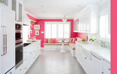
A black-and-white color palette is a classic look that always feels fresh and sophisticated, like a perfectly tailored tuxedo. Check out these before-and-after photos to see how three designers used the high-contrast color scheme and other standout features to give their clients’ kitchens new life.
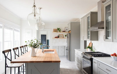
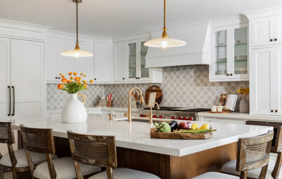
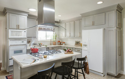
After: While the kitchen’s layout was functional and its footprint was adequate, the upper cabinets blocked the potential for leafy views. The designer removed the cabinets to make room for expansive windows. “My clients are minimalists who didn’t need a ton of storage. Plus, they already had a walk-in pantry,” Kestenbaum says. She used black-framed casement windows, which provide stark contrast to the crisp new white cabinets, island, range hood and walls.
Windows: Kolbe Windows & Doors
Windows: Kolbe Windows & Doors

Need a pro for your kitchen remodeling project?
Let Houzz find the best pros for you
Let Houzz find the best pros for you
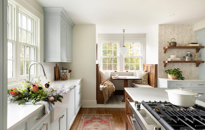
The countertops are soapstone, a favorite of the homeowners. “These clients wanted to use as many natural elements and details as possible,” Kestenbaum says. They include wood details and solid wood cabinets. The homeowners selected a farmhouse sink, and the elegant kitchen faucet is polished nickel with an integrated pull-down sprayer.
The designer recessed the windows into the drywall to extend the countertops into the window wells. Then she added a low soapstone backsplash to line up at the same height as the bottom rails of the windows. This created one continuous black line around the room. “It really helped pull everything together,” Kestenbaum says.
Shop for a white farmhouse sink
Read more about this kitchen remodel
2. Delightful Double Islands
Kitchen at a Glance
Who lives here: Ronnie and Jenn Mafrici and their two young daughters
Location: Woodland, California
Size: 450 square feet (42 square meters)
Designer: Lori Brazier of House of Brazier
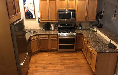
Before: Wanting a kitchen with better flow and a more sophisticated feel, these California homeowners tasked designer Lori Brazier to completely reimagine their space with a new layout and a black-and-white color palette.
The existing kitchen featured leftovers from the 1990s, including midtone wood veneer cabinets and light-colored laminate countertops. A large angled island and a smaller island with a massive range hood above it created an awkward flow and a bit of an eyesore. A walk-in pantry behind the wall ovens and a breakfast nook, seen on the right, weren’t the best use of space.
Kitchen at a Glance
Who lives here: Ronnie and Jenn Mafrici and their two young daughters
Location: Woodland, California
Size: 450 square feet (42 square meters)
Designer: Lori Brazier of House of Brazier
Before: Wanting a kitchen with better flow and a more sophisticated feel, these California homeowners tasked designer Lori Brazier to completely reimagine their space with a new layout and a black-and-white color palette.
The existing kitchen featured leftovers from the 1990s, including midtone wood veneer cabinets and light-colored laminate countertops. A large angled island and a smaller island with a massive range hood above it created an awkward flow and a bit of an eyesore. A walk-in pantry behind the wall ovens and a breakfast nook, seen on the right, weren’t the best use of space.
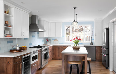
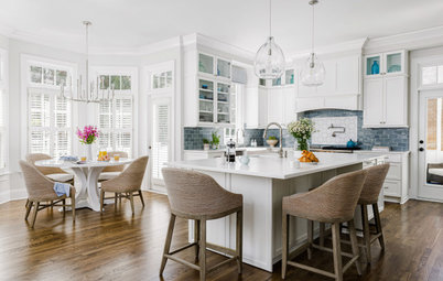
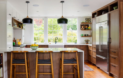
After: Brazier replaced the awkward islands with two new rectangular islands for better workspace and flow. The island in the foreground is a designated dining spot with a trio of comfortable bar stools on each side.
The island in front of the range serves as a working island with handy drawer storage. “This way people can be hanging out at the eating island without being on top of the person cooking,” Brazier says.
The designer had the base of both islands painted a true crisp black (Tricorn Black by Sherwin-Williams), which offers dramatic contrast to the white walls and white-painted Shaker-style custom cabinets (Snowbound by Sherwin-Williams) with matte black hardware.
Shrinking the former walk-in pantry to a corner space through the frosted glass door on the left and extending the kitchen into the former breakfast nook on the right helped add 75 square feet to the kitchen and significantly increase functional storage.
The kitchen lost the windows on the back wall, but Brazier added new ones along the sink wall, as well as a glass door that leads to a patio with an outdoor dining area and pool. The black door and window frames complement the other matte black details in the kitchen.
Two-inch-thick quartz countertops that mimic Calacatta marble on the island and perimeters keep things looking fresh and light. The backsplash is white-glazed hand-shaped ceramic subway tiles that show variation and texture. “Adding that charcoal-colored grout gives it character and a bit more dimension with all the white in this kitchen,” Brazier says.
Read more about this kitchen remodel
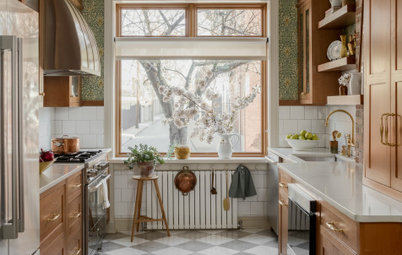
3. Tantalizing Tile
Kitchen at a Glance
Who lives here: A couple
Location: Atlanta
Size: 400 square feet (37 square meters)
Designers: Joann Kandrac and Kelly Kole of Kandrac & Kole Interior Design
Contractor: Atlanta Remodeling & Construction
Cabinetry design and construction: Cabinet Resources
Before: These Atlanta homeowners knew it was time for a kitchen refresh. The tile floor had seen better days, the cabinets were out of style and the painted soffits above the cabinets gave the room a dated look. They contacted designers Joann Kandrac and Kelly Kole to devise a fresh look with a high-contrast color scheme and eye-catching tile.
While the former kitchen’s materials were dated, the functionality of the layout worked well for the homeowners. A central island provided extra counter space within the work triangle, a spot for the stovetop and a place for the family of four to gather. So the designers kept all of the major appliance locations in approximately the same places.
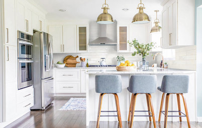
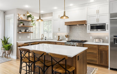
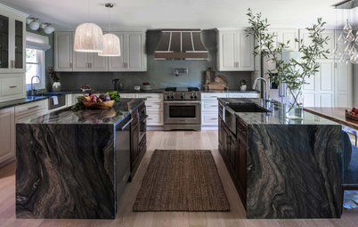
After: Removing the soffits allowed the designers to extend the upper cabinets, topped with crown molding, to the ceiling. This added more storage and also made the space feel more streamlined.
The new countertops in the room are a marble-look engineered quartz. To make the island stand out, the team gave its countertop a 6-centimeter-thick profile. The perimeter counters are the standard thickness of 3 centimeters.
The homeowners had recently installed new hardwood floors in an adjacent room and the designers were able to match them in the new kitchen. The flooring anchors the room with warm tones.
Countertops: Bianco Drift, Caesarstone
A backsplash of bold graphic marble mosaic tile sets a sophisticated tone for the room’s transitional style. The tile, which extends all the way to the ceiling for major impact, also sets the color palette of black, white and gray. The cabinets are a very light warm gray, while the walls are a few shades darker for contrast. Matte black hardware pops against the light cabinets.
Another elegant style choice was the new light fixtures. A trio of black, white and brass pendants hangs above the island.
Pendant lights: Cadence, Feiss; cabinet hardware: Ascendra collection, Top Knobs
Read more about this kitchen remodel
More on Houzz
Read more kitchen stories
Browse kitchen photos
Hire a kitchen remodeler
Shop for kitchen products
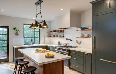
Kitchen at a Glance
Who lives here: A couple and their two dogs
Location: Redmond, Washington
Size: 168 square feet (16 square meters); 10½ by 16 feet
Designer: Tamar Kestenbaum of Sienna & Sage Interior Design
Before: These Washington homeowners felt their former kitchen was rather dark and dated. The knotty pine cabinets, angled island and bulky range hood didn’t fit with their preferred clean-lined aesthetic. And with only one window, the kitchen wasn’t taking advantage of the lush trees surrounding the property.
The owners reached out to designer Tamar Kestenbaum to remodel the kitchen by adding lots of statement-making casement windows and a chic black-and-white color palette. “This home is nestled into the trees and was already gorgeous, except for the kitchen. It was this dark corner of the house,” Kestenbaum says.
Find an interior designer on Houzz