Kitchen of the Week: Family-Friendly With European-Inspired Style
A designer looks to Belgian farmhouse style for inspiration, balancing high contrast and warmth
This house in North Vancouver, British Columbia, had quintessential 1990s style, and its new homeowners were looking for something more streamlined and European-inspired. “When I first asked them about their style, they said, ‘Whatever this is, we want the opposite,’ ” designer Lori Steeves says. In addition, the couple, who are both from Europe, had two kindergartners and a dog, and the kitchen and family room needed to function well for the whole family.
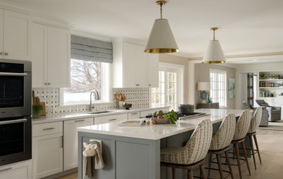
After speaking more extensively with the couple and studying their Houzz ideabooks, the designer gave the kitchen a Belgian farmhouse-inspired look. The new space, open to the family room, serves as the hub of the busy household, and Steeves provided family-friendly gathering spaces where they love to spend time.
After speaking more extensively with the couple and studying their Houzz ideabooks, the designer gave the kitchen a Belgian farmhouse-inspired look. The new space, open to the family room, serves as the hub of the busy household, and Steeves provided family-friendly gathering spaces where they love to spend time.
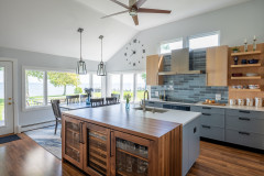
After: As Steeves renovated the kitchen and family room at the same time, she created relationships between the two. While the kitchen layout remained roughly the same, she extended it into the formerly empty area between the two rooms. She left a clear path in front of the sliding patio doors.
“The wife is a vegan, and having lots of space to prepare food was very important to her,” Steeves says. The designer took advantage of the size of the space by using a previously empty bay as a cozy spot for a kitchen table. And she extended the island so that it would provide an ample prep area within the work triangle, as well as seating for the whole family. The island measures 10 feet, 2 inches by 4 feet, 4 inches.
“The wife is a vegan, and having lots of space to prepare food was very important to her,” Steeves says. The designer took advantage of the size of the space by using a previously empty bay as a cozy spot for a kitchen table. And she extended the island so that it would provide an ample prep area within the work triangle, as well as seating for the whole family. The island measures 10 feet, 2 inches by 4 feet, 4 inches.
“At first the homeowner was hesitant to place a dining area in the bay, because she loves plants and knew it was a good spot for them,” Steeves says. “But I promised we’d find good spots for her plants. Now she tells me it’s the kids’ favorite part of the kitchen. In addition to having meals here, they do all their crafting and their homework at the table.”
The designer built in a bench under the windows that has storage underneath. “The oval table fits the room nicely, and the curved edges and pedestal make it easy to get around,” she says. The woven light overhead plays off woven elements she used in the adjacent family room.
Shop for kitchen lighting
Before: The kitchen island had a cooktop but lacked seating. There was a full range on the wall behind the island. On the left side of this photo, the fridge juts awkwardly into the kitchen, as do the pantry walls. “It was one of those pantries that was a waste of space,” Steeves says. “We decided to rip it out and put in pantry cabinets instead.”
As for style, she notes that the house was very 1990s, with glossy cabinets and lots of powder pink and teal. “She’s from France and he’s Dutch,” Steeves says. “I came up with a Belgian farmhouse-inspired look but more streamlined and simple.” Sustainability and health were also factors.
As for style, she notes that the house was very 1990s, with glossy cabinets and lots of powder pink and teal. “She’s from France and he’s Dutch,” Steeves says. “I came up with a Belgian farmhouse-inspired look but more streamlined and simple.” Sustainability and health were also factors.
After: Now the island has a working end within the kitchen’s work triangle, plus room for the whole family to gather around three sides at the opposite end. The work end has storage and houses the dishwasher.
The black-and-white scheme comes from a combination of white painted MDF cabinets and black wood-grain-look laminate cabinets by Greenlam. The countertops are Caesarstone with very subtle purplish-black veining. “The white oak on the shelves, range hood, flooring and fireplace mantel in the family room softens and warms things up,” Steeves says. “Sometimes when you have just black and white, the high contrast can be too cold.”
Also warming things up are the light fixtures. “You want to limit how many hanging things you have or it can be distracting,” Steeves says. “But because the island was the centerpiece of the room and was so large, it needed three significant pendants. They also add the only brass touches in the room, which play nicely off the warm wood.”
“One thing about the existing kitchen that the homeowner absolutely loved was looking out three windows toward her backyard when working at the sink. So we left them in the same location,” Steeves says.
Browse black kitchen faucets in the Houzz Shop
Browse black kitchen faucets in the Houzz Shop
The dishwasher is in the island kitty-corner from the sink, close to where the glassware and dishes are stored. “After our initial meeting, these clients decided they needed to save money to do this project right, and I didn’t know if I’d hear from them again,” Steeves says. “But about six months later, their dishwasher broke and they asked if I could help. I happened to have a client who was replacing a perfectly good high-end dishwasher with a panel-front one, and I asked if she’d sell it to them. I think they got it for around $100.” Months later, they were ready to start the renovation.
When this dishwasher kicks the bucket, the homeowners plan to replace it with a panel-front model. “They thought it would be wasteful to replace a perfectly good dishwasher, and it’s in a spot where it isn’t that visible,” Steeves says. She ordered a panel for a panel-front model when she ordered the cabinets. That way, when this dishwasher eventually dies, its replacement will match the cabinetry.
When this dishwasher kicks the bucket, the homeowners plan to replace it with a panel-front model. “They thought it would be wasteful to replace a perfectly good dishwasher, and it’s in a spot where it isn’t that visible,” Steeves says. She ordered a panel for a panel-front model when she ordered the cabinets. That way, when this dishwasher eventually dies, its replacement will match the cabinetry.
“When I first proposed a black kitchen, my clients were hesitant, because they love light,” Steeves says. “But I explained that because we weren’t going to be putting in upper cabinets, it would keep the room light and anchor the bottom half. And we kept the pantry wall white.”
She suggested open shelving rather than a dark upper cabinet here. “This was a good chance to add more of the warm white oak wood,” Steeves says. It’s also a good spot for some of the homeowner’s beloved plants.
The backsplash is a ceramic white subway tile with a tumbled look. “I wanted some of the finishes in the kitchen and family room to tie together,” Steeves says. “The tumbled ceramic mimics the white painted brick on the family room’s new fireplace surround.”
One change Steeves made to the layout was moving the fridge from the pantry wall to the range wall. Then she moved the wall ovens to the pantry wall.
She replaced all the flooring on the first level with engineered white oak. “I told them that would be best because we wanted them all to match,” Steeves says. “If we’d waited to do the other rooms until they were ready to renovate them, the floorboards could have faded and they wouldn’t have matched.”
She replaced all the flooring on the first level with engineered white oak. “I told them that would be best because we wanted them all to match,” Steeves says. “If we’d waited to do the other rooms until they were ready to renovate them, the floorboards could have faded and they wouldn’t have matched.”
The new range is an induction cooktop. The range hood has a white oak detail.
The wall ovens are a steam oven and a convection oven from Miele. “My clients also wanted a separate coffee bar,” Steeves says. She tucked it within the pantry wall. “I added a solid-surface countertop so that it can stand up to coffee spills and stains,” she says. When opened, the doors can slide back into the cabinetry and out of the way.
Find a local cabinet pro
Find a local cabinet pro
Before: The rooms had tile and carpeting, the vast open space between them was awkward, and the fireplace surround didn’t suit the family’s style at all.
“They had the sofa in front of the windows and didn’t know what to do with the big blank wall across from it,” Steeves says. “I told them that wall was where the sofa should be.”
The clients also had replaced all the exterior windows before the design phase started. “They called me to ask if they should do black-framed windows and I said they absolutely should, inside and out,” she says.
After: The designer added caned chairs in front of the windows for a lighter, more open feel and played off the texture by adding a rattan cabinet behind the sofa. This piece lightens up the look from the kitchen toward the family room. Steeves also added woven baskets to bring that texture to the wall.
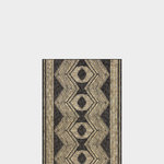
“My clients were into very natural organic textures, so we went with a 100% wool rug,” Steeves says. “Wool can stand up to kids and the dog and just about anything else you throw at it.” The hexagonal pattern has a woven look that plays off the caning and rattan.
“My clients were into very natural organic textures, so we went with a 100% wool rug,” Steeves says. “Wool can stand up to kids and the dog and just about anything else you throw at it.” The hexagonal pattern has a woven look that plays off the caning and rattan.
The new fireplace surround is a brick veneer painted white, and the new mantel is white oak. Steeves added built-in storage on either side. “These offered more good spots for plants,” she says. She used black on the lighting to play off the kitchen lighting.
“This TV is a Samsung Frame TV that we are using just about everywhere now,” Steeves says. “The clients had this French painting selected the day of the photo shoot and it was perfect.” The TV looks like a piece of framed art when not in use.
More on Houzz
Read more kitchen stories
Browse kitchen photos
Hire a kitchen remodeler
Shop for kitchen products







Kitchen at a Glance
Who lives here: A couple with two young kids and a dog
Location: North Vancouver, British Columbia
Size: 577 square feet (54 square meters)
Designer: Lori Steeves of Simply Home Decorating
Before: Understanding the layout of the back of the house is the key to understanding the impact of the renovation. The more formal areas, including the dining room and living room, run along the front of the home, while the kitchen and family room make up the back. Because the rooms were in one open space, Steeves designed renovations for both areas at the same time. The couple plan on completing the renovations in phases that work with their budget.
“The kitchen is so important to this family,” Steeves says. “It’s where they wanted to hang out, eat together and do homework. So it was really important to make this part of the renovation phase one. The space back here was quite large, but there was a lot of wasted space in between the kitchen and family room that was empty.”
Hire an interior designer on Houzz