Orange You Glad This Doesn’t Look Halloween-y?
Pops of orange don’t have to stop once trick-or-treating does. Here are some ways to make the bold color work anytime

It’s the color of pumpkins and candy corn — and at this time of year, it’s everywhere. But bright, bold orange shouldn’t be limited to jack-o’-lanterns. If you love the energy and warmth the color embodies, check out these ways from interior designers on Houzz to use orange in your decor year-round without screaming “boo!”
Make It Pop
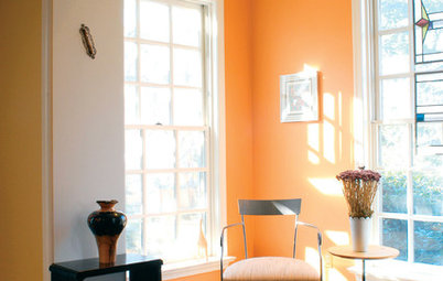
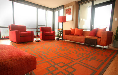
Designer Ann Brown says she loves working with orange because it’s warm and bright and goes with neutrals and other eye-catching colors, like hot pink. In this Sausalito, California, living room, Brown used a citrusy orange to make the fireplace wall and built-in cabinetry stand out. “I love orange as in the color of a real orange, not a brown-orange, which I think gets too serious and a little depressing,” Brown says.
For balance, the orange shelving ties the room together with the Roman shades and the oversize woven rug, swirled with corals and blues.
See more inspiration photos with orange living rooms on Houzz
Pairing shades of orange with too much black can make Halloween come to mind, Brown says, but in this New York City bathroom, the clean geometric pattern of the tile and stark white walls give the space just enough edge for the vibrant vanity.
Find an interior designer near you
Find an interior designer near you
The orange window seat in this bedroom again feels unexpected and rich next to bright white walls (Dunn-Edwards Paints’ Often Orange and Whisper, respectively) and white bedding.
Pair It With Neutrals
For a jolt of orange that’s not quite as sharp, interior designer Holly Kauffmann of HKW Designs suggests combining orange pieces with warm neutrals.
In this New York powder room, the unusually shaped vessel sink and mirror work with the pearlized champagne-colored wallpaper (Osborne & Little’s Kikko Trellis) to make the small space feel cozy and inviting.
Browse neutral wallpaper
In this Seattle bathroom, the design team went with creamier orange accents that brighten up the subdued blue-gray walls (Pratt & Lambert’s Florida Gold and Blue Slate, respectively). Against the texture of the narrow wood strips on one wall and semigloss white tile on another, the color combination is striking without being overbearing.
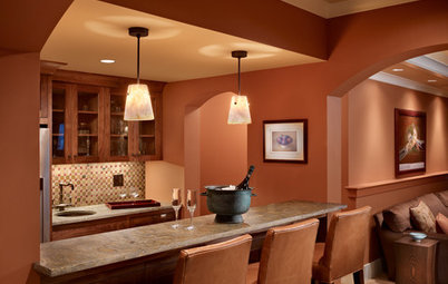
Find Statement Pieces
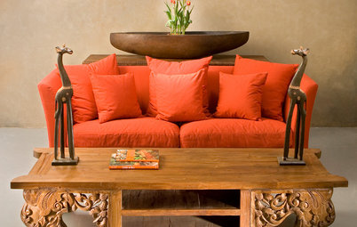
Orange may feel like too bold a choice for some homeowners, but Brown says she’s found that even clients who are hesitant to use orange usually come to appreciate the statement-making shade once they see it next to other colors in the finished product. “It takes a client who loves color and wants some bold accents,” she says.
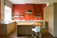
If you’re going to go bold with a few select pieces, it’s smart to choose ones that will make the most impact. In this case, the homeowners of this Washington, D.C.-area kitchen opted for a retro-cool orange Big Chill Slim refrigerator. Instead of stopping there, the team at Kingston Design Remodeling anchored the whole room in orange by using the hue above the custom stained concrete countertops as well.
Orange may feel like too bold a choice for some homeowners, but Brown says she’s found that even clients who are hesitant to use orange usually come to appreciate the statement-making shade once they see it next to other colors in the finished product. “It takes a client who loves color and wants some bold accents,” she says.
If you’re going to go bold with a few select pieces, it’s smart to choose ones that will make the most impact. In this case, the homeowners of this Washington, D.C.-area kitchen opted for a retro-cool orange Big Chill Slim refrigerator. Instead of stopping there, the team at Kingston Design Remodeling anchored the whole room in orange by using the hue above the custom stained concrete countertops as well.
Consider a Custom Color
With a daring color like orange, finding the right shade can make all the difference. Kauffmann advises homeowners to lean toward oranges with deeper blue or red undertones to keep things from feeling too pumpkin-y. And if the perfect color can’t be found, a custom approach might be your best bet.
In this Northern California bathroom, for instance, Kauffmann and her team focused on a redder orange once they landed on a wallpaper they liked. The entire space evolved from the wallpaper, as they were working with the room’s existing tile, cabinetry and countertop. “Since the colors on the existing materials were so neutral, we thought orange would be the perfect color to really spice things up,” Kauffmann says. The cabinetry was painted a custom shade to match the walls.
Your turn: How did you incorporate orange into your decor? Tell us in the Comments.
More
Falling for Color: 9 Ways With Pumpkin Orange
Find an interior designer on Houzz to help plan your color palette