


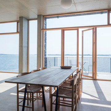
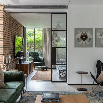
Search results for "Connect" in Home Design Ideas
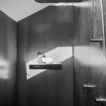
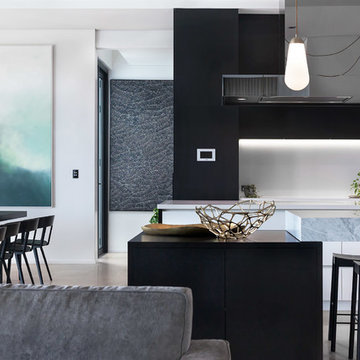
Images by Nicole England
Styling by Simona Castagna
Design by Minosa
Description of the House, its local & occupants
A dilapidated two bedroom, timber clad, 1920’s heritage listed home in Sydney’s Crows Nest was in desperate need of saving. Its life for the past 10 years had been home to squatters and the homeless. Situated close to the city, cafes and schools the new owners believed it had great potential to be transformed/renovated into their magnificent family home.
As this home was to be their “forever” one; and with young girls leading into their pre teen years this space had to cater to the family’s busy lifestyle & had to do justice to the heritage of the old and the proposed modern architecture for the rear extension.
Therefore with walls crumbling and covered in graffiti this family of four took it on and looked forward to the houses transformation with bated breath. In return they saw an ugly ducking totally transform in to a swan.
The Brief
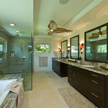
A luxurious beautiful bathroom that is connected with parents master space, room to function as a wet area, dressing & make up zone. A space for two to share.
CLIENT REQUIREMENTS:
• Door entry to slide/split open onto master bed space ‘quiet opening’
• In makeup zone, consider built-in table with oversized mirror & LED lighting for precise make up work
• Storage accommodated in recessed format mirror cabinet
• Concealed toilet
• Vanity to offer double basin, preference not to see plumbing below.
• Double shower with hand held spout
• Good light
CONSTRAINTS: -
• Slope of roof line slopes from east to west
• 2x manually operable skylights
• Existing north facing window
Design Statement - How the requirements of the client brief were achieved & problems solved
The challenges of this space where many, the space is narrow, the client wanted a lot into a spall space, the sloping ceiling also reduced the usable floor space to one long run of the room.
The designer chose to create a centre blade wall, this wall divides the room and fulfils many aspects of the clients brief; this centre wall creates two access points on each end of the wall, one access to the now concealed toilet area and the other walks into the double shower.
The ingenious solution of the design was to rotate the showerhead to the (longer) length of the wall rather than the short (narrow) side of the shower wall, as this is what makes this space feel larger than it actually is. When we address a shower we stand front or back on, so it makes a lot of sense to have the water sources on the longest wall – hence making the shower feel bigger.
With the bathing and toilet taken care of it came down to the vanity wall, the designer chose to create three balanced spaces, two thirds to be given to the custom made solid surface washbasin and one third to the dressing or make up area.
The lighting as usual plays a big role, especially when make up is involved. The designer created a concealed LED light source with reflectors so when sitting at the make up area the face is perfectly illuminated from both sides and by selected LED lights with CRI (Colour Render Index) output of 90 it meant colour is reproduced almost perfectly.
As it is a small room, one 14.4 watt high out put LED light on top of the centre wall offers all the room light this small space requires, low energy efficient LED downlights over the basin provide a little extra facial illumination for shaving and so on. A sensor light under the vanity & under the recess wall cabinets provides a low out put of light for the midnight dash.
For a small space there is a lot of storage, the two doors above the basins are recessed to house all of the day-to-day personal effects. The designer created doors that lifted up rather than open out, this means the doors are up and out of the way when access is needed and it also eliminated have that dreaded vertical split in the door directly over the basin. – this longer door also helps in making the room feel longer (visually)
The materials are always the last element selected; connection to the other spaces the designer created for this client was important. Large format tiles 3000mm x 1000mm are applied to all walls and the floor of the shower and toilet. The engineered timber floor from the bedroom runs thru and under the vanity connecting the bedroom to the space thru the floor and a large oversized sliding door.
This space has created a private retreat for the owners of this stunning property, a space where they can both function, rejuvenate or get ready for the busy day ahead.
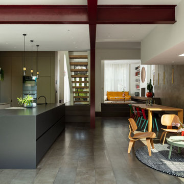
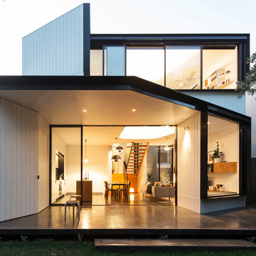
The large open space continues the themes set out in the Living and Dining areas with a similar palette of darker surfaces and finishes, chosen to create an effect that is highly evocative of past centuries, linking new and old with a poetic approach.
The dark grey concrete floor is a paired with traditional but luxurious Tadelakt Moroccan plaster, chose for its uneven and natural texture as well as beautiful earthy hues.
The supporting structure is exposed and painted in a deep red hue to suggest the different functional areas and create a unique interior which is then reflected on the exterior of the extension.
Find the right local pro for your project
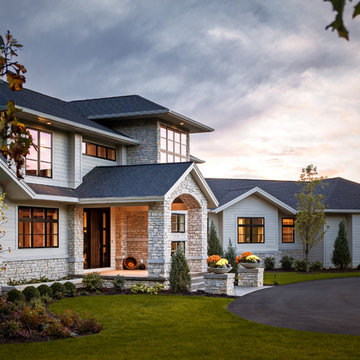
The Cicero is a modern styled home for today’s contemporary lifestyle. It features sweeping facades with deep overhangs, tall windows, and grand outdoor patio. The contemporary lifestyle is reinforced through a visually connected array of communal spaces. The kitchen features a symmetrical plan with large island and is connected to the dining room through a wide opening flanked by custom cabinetry. Adjacent to the kitchen, the living and sitting rooms are connected to one another by a see-through fireplace. The communal nature of this plan is reinforced downstairs with a lavish wet-bar and roomy living space, perfect for entertaining guests. Lastly, with vaulted ceilings and grand vistas, the master suite serves as a cozy retreat from today’s busy lifestyle.
Photographer: Brad Gillette
The Cabinet Connection
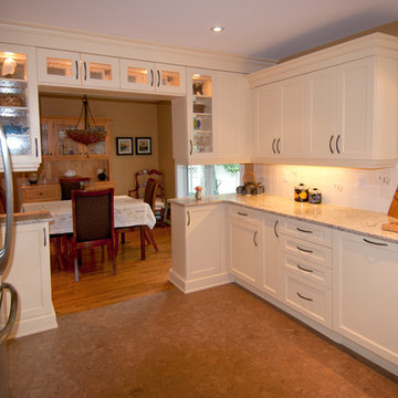
Mid-sized elegant u-shaped cork floor eat-in kitchen photo in Ottawa with an undermount sink, beige cabinets, quartz countertops, white backsplash, ceramic backsplash, stainless steel appliances, shaker cabinets and no island
Mid-sized elegant u-shaped cork floor eat-in kitchen photo in Ottawa with an undermount sink, beige cabinets, quartz countertops, white backsplash, ceramic backsplash, stainless steel appliances, shaker cabinets and no island
Sponsored
Over 300 locations across the U.S.
Schedule Your Free Consultation
Ferguson Bath, Kitchen & Lighting Gallery
Ferguson Bath, Kitchen & Lighting Gallery
This 20 year old kitchen was in desperate need of an update! The original cabinets were still in great shape so we gave them a makeover with a custom faux paint application. The old island was too long and too narrow, so a new island was created and installed adding more storage and function to this space. The gorgeous metallic subway tiled backsplash blends beautifully with their new granite.
The popcorn was removed from the ceiling and the walls were textured and glazed. A custom granite-top table was created and comfy leather chairs selected. The pendant lights add a great accent and ambiance to this charming kitchen.
Winner of ASID (American Society of Interior Designers) “Design Excellence Award”.
Design Connection, Inc. provided kitchen design and space planning, furniture, tile design and tile, paint selections, faux painting, lighting design, design supervision and island cabinet.
SEE THE BEFORE & AFTER PICS OF THIS PROJECT IN OUR PORTFOLIO http://www.DesignConnectionInc.com/Portfolio
This house was a very small mid-century bungalow with previous additions that resulted in a large but chaotic layout. The owners wanted to convert the house to a super-efficient, and charming Craftsman-style, 6 bedroom home for their large family and work at home.
We achieved the space needs by moving a few walls for a more efficient, organized layout, setting up spaces for overlapping uses, and making a small upstairs addition. Every bit of square footage was optimized to meet the goals of the project without making the house huge or adding unnecessary cost.
Much thought was given to the entry sequence near the front door. A large flow-through mudroom with storage for each family member, and adjacent laundry, make it easy for children to be taught to keep their things organized and to contribute to household chores. A mail station and central home admin area at the mudroom help keep clutter down at other areas and minimize home management tasks. A garage door near the kitchen gives quick access to bulk items.
The existing house had too much view to the street from the living room through large corner windows, and too little entry transition, to the extent that the family did not feel comfortable using the living room much without shades drawn. We raised the window sills and brought the new windows in from the corner of the house, allowing plenty of light while protecting privacy and a sense of enclosure in the living room. We enlarged the front porch to create a more graceful transition from the public to private space. We located the front door so that the circulation from entry into the house would allow for furnishing the living room with a sitting circle that is not intruded upon by people walking through the room.
Sight lines through the living spaces were an important consideration in the design. The owners wanted discreet spaces for living room, kitchen, dining and family room, but also wanted the living spaces to feel connected and to be able to easily watch their children. Being able to see the children playing in the yard while getting things done inside the house was also important. While largely working with the existing structure, we opened walls and rearranged the use of spaces to make a series of connected living spaces with long views through them.
The character of the remodeled house is a contemporary Craftsman with classic materials and cool, consistent colors. A few arches echo through the house to frame spaces and soften the feeling of the rooms.
Photography: Kurt Manley
https://saikleyarchitects.com/portfolio/bungalow-expansion/
Joe Fletcher
Example of a trendy medium tone wood floor and brown floor hallway design in San Francisco with beige walls
Example of a trendy medium tone wood floor and brown floor hallway design in San Francisco with beige walls
hovering walkway connecting the Master bedroom to the rest of the house
Inspiration for a large contemporary black two-story mixed siding exterior home remodel in Vancouver with a shingle roof
Inspiration for a large contemporary black two-story mixed siding exterior home remodel in Vancouver with a shingle roof
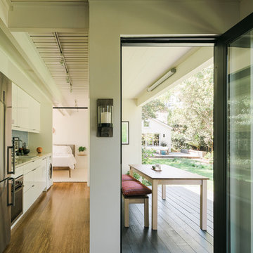
A book loving family of four, Dan, Julia and their two daughters were looking to add on to and rearrange their three bedroom, one bathroom home to suit their unique needs for places to study, rest, play, and hide and go seek. A generous lot allowed for a addition to the north of the house connecting to the middle bedroom/den, and the design process, while initially motivated by the need for a more spacious and private master bedroom and bathroom, evolved to focus around Dan & Julia distinct desires for home offices.
Dan, a Minnesotan Medievalist, craved a cozy, wood paneled room with a nook for his reading chair and ample space for books, and, Julia, an American Studies professor with a focus on history of progressive children's literature, imagined a bright and airy space with plenty of shelf and desk space where she could peacefully focus on her latest project. What resulted was an addition with two offices, one upstairs, one downstairs, that were animated very differently by the presence of the connecting stair--Dan's reading nook nestled under the stair and Julia's office defined by a custom bookshelf stair rail that gave her plenty of storage down low and a sense of spaciousness above. A generous corridor with large windows on both sides serves as the transitional space between the addition and the original house as well as impromptu yoga room. The master suite extends from the end of the corridor towards the street creating a sense of separation from the original house which was remodeled to create a variety of family rooms and utility spaces including a small "office" for the girls, an entry hall with storage for shoes and jackets, a mud room, a new linen closet, an improved great room that reused an original window that had to be removed to connect to the addition. A palette of local and reclaimed wood provide prominent accents throughout the house including pecan flooring in the addition, barn doors faced with reclaimed pine flooring, reused solid wood doors from the original house, and shiplap paneling that was reclaimed during remodel.
Photography by: Michael Hsu
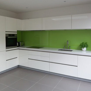
- Schuller Kitchens - German Style
- Handle-less Kitchen Design
- High Gloss Lacquer Finish in Crystal White colour
- Fully Integrated Appliances
- Franke single bowl under-mount sink
- MGS tap
- 60mm thick white composite worktop
- Induction Hob
- Green Splashback
- Integrated extractor hood
Showing Results for "Connect"
Sponsored
Over 300 locations across the U.S.
Schedule Your Free Consultation
Ferguson Bath, Kitchen & Lighting Gallery
Ferguson Bath, Kitchen & Lighting Gallery
Construction: 2010 / 2012
Designer : Eduardo Hernández
Photo: Yoshihiro Koitani.
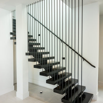
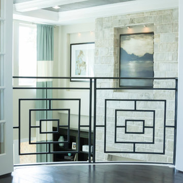
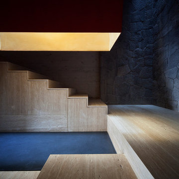
Example of a minimalist staircase design in Other
Example of a minimalist staircase design in Other
141