


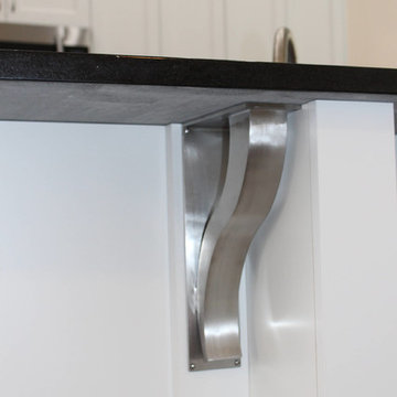
Search results for "Decorative support beams" in Home Design Ideas
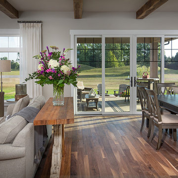
Plaster and beam ceiling in the dining area. This farmhouse style home was custom-designed and manufactured by Habitat Post & Beam, Inc., pre-cut and shipped to the western Massachusetts job site where it was assembled by a local builder. Photos by Michael Penney, architectural photographer. IMPORTANT NOTE: We are not involved in the finish or decoration of these homes, so it is unlikely that we can answer any questions about elements that were not part of our kit package, i.e., specific elements of the spaces such as appliances, colors, lighting, furniture, landscaping, etc.
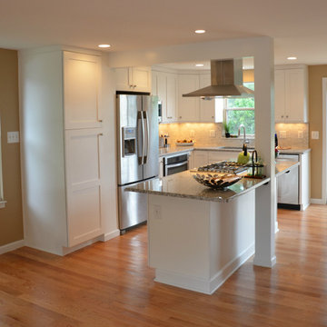
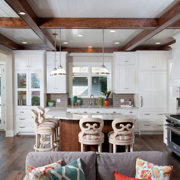
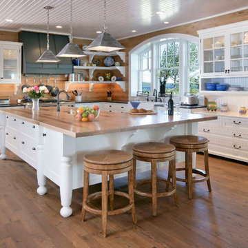
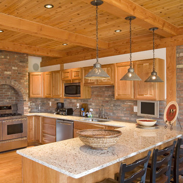
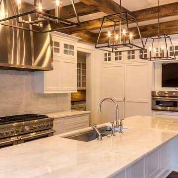
There are so many design elements to this kitchen, I almost don’t know where to start. Bright and airy with crisp clean white cabinets, the kitchen is open and welcoming. Still crisp but gently contrasting, the stainless steel appliance add depth amid the white. To keep this kitchen warm, natural oak covers the floors and a toasted wheat color washes the walls. And then there is the architectural elements. You know. That post and beam in the middle of the room. It’s the center of attention.When you walk into a room your eyes roam around, establishing the size and shape of the room as your feet take you forward. From the front door of this home straight ahead you encountered this wall. The dining area to the right gives you a glimpse of things to come. Where there is a dining room you will usually find a kitchen.
The architecture of years gone by consistently hides the kitchen, the heart of the home, behind walls. I sympathize with my Mom, and all the other Moms, who have had to spend so much time tucked into a tight kitchen, away from the family. This wall had to go, but it was structural. We needed its support but not its bulk.So we got rid of the bulk and only the bulk. Instead of a wall we have a post and beam, offering all of the structure we need. We could have installed a huge steel beam and reconfigure the joists to upset the beam, but why? The small beam and post add an incredible architectural element. It’s turning lemons into lemon, we simply made the most of what we had. It may be functional but it’s so fantastic. It looks like we created the effect just for the drama.
The original kitchen may have had a working triangle and some counter space, but it was fairly small, with each area only a step or two away. The dark cabinets made the space feel even smaller and the butcher block patterned laminate counter tops were very dated. The appliances were feeling their age as well, from a coil burner electric stove to a top freezer refrigerator. To keep this kitchen within its space, a half wall separated it from the dining area.
With the wall gone we borrowed some space from the living room and extended what was a U shaped kitchen into an L. At the living room window we start our new kitchen. We kept a small part of the wall to support the other end of our decorative beam. Sandwiched between a large pantry and our new French door refrigerator, the wall disappears. With our new open floor plan a sizable island was in order.
We split our cooking areas and installed a continuous grill gas cooktop into the island. A sleek island hood takes care of exhaust and adds an extra element to our architectural feature. Under the cooktop we added over-sized drawers for pots and pan storage. The frameless cabinets from New River Cabinetry are maple, painted white, with the Herndon door style. With the cooktop safely nestled into our island, we still had to add an oven.
We used the space where the old range sat for a large single oven of stainless steel and glass. If it worked for one, why not two? We created a home for a microwave in the wall cabinets. It’s perfect for heating leftovers so close to the refrigerator.An important consideration for hot spots in your kitchen is landing zones. Each of our cooking areas have generous landing zones, one on each side of the cooktop and an entire counter area above or below the ovens, depending on which one you’re using.We wanted to give the sink area more room so the half wall had to come out. We moved the trash and recycle cans into a cabinet, removed the heavy soffits and kept the sink under the window.With that little bit of extra space we were able to add a larger cabinet above the dishwasher and slide it all down. This used to be where the carpeting met the vinyl floor, but all of it is gone. Long oak planks eliminate that final divide between the kitchen and the dining area, while adding visual length to the area. White wall cabinets on each side of the window reflect the sunlight for a brighter view.
With all of the darker cabinetry the backsplash walls had been painted white. Even still, there was a darkness in the corners and it wasn’t very exciting. We wanted to add visual interest and reflect the new under-cabinet lighting, eliminating the shadows in this corner.With 1″x 2″ Arabescato Honed marble mosaics and those under-cabinet lights, we achieved the perfect balance. The marble has subtle swirls in gray and beige on a clean white background, but with the honed finish the light is softly reflected instead of glaring. For granite, we chose the soft gray tones of Luna Pearl. The speckles of gray and beige are a gentle contrast to the white cabinets and emulate the color of the stainless steel.Between the carpet, red half wall, dark railing and dated light fixture, the dining area felt tired. Since the kitchen lacked sufficient storage, a large utility cabinet crowded the table space without adding any decorate elements.Although it didn’t get any bigger, our dining area feels fresher and more open too. With the oak flooring joining the area to the rest of our space and the toasted wheat on the walls, the white table and chairs compliment the cabinetry while contrasting the warmer colors. We replaced the chandelier with recessed lighting and changed that railing too.With our new open floor plan, we ended up with a fairly open area in between our foyer closet and the living room window. Not one to miss an opportunity, we filled the space with a multi-functional work space.
With the sunlight streaming in this bright corner works for anything this family needs.
Photo Credit to RJK Construction, Inc.
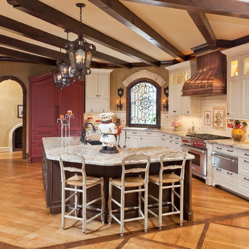
Forget just one room with a view—Lochley has almost an entire house dedicated to capturing nature’s best views and vistas. Make the most of a waterside or lakefront lot in this economical yet elegant floor plan, which was tailored to fit a narrow lot and has more than 1,600 square feet of main floor living space as well as almost as much on its upper and lower levels. A dovecote over the garage, multiple peaks and interesting roof lines greet guests at the street side, where a pergola over the front door provides a warm welcome and fitting intro to the interesting design. Other exterior features include trusses and transoms over multiple windows, siding, shutters and stone accents throughout the home’s three stories. The water side includes a lower-level walkout, a lower patio, an upper enclosed porch and walls of windows, all designed to take full advantage of the sun-filled site. The floor plan is all about relaxation – the kitchen includes an oversized island designed for gathering family and friends, a u-shaped butler’s pantry with a convenient second sink, while the nearby great room has built-ins and a central natural fireplace. Distinctive details include decorative wood beams in the living and kitchen areas, a dining area with sloped ceiling and decorative trusses and built-in window seat, and another window seat with built-in storage in the den, perfect for relaxing or using as a home office. A first-floor laundry and space for future elevator make it as convenient as attractive. Upstairs, an additional 1,200 square feet of living space include a master bedroom suite with a sloped 13-foot ceiling with decorative trusses and a corner natural fireplace, a master bath with two sinks and a large walk-in closet with built-in bench near the window. Also included is are two additional bedrooms and access to a third-floor loft, which could functions as a third bedroom if needed. Two more bedrooms with walk-in closets and a bath are found in the 1,300-square foot lower level, which also includes a secondary kitchen with bar, a fitness room overlooking the lake, a recreation/family room with built-in TV and a wine bar perfect for toasting the beautiful view beyond.
Find the right local pro for your project
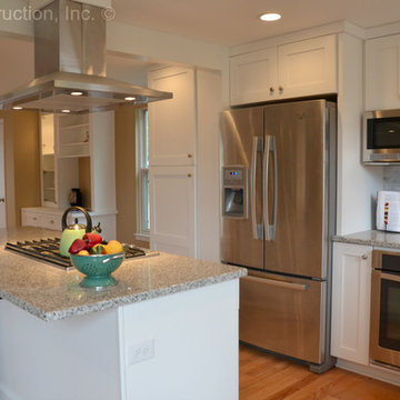
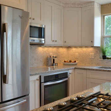
This Clear Lake area kitchen was designed foremost to be functional, as well as beautiful. Appliances were repositioned to create two distinct focal points, separated by a new window that brightens a previously dark area. The island features the owner's custom soapstone farm sink and a new prep sink was added in front of the new window. The kitchen also features a professional-style range by Wolf and a custom Sub-Zero refrigerator/freezer armoire cabinet. Wood-Mode custom cabinetry was designed and supplied by Kitchen & Bath Concepts. The custom hood is by Lone Star Range Hood, and the backsplash is hand-painted custom tile by ADR, over granite countertops.
Designed by Kitchen & Bath Concepts. Renovation by Breck Powers of LBJ Construction. Photography by Brad Carr.
There are so many design elements to this kitchen, I almost don’t know where to start. Bright and airy with crisp clean white cabinets, the kitchen is open and welcoming. Still crisp but gently contrasting, the stainless steel appliance add depth amid the white. To keep this kitchen warm, natural oak covers the floors and a toasted wheat color washes the walls. And then there is the architectural elements. You know. That post and beam in the middle of the room. It’s the center of attention.When you walk into a room your eyes roam around, establishing the size and shape of the room as your feet take you forward. From the front door of this home straight ahead you encountered this wall. The dining area to the right gives you a glimpse of things to come. Where there is a dining room you will usually find a kitchen.
The architecture of years gone by consistently hides the kitchen, the heart of the home, behind walls. I sympathize with my Mom, and all the other Moms, who have had to spend so much time tucked into a tight kitchen, away from the family. This wall had to go, but it was structural. We needed its support but not its bulk.So we got rid of the bulk and only the bulk. Instead of a wall we have a post and beam, offering all of the structure we need. We could have installed a huge steel beam and reconfigure the joists to upset the beam, but why? The small beam and post add an incredible architectural element. It’s turning lemons into lemon, we simply made the most of what we had. It may be functional but it’s so fantastic. It looks like we created the effect just for the drama.
The original kitchen may have had a working triangle and some counter space, but it was fairly small, with each area only a step or two away. The dark cabinets made the space feel even smaller and the butcher block patterned laminate counter tops were very dated. The appliances were feeling their age as well, from a coil burner electric stove to a top freezer refrigerator. To keep this kitchen within its space, a half wall separated it from the dining area.
With the wall gone we borrowed some space from the living room and extended what was a U shaped kitchen into an L. At the living room window we start our new kitchen. We kept a small part of the wall to support the other end of our decorative beam. Sandwiched between a large pantry and our new French door refrigerator, the wall disappears. With our new open floor plan a sizable island was in order.
We split our cooking areas and installed a continuous grill gas cooktop into the island. A sleek island hood takes care of exhaust and adds an extra element to our architectural feature. Under the cooktop we added over-sized drawers for pots and pan storage. The frameless cabinets from New River Cabinetry are maple, painted white, with the Herndon door style. With the cooktop safely nestled into our island, we still had to add an oven.
We used the space where the old range sat for a large single oven of stainless steel and glass. If it worked for one, why not two? We created a home for a microwave in the wall cabinets. It’s perfect for heating leftovers so close to the refrigerator.An important consideration for hot spots in your kitchen is landing zones. Each of our cooking areas have generous landing zones, one on each side of the cooktop and an entire counter area above or below the ovens, depending on which one you’re using.We wanted to give the sink area more room so the half wall had to come out. We moved the trash and recycle cans into a cabinet, removed the heavy soffits and kept the sink under the window.With that little bit of extra space we were able to add a larger cabinet above the dishwasher and slide it all down. This used to be where the carpeting met the vinyl floor, but all of it is gone. Long oak planks eliminate that final divide between the kitchen and the dining area, while adding visual length to the area. White wall cabinets on each side of the window reflect the sunlight for a brighter view.
With all of the darker cabinetry the backsplash walls had been painted white. Even still, there was a darkness in the corners and it wasn’t very exciting. We wanted to add visual interest and reflect the new under-cabinet lighting, eliminating the shadows in this corner.With 1″x 2″ Arabescato Honed marble mosaics and those under-cabinet lights, we achieved the perfect balance. The marble has subtle swirls in gray and beige on a clean white background, but with the honed finish the light is softly reflected instead of glaring. For granite, we chose the soft gray tones of Luna Pearl. The speckles of gray and beige are a gentle contrast to the white cabinets and emulate the color of the stainless steel.Between the carpet, red half wall, dark railing and dated light fixture, the dining area felt tired. Since the kitchen lacked sufficient storage, a large utility cabinet crowded the table space without adding any decorate elements.Although it didn’t get any bigger, our dining area feels fresher and more open too. With the oak flooring joining the area to the rest of our space and the toasted wheat on the walls, the white table and chairs compliment the cabinetry while contrasting the warmer colors. We replaced the chandelier with recessed lighting and changed that railing too.With our new open floor plan, we ended up with a fairly open area in between our foyer closet and the living room window. Not one to miss an opportunity, we filled the space with a multi-functional work space.
With the sunlight streaming in this bright corner works for anything this family needs.
Photo Credit to RJK Construction, Inc.
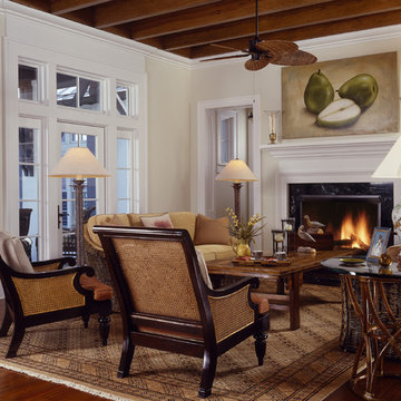
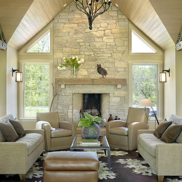
Interior Design by Martha O'Hara Interiors
Built by Stonewood, LLC
Photography by Troy Thies
Photo Styling by Shannon Gale
Inspiration for a transitional living room remodel in Minneapolis
Inspiration for a transitional living room remodel in Minneapolis
Reclaimed Box Beams, made from weathered antique boards, aren’t only a beautiful and unique addition to your home, they help add another level of warmth to the space.
Sponsored
Columbus, OH
Hope Restoration & General Contracting
Columbus Design-Build, Kitchen & Bath Remodeling, Historic Renovations
Modern - Contemporary Interior Designs By J Design Group in Miami, Florida.
Aventura Magazine selected one of our contemporary interior design projects and they said:
Shortly after Jennifer Corredor’s interior design clients bought a four-bedroom, three bath home last year, the couple suffered through a period of buyer’s remorse.
While they loved the Bay Harbor Islands location and the 4,000-square-foot, one-story home’s potential for beauty and ample entertaining space, they felt the living and dining areas were too restricted and looked very small. They feared they had bought the wrong house. “My clients thought the brown wall separating these spaces from the kitchen created a somber mood and darkness, and they were unhappy after they had bought the house,” says Corredor of the J. Design Group in Coral Gables. “So we decided to renovate and tear down the wall to make a galley kitchen.” Mathy Garcia Chesnick, a sales director with Cervera Real Estate, and husband Andrew Chesnick, an executive for the new Porsche Design Tower residential project in Sunny Isles, liked the idea of incorporating the kitchen area into the living and dining spaces. Since they have two young children, the couple felt those areas were too narrow for easy, open living. At first, Corredor was afraid a structural beam could get in the way and impede the restoration process. But after doing research, she learned that problem did not exist, and there was nothing to hinder the project from moving forward. So she collapsed the wall to create one large kitchen, living and dining space. Then she changed the flooring, using 36x36-inch light slabs of gold Bianco marble, replacing the wood that had been there before. This process also enlarged the look of the space, giving it lightness, brightness and zoom. “By eliminating the wall and adding the marble we amplified the new and expanded public area,” says Corredor, who is known for optimizing space in creative ways. “And I used sheer white window treatments which further opened things up creating an airy, balmy space. The transformation is astonishing! It looks like a different place.” Part of that transformation included stripping the “awful” brown kitchen cabinets and replacing them with clean-lined, white ones from Italy. She also added a functional island and mint chocolate granite countertops. At one end of the kitchen space, Corredor designed dark wood shelving where Mathy displays her collection of cookbooks. “Mathy cooks a great deal, and they entertain on a regular basis,” says Corredor. “The island we created is where she likes to serve the kids breakfast and have family members gather. And when they have a dinner party, everyone can mill in and out of the kitchen-galley, dining and living areas while able to see everything going on around them. It looks and functions so much better.” Corredor extended the Bianco marble flooring to other open areas of the house, nearly everywhere except for the bedrooms. She also changed the powder room, which is annexed to the kitchen. She applied white linear glass on the walls and added a new white square sink by Hastings. Clean and fresh, the room is reminiscent of a little jewel box. I n the living room, Corredor designed a showpiece wall unit of exotic cherry wood with an aqua center to bring back some warmth that modernizing naturally strips away. The designer also changed the room’s lighting, introducing a new system that eschews a switch. Instead, it works by remote and also dims to create various moods for different social engagements. “The lighting is wonderful and enhances everything else we have done in these open spaces,” says Corredor. T he dining room overlooks the pool and yard, with large, floorto- ceiling window brings the outdoors inside. A chandelier above the dining table is another expression of openness, like the lens of a person’s eyeglasses. “We wanted this unusual piece because its sort of translucence takes you outside without ever moving from the room,” explains Corredor. “The family members love seeing the yard and pool from the living and dining space. It’s also great for entertaining friends and business associates. They can get a real feel for the subtropical elegance of Miami.” N earby, the front door was originally brown so she repainted it a sleek lacquered white. This bright consistency helps maintain a constant eye flow from one section of the open areas to another. Everything is visible in the new extended space and creates a bright and inviting atmosphere. “It was important to modernize and update the house without totally changing the character,” says Corredor. “We organized everything well and it turned out beautifully, just as we envisioned it.” While nothing on the home’s exterior was changed, Corredor worked her magic in the master bedroom by adding panels with a wavelike motif to again bring elements of the outside in. The room is austere and clean lined, elegant, peaceful and not cluttered with unnecessary furnishings. In the master bath, Corredor removed the existing cabinets and made another large cherry wood cabinet, this time with double sinks for husband and wife. She also added frosted green glass to give a spa-like aura to the spacious room. T hroughout the house are splashy canvases from Mathy’s personal art collection. She likes to add color to the decor through the art while the backdrops remain a soothing white. The end result is a divine, refined interior, light, bright and open. “The owners are thrilled, and we were able to complete the renovation in a few months,” says Corredor. “Everything turned out how it should be.”
J Design Group
Call us.
305-444-4611
Miami modern,
Contemporary Interior Designers,
Modern Interior Designers,
Coco Plum Interior Designers,
Sunny Isles Interior Designers,
Pinecrest Interior Designers,
J Design Group interiors,
South Florida designers,
Best Miami Designers,
Miami interiors,
Miami décor,
Miami Beach Designers,
Best Miami Interior Designers,
Miami Beach Interiors,
Luxurious Design in Miami,
Top designers,
Deco Miami,
Luxury interiors,
Miami Beach Luxury Interiors,
Miami Interior Design,
Miami Interior Design Firms,
Beach front,
Top Interior Designers,
top décor,
Top Miami Decorators,
Miami luxury condos,
modern interiors,
Modern,
Pent house design,
white interiors,
Top Miami Interior Decorators,
Top Miami Interior Designers,
Modern Designers in Miami,
J Design Group
Call us.
305-444-4611
www.JDesignGroup.com
The architectural vocabulary draws upon British Colonial precedents in the West Indies with masonry-stucco walls, a standing seam metal hip roof with a kick at the eaves, a wooden balcony supported by wood brackets on the more public street facade, and a wooden gallery atop hefty masonry columns framed with wood brackets on the more private waterfront façade. These features have been developed and refined over hundreds of years to accommodate comfortable living in the Caribbean and have evolved into a living tradition of beautiful vernacular architecture that is, as a result, truly sustainable.
The covered outdoor spaces in conjunction with the protected courts, deep overhangs and operable wood shutters provide a sustainable home that respects the context and climate, maximizes energy-efficiency and minimizes environmental impact. The simple massing and layout of this house with its simple and flexible spaces can accommodate many different family types and lifestyles and can even change uses as market demands change over time. These characteristics together with a timeless elegance and beauty support the firmness, commodity and delight required for truly sustainable living.
Dave Teel Photography
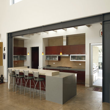
Example of a trendy concrete floor open concept kitchen design in Los Angeles with flat-panel cabinets, dark wood cabinets, quartz countertops and an island
Example of a trendy concrete floor open concept kitchen design in Los Angeles with flat-panel cabinets, dark wood cabinets, quartz countertops and an island
Our Antique Beam Sawn flooring in random widths from 2.5"-6.5". The flooring was stained with 1 part Bona "medium brown" and one part Bona "natural". Then three clear coats of "Bona naturale" to finish. This gorgeous house overlooks Lake Michigan.
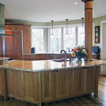
The supporting post for the island was custom crafted by our Caves Millwork Custom Cabinetry brand to give the island some more personality.
When the kitchen was extended the support beam became exposed and Caves Millwork custom crafted the cherry panels to cover the beam and turn it into an accent piece.
-Allison Caves, CKD
Caves Kitchen
There are so many design elements to this kitchen, I almost don’t know where to start. Bright and airy with crisp clean white cabinets, the kitchen is open and welcoming. Still crisp but gently contrasting, the stainless steel appliance add depth amid the white. To keep this kitchen warm, natural oak covers the floors and a toasted wheat color washes the walls. And then there is the architectural elements. You know. That post and beam in the middle of the room. It’s the center of attention.When you walk into a room your eyes roam around, establishing the size and shape of the room as your feet take you forward. From the front door of this home straight ahead you encountered this wall. The dining area to the right gives you a glimpse of things to come. Where there is a dining room you will usually find a kitchen.
The architecture of years gone by consistently hides the kitchen, the heart of the home, behind walls. I sympathize with my Mom, and all the other Moms, who have had to spend so much time tucked into a tight kitchen, away from the family. This wall had to go, but it was structural. We needed its support but not its bulk.So we got rid of the bulk and only the bulk. Instead of a wall we have a post and beam, offering all of the structure we need. We could have installed a huge steel beam and reconfigure the joists to upset the beam, but why? The small beam and post add an incredible architectural element. It’s turning lemons into lemon, we simply made the most of what we had. It may be functional but it’s so fantastic. It looks like we created the effect just for the drama.
The original kitchen may have had a working triangle and some counter space, but it was fairly small, with each area only a step or two away. The dark cabinets made the space feel even smaller and the butcher block patterned laminate counter tops were very dated. The appliances were feeling their age as well, from a coil burner electric stove to a top freezer refrigerator. To keep this kitchen within its space, a half wall separated it from the dining area.
With the wall gone we borrowed some space from the living room and extended what was a U shaped kitchen into an L. At the living room window we start our new kitchen. We kept a small part of the wall to support the other end of our decorative beam. Sandwiched between a large pantry and our new French door refrigerator, the wall disappears. With our new open floor plan a sizable island was in order.
We split our cooking areas and installed a continuous grill gas cooktop into the island. A sleek island hood takes care of exhaust and adds an extra element to our architectural feature. Under the cooktop we added over-sized drawers for pots and pan storage. The frameless cabinets from New River Cabinetry are maple, painted white, with the Herndon door style. With the cooktop safely nestled into our island, we still had to add an oven.
We used the space where the old range sat for a large single oven of stainless steel and glass. If it worked for one, why not two? We created a home for a microwave in the wall cabinets. It’s perfect for heating leftovers so close to the refrigerator.An important consideration for hot spots in your kitchen is landing zones. Each of our cooking areas have generous landing zones, one on each side of the cooktop and an entire counter area above or below the ovens, depending on which one you’re using.We wanted to give the sink area more room so the half wall had to come out. We moved the trash and recycle cans into a cabinet, removed the heavy soffits and kept the sink under the window.With that little bit of extra space we were able to add a larger cabinet above the dishwasher and slide it all down. This used to be where the carpeting met the vinyl floor, but all of it is gone. Long oak planks eliminate that final divide between the kitchen and the dining area, while adding visual length to the area. White wall cabinets on each side of the window reflect the sunlight for a brighter view.
With all of the darker cabinetry the backsplash walls had been painted white. Even still, there was a darkness in the corners and it wasn’t very exciting. We wanted to add visual interest and reflect the new under-cabinet lighting, eliminating the shadows in this corner.With 1″x 2″ Arabescato Honed marble mosaics and those under-cabinet lights, we achieved the perfect balance. The marble has subtle swirls in gray and beige on a clean white background, but with the honed finish the light is softly reflected instead of glaring. For granite, we chose the soft gray tones of Luna Pearl. The speckles of gray and beige are a gentle contrast to the white cabinets and emulate the color of the stainless steel.Between the carpet, red half wall, dark railing and dated light fixture, the dining area felt tired. Since the kitchen lacked sufficient storage, a large utility cabinet crowded the table space without adding any decorate elements.Although it didn’t get any bigger, our dining area feels fresher and more open too. With the oak flooring joining the area to the rest of our space and the toasted wheat on the walls, the white table and chairs compliment the cabinetry while contrasting the warmer colors. We replaced the chandelier with recessed lighting and changed that railing too.With our new open floor plan, we ended up with a fairly open area in between our foyer closet and the living room window. Not one to miss an opportunity, we filled the space with a multi-functional work space.
With the sunlight streaming in this bright corner works for anything this family needs.
Photo Credit to RJK Construction, Inc.
A house located at a southern Vermont ski area, this home is based on our Lodge model. Custom designed, pre-cut and shipped to the site by Habitat Post & Beam, the home was assembled and finished by a local builder. Photos by Michael Penney, architectural photographer. IMPORTANT NOTE: We are not involved in the finish or decoration of these homes, so it is unlikely that we can answer any questions about elements that were not part of our kit package, i.e., specific elements of the spaces such as appliances, colors, lighting, furniture, landscaping, etc.
This wood ceiling needed something to tone down the grain in the planks. We were able to create a wash that did exactly that.
The floors (reclaimed red oak from a pre-Civil War barn) needed to have their different colors highlighted, not homogenized. Instead of staining the floor, we used a tung oil and beeswax finish that was hand buffed.
Our clients wanted to have reclaimed wood beams in their ceiling, but could not use true old beams as they would not be sturdy enough to support the roof. We took their fresh- cut fir beams and used synthetic plasters, paints, and glazes to give them an authentic aged look.
Taken by Alise O'Brien (aliseobrienphotography.com)
Interior Designer: Emily Castle (emilycastle.com)
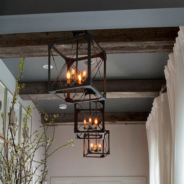
Reclaimed wood beams perfectly complement this beach house decor. They're used as classic ceiling beams in this hallway as well as vertically in the left side of the photo.
Showing Results for "Decorative Support Beams"
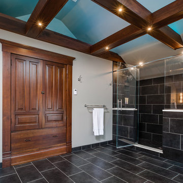
Right at home in this century old downtown traverse city mansion, this transitional bathroom perfectly combines existing antique built-ins and support beams with sleek and sophisticated tile, glass and plumbing/lighting fixtures.
Designer: Paige Fuller
Photos: Mike Gullon
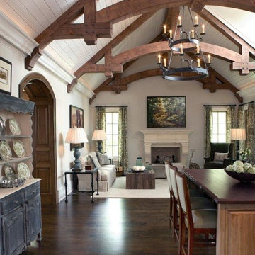
Pineapple House adds a rustic stained wooden beams with arches to the painted white ceiling with tongue and groove V-notch slats to unify the kitchen and family room. Chris Little Photography
8