


Search results for "Hidden safes ideas" in Home Design Ideas

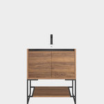
The DigitalSafe Platinum Wall Safe includes a hidden compartment, only available at DigitalSafe, that is easily accessible by rotating the bottom panel of the safe upwards. This unique patent pending design offers 20% more space to conceal, within the safe, particular valuables allowing enough space for two handguns. www.digitalsafesonline.com

The DigitalSafe Platinum Wall Safe includes a hidden compartment, only available at DigitalSafe, that is easily accessible by rotating the bottom panel of the safe upwards. This unique patent pending design offers 20% more space to conceal, within the safe, particular valuables allowing enough space for two handguns. www.digitalsafesonline.com
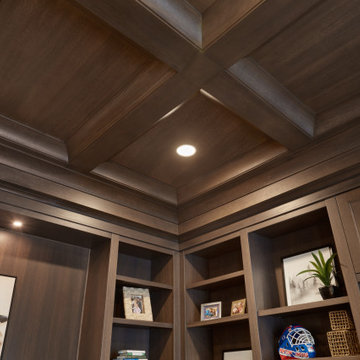
This beautiful home office & library features Rift Cut White Oak coffered ceilings, wall panelling, wainscotting and built-in wall units.
Complimented by TopKnobs cabinet pulls, custom file storage drawers, a hidden safe and a printer cabinet pullout.
Find the right local pro for your project
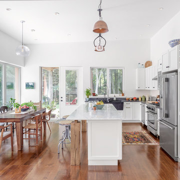
After six years of living in their Huntley IL home, Chris and Meghan were tired of their dark, dingy, outdated kitchen and it was finally time for a long-anticipated change. “The kitchen is the place where we live, it’s where we do everything,” Meghan said. “It was important that it be a space where we wanted to be.” Meghan loves cooking and enjoys including their girls in healthy meal prepping, this led them to want a brighter, more enjoyable kitchen with increased functionality and improved storage.
For Chris especially, the laundry room was an entirely dysfunctional eyesore. “We had a washer and a dryer, but it was all kind-of cobbled together!” Chris said. “There were always laundry piles everywhere, we weren’t really sure what we wanted to do in there, but it was time for us to make a change.” The mess of the space was stressful every time they walked in the door from the garage each day. Kids’ backpacks and shoes piled up haphazardly in the makeshift boot-bench closet left the family feeling disorganized and stressed. They needed space for folding clothes and locker cubbies to help keep the family organized.
Having known Christine and Todd in the Huntley community for years, Chris and Meghan were familiar with their work. “We already trusted them personally and having seen their projects for years we knew they did top notch work. After we reviewed the initial round of designs, we knew that hiring them was definitely the right choice,” Meghan and Chris said. Although Chris had done a lot of work in their home himself, the kitchen and laundry room renovation was such a large undertaking that he didn’t want to steal time away from his family to spend what would surely be many long weekends doing the job himself. “That would not have been a wise choice for us,” Chris laughed.
“Our designer, Michelle was very, very, easy to work with; anything we wanted to see or weren’t sure about, she went above and beyond to make this easy for us. She was easy to get hold of and always quick to respond,” the couple said. Michelle pulled ideas that mirrored the couple’s taste and style and was adept at directing the couple to limited choices that didn’t overwhelm them and kept the process moving. “I have a hard time making decisions. Michelle made the decision-making process so easy. I loved how she listened to what I liked and then presented three great options for me to choose from,” Meghan said.
The main objectives for the kitchen were better storage solutions, they wanted the space to reflect their lifestyle and taste, and they wanted it to last for years with low maintenance. One of the first steps in creating a more functional kitchen was relocating the refrigerator, creating an improved workflow for the busy family.
“We didn’t know that we could even move the refrigerator to a new location where it is now, that was something that we never would have thought of,” Chris said. “The new refrigerator location makes the kitchen feel so much bigger. We didn’t add any space, but our whole kitchen with the new design just seems like it’s so much larger than before!” Meghan said.
The perimeter mist colored cabinets helped warm and brighten the entire room, while the graphite colored cabinets on the island added contrast. Using this fresh, clean color palette satisfied the couple’s desire for a bright space that was the exact opposite of what they had before. Organization accessories were also added to the cabinets such as a spice drawer tray and roll outs to create hidden convenience.
“I absolutely love the hidden spices – it makes cooking so much more enjoyable!” Chris said. “And all the pull outs, and the double trash bin, who would think you could get so excited about organization!” the couple said in unison.
One thing they hated in their original kitchen was how dark the space felt. Added lighting on the ceiling with the new light fixtures combined with the lighter cabinetry colors throughout solved this problem. “Our new kitchen has this warm, almost cozy feeling that our old kitchen never had, it’s just a space that I love spending my time in now,” Meghan said. The light airy feeling was accentuated with the use of floating white shelves on either side of the decorative range hood. “We have so much cabinetry space, the new design is amazing we actually have more storage space than we will ever need,” Meghan said.
The island was extended to create more work surface and added space for stool seating. “The new island changes how we live. Now the kids can be in the kitchen with us, doing homework, eating breakfast, and the three of us have special dinners there when Chris is working late,” Meghan said.
The Carrara Marmi Quartz countertops were chosen because they are, not only beautiful, but are made from hard-working material that doesn’t require maintenance. The white subway tile backsplash that wraps to the ceiling behind the focal point cooktop range/hood compliments the crisp white countertops perfectly, while brushed brass hardware and light fixtures keep the design fresh and new.
The couple had a few fears at the beginning of the project, as most homeowners do. Their biggest fear was being out of their kitchen and laundry room for an extended time. The crew made it very easy for the family to work in a limited space keeping the washer and dryer hooked up the majority of the time, and also getting appliances working with minimal downtime.
“They above and beyond accommodated us to get us through the process,” Meghan said. “They did a great job making sure we were as comfortable as possible throughout the process,” Chris added.
“Our project manager DJ did a great job. He was very good at updating us on schedule changes, getting guys in as quickly as possible. Everyone that stepped in the house was nice and did great work,” said Chris. They thought Advance’s carpenter was phenomenal and were impressed when he took a conceptual idea from a photograph and worked with designer Michelle to create a one of a kind range/hood that has become the topic of conversation with friends and family who visit the new kitchen. “He was in our house literally every day for several weeks. He was easy to work with and good at what he did,” Meghan and Chris said.
The focal point of the kitchen; a hand-crafted, custom-built ventilation hood was clad with handpicked reclaimed barnwood. Advance Design’s carpenter built the framework and the cladding to create a one-of-a-kind design element that the couple loves.
“I think it was especially fun for him to create something unique from scratch, showcasing his talent in this area,” Meghan said. “I love that my kitchen is not like everyone else’s. I got to pick out the wood on my hood and watch it being built and was able to choose what pieces of wood went where on it. It’s totally unique.”
Red Oak flooring was toothed-in throughout the kitchen and the rest of the first floor anywhere changes were made. Then the whole floor was refinished to tone down the orange undertones in the existing floor stain, ultimately changing the color complexion of the entire first floor. The result is a completely new feeling to the entire home.
Renovating the laundry room was extremely important to Meghan and Chris, but they had trouble visualizing what the possibilities were for the seemingly small space. Michelle produced beautiful 3D illustrations that helped them envision the space in a whole new way.
“I must have told Michelle 100 times that I am a visual person, seeing the designs in 3D made it so easy to make decisions and see what we could really do with our space,” Meghan said.
A dividing wall and doorway were removed between the existing laundry room and hallway formerly containing a coat closet, providing space to design specialized graphite colored cabinetry matching the kitchen island to house custom storage cubbies for each family member. Adding the tall utility cabinetry in the new laundry area helped solve the storage issue, tucking away cleaning supplies, household items, and even the cat got its own cubby.
“I love how everything is now hidden in its own space. I can’t tell you how much I hated coming home and seeing everything sitting around on counters,” Chris said.
Electrical outlets were planned for the inside of utility cabinets, so devices could charge in hidden locations. Stacking the washer and dryer allowed for wider countertop space to provide a folding area and a special space for clothes to hang. “The way I do laundry has been completely transformed! I can actually fold clothes and hang them now right out of the washer and dryer,” Meghan said.
“The end result in the kitchen and the laundry/mud room was an updated light and bright space, with a smarter work flow that better meets the needs of this family,” Michelle said.
“I would totally recommend Advance Design,” Meghan said. “Sometimes I sit and just look at my kitchen and laundry room and think ‘Wow, I can’t believe I get to live here!’ It’s an understatement to say we love our new space.”
Dr. Shah works as a physician, and Mrs. Shah is a stay-at-home mom. Mrs. Shah was given the task of making their home colourful, upbeat, and bright in keeping with her personality. She was used to visiting her husband's clinic frequently, which had the traditional decor, therefore she didn't want to go mainstream with the typical dark wood and white interiors. Mr. Shah wanted the expenditure budget to be moderate, so we were free to experiment with colours and finishes.
We turned the client's four-bedroom flat, which was builder-ready, into a three-bedroom one. We replaced the apartment's old tile flooring using Nexion "Coniwood Cedro" tiles throughout the entire space in a herringbone pattern. The builder left the kitchen in its original condition, and we replaced the sink and faucet in the dry areas of the two bathrooms and the powder room to freshen them up. The master bathroom received a total remodel. All free-standing furniture is created in-house and is customised for size and style.
We immediately enter the spacious living area, which has big front windows that extend from end to end. A nesting coffee table and an L-shaped sofa make up the furniture arrangement. On the left, a movable-back upholstered swing, and two armchairs just across from it. The L-shaped sofa and the installation of a hardwood ceiling above the swing bring warmth to the room's plain, white ceiling. A tall highlighted mint green boxed panel with a modern design notion was inspired by old antique village doors and is located next to the armchairs. The boxed panel doubles as a closet and a door to one bedroom.
The bedroom next to the living area serves as a guest room as well as a temporary residence for their oldest daughter's American family. She requested a dark green sofa and a Scandinavian aesthetic, which is how this space was designed. Since this room is the smallest of the others, we had to design a couch bed that can be converted into a comfortable queen-sized bed for visitors. We only added a pastel-coloured splash of paint art wallpaper in a wood frame at the back of the sofa since we wanted the room to be as tidy and white on the walls. The clients wanted more seats so they could utilise the space as a den and perhaps host small gatherings. Because of this, we placed a wooden bench with storage within and an upholstered seating ledge on top by the window. A white-finished dresser and desk with a bespoke design are placed next to the sofa. Wardrobes guide the way through the room's white and mirror-finished hallway.
After passing through a little corridor with a textured, side-lit wall panel made of white Indian stone, we enter the living area once more. On the Indian stone wall, a teak wood console unit with an organic mirror above it and a little drawer for knick-knacks was mounted. The existing powder room, which was light grey and white in colour, is located just across from it. We replaced the sink and the faucet added a specially-made mirror and added a black and white drawer unit underneath.
The large dining room has a table that accommodates eight people. A table with a veneer finish and a huge tile top is part of the setting. A dramatic and asymmetrical feeling is created by 5 dining chairs in white with 2 different types. An upholstered bench with an upholstered back was resting against the wall. To increase the size of the master bedroom, we moved the shared wall between the dining area and the master bedroom in the direction of the dining area. The dining area's constructed niche was the perfect location for the client's intended temple.
The temple has veneer arched panels, a white door with a fluted finish for storage beneath the shelf, and an aqua-blue quartz inlay on a white stone back that serves as the temple's back. From the scraps of the composite stone, we also made the stairs to support the idol.
The doors with a disguised white and mirror frame are next to the dining area. A tall storage unit, the kitchen, a second tall storage unit, and a third bedroom are all accessible starting from the right.
The younger daughter and her husband, who frequently pays a visit to the couple, will use this bedroom. The layout of this bedroom, which is reached by a lengthy corridor, features a queen-size teak wood bed in the front, a headboard made of upholstered wood with a wooden frame, a side table with a fluted design panelled from top to bottom, and wardrobes with louvred designs on the right. A teak wood dresser with a drawer at the bottom is next to the closet. Streamlined profile lighting built into the mirror. Our client was particular that her room is made of wood and has straightforward ideas, therefore there is a ladder desk directly across from the bed in the corner.
Then we make our way back to the dining room. A dramatic blue door that goes into the master bedroom is located next to the hidden mirror and white-framed doors. This bedroom was created by combining two tiny bedrooms into one, giving the enormous king-size bed and wardrobes space on both sides. The bed and the white dressing area with the white wood-finished wardrobes for the clients' everyday use are visible upon arrival on the left. Next to this wardrobe is the master bathroom, which features a colour scheme of aqua blue, wood, and cream with gold fixtures and decorations. A shelf made of unfinished wood with lighting fixtures was added as a feature. For the clients' outerwear, there is another wardrobe section completed in bolivar green wood across from the bed.
Each bedroom has a large window that lets in enough natural light to brighten the room.
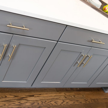
Example of a mid-sized transitional u-shaped light wood floor and brown floor kitchen design in Austin with an undermount sink, shaker cabinets, white cabinets, quartz countertops, white backsplash, ceramic backsplash, stainless steel appliances, a peninsula and white countertops
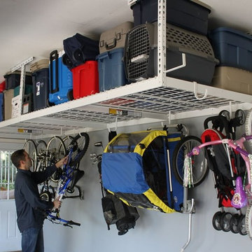
Two SafeRacks 4x8 Racks install side by side. These garage racks can fit any garage freeing up valuable floor space. Finally, get your car back inside the garage.
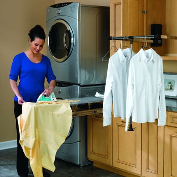
Retracting drop down hanging rack along with the pull out ironing board. The rack can be adjusted all the way to 47" wide.
Example of a classic laundry room design in Portland
Example of a classic laundry room design in Portland
DESIGN STATEMENT:
GOLD COAST KITCHEN
Interior Designer: Darren James
www.interiorsbydarrenjames.com.au
Precision, attention to detail and an appreciation for the finer things in life are qualities often associated with the German culture. So when the German owners engaged Interiors by Darren James to design and build their dream kitchen they wanted premium quality in every detail: design, materials, workmanship and finish. This project clearly demonstrates what is possible when you combine good design, the latest technical mechanisms, quality materials and handcraft production techniques – a project that exceeds every expectation.
Whilst the clients requested an ultramodern design they still wanted it to suit their Australian lifestyle. Central to the brief was the need to satisfy an enthusiastic and demanding gourmand by creating a kitchen that “feels like home” yet still packs a punch visually and supports the entertaining of family and friends. The result is a free flowing functional kitchen design that makes the best possible use of the available space in this long and narrow room.
The existing space
The original kitchen was small, cramped and non-functional. To pave the way for a larger space highly sought after by the clients, the diving wall that separated the previous kitchen and an unused sitting room was bought down – a concept the clients hadn’t considered until now. The resulting space was a larger room, approximately 7.5 x 3.2m. Starting from scratch we were now able to square set all the walls, ceilings and windows. The existing windows and sliding doors were also removed and replaced with new double glazed windows.
Hidden work space hides the mess and reduced visual depth
To shorten the visual depth in such a long room, a scullery focused purely on function is placed at the rear of the room to hide the mess when entertaining and ensures the kitchen is kept clutter free. Housing a large side by side Miele Fridge-Freezer and providing storage for food and everyday bulky appliances, the scullery also acts as an out of the way prep zone. A stainless steel benchtop provides the ultimate surface in terms of hygiene, heat resistant and food preparation for this home chef who avidly enjoys cooking.
Wall Oven feature & room divider
A strategically placed wall oven feature surrounded by LED strip lighting is suspended 300mm off the floor and 300mm off the ceiling creating a unique floating look and provides access either side to the cleverly hidden scullery. Metal supports and bracing was incorporated into the construction of the wall and thicker timber framing was also used to ensure structural integrity.
A selected range of stainless steel Miele appliances included in the feature wall further enhance the cutting edge look whilst providing all the functional requirements of the clients’ healthy cooking style. The black glass finish on the feature door and drawer fronts complement the ‘piano finish’ of the surrounding ‘Ebony Maccassar’natural veneer. In keeping with the desired minimalist look, all the black glass fronts are handless and open electronically using Blums ‘Servo drive’ mechanisms. Thanks to this technology with the simple press of the button the wall oven feature easily transforms from a stunning furniture piece to a fully functional storage space.
To complete the high class finish, black ‘intivo’ drawers, black internals and 10mm glass shelves are incorporated ensuring this feature wall remains a showpiece whether open or closed. It is important to note that due to the clients’ sensitivity to formaldehyde all the board that was used throughout the kitchen both internal and external was ‘EO’ class substrate.
Functional cooking and cleaning zones
A number of work zones within the kitchen ensure the space operates efficiently at all times. The cooking zone includes an induction cooktop for efficient cooking whilst the Neff rangehood is cleverly concealed in the piano finish ‘Ebony Maccassar’ natural veneer which is highlighted by LED strip lighting. To enhance the overall look the veneer work on the rangehood feature box is grain matched and mitred to create a superior and seamless finish. The sink area consists of a large single bowl ‘professional series’ Oliveri sink and a water efficient KWC Inox vege spray mixer ensures even bulky baking items and trays are easy to clean. A three bin system is placed at the bottom of the sink cupboard on a servo drive mechanism allowing the client to easily open without the need of any hands.
A zip hydro boil with its own font and drain unit is also incorporated into the sink area. Due to its placement above the dishwasher a thicker benchtop was required to handle the drain depth that extends from the bottom of the zip font. For this reason the benchtop is 100mm thick and to create visual impact the ‘Metero’ Staron benchtop reduces to 20mm over and into the cooktop area.
Practical Island Bench that packs a punch….
The visually stunning island bench serves dual function purposes. Staron ‘ solid surface was selected for its contemporary appearance as well as for its durability and has been raised 20mm to define a casual seating and dining area.
The client has a passion for baking, making her own pastry, pasta and breads. Like many a pastry chef she prefers working on natural stone. Therefore a 20mm piece of ‘Calacutta’ marble was selected and inlayed into the 100mm Staron ‘Metero’ benchtop. The gorgeous showpiece slab gives the impression of elegance, adds visual character and complements the other natural elements perfectly.
Piano finish natural veneer open-shelves supported with steel rods to eliminate the need for visible gables are located either side of the island to house the clients loved collection of frequently used cookbooks. A custom made stainless steel light rack provides functional task lighting, bottle glass storage and further enhances the professional look of this ‘home chef’ style kitchen. Again, supports are positioned between the trusses in the ceiling to provide appropriate support.
Storage
Storage has been well considered in this kitchen with a scullery providing ample space for groceries as well as specific areas that have been custom designed to house items such as recipe books, small appliances and cutting boards. Every storage item has been thoughtfully located in terms of function and frequency of use. Storage space has been optimized with the use of easy access drawers using Blum’s slow motion drawers. Again the kitchen has been fitted out with the full range of Blum organizational accessories including plate racks, spice racks, knife racks as well as ‘orgaline’ for cutlery and utensil.
Luxurious quality finishes
One of the main requests of the owners was to include luxurious quality finishes to create maximum visual impact. A combination of different textures and finishes were incorporated to ensure high esthetic qualities as well as top performance. This was created by creatively combining an array of high end materials and textures: The piano finish ‘Ebony Macassar’ natural veneer, black painted glass, automotive high gloss grey lacquer, stainless steel, Calacutta Oro marble and Staron Tempest all combine to create a sophisticated and visually stunning space.
The incorporation of the mirror splash back not only adds to the sense of space but ensures nothing is taken away the sophisticated simplicity that this kitchen already boasts.
Light it up
LED stip lighting is thoughtfully placed for both ambient, feature and practical purposes. It particularly highlights the stunning design of cabinetry features seen throughout this kitchen. Natural lighting is maximised with the inclusion of a sliding door in the scullery which conveniently opens out to the alfresco area. LED Downlights have been thoughtfully placed throughout the kitchen to illuminate task areas and work surfaces.
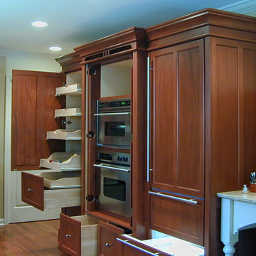
The Armoire is shown open. There are many combinations that are possible using the Subzero refrigerator models that integrate flawlessly with storage and cooking modules. (For built-in units, see our Stealth Kitchen Modules line.) The pocket doors safely hide the ovens using YesterTec's unique U L Listed technology.
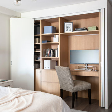
Primary Bedroom with a secret desk. Pocketing doors open fully to a custom desk and shelving unit.
Oak veneers for the cabinets and shelves.
Example of a small trendy carpeted and gray floor home office design in New York with white walls
Example of a small trendy carpeted and gray floor home office design in New York with white walls
Sponsored
London, OH
Fine Designs & Interiors, Ltd.
Columbus Leading Interior Designer - Best of Houzz 2014-2022
Carrara Marble Tiles and Bathroom Tiles
We all love a bathroom backdrop that creates the most serene ambience in which we can soak ourselves after a long day of work. Nothing gives your bathroom that posh look like snow white Carrara marble tiles. It is sold in different textures and density in the market; you have the option of making the selection that suits your style.
There are so many ways to carpet your bathroom with Carrara marble tile. Since the bathroom tiles are non-porous in nature, they cannot soak in water. This makes them perfect to cover your walls with them and provide that warm ambience as you take a shower. Carrara stone does not retain odors as well thus you are perfectly safe using your shampoo or liquid body wash however you want without worrying.
Carrara marble tile bathroom walls offer a perfect white backdrop in which you can add details like silvery faucets, flower vases or candelabras when having romantic moments with your spouse. Because stone can be polished to a glimmer, using Carrara bathroom tiles on the walls reflects light off making the entire room look illuminated and fresh. And the plush white look doesn’t have to end with the walls; your own drop-in tab can also be decorated with Carrara marble tiles to complete the sophisticated hotel-style look.
Marble is also perfect on floors especially when you want to do away with the rugs. Bathroom rugs tend to soak and look ugly on the floor or get dump and give off nauseating odors. Polished Carrara marble is all you do to make the floor neat and shiny. And because they don’t get dump, they maintain their temperatures and feel warm whenever you walk on them.
Installing these tiles is a smooth job and stone can easily be cut using hand-held tile cutters. Laying the tiles yourself also gives you the freedom to try different patterns on the walls and floor. Moreover, you can also try out mosaic formats to achieve a different look but you have to consult someone if you are not sure about mosaics. Make sure you use non-slippery grout sealers so your Carrara bathroom design remains safe even when walking bare foot.
Investing in Carrara marble tiles is a one-time opportunity that will last for as long as possible. There is little maintenance on the stone marble and it cleans up easily and doesn’t corrode either. If you are tired of your current bathroom look, invest in this option for a change.
http://AllMarbleTiles.com
A young family with a wooded, triangular lot in Ipswich, Massachusetts wanted to take on a highly creative, organic, and unrushed process in designing their new home. The parents of three boys had contemporary ideas for living, including phasing the construction of different structures over time as the kids grew so they could maximize the options for use on their land.
They hoped to build a net zero energy home that would be cozy on the very coldest days of winter, using cost-efficient methods of home building. The house needed to be sited to minimize impact on the land and trees, and it was critical to respect a conservation easement on the south border of the lot.
Finally, the design would be contemporary in form and feel, but it would also need to fit into a classic New England context, both in terms of materials used and durability. We were asked to honor the notions of “surprise and delight,” and that inspired everything we designed for the family.
The highly unique home consists of a three-story form, composed mostly of bedrooms and baths on the top two floors and a cross axis of shared living spaces on the first level. This axis extends out to an oversized covered porch, open to the south and west. The porch connects to a two-story garage with flex space above, used as a guest house, play room, and yoga studio depending on the day.
A floor-to-ceiling ribbon of glass wraps the south and west walls of the lower level, bringing in an abundance of natural light and linking the entire open plan to the yard beyond. The master suite takes up the entire top floor, and includes an outdoor deck with a shower. The middle floor has extra height to accommodate a variety of multi-level play scenarios in the kids’ rooms.
Many of the materials used in this house are made from recycled or environmentally friendly content, or they come from local sources. The high performance home has triple glazed windows and all materials, adhesives, and sealants are low toxicity and safe for growing kids.
Photographer credit: Irvin Serrano
In brief
Location, location, location
When looking for your perfect home where you can put down your grass roots and start a family there are many ‘must haves’ that we all have on our wish lists. The obvious contenders are price and location with many other niceties, like the number of bedrooms, layout and decor taking a back seat. As we all know, location can sell a home to those who strive to be in the right area, for transport links, local amenities and the all-important school catchment areas.
Like many other families throughout the UK our clients chose their house for its excellent location. Just ten minutes from the centre of Stafford by car, our client’s house is in a popular and sought-after suburb of the town for couples and families alike. They have always loved the location of their house for its easy access to work, schools, leisure facilities and social connections, but they were becoming increasingly frustrated with the layout of the ground floor of their home.
It’s inevitable that families will evolve and our needs from our properties will change too. Since the young family of four moved to their large four-bedroom detached house a few years ago, their property has been unable to meet their lifestyle needs and living patterns.
Although their property has adequate bedroom space for them and their two children, the layout of the downstairs living area was not functional and it obstructed their everyday life, making entertaining and family gatherings difficult.
Our First Meeting
Upon our initial consultation with our clients it was clear from the outset why they sought to make changes to the layout of their house. The property had been extended to create extra space by the previous owners, but unfortunately the design and build hadn’t been executed well at all. The rooms and layout were awkward in size and shape and it didn’t allow the family to come together and enjoy their home. They had the floor space, but it was sectioned off into separate rooms, some without a purpose.
The garden surrounds the house on all three sides and is of a good size in its entirety with different areas on each aspect. We could clearly see that the house itself didn’t address any particular aspect of the garden in any way.
Moving to a new house wasn’t an option, the family were happy with the location and size of the property. What they wanted was a modern, functional, stylish space for everyday family life, with the flexibility to accommodate their large extended family when needed and to ultimately add value to their property.
We were appointed by our clients to create a design solution to redesign the ground floor living area with a modern, light filled, open plan space that connects with the garden. It was clear from outset that our design intention was to break down the room barriers and to respond to the needs of the family, supporting their lifestyle now and for the future, bringing them together and creating a house they could call a home.
Delivering a project on time and within our client’s budget are always a top priority for our team. The family decided to stay in their house during construction, therefore it was even more essential to minimise the level of disruption to their daily lifestyle with a young family living on site.
The family needed help from our team at Croft Architecture to swiftly and successfully acquire Building Control Approval for their project to progress rapidly, ensuring project completion on time and to their determined budget.
Our Approach
Surveying the site
The client’s home is located on the entrance to a quiet cul-de-sac on a mature, leafy, suburban housing estate. Their home nestles into its well-established site, with ample space between the neighbouring properties and has considerable garden space to the rear and both sides.
During our initial visit we spent a long time with the family observing the existing layout, talking about how they currently live in the property, their annoyances with the house in its current form, how they would like to be able to live in their family home and how they aspired it to feel, look and live.
We walked through the house and it was clear that the existing layout didn’t work downstairs. The house had been extended onto before they had bought the property and the space hadn’t been well thought through in terms of how it would be used effectively.
The rooms directly to the left off the hallway, didn’t really have a proper function. The previously extended space had resulted in the house with too many rooms and subsequently this had led to a series of impractical spaces.
The long and narrow extension was home to a small U-shaped kitchen at the front of the house, which led onto the dining area and then onto a small room at the back of the extension. For the size of the house the kitchen and dining room in a much smaller and narrower area, leaving larger living areas to the rear of property with copious amounts of dead space. The small kitchen was tucked away at the front of the property which made life difficult for our clients to observe their children playing safely in the garden whilst preparing food and carrying out work in the kitchen. On the opposite side of the property there was another old extension which had a step down into it. This living area had a tiled floor and large glazed windows on all sides which made it feel almost like a conservatory.This area was rarely used by the family as it had no real function, plus it was hot in the summer and cold in the winter. It had become an under utilised space.
We walked around the property and it was clear that the house itself didn’t address their private garden space to any particular aspect in any way, meaning that the garden space was under used because of the poor connections.
The family wanted a combined kitchen, dining, lounge space for daily life and also for entertaining their family.
Design Approach
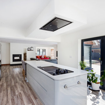
The size of the property presented the opportunity to substantially reconfigure the family home to create a series of dynamic living spaces oriented towards the large, south-facing garden.
Our team suggested removing the little kitchen from the front of the property and re positioning it within the unused glazed space at the back of the house.
The glazed room had internal French doors with a step down into the space separating it from the lounge. We proposed to remove the French doors, level the floor and make it into one room with the existing lounge.
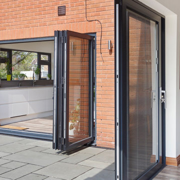
To connect the new open plan kitchen and living space to the rear and side garden sliding and folding doors were the solution, extending the family’s usable living space by creating a seamless indoor-outdoor flow. There was already a patio area there and it made sense for the kitchen to move to the rear of the house to be close to the patio for easy outside dining.
It was therefore logical to retain the existing living space in it's current location next to the new kitchen, maintaining the natural flow of the house for the family after eating and entertaining in the kitchen.
When making decisions regarding the kitchen design, we worked closely with the family. They thoroughly enjoy spending time cooking and entertaining with their large extended family. To assist with their culinary preparations our clients had aspired to have an induction hob within their new kitchen. As they were working through the design with us, they weren’t sure about an induction hob because of different cooking methods required for certain meals that they like to produce. They particularly like making chapatis which require a round pan and a gas hob. We didn’t see this as a problem and suggested having a single gas burner for purely this purpose whilst still installing an induction hob. They decided to go ahead with our idea, choosing a single gas burner and an induction hob, and it looks great!
The existing lounge space had a corner aspect at the rear property that protruded into the garden. Positioned next to the kitchen and dining space it seemed logical to us for the living area to also open out onto the patio, thus connecting the garden to the house on a wider aspect. To enhance the connection between the garden and the living room we thought that a corner door would work extremely well to really open up this space. The clients really liked the design concept to create a feature of the corner with glazed sliding doors that would completely open the house up to the garden. They were excited about the prospect of the allowing huge amounts of natural light into their home and the flexible access it would provide to the garden.
Once the new kitchen, dining and living space had been concluded, we then had to consider what the previous kitchen and dining area was going to be used for within the small, long side extension. We talked with our clients about a few possible uses. We noticed that the family have a piano and few other musical instruments. It made sense for this space to become a quiet part of the house for them to escape to, play music, read and generally relax in a snug area.
To shorten the length of the new music room and make an additional feature in the newly created open plan kitchen, dining and living area, we reclaimed some of the space from the back of the side extension and opened it up to the main open-plan space, thus creating another new snug. We added an additional design feature within the snug by creating a timber window seat. Not only does it provide extra seating, but it’s also created a snug within a snug, a haven for reading, napping and gazing out into the garden.
As part of their brief our clients also wanted a to incorporate a log burner into their newly remodelled home. To connect the new music room and snug to the living space we proposed to position a two-way log burner where the existing gas fire was located. By retaining a fire in the original location it would minimise the disruption and work required to install the wood burner. However, the theory didn’t turn into reality and the new fire resulted in being quite a task to get it to work. When the contractor began to strip back the existing fireplace, they discovered that fitting the pipe within the building was going to be more challenging than they anticipated because of the poorly constructed extension. It was difficult to execute but it was ultimately achieved.
What lies beneath?
It’s not until you uncover the fabric of the building that you fully understand what’s going on underneath. When the contractor exposed the structure of the house, we found out that the property had been poorly constructed, and they uncovered a lot of poor workmanship from the original builders. As the build progressed the inner skin of the extended structure was exposed, we found that it wasn’t actually strong enough and we needed to make it safe in order to proceed. Going forwards we ensured that the structure was safe, and all issues were identified and immediately rectified.
The previous extensions to the house also presented further challenges as the build progressed. We found that the floors between rooms were not level. We wanted to create the appearance of one space rather than lots of chopped up areas. To do so we needed to alter the floor and ceilings to ensure that they were flush right through the new open plan living space. Also, after removing the internal French doors, the down-stand beam where the doors had previously been were subsequently left prominent down from the ceiling. The design required careful planning and attention to detail to achieve the best looking finished results for the client.
For us, in principle our clients’ scheme at the outset was quite a simple project but when the strip out commenced there was actually a more going on underneath that needed attention before the project could start to take shape. A lot of things needed to be considered to make it work structurally and properly for the family.
When the carpet was initially lifted, we found a parquet floor underneath. The family and our team were extremely excited at the prospect of having a traditional parquet floor that could be sanded down and made good. However, when ‘all’ of the carpet was removed only half of the living room had been covered in parquet flooring and the other half was actually a solid concrete floor. Unfortunately, we couldn’t proceed with the flooring and our clients chose another floor finish.
Making connections
Our team at Croft Architecture have created a new, sleek, spacious family ‘hub’ that’s light with clean lines. The open plan space unites the family of four whilst providing the ability to gather the wider family and seamlessly connecting their home with the garden through the new full length sliding doors. Although they now have plenty of space to gather with the family, they also have areas of seclusion to spread out and escape to when needed.
A strong working relationship between our team, the client and Building Control enabled us to gain the necessary permissions promptly. We enjoyed working with the project team and we’re extremely pleased to successfully deliver the completed project. Although it wasn't in accordance with our client’s timescales with the discovery of hidden structural challenges, we spent the time carefully resolving the issues to unsure that our clients home was not only safe, but also looks great and functions perfectly.
In brief
Location, location, location
When looking for your perfect home where you can put down your grass roots and start a family there are many ‘must haves’ that we all have on our wish lists. The obvious contenders are price and location with many other niceties, like the number of bedrooms, layout and decor taking a back seat. As we all know, location can sell a home to those who strive to be in the right area, for transport links, local amenities and the all-important school catchment areas.
Like many other families throughout the UK our clients chose their house for its excellent location. Just ten minutes from the centre of Stafford by car, our client’s house is in a popular and sought-after suburb of the town for couples and families alike. They have always loved the location of their house for its easy access to work, schools, leisure facilities and social connections, but they were becoming increasingly frustrated with the layout of the ground floor of their home.
It’s inevitable that families will evolve and our needs from our properties will change too. Since the young family of four moved to their large four-bedroom detached house a few years ago, their property has been unable to meet their lifestyle needs and living patterns.
Although their property has adequate bedroom space for them and their two children, the layout of the downstairs living area was not functional and it obstructed their everyday life, making entertaining and family gatherings difficult.
Our First Meeting
Upon our initial consultation with our clients it was clear from the outset why they sought to make changes to the layout of their house. The property had been extended to create extra space by the previous owners, but unfortunately the design and build hadn’t been executed well at all. The rooms and layout were awkward in size and shape and it didn’t allow the family to come together and enjoy their home. They had the floor space, but it was sectioned off into separate rooms, some without a purpose.
The garden surrounds the house on all three sides and is of a good size in its entirety with different areas on each aspect. We could clearly see that the house itself didn’t address any particular aspect of the garden in any way.
Moving to a new house wasn’t an option, the family were happy with the location and size of the property. What they wanted was a modern, functional, stylish space for everyday family life, with the flexibility to accommodate their large extended family when needed and to ultimately add value to their property.
We were appointed by our clients to create a design solution to redesign the ground floor living area with a modern, light filled, open plan space that connects with the garden. It was clear from outset that our design intention was to break down the room barriers and to respond to the needs of the family, supporting their lifestyle now and for the future, bringing them together and creating a house they could call a home.
Delivering a project on time and within our client’s budget are always a top priority for our team. The family decided to stay in their house during construction, therefore it was even more essential to minimise the level of disruption to their daily lifestyle with a young family living on site.
The family needed help from our team at Croft Architecture to swiftly and successfully acquire Building Control Approval for their project to progress rapidly, ensuring project completion on time and to their determined budget.
Our Approach
Surveying the site
The client’s home is located on the entrance to a quiet cul-de-sac on a mature, leafy, suburban housing estate. Their home nestles into its well-established site, with ample space between the neighbouring properties and has considerable garden space to the rear and both sides.
During our initial visit we spent a long time with the family observing the existing layout, talking about how they currently live in the property, their annoyances with the house in its current form, how they would like to be able to live in their family home and how they aspired it to feel, look and live.
We walked through the house and it was clear that the existing layout didn’t work downstairs. The house had been extended onto before they had bought the property and the space hadn’t been well thought through in terms of how it would be used effectively.
The rooms directly to the left off the hallway, didn’t really have a proper function. The previously extended space had resulted in the house with too many rooms and subsequently this had led to a series of impractical spaces.
The long and narrow extension was home to a small U-shaped kitchen at the front of the house, which led onto the dining area and then onto a small room at the back of the extension. For the size of the house the kitchen and dining room in a much smaller and narrower area, leaving larger living areas to the rear of property with copious amounts of dead space. The small kitchen was tucked away at the front of the property which made life difficult for our clients to observe their children playing safely in the garden whilst preparing food and carrying out work in the kitchen. On the opposite side of the property there was another old extension which had a step down into it. This living area had a tiled floor and large glazed windows on all sides which made it feel almost like a conservatory.This area was rarely used by the family as it had no real function, plus it was hot in the summer and cold in the winter. It had become an under utilised space.
We walked around the property and it was clear that the house itself didn’t address their private garden space to any particular aspect in any way, meaning that the garden space was under used because of the poor connections.
The family wanted a combined kitchen, dining, lounge space for daily life and also for entertaining their family.
Design Approach
The size of the property presented the opportunity to substantially reconfigure the family home to create a series of dynamic living spaces oriented towards the large, south-facing garden.
Our team suggested removing the little kitchen from the front of the property and re positioning it within the unused glazed space at the back of the house.
The glazed room had internal French doors with a step down into the space separating it from the lounge. We proposed to remove the French doors, level the floor and make it into one room with the existing lounge.
To connect the new open plan kitchen and living space to the rear and side garden sliding and folding doors were the solution, extending the family’s usable living space by creating a seamless indoor-outdoor flow. There was already a patio area there and it made sense for the kitchen to move to the rear of the house to be close to the patio for easy outside dining.
It was therefore logical to retain the existing living space in it's current location next to the new kitchen, maintaining the natural flow of the house for the family after eating and entertaining in the kitchen.
When making decisions regarding the kitchen design, we worked closely with the family. They thoroughly enjoy spending time cooking and entertaining with their large extended family. To assist with their culinary preparations our clients had aspired to have an induction hob within their new kitchen. As they were working through the design with us, they weren’t sure about an induction hob because of different cooking methods required for certain meals that they like to produce. They particularly like making chapatis which require a round pan and a gas hob. We didn’t see this as a problem and suggested having a single gas burner for purely this purpose whilst still installing an induction hob. They decided to go ahead with our idea, choosing a single gas burner and an induction hob, and it looks great!
The existing lounge space had a corner aspect at the rear property that protruded into the garden. Positioned next to the kitchen and dining space it seemed logical to us for the living area to also open out onto the patio, thus connecting the garden to the house on a wider aspect. To enhance the connection between the garden and the living room we thought that a corner door would work extremely well to really open up this space. The clients really liked the design concept to create a feature of the corner with glazed sliding doors that would completely open the house up to the garden. They were excited about the prospect of the allowing huge amounts of natural light into their home and the flexible access it would provide to the garden.
Once the new kitchen, dining and living space had been concluded, we then had to consider what the previous kitchen and dining area was going to be used for within the small, long side extension. We talked with our clients about a few possible uses. We noticed that the family have a piano and few other musical instruments. It made sense for this space to become a quiet part of the house for them to escape to, play music, read and generally relax in a snug area.
To shorten the length of the new music room and make an additional feature in the newly created open plan kitchen, dining and living area, we reclaimed some of the space from the back of the side extension and opened it up to the main open-plan space, thus creating another new snug. We added an additional design feature within the snug by creating a timber window seat. Not only does it provide extra seating, but it’s also created a snug within a snug, a haven for reading, napping and gazing out into the garden.
As part of their brief our clients also wanted a to incorporate a log burner into their newly remodelled home. To connect the new music room and snug to the living space we proposed to position a two-way log burner where the existing gas fire was located. By retaining a fire in the original location it would minimise the disruption and work required to install the wood burner. However, the theory didn’t turn into reality and the new fire resulted in being quite a task to get it to work. When the contractor began to strip back the existing fireplace, they discovered that fitting the pipe within the building was going to be more challenging than they anticipated because of the poorly constructed extension. It was difficult to execute but it was ultimately achieved.
What lies beneath?
It’s not until you uncover the fabric of the building that you fully understand what’s going on underneath. When the contractor exposed the structure of the house, we found out that the property had been poorly constructed, and they uncovered a lot of poor workmanship from the original builders. As the build progressed the inner skin of the extended structure was exposed, we found that it wasn’t actually strong enough and we needed to make it safe in order to proceed. Going forwards we ensured that the structure was safe, and all issues were identified and immediately rectified.
The previous extensions to the house also presented further challenges as the build progressed. We found that the floors between rooms were not level. We wanted to create the appearance of one space rather than lots of chopped up areas. To do so we needed to alter the floor and ceilings to ensure that they were flush right through the new open plan living space. Also, after removing the internal French doors, the down-stand beam where the doors had previously been were subsequently left prominent down from the ceiling. The design required careful planning and attention to detail to achieve the best looking finished results for the client.
For us, in principle our clients’ scheme at the outset was quite a simple project but when the strip out commenced there was actually a more going on underneath that needed attention before the project could start to take shape. A lot of things needed to be considered to make it work structurally and properly for the family.
When the carpet was initially lifted, we found a parquet floor underneath. The family and our team were extremely excited at the prospect of having a traditional parquet floor that could be sanded down and made good. However, when ‘all’ of the carpet was removed only half of the living room had been covered in parquet flooring and the other half was actually a solid concrete floor. Unfortunately, we couldn’t proceed with the flooring and our clients chose another floor finish.
Making connections
Our team at Croft Architecture have created a new, sleek, spacious family ‘hub’ that’s light with clean lines. The open plan space unites the family of four whilst providing the ability to gather the wider family and seamlessly connecting their home with the garden through the new full length sliding doors. Although they now have plenty of space to gather with the family, they also have areas of seclusion to spread out and escape to when needed.
A strong working relationship between our team, the client and Building Control enabled us to gain the necessary permissions promptly. We enjoyed working with the project team and we’re extremely pleased to successfully deliver the completed project. Although it wasn't in accordance with our client’s timescales with the discovery of hidden structural challenges, we spent the time carefully resolving the issues to unsure that our clients home was not only safe, but also looks great and functions perfectly.
Showing Results for "Hidden Safes Ideas"
Sponsored
Fredericksburg, OH
High Point Cabinets
Columbus' Experienced Custom Cabinet Builder | 4x Best of Houzz Winner
Trendy galley light wood floor kitchen photo in Dorset with flat-panel cabinets, gray cabinets and an island
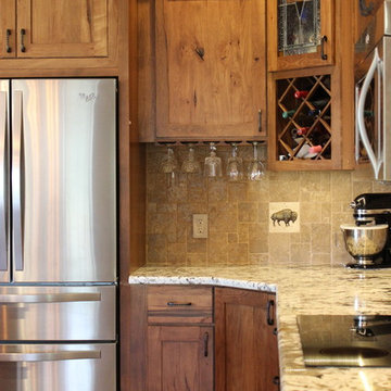
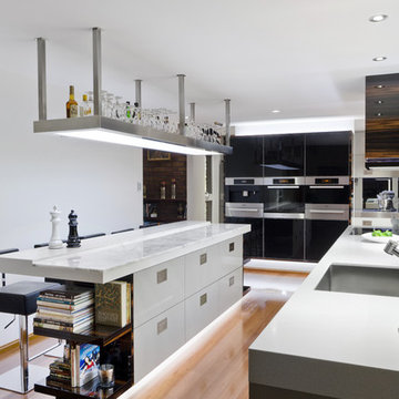
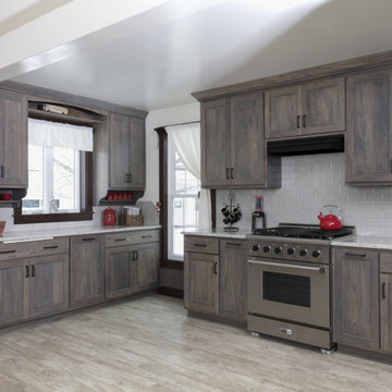
The corner is this large L-shape kitchen includes wine storage, stemware holders, staggered height on the corner cabinet and art glass.
Village Home Stores
12