


Search results for "House single storey modern" in Home Design Ideas

This historic home and coach house in a landmark district on Astor Street was built in the late 1800’s. Originally designed as an 11,000sf single family residence, the home
was divided into nine apartments in the 1960’s and had fallen into disrepair. The new owners purchased the property with a vision to convert the building back to single
family residence for their young family.
The design concept was to restore the limestone exterior to its original state and reconstruct the interior into a home with an open floor plan and modern amenities for entertaining and family living, incorporating vintage details from the original property whenever possible. Program requirements included five bedrooms, all new bathrooms, contemporary kitchen, salon, library, billiards room with bar, home office, cinema, playroom, garage with stacking car lifts, and outdoor gardens with all new landscaping.
The home is unified by a grand staircase which is flooded with natural light from a glass laylight roof. The first level includes a formal entry with rich wood and marble finishes,
a walnut-paneled billiards room with custom bar, a play room, and a separate family entry with mudroom. A formal living and dining room with adjoining intimate salon are located on the second level; an addition at the rear of the home includes a custom deGiulio kitchen and family room. The third level master suite includes a marble bathroom, dressing room, library, and office. The fourth level includes the family bedrooms and a guest suite with a terrace and views of Lake Michigan. The lower level houses a custom cinema. Sustainable elements are seamlessly integrated throughout and include renewable materials, high-efficiency mechanicals and thermal envelope, restored original mahogany windows with new high-performance low-E glass, and a green roof.
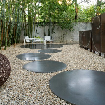
A local Houston art collector hired us to create a low maintenance, sophisticated, contemporary landscape design. She wanted her property to compliment her eclectic taste in architecture, outdoor sculpture, and modern art. Her house was built with a minimalist approach to decoration, emphasizing right angles and windows instead of architectural keynotes. The west wing of the house was only one story, while the east wing was two-story. The windows in both wings were larger than usual, so that visitors could see her art collection from the home’s exterior. Near one of the large rear windows, there was an abstract metal sculpture designed in the form of a spiral.
When she initially contacted us, the surrounding property had only a few trees and indigenous grass as vegetation. This was actually a good beginning point with us, because it allowed us to develop a contemporary landscape design that featured a very linear, crisp look supportive of the home and its contents. We began by planting a garden around the large contemporary sculpture near the window. Landscape designers planted horsetail reed under windows, along the sides of the home, and around the corners. This vegetation is very resilient and hardy, and requires little trimming, weeding, or mulching. This helped unite the diverse elements of sculpture, contemporary architecture, and landscape design into a more fluid harmony that preserved the proportions of each unique element, but eliminated any tendency for the elements to clash with one another.
We then added two stonework designs to the landscape surrounding the contemporary art collection and home. The first was a linear walkway we build from concrete pads purchased through a retail vendor as a cost-saving benefit to our client. We created this walkway to follow the perimeter of the home so that visitors could walk around the entire property and admire the outdoor sculptures and the collections of modern art visible through the windows. This was especially enjoyable at night, when the entire home was brightly lit from within.
To add a touch of tranquility and quite repose to the stark right angles of the home and surrounding contemporary landscape, we designed a special seating area toward the northwest corner of the property. We wanted to create a sense of contemplation in this area, so we departed from the linear and angular designs of the surrounding landscape and established a theme of circular geometry. We laid down gravel as ground cover, then placed large, circular pads arranged like giant stepping stones that led up to a stone patio filled with chairs. The shape of the granite pads and the contours of the graveled area further complimented the spirals and turns in the outdoor metal sculpture, and balanced the entire contemporary landscape design with proportional geometric forms of lines, angles, and curves.
This particular contemporary landscape design also has a sense of movement attached to it. All stonework leads to a destination of some sort. The linear pathway provides a guided tour around the home, garden, and modern art collection. The granite pathway stones create movement toward separate space where the entire experience of art, vegetation, and architecture can be viewed and experienced as a unity.
Contemporary landscaping designs like create form out of feeling by using basic geometric forms and variations of forms. Sometimes very stark forms are used to create a sense of absolutism or contrast. At other times, forms are blended, or even distorted to suggest a sense of complex emotion, or a sense of multi-dimensional reality. The exact nature of the design is always highly subjective, and developed on a case-by-case basis with the client.
The Kiguchi family moved into their Austin, Texas home in 1994. Built in the 1980’s as part of a neighborhood development, they happily raised their family here but longed for something more contemporary. Once they became empty nesters, they decided it was time for a major remodel. After spending many years visiting Austin AIA Home Tours that highlight contemporary residential architecture, they had a lot of ideas and in 2013 were ready to interview architects and get their renovation underway.
The project turned into a major remodel due to an unstable foundation. Architects Ben Arbib and Ed Hughey, of Arbib Hughey Design were hired to solve the structural issue and look for inspiration in the bones of the house, which sat on top of a hillside and was surrounded by great views.
Unfortunately, with the old floor plan, the beautiful views were hidden by small windows that were poorly placed. In order to bring more natural light into the house the window sizes and configurations had to be addressed, all while keeping in mind the homeowners desire for a modern look and feel.
To achieve a more contemporary and sophisticated front of house, a new entry was designed that included removing a two-story bay window and porch. The entrance of the home also became more integrated with the landscape creating a template for new foliage to be planted. Older exterior materials were updated to incorporate a more muted palette of colors with a metal roof, dark grey siding in the back and white stucco in the front. Deep eaves were added over many of the new large windows for clean lines and sun protection.
“Inside it was about opening up the floor plan, expanding the views throughout the house, and updating the material palette to get a modern look that was also warm and inviting,” said Ben from Arbib Hughey Design. “Prior to the remodel, the house had the typical separation of rooms. We removed the walls between them and changed all of the windows to Milgard Thermally Improved Aluminum to connect the inside with the outside. No matter where you are you get nice views and natural light.”
The architects wanted to create some drama, which they accomplished with the window placement and opening up the interior floor plan to an open concept approach. Cabinetry was used to help delineate intimate spaces. To add warmth to an all-white living room, white-washed oak wood floors were installed and pine planks were used around the fireplace. The large windows served as artwork bringing the color of nature into the space.
An octagon shaped, elevated dining room, (named “the turret”), had a big impact on the design of the house. They architects rounded the corners and added larger window openings overlooking a new sunken garden. The great room was also softened by rounding out the corners and that circular theme continued throughout the house, being picked up in skylight wells and kitchen cabinetry. A staircase leading to a catwalk was added and the result was a two-story window wall that flooded the home with natural light.
When asked why Milgard® Thermally Improved Aluminum windows were selected, the architectural team listed many reasons:
1) Aesthetics: “We liked the slim profiles and narrow sightlines. The window frames never get in the way of the view and that was important to us. They also have a very contemporary look that went well with our design.”
2) Options: “We liked that we could get large sliding doors that matched the windows, giving us a very cohesive look and feel throughout the project.”
3) Cost Effective: “Milgard windows are affordable. You get a good product at a good price.”
4) Custom Sizes: “Milgard windows are customizable, which allowed us to get the right window for each location.”
Ready to take on your own traditional to modern home remodeling project? Arbib Hughey Design advises, “Work with a good architect. That means picking a team that is creative, communicative, listens well and is responsive. We think it’s important for an architect to listen to their clients and give them something they want, not something the architect thinks they should have. At the same time you want an architect who is willing and able to think outside the box and offer up design options that you may not have considered. Design is about a lot of back and forth, trying out ideas, getting feedback and trying again.”
The home was completely transformed into a unique, contemporary house perfectly integrated with its site. Internally the home has a natural flow for the occupants and externally it is integrated with the surroundings taking advantage of great natural light. As a side note, it was highly praised as part of the Austin AIA homes tour.
Find the right local pro for your project
A Memorial-area art collector residing in a chic modern home wanted his house to be more visible from the street. His yard was full of trees, and he asked us to consider removing them and developing a more modern landscape design that would fully complement the exterior of his home. He was a personal friend of ours as well, and he understood that our policy is to preserve as many trees as possible whenever we undertake a project. However, we decided to make an exception in his case for two reasons. For one thing, he was a very close friend to many people in our company. Secondly, large trees simply would not work with a landscape reflective of the modern architecture that his house featured.
The house had been built as story structure that was formed around a blend of unique curves and angles very reminiscent of the geometric patterns common in modern sculpture and art. The windows had been built deliberately large, so that visitors driving up to the house could have a lighted glimpse into the interior, where many sculptures and works of modern art were showcased. The entire residence, in fact, was meant to showcase the eclectic diversity of his artistic tastes, and provide a glimpse at the elegant contents within the home.
He asked us to create more modern look to the landscape that would complement the residence with patterns in vegetation, ornamentation, and a new lighted water fountain that would act like a mirror-image of the home. He also wanted us to sculpt the features we created in such a way as to center the eye of the viewer and draw it up and over the landscape to focus on the house itself.
The challenge was to develop a truly sophisticated modern landscaping design that would compliment, but in no way overpower the façade of the home. In order to do this, we had to focus very carefully on the geometric appearance of the planting areas first. Since the vegetation would be surrounding a very large, circular stone drive, we took advantage of the contours and created a sense of flowing perspective. We were then very careful to plant vegetation that could be maintained at a very low growth height. This was to prevent vegetation from behaving like the previous trees which had blocked the view of the house. Small hedges, ferns, and flowers were planted in winding rows that followed the course of the circular stone driveway that surrounded the fountain.
We then centered this new modern landscape plan with a very sophisticated contemporary fountain. We chose a circular shape for the fountain both to center the eye and to work as a compliment to the curved elements in the home’s exterior design. We selected black granite as the building material, partly because granite speaks to the monumental, and partly because it is a very common material for modern architecture and outdoor contemporary sculpture. We placed the fountain in the very center of the driveway as well, which had the effect of making the entire landscape appear to converge toward the middle of the home’s façade. To add a sense of eclectic refinement to the fountain, we then polished the granite so that anyone driving or walking up to the fountain would see a reflection of the home in the base. To maintain consistency of the circular shape, we radius cut all of the coping around the fountain was all radius cut from polished limestone. The lighter color of the limestone created an archetypal contrast of light and darkness, further contributing to the modern theme of the landscape design, and providing a surface for illumination so the fountain would remain an established keynote on the landscape during the night.
The Kiguchi family moved into their Austin, Texas home in 1994. Built in the 1980’s as part of a neighborhood development, they happily raised their family here but longed for something more contemporary. Once they became empty nesters, they decided it was time for a major remodel. After spending many years visiting Austin AIA Home Tours that highlight contemporary residential architecture, they had a lot of ideas and in 2013 were ready to interview architects and get their renovation underway.
The project turned into a major remodel due to an unstable foundation. Architects Ben Arbib and Ed Hughey, of Arbib Hughey Design were hired to solve the structural issue and look for inspiration in the bones of the house, which sat on top of a hillside and was surrounded by great views.
Unfortunately, with the old floor plan, the beautiful views were hidden by small windows that were poorly placed. In order to bring more natural light into the house the window sizes and configurations had to be addressed, all while keeping in mind the homeowners desire for a modern look and feel.
To achieve a more contemporary and sophisticated front of house, a new entry was designed that included removing a two-story bay window and porch. The entrance of the home also became more integrated with the landscape creating a template for new foliage to be planted. Older exterior materials were updated to incorporate a more muted palette of colors with a metal roof, dark grey siding in the back and white stucco in the front. Deep eaves were added over many of the new large windows for clean lines and sun protection.
“Inside it was about opening up the floor plan, expanding the views throughout the house, and updating the material palette to get a modern look that was also warm and inviting,” said Ben from Arbib Hughey Design. “Prior to the remodel, the house had the typical separation of rooms. We removed the walls between them and changed all of the windows to Milgard Thermally Improved Aluminum to connect the inside with the outside. No matter where you are you get nice views and natural light.”
The architects wanted to create some drama, which they accomplished with the window placement and opening up the interior floor plan to an open concept approach. Cabinetry was used to help delineate intimate spaces. To add warmth to an all-white living room, white-washed oak wood floors were installed and pine planks were used around the fireplace. The large windows served as artwork bringing the color of nature into the space.
An octagon shaped, elevated dining room, (named “the turret”), had a big impact on the design of the house. They architects rounded the corners and added larger window openings overlooking a new sunken garden. The great room was also softened by rounding out the corners and that circular theme continued throughout the house, being picked up in skylight wells and kitchen cabinetry. A staircase leading to a catwalk was added and the result was a two-story window wall that flooded the home with natural light.
When asked why Milgard® Thermally Improved Aluminum windows were selected, the architectural team listed many reasons:
1) Aesthetics: “We liked the slim profiles and narrow sightlines. The window frames never get in the way of the view and that was important to us. They also have a very contemporary look that went well with our design.”
2) Options: “We liked that we could get large sliding doors that matched the windows, giving us a very cohesive look and feel throughout the project.”
3) Cost Effective: “Milgard windows are affordable. You get a good product at a good price.”
4) Custom Sizes: “Milgard windows are customizable, which allowed us to get the right window for each location.”
Ready to take on your own traditional to modern home remodeling project? Arbib Hughey Design advises, “Work with a good architect. That means picking a team that is creative, communicative, listens well and is responsive. We think it’s important for an architect to listen to their clients and give them something they want, not something the architect thinks they should have. At the same time you want an architect who is willing and able to think outside the box and offer up design options that you may not have considered. Design is about a lot of back and forth, trying out ideas, getting feedback and trying again.”
The home was completely transformed into a unique, contemporary house perfectly integrated with its site. Internally the home has a natural flow for the occupants and externally it is integrated with the surroundings taking advantage of great natural light. As a side note, it was highly praised as part of the Austin AIA homes tour.
photos by Ken Wyner
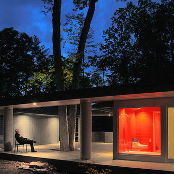
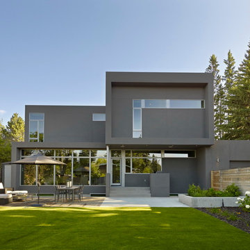
Inspiration for a modern one-story exterior home remodel in DC Metro
Inspiration for a modern one-story exterior home remodel in DC Metro
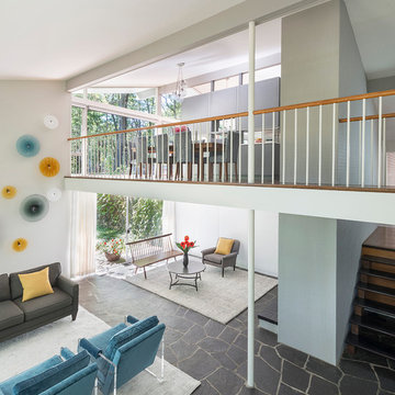
Mid-Century Remodel on Tabor Hill
This sensitively sited house was designed by Robert Coolidge, a renowned architect and grandson of President Calvin Coolidge. The house features a symmetrical gable roof and beautiful floor to ceiling glass facing due south, smartly oriented for passive solar heating. Situated on a steep lot, the house is primarily a single story that steps down to a family room. This lower level opens to a New England exterior. Our goals for this project were to maintain the integrity of the original design while creating more modern spaces. Our design team worked to envision what Coolidge himself might have designed if he'd had access to modern materials and fixtures.
With the aim of creating a signature space that ties together the living, dining, and kitchen areas, we designed a variation on the 1950's "floating kitchen." In this inviting assembly, the kitchen is located away from exterior walls, which allows views from the floor-to-ceiling glass to remain uninterrupted by cabinetry.
We updated rooms throughout the house; installing modern features that pay homage to the fine, sleek lines of the original design. Finally, we opened the family room to a terrace featuring a fire pit. Since a hallmark of our design is the diminishment of the hard line between interior and exterior, we were especially pleased for the opportunity to update this classic work.
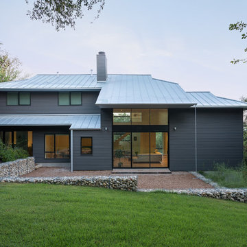
This new home for a young family responds to the desire for a modern, comfortable and sustainable home. Within the single-story structure three distinct levels, each connected by 3 steps, are designed to graciously work with the gently sloping site, providing multiple connection points to the outdoors along the way. Public areas of the house open up to engage the outdoor living spaces, while bedrooms along the north side of the home preserve privacy. The mass of the home was sited along the northern portion of the lot to take advantage of natural light throughout the year. Overhangs are proportioned to keep the house cool in the summer while taking in the sun’s warmth in the winter months.
Dark metal windows, smooth-faced stucco, wood siding, exposed masonry and a standing seam roof provide a clean, durable envelope. Interiors are kept simple with wood flooring and white paint serving as a backdrop for wood and steel casework. JLC Architecture provided a full architectural and interior design package.
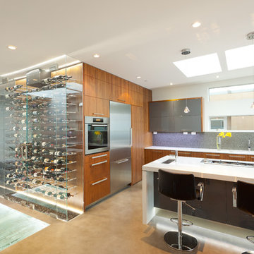
Situated on a challenging sloped lot, an elegant and modern home was achieved with a focus on warm walnut, stainless steel, glass and concrete. Each floor, named Sand, Sea, Surf and Sky, is connected by a floating walnut staircase and an elevator concealed by walnut paneling in the entrance.
The home captures the expansive and serene views of the ocean, with spaces outdoors that incorporate water and fire elements. Ease of maintenance and efficiency was paramount in finishes and systems within the home. Accents of Swarovski crystals illuminate the corridor leading to the master suite and add sparkle to the lighting throughout.
A sleek and functional kitchen was achieved featuring black walnut and charcoal gloss millwork, also incorporating a concealed pantry and quartz surfaces. An impressive wine cooler displays bottles horizontally over steel and walnut, spanning from floor to ceiling.
Features were integrated that capture the fluid motion of a wave and can be seen in the flexible slate on the contoured fireplace, Modular Arts wall panels, and stainless steel accents. The foyer and outer decks also display this sense of movement.
At only 22 feet in width, and 4300 square feet of dramatic finishes, a four car garage that includes additional space for the client's motorcycle, the Wave House was a productive and rewarding collaboration between the client and KBC Developments.
Featured in Homes & Living Vancouver magazine July 2012!
photos by Rob Campbell - www.robcampbellphotography
photos by Tony Puezer - www.brightideaphotography.com
The clients brief asked for extra living and sleeping areas. Due to the unusual shape of the rear garden and north facing orientation, we proposed a long single storey extension along the side of the garden. The new east facing extension housed the new living areas which receive morning light through the large timber sliding doors which opened to the stone clad garden. We used a curved zinc clad roof to detract from the linear feel with a central rooflight to pull light into the house in the afternoon. This design retained a regular shaped garden. The client’s passion for natural materials and beautiful stone is evident throughout, not just in the bathroom but throughout the ground floor, including the guest bedroom where we housed a custom designed handmade Turkish sunken stone bath. www.dmvf.ie.
Project :: SD House
Design by :: www.thirdstone.ca
Photography: merle prosofsky
Inspiration for a modern wood exterior home remodel in Edmonton
Inspiration for a modern wood exterior home remodel in Edmonton
Situated on a challenging sloped lot, an elegant and modern home was achieved with a focus on warm walnut, stainless steel, glass and concrete. Each floor, named Sand, Sea, Surf and Sky, is connected by a floating walnut staircase and an elevator concealed by walnut paneling in the entrance.
The home captures the expansive and serene views of the ocean, with spaces outdoors that incorporate water and fire elements. Ease of maintenance and efficiency was paramount in finishes and systems within the home. Accents of Swarovski crystals illuminate the corridor leading to the master suite and add sparkle to the lighting throughout.
A sleek and functional kitchen was achieved featuring black walnut and charcoal gloss millwork, also incorporating a concealed pantry and quartz surfaces. An impressive wine cooler displays bottles horizontally over steel and walnut, spanning from floor to ceiling.
Features were integrated that capture the fluid motion of a wave and can be seen in the flexible slate on the contoured fireplace, Modular Arts wall panels, and stainless steel accents. The foyer and outer decks also display this sense of movement.
At only 22 feet in width, and 4300 square feet of dramatic finishes, a four car garage that includes additional space for the client's motorcycle, the Wave House was a productive and rewarding collaboration between the client and KBC Developments.
Featured in Homes & Living Vancouver magazine July 2012!
photos by Rob Campbell - www.robcampbellphotography
photos by Tony Puezer - www.brightideaphotography.com

This project involved a two storey extension to the side and a single storey extension to the rear of an existing 1930′s semi-detached house with a revised internal layout to create a family home suitable for today’s living standards. The single storey extension to the rear created a seamless extension of the original house, housing a new open plan kitchen, living and dining area with a large internal sliding door which closes off the living area if desired. Light wells overhead provide natural light deep into the existing house plan. Large sliding aluminium framed doors open off the main living areas onto a timber deck and the rear garden. www.dmvf.ie.
Sponsored
Columbus, OH
Dave Fox Design Build Remodelers
Columbus Area's Luxury Design Build Firm | 17x Best of Houzz Winner!
Project :: SD House
Design by :: www.thirdstone.ca
Photography: merle prosofsky
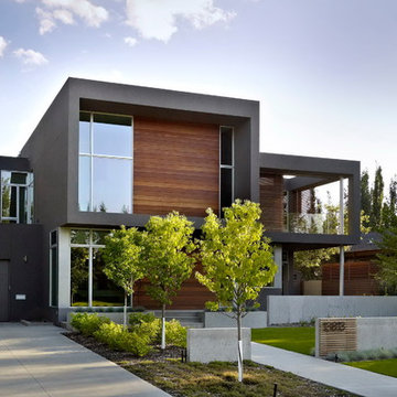
Inspiration for a mid-sized modern gray two-story exterior home remodel in Edmonton
Inspiration for a mid-sized modern gray two-story exterior home remodel in Edmonton
Our clients had been living in this 1950s detached house for several years and had carried out some works to the house, including a single storey rear extension. The social area of the house worked quite well, but the bedrooms on the first floor, comprising of a double and a single bedroom with shared family bathroom, as well as the master bedroom with en-suite bathroom, was the area that the clients wanted to have an improved layout.
The main problem was that the master bedroom, with its fitted wardrobes, took up too much space. They asked us to design a first floor extension over the existing single storey extension, to create a larger master bedroom with a new en-suite bathroom and a further double bedroom to be used by one of their children, while converting the existing single bedroom into a study. While discussing the design with the planning authorities, we were asked to extend the existing pitched tiled roof over the new extension. This gave a good potential space to use the loft as living space, where we managed to get permission to insert 5 dormer windows which gave birth to a music/chill out room, another small bedroom and a potential shower room which was left plumbed ready for future use, whilst in the interim being used as storage.
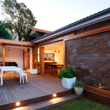
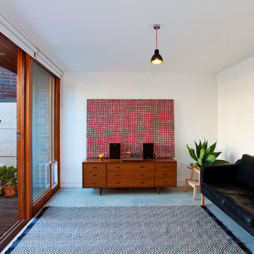
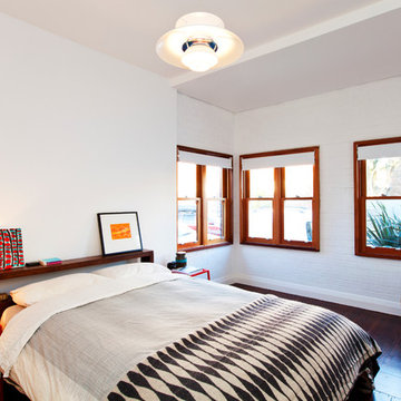
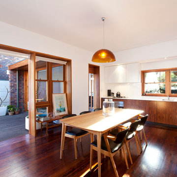
The house was originally a single story face brick home, which was ‘cut in half’ to make two smaller residences. It is on a triangular corner site, and is nestled in between a unit block to the South, and large renovated two storey homes to the West. The owners loved the original character of the house, and were keen to retain this with the new proposal, but felt that the internal plan was disjointed, had no relationship to the paved outdoor area, and above all was very cold in Winter, with virtually no natural light entering the house.
The existing plan had the bedrooms and bathrooms on the side facing the outdoor area, with the living area on the other side of the hallway. We swapped this to have an open plan living room opening out onto a new deck area. An added bonus through the design stage was adding a rumpus room, which was built to the boundary on two sides, and also leads out onto the new deck area. Two large light wells open into the roof, and natural light floods into the house through the skylights above. The automated skylights really help with airflow, and keeping the house cool in the Summer. Warm timber finishes, including cedar windows and doors have been used throughout, and are a low key inclusion into the existing fabric of the house.
Photography by Sarah Braden
Showing Results for "House Single Storey Modern"
Sponsored
Columbus, OH
Dave Fox Design Build Remodelers
Columbus Area's Luxury Design Build Firm | 17x Best of Houzz Winner!
The house was originally a single story face brick home, which was ‘cut in half’ to make two smaller residences. It is on a triangular corner site, and is nestled in between a unit block to the South, and large renovated two storey homes to the West. The owners loved the original character of the house, and were keen to retain this with the new proposal, but felt that the internal plan was disjointed, had no relationship to the paved outdoor area, and above all was very cold in Winter, with virtually no natural light entering the house.
The existing plan had the bedrooms and bathrooms on the side facing the outdoor area, with the living area on the other side of the hallway. We swapped this to have an open plan living room opening out onto a new deck area. An added bonus through the design stage was adding a rumpus room, which was built to the boundary on two sides, and also leads out onto the new deck area. Two large light wells open into the roof, and natural light floods into the house through the skylights above. The automated skylights really help with airflow, and keeping the house cool in the Summer. Warm timber finishes, including cedar windows and doors have been used throughout, and are a low key inclusion into the existing fabric of the house.
Photography by Sarah Braden
8