


Search results for "Uncover" in Home Design Ideas
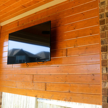
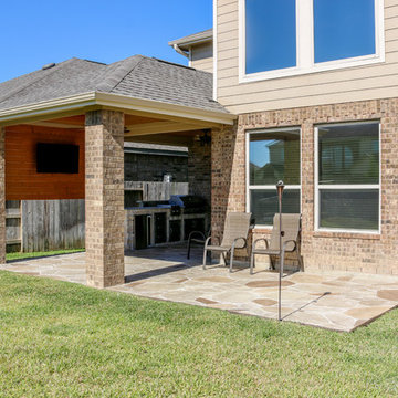
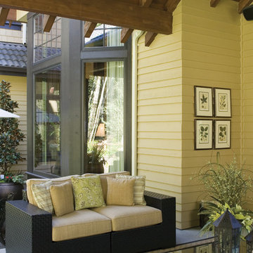
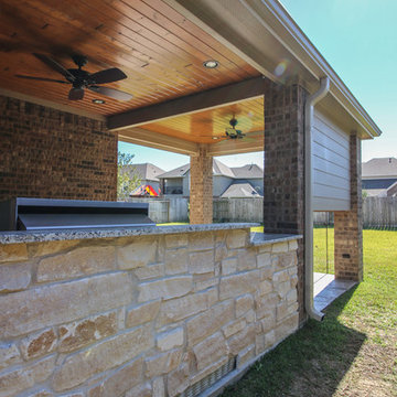
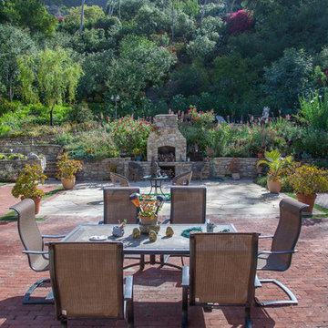
This backyard project was beautifully built to look original to the home. The brick and trim match perfectly, and the addition of the outdoor kitchen into this covered patio is seamless. The custom color of this flagstone style of stamped concrete is the perfect combination with the brick.
The outdoor kitchen is complete with a grilling center, mini fridge, burners, and ample storage.
This space can easily entertain as a TV was added to a gorgeous tongue and groove wall. With shaded space and uncovered patio extension, this backyard is ideal for day or night! Our clients can enjoy stargazing on the uncovered portion or watch the game with an early evening meal underneath the covered patio.
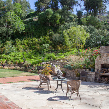
The entirely redone hillside, with large flagstone patio, uncovered stairs to a second level, and an uncovered pathway through the hillside.
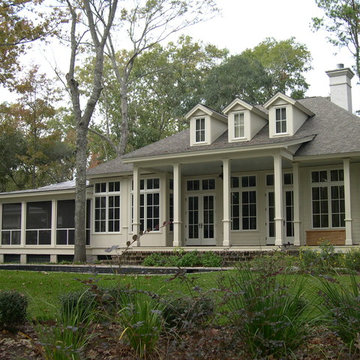
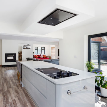
Example of a trendy exterior home design in Los Angeles
Example of a trendy exterior home design in Los Angeles
Find the right local pro for your project
In brief
Location, location, location
When looking for your perfect home where you can put down your grass roots and start a family there are many ‘must haves’ that we all have on our wish lists. The obvious contenders are price and location with many other niceties, like the number of bedrooms, layout and decor taking a back seat. As we all know, location can sell a home to those who strive to be in the right area, for transport links, local amenities and the all-important school catchment areas.
Like many other families throughout the UK our clients chose their house for its excellent location. Just ten minutes from the centre of Stafford by car, our client’s house is in a popular and sought-after suburb of the town for couples and families alike. They have always loved the location of their house for its easy access to work, schools, leisure facilities and social connections, but they were becoming increasingly frustrated with the layout of the ground floor of their home.
It’s inevitable that families will evolve and our needs from our properties will change too. Since the young family of four moved to their large four-bedroom detached house a few years ago, their property has been unable to meet their lifestyle needs and living patterns.
Although their property has adequate bedroom space for them and their two children, the layout of the downstairs living area was not functional and it obstructed their everyday life, making entertaining and family gatherings difficult.
Our First Meeting
Upon our initial consultation with our clients it was clear from the outset why they sought to make changes to the layout of their house. The property had been extended to create extra space by the previous owners, but unfortunately the design and build hadn’t been executed well at all. The rooms and layout were awkward in size and shape and it didn’t allow the family to come together and enjoy their home. They had the floor space, but it was sectioned off into separate rooms, some without a purpose.
The garden surrounds the house on all three sides and is of a good size in its entirety with different areas on each aspect. We could clearly see that the house itself didn’t address any particular aspect of the garden in any way.
Moving to a new house wasn’t an option, the family were happy with the location and size of the property. What they wanted was a modern, functional, stylish space for everyday family life, with the flexibility to accommodate their large extended family when needed and to ultimately add value to their property.
We were appointed by our clients to create a design solution to redesign the ground floor living area with a modern, light filled, open plan space that connects with the garden. It was clear from outset that our design intention was to break down the room barriers and to respond to the needs of the family, supporting their lifestyle now and for the future, bringing them together and creating a house they could call a home.
Delivering a project on time and within our client’s budget are always a top priority for our team. The family decided to stay in their house during construction, therefore it was even more essential to minimise the level of disruption to their daily lifestyle with a young family living on site.
The family needed help from our team at Croft Architecture to swiftly and successfully acquire Building Control Approval for their project to progress rapidly, ensuring project completion on time and to their determined budget.
Our Approach
Surveying the site
The client’s home is located on the entrance to a quiet cul-de-sac on a mature, leafy, suburban housing estate. Their home nestles into its well-established site, with ample space between the neighbouring properties and has considerable garden space to the rear and both sides.
During our initial visit we spent a long time with the family observing the existing layout, talking about how they currently live in the property, their annoyances with the house in its current form, how they would like to be able to live in their family home and how they aspired it to feel, look and live.
We walked through the house and it was clear that the existing layout didn’t work downstairs. The house had been extended onto before they had bought the property and the space hadn’t been well thought through in terms of how it would be used effectively.
The rooms directly to the left off the hallway, didn’t really have a proper function. The previously extended space had resulted in the house with too many rooms and subsequently this had led to a series of impractical spaces.
The long and narrow extension was home to a small U-shaped kitchen at the front of the house, which led onto the dining area and then onto a small room at the back of the extension. For the size of the house the kitchen and dining room in a much smaller and narrower area, leaving larger living areas to the rear of property with copious amounts of dead space. The small kitchen was tucked away at the front of the property which made life difficult for our clients to observe their children playing safely in the garden whilst preparing food and carrying out work in the kitchen. On the opposite side of the property there was another old extension which had a step down into it. This living area had a tiled floor and large glazed windows on all sides which made it feel almost like a conservatory.This area was rarely used by the family as it had no real function, plus it was hot in the summer and cold in the winter. It had become an under utilised space.
We walked around the property and it was clear that the house itself didn’t address their private garden space to any particular aspect in any way, meaning that the garden space was under used because of the poor connections.
The family wanted a combined kitchen, dining, lounge space for daily life and also for entertaining their family.
Design Approach
The size of the property presented the opportunity to substantially reconfigure the family home to create a series of dynamic living spaces oriented towards the large, south-facing garden.
Our team suggested removing the little kitchen from the front of the property and re positioning it within the unused glazed space at the back of the house.
The glazed room had internal French doors with a step down into the space separating it from the lounge. We proposed to remove the French doors, level the floor and make it into one room with the existing lounge.
To connect the new open plan kitchen and living space to the rear and side garden sliding and folding doors were the solution, extending the family’s usable living space by creating a seamless indoor-outdoor flow. There was already a patio area there and it made sense for the kitchen to move to the rear of the house to be close to the patio for easy outside dining.
It was therefore logical to retain the existing living space in it's current location next to the new kitchen, maintaining the natural flow of the house for the family after eating and entertaining in the kitchen.
When making decisions regarding the kitchen design, we worked closely with the family. They thoroughly enjoy spending time cooking and entertaining with their large extended family. To assist with their culinary preparations our clients had aspired to have an induction hob within their new kitchen. As they were working through the design with us, they weren’t sure about an induction hob because of different cooking methods required for certain meals that they like to produce. They particularly like making chapatis which require a round pan and a gas hob. We didn’t see this as a problem and suggested having a single gas burner for purely this purpose whilst still installing an induction hob. They decided to go ahead with our idea, choosing a single gas burner and an induction hob, and it looks great!
The existing lounge space had a corner aspect at the rear property that protruded into the garden. Positioned next to the kitchen and dining space it seemed logical to us for the living area to also open out onto the patio, thus connecting the garden to the house on a wider aspect. To enhance the connection between the garden and the living room we thought that a corner door would work extremely well to really open up this space. The clients really liked the design concept to create a feature of the corner with glazed sliding doors that would completely open the house up to the garden. They were excited about the prospect of the allowing huge amounts of natural light into their home and the flexible access it would provide to the garden.
Once the new kitchen, dining and living space had been concluded, we then had to consider what the previous kitchen and dining area was going to be used for within the small, long side extension. We talked with our clients about a few possible uses. We noticed that the family have a piano and few other musical instruments. It made sense for this space to become a quiet part of the house for them to escape to, play music, read and generally relax in a snug area.
To shorten the length of the new music room and make an additional feature in the newly created open plan kitchen, dining and living area, we reclaimed some of the space from the back of the side extension and opened it up to the main open-plan space, thus creating another new snug. We added an additional design feature within the snug by creating a timber window seat. Not only does it provide extra seating, but it’s also created a snug within a snug, a haven for reading, napping and gazing out into the garden.
As part of their brief our clients also wanted a to incorporate a log burner into their newly remodelled home. To connect the new music room and snug to the living space we proposed to position a two-way log burner where the existing gas fire was located. By retaining a fire in the original location it would minimise the disruption and work required to install the wood burner. However, the theory didn’t turn into reality and the new fire resulted in being quite a task to get it to work. When the contractor began to strip back the existing fireplace, they discovered that fitting the pipe within the building was going to be more challenging than they anticipated because of the poorly constructed extension. It was difficult to execute but it was ultimately achieved.
What lies beneath?
It’s not until you uncover the fabric of the building that you fully understand what’s going on underneath. When the contractor exposed the structure of the house, we found out that the property had been poorly constructed, and they uncovered a lot of poor workmanship from the original builders. As the build progressed the inner skin of the extended structure was exposed, we found that it wasn’t actually strong enough and we needed to make it safe in order to proceed. Going forwards we ensured that the structure was safe, and all issues were identified and immediately rectified.
The previous extensions to the house also presented further challenges as the build progressed. We found that the floors between rooms were not level. We wanted to create the appearance of one space rather than lots of chopped up areas. To do so we needed to alter the floor and ceilings to ensure that they were flush right through the new open plan living space. Also, after removing the internal French doors, the down-stand beam where the doors had previously been were subsequently left prominent down from the ceiling. The design required careful planning and attention to detail to achieve the best looking finished results for the client.
For us, in principle our clients’ scheme at the outset was quite a simple project but when the strip out commenced there was actually a more going on underneath that needed attention before the project could start to take shape. A lot of things needed to be considered to make it work structurally and properly for the family.
When the carpet was initially lifted, we found a parquet floor underneath. The family and our team were extremely excited at the prospect of having a traditional parquet floor that could be sanded down and made good. However, when ‘all’ of the carpet was removed only half of the living room had been covered in parquet flooring and the other half was actually a solid concrete floor. Unfortunately, we couldn’t proceed with the flooring and our clients chose another floor finish.
Making connections
Our team at Croft Architecture have created a new, sleek, spacious family ‘hub’ that’s light with clean lines. The open plan space unites the family of four whilst providing the ability to gather the wider family and seamlessly connecting their home with the garden through the new full length sliding doors. Although they now have plenty of space to gather with the family, they also have areas of seclusion to spread out and escape to when needed.
A strong working relationship between our team, the client and Building Control enabled us to gain the necessary permissions promptly. We enjoyed working with the project team and we’re extremely pleased to successfully deliver the completed project. Although it wasn't in accordance with our client’s timescales with the discovery of hidden structural challenges, we spent the time carefully resolving the issues to unsure that our clients home was not only safe, but also looks great and functions perfectly.
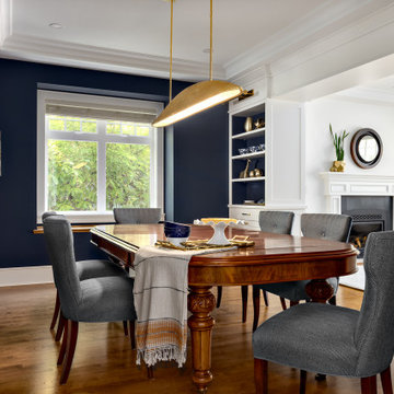
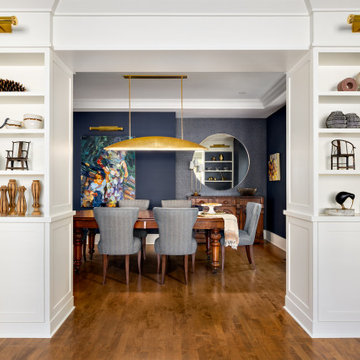
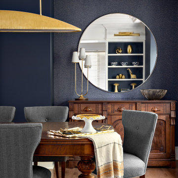
The kitchen may be the heart of a home, but the dining room is where the family gathers to enjoy special occasions, create and pass on traditions, and savour each other’s company free from distractions. The family behind this particular dining room enjoys doing just that.
When they are not traveling the world, Matthew and Anna (names changed) love to cook meals at home with their teenage daughter, entertain family and friends, and live amongst their cherished travel souvenirs and heirlooms. Their dining room, however, was far from the perfect backdrop for these experiences.
Before: Dining Room:
When Matthew and Anna contacted us, they imagined a space that would comfortably seat 8 to 10 people and incorporate their beautiful inherited dining table and sideboard in a fresh, modern way. Above all, they wanted a dining room that they would feel proud to share.
They worked with us to design, lightly renovate, and furnish their dining room and adjacent living space. Now, the room is nothing short of inviting and elevated.
Classic Yet Contemporary Dining Room:
Viewed from the living area, the dining room is a hidden gem waiting to be discovered. Matthew and Anna wanted dark blue for the walls, and we couldn’t have been happier to find the perfect shade for them. By leaning darker, this rich blue creates the perception of depth, making the room feel enticing, comfortable and secluded.
The previous built-ins were underwhelming and lacked function, so we designed wider, taller, double sided cabinets that integrated the existing bulk-head, and then accessorized the shelves with the family’s travel finds, books, and decor. Topping these units with brass art lights not only blends contemporary and traditional styles, it also draws attention to the dining table’s modern show-stopping chandelier. You can’t miss it.
Inside the dining room, the effect is equally impressive: enveloping yet spacious, warm yet cool, classic yet contemporary. We incorporated their heirloom pieces seamlessly into the design thanks to the 1:2 ratio. For every traditional piece, we introduced two more modern or contemporary pieces — clean lines, subtle curves, and lustrous brass hardware. The result is a collected yet updated look.
In any room with dark walls, lighting is of the utmost importance. We placed a mirror adjacent to the window to reflect natural light throughout the room, and we kept the trim and ceiling white for brightness. To provide maximum versatility, we provided multiple light sources that can be adjusted to create different levels of light to suit any mood or occasion. These include: pot lights and a chandelier on dimmers, a sculptural trilight lamp on the sideboard, and art lights on the bookcases and above important art pieces.
The built-ins have another surprise waiting inside this special dining room:
Double-sided built-ins: dining room shelving and living room shelving.
Rather than keep them white like we did in the living room, we painted the back wall of the book cases the same dark blue as the walls in the rest of the room. This reduces the contrast with the surrounding walls and emphasizes the white outline of the cabinets. We also love the dark blue walls’ role as a beautiful backdrop for this family’s treasures. The brass accessories and hand-painted vases and bowls feel like part of the experience.
Of course, what is beauty without function? It may not look like it, but the base storage is only accessible from the dining room side. The units include deep cabinets for storing serving ware, as well as another delightful surprise: silverware drawers lined in luxurious navy velvet!
Lastly, we designed this beautiful nook for their heirloom sideboard. From afar, the wall looks as if it has texture and perhaps a touch of shine. Up close, you will notice that it is actually navy blue wallpaper with tiny golden dots. This unique touch accentuates the brass in the room touches throughout the space.. The room feels curated, contemporary, and full of character.
Words of Praise:
Anna and Matthew were thrilled with their new dining room and with the design process itself, which is always the highest compliment. They said:
“Working with Lori and her team at Simply Home Decorating was a great experience. The design they came up with was both beautiful and practical for our family. Renovations can be stressful but working with Simply Home made the process much more pleasant.
“Simply Home's project management and their longstanding relationships with reliable trades meant we could relax, knowing that everything was taken care of. If an issue arose, the entire Simply Home team was quick to address it. They were excellent at communicating with us—we never felt like we didn't know what was going on. We would highly recommend working with Simply Home Decorating.”
Thank you, Matthew and Anna! We are honoured to have been part of your journey and wish your family many happy memories in these new spaces.
Now, is it your turn? Are you ready to uncover the hidden potential in your home? If so, contact us here to start the conversation or download my guide Uncovering the Hidden Potential in Your Home below to learn more about what we can do for you.
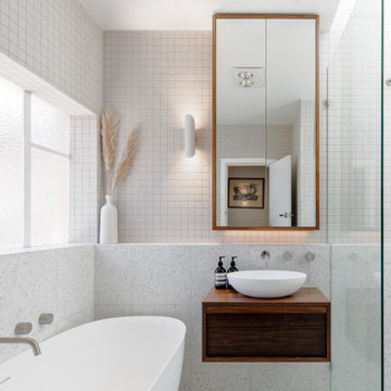
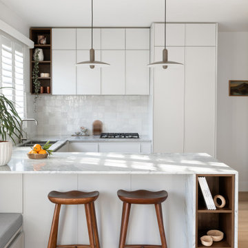
Nestled inside a mid-century apartment block, our home was given a sensitive renovation to uncover and celebrate its original features. Walnut timbers, brushed nickel, small square tiles, and terrazzo stone were some of the finishes that were chosen to exemplify this.
I chose to furnish the apartment with a combination of modern and vintage mid-century furniture, to showcase the modernisation of the classic craftsmanship of true mid-century furniture. We wanted to achieve a timeless finish which meant to us that the finishes needed to not only link back to the context of the existing home but also to stand the test of time for now and into the future.
Venato Forte, a natural stone product from Signorino, was selected for it’s visual similarity to the shadows & light that danced across the kitchen in the afternoon. Linking the finishes to their context would allow the project to achieve cohesion and harmony.
The kitchen needed to be optimal in terms of storage and practicality, whist also allowing observation and interaction with family members within the other common living areas. Uncovering the old kitchen room meant that building permits and significant construction would be required, however the reconnection with the whole family made it truly worthwhile.
The selection of subtle grey tones ranging in contrast were chosen as a reflection of the light and shadow at play in this area of the home, while the walnut timber and brushed nickel were selected as a nod to the mid-century origins of the apartment.
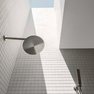
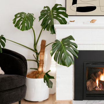
While the kitchen space was built reconnect the family, the bathroom was intended for the opposite, to provide a space for solitary bliss. The skylight allowed for stargazing at night, while the full height finishes were intended to envelop and hold the space. The bathtub would become a place for restoration and rest, its muted palette intended to harmonise and open up the space.
Our Brighton East project exemplifies our ethos: transforming the everyday routine into moments of calm, serenity, and mindfulness.

This backyard project was beautifully built to look original to the home. The brick and trim match perfectly, and the addition of the outdoor kitchen into this covered patio is seamless. The custom color of this flagstone style of stamped concrete is the perfect combination with the brick.
The outdoor kitchen is complete with a grilling center, mini fridge, burners, and ample storage.
This space can easily entertain as a TV was added to a gorgeous tongue and groove wall. With shaded space and uncovered patio extension, this backyard is ideal for day or night! Our clients can enjoy stargazing on the uncovered portion or watch the game with an early evening meal underneath the covered patio.
Copper Falls was featured in the 2007 Seattle Street of Dreams. Photos by Bob Greenspan.
Inspiration for a timeless home design remodel in Portland
Inspiration for a timeless home design remodel in Portland
The kitchen may be the heart of a home, but the dining room is where the family gathers to enjoy special occasions, create and pass on traditions, and savour each other’s company free from distractions. The family behind this particular dining room enjoys doing just that.
When they are not traveling the world, Matthew and Anna (names changed) love to cook meals at home with their teenage daughter, entertain family and friends, and live amongst their cherished travel souvenirs and heirlooms. Their dining room, however, was far from the perfect backdrop for these experiences.
Before: Dining Room:
When Matthew and Anna contacted us, they imagined a space that would comfortably seat 8 to 10 people and incorporate their beautiful inherited dining table and sideboard in a fresh, modern way. Above all, they wanted a dining room that they would feel proud to share.
They worked with us to design, lightly renovate, and furnish their dining room and adjacent living space. Now, the room is nothing short of inviting and elevated.
Classic Yet Contemporary Dining Room:
Viewed from the living area, the dining room is a hidden gem waiting to be discovered. Matthew and Anna wanted dark blue for the walls, and we couldn’t have been happier to find the perfect shade for them. By leaning darker, this rich blue creates the perception of depth, making the room feel enticing, comfortable and secluded.
The previous built-ins were underwhelming and lacked function, so we designed wider, taller, double sided cabinets that integrated the existing bulk-head, and then accessorized the shelves with the family’s travel finds, books, and decor. Topping these units with brass art lights not only blends contemporary and traditional styles, it also draws attention to the dining table’s modern show-stopping chandelier. You can’t miss it.
Inside the dining room, the effect is equally impressive: enveloping yet spacious, warm yet cool, classic yet contemporary. We incorporated their heirloom pieces seamlessly into the design thanks to the 1:2 ratio. For every traditional piece, we introduced two more modern or contemporary pieces — clean lines, subtle curves, and lustrous brass hardware. The result is a collected yet updated look.
In any room with dark walls, lighting is of the utmost importance. We placed a mirror adjacent to the window to reflect natural light throughout the room, and we kept the trim and ceiling white for brightness. To provide maximum versatility, we provided multiple light sources that can be adjusted to create different levels of light to suit any mood or occasion. These include: pot lights and a chandelier on dimmers, a sculptural trilight lamp on the sideboard, and art lights on the bookcases and above important art pieces.
The built-ins have another surprise waiting inside this special dining room:
Double-sided built-ins: dining room shelving and living room shelving.
Rather than keep them white like we did in the living room, we painted the back wall of the book cases the same dark blue as the walls in the rest of the room. This reduces the contrast with the surrounding walls and emphasizes the white outline of the cabinets. We also love the dark blue walls’ role as a beautiful backdrop for this family’s treasures. The brass accessories and hand-painted vases and bowls feel like part of the experience.
Of course, what is beauty without function? It may not look like it, but the base storage is only accessible from the dining room side. The units include deep cabinets for storing serving ware, as well as another delightful surprise: silverware drawers lined in luxurious navy velvet!
Lastly, we designed this beautiful nook for their heirloom sideboard. From afar, the wall looks as if it has texture and perhaps a touch of shine. Up close, you will notice that it is actually navy blue wallpaper with tiny golden dots. This unique touch accentuates the brass in the room touches throughout the space.. The room feels curated, contemporary, and full of character.
Words of Praise:
Anna and Matthew were thrilled with their new dining room and with the design process itself, which is always the highest compliment. They said:
“Working with Lori and her team at Simply Home Decorating was a great experience. The design they came up with was both beautiful and practical for our family. Renovations can be stressful but working with Simply Home made the process much more pleasant.
“Simply Home's project management and their longstanding relationships with reliable trades meant we could relax, knowing that everything was taken care of. If an issue arose, the entire Simply Home team was quick to address it. They were excellent at communicating with us—we never felt like we didn't know what was going on. We would highly recommend working with Simply Home Decorating.”
Thank you, Matthew and Anna! We are honoured to have been part of your journey and wish your family many happy memories in these new spaces.
Now, is it your turn? Are you ready to uncover the hidden potential in your home? If so, contact us here to start the conversation or download my guide Uncovering the Hidden Potential in Your Home below to learn more about what we can do for you.
Nestled inside a mid-century apartment block, our home was given a sensitive renovation to uncover and celebrate its original features. Walnut timbers, brushed nickel, small square tiles, and terrazzo stone were some of the finishes that were chosen to exemplify this.
I chose to furnish the apartment with a combination of modern and vintage mid-century furniture, to showcase the modernisation of the classic craftsmanship of true mid-century furniture. We wanted to achieve a timeless finish which meant to us that the finishes needed to not only link back to the context of the existing home but also to stand the test of time for now and into the future.
Venato Forte, a natural stone product from Signorino, was selected for it’s visual similarity to the shadows & light that danced across the kitchen in the afternoon. Linking the finishes to their context would allow the project to achieve cohesion and harmony.
The kitchen needed to be optimal in terms of storage and practicality, whist also allowing observation and interaction with family members within the other common living areas. Uncovering the old kitchen room meant that building permits and significant construction would be required, however the reconnection with the whole family made it truly worthwhile.
The selection of subtle grey tones ranging in contrast were chosen as a reflection of the light and shadow at play in this area of the home, while the walnut timber and brushed nickel were selected as a nod to the mid-century origins of the apartment.
While the kitchen space was built reconnect the family, the bathroom was intended for the opposite, to provide a space for solitary bliss. The skylight allowed for stargazing at night, while the full height finishes were intended to envelop and hold the space. The bathtub would become a place for restoration and rest, its muted palette intended to harmonise and open up the space.
Our Brighton East project exemplifies our ethos: transforming the everyday routine into moments of calm, serenity, and mindfulness.
This backyard project was beautifully built to look original to the home. The brick and trim match perfectly, and the addition of the outdoor kitchen into this covered patio is seamless. The custom color of this flagstone style of stamped concrete is the perfect combination with the brick.
The outdoor kitchen is complete with a grilling center, mini fridge, burners, and ample storage.
This space can easily entertain as a TV was added to a gorgeous tongue and groove wall. With shaded space and uncovered patio extension, this backyard is ideal for day or night! Our clients can enjoy stargazing on the uncovered portion or watch the game with an early evening meal underneath the covered patio.
The kitchen may be the heart of a home, but the dining room is where the family gathers to enjoy special occasions, create and pass on traditions, and savour each other’s company free from distractions. The family behind this particular dining room enjoys doing just that.
When they are not traveling the world, Matthew and Anna (names changed) love to cook meals at home with their teenage daughter, entertain family and friends, and live amongst their cherished travel souvenirs and heirlooms. Their dining room, however, was far from the perfect backdrop for these experiences.
Before: Dining Room:
When Matthew and Anna contacted us, they imagined a space that would comfortably seat 8 to 10 people and incorporate their beautiful inherited dining table and sideboard in a fresh, modern way. Above all, they wanted a dining room that they would feel proud to share.
They worked with us to design, lightly renovate, and furnish their dining room and adjacent living space. Now, the room is nothing short of inviting and elevated.
Classic Yet Contemporary Dining Room:
Viewed from the living area, the dining room is a hidden gem waiting to be discovered. Matthew and Anna wanted dark blue for the walls, and we couldn’t have been happier to find the perfect shade for them. By leaning darker, this rich blue creates the perception of depth, making the room feel enticing, comfortable and secluded.
The previous built-ins were underwhelming and lacked function, so we designed wider, taller, double sided cabinets that integrated the existing bulk-head, and then accessorized the shelves with the family’s travel finds, books, and decor. Topping these units with brass art lights not only blends contemporary and traditional styles, it also draws attention to the dining table’s modern show-stopping chandelier. You can’t miss it.
Inside the dining room, the effect is equally impressive: enveloping yet spacious, warm yet cool, classic yet contemporary. We incorporated their heirloom pieces seamlessly into the design thanks to the 1:2 ratio. For every traditional piece, we introduced two more modern or contemporary pieces — clean lines, subtle curves, and lustrous brass hardware. The result is a collected yet updated look.
In any room with dark walls, lighting is of the utmost importance. We placed a mirror adjacent to the window to reflect natural light throughout the room, and we kept the trim and ceiling white for brightness. To provide maximum versatility, we provided multiple light sources that can be adjusted to create different levels of light to suit any mood or occasion. These include: pot lights and a chandelier on dimmers, a sculptural trilight lamp on the sideboard, and art lights on the bookcases and above important art pieces.
The built-ins have another surprise waiting inside this special dining room:
Double-sided built-ins: dining room shelving and living room shelving.
Rather than keep them white like we did in the living room, we painted the back wall of the book cases the same dark blue as the walls in the rest of the room. This reduces the contrast with the surrounding walls and emphasizes the white outline of the cabinets. We also love the dark blue walls’ role as a beautiful backdrop for this family’s treasures. The brass accessories and hand-painted vases and bowls feel like part of the experience.
Of course, what is beauty without function? It may not look like it, but the base storage is only accessible from the dining room side. The units include deep cabinets for storing serving ware, as well as another delightful surprise: silverware drawers lined in luxurious navy velvet!
Lastly, we designed this beautiful nook for their heirloom sideboard. From afar, the wall looks as if it has texture and perhaps a touch of shine. Up close, you will notice that it is actually navy blue wallpaper with tiny golden dots. This unique touch accentuates the brass in the room touches throughout the space.. The room feels curated, contemporary, and full of character.
Words of Praise:
Anna and Matthew were thrilled with their new dining room and with the design process itself, which is always the highest compliment. They said:
“Working with Lori and her team at Simply Home Decorating was a great experience. The design they came up with was both beautiful and practical for our family. Renovations can be stressful but working with Simply Home made the process much more pleasant.
“Simply Home's project management and their longstanding relationships with reliable trades meant we could relax, knowing that everything was taken care of. If an issue arose, the entire Simply Home team was quick to address it. They were excellent at communicating with us—we never felt like we didn't know what was going on. We would highly recommend working with Simply Home Decorating.”
Thank you, Matthew and Anna! We are honoured to have been part of your journey and wish your family many happy memories in these new spaces.
Now, is it your turn? Are you ready to uncover the hidden potential in your home? If so, contact us here to start the conversation or download my guide Uncovering the Hidden Potential in Your Home below to learn more about what we can do for you.
Showing Results for "Uncover"
The entirely redone hillside, with large flagstone patio, uncovered stairs to a second level, and an uncovered pathway through the hillside.
Example of a trendy exterior home design in Los Angeles
Example of a trendy exterior home design in Los Angeles
In brief
Location, location, location
When looking for your perfect home where you can put down your grass roots and start a family there are many ‘must haves’ that we all have on our wish lists. The obvious contenders are price and location with many other niceties, like the number of bedrooms, layout and decor taking a back seat. As we all know, location can sell a home to those who strive to be in the right area, for transport links, local amenities and the all-important school catchment areas.
Like many other families throughout the UK our clients chose their house for its excellent location. Just ten minutes from the centre of Stafford by car, our client’s house is in a popular and sought-after suburb of the town for couples and families alike. They have always loved the location of their house for its easy access to work, schools, leisure facilities and social connections, but they were becoming increasingly frustrated with the layout of the ground floor of their home.
It’s inevitable that families will evolve and our needs from our properties will change too. Since the young family of four moved to their large four-bedroom detached house a few years ago, their property has been unable to meet their lifestyle needs and living patterns.
Although their property has adequate bedroom space for them and their two children, the layout of the downstairs living area was not functional and it obstructed their everyday life, making entertaining and family gatherings difficult.
Our First Meeting
Upon our initial consultation with our clients it was clear from the outset why they sought to make changes to the layout of their house. The property had been extended to create extra space by the previous owners, but unfortunately the design and build hadn’t been executed well at all. The rooms and layout were awkward in size and shape and it didn’t allow the family to come together and enjoy their home. They had the floor space, but it was sectioned off into separate rooms, some without a purpose.
The garden surrounds the house on all three sides and is of a good size in its entirety with different areas on each aspect. We could clearly see that the house itself didn’t address any particular aspect of the garden in any way.
Moving to a new house wasn’t an option, the family were happy with the location and size of the property. What they wanted was a modern, functional, stylish space for everyday family life, with the flexibility to accommodate their large extended family when needed and to ultimately add value to their property.
We were appointed by our clients to create a design solution to redesign the ground floor living area with a modern, light filled, open plan space that connects with the garden. It was clear from outset that our design intention was to break down the room barriers and to respond to the needs of the family, supporting their lifestyle now and for the future, bringing them together and creating a house they could call a home.
Delivering a project on time and within our client’s budget are always a top priority for our team. The family decided to stay in their house during construction, therefore it was even more essential to minimise the level of disruption to their daily lifestyle with a young family living on site.
The family needed help from our team at Croft Architecture to swiftly and successfully acquire Building Control Approval for their project to progress rapidly, ensuring project completion on time and to their determined budget.
Our Approach
Surveying the site
The client’s home is located on the entrance to a quiet cul-de-sac on a mature, leafy, suburban housing estate. Their home nestles into its well-established site, with ample space between the neighbouring properties and has considerable garden space to the rear and both sides.
During our initial visit we spent a long time with the family observing the existing layout, talking about how they currently live in the property, their annoyances with the house in its current form, how they would like to be able to live in their family home and how they aspired it to feel, look and live.
We walked through the house and it was clear that the existing layout didn’t work downstairs. The house had been extended onto before they had bought the property and the space hadn’t been well thought through in terms of how it would be used effectively.
The rooms directly to the left off the hallway, didn’t really have a proper function. The previously extended space had resulted in the house with too many rooms and subsequently this had led to a series of impractical spaces.
The long and narrow extension was home to a small U-shaped kitchen at the front of the house, which led onto the dining area and then onto a small room at the back of the extension. For the size of the house the kitchen and dining room in a much smaller and narrower area, leaving larger living areas to the rear of property with copious amounts of dead space. The small kitchen was tucked away at the front of the property which made life difficult for our clients to observe their children playing safely in the garden whilst preparing food and carrying out work in the kitchen. On the opposite side of the property there was another old extension which had a step down into it. This living area had a tiled floor and large glazed windows on all sides which made it feel almost like a conservatory.This area was rarely used by the family as it had no real function, plus it was hot in the summer and cold in the winter. It had become an under utilised space.
We walked around the property and it was clear that the house itself didn’t address their private garden space to any particular aspect in any way, meaning that the garden space was under used because of the poor connections.
The family wanted a combined kitchen, dining, lounge space for daily life and also for entertaining their family.
Design Approach
The size of the property presented the opportunity to substantially reconfigure the family home to create a series of dynamic living spaces oriented towards the large, south-facing garden.
Our team suggested removing the little kitchen from the front of the property and re positioning it within the unused glazed space at the back of the house.
The glazed room had internal French doors with a step down into the space separating it from the lounge. We proposed to remove the French doors, level the floor and make it into one room with the existing lounge.
To connect the new open plan kitchen and living space to the rear and side garden sliding and folding doors were the solution, extending the family’s usable living space by creating a seamless indoor-outdoor flow. There was already a patio area there and it made sense for the kitchen to move to the rear of the house to be close to the patio for easy outside dining.
It was therefore logical to retain the existing living space in it's current location next to the new kitchen, maintaining the natural flow of the house for the family after eating and entertaining in the kitchen.
When making decisions regarding the kitchen design, we worked closely with the family. They thoroughly enjoy spending time cooking and entertaining with their large extended family. To assist with their culinary preparations our clients had aspired to have an induction hob within their new kitchen. As they were working through the design with us, they weren’t sure about an induction hob because of different cooking methods required for certain meals that they like to produce. They particularly like making chapatis which require a round pan and a gas hob. We didn’t see this as a problem and suggested having a single gas burner for purely this purpose whilst still installing an induction hob. They decided to go ahead with our idea, choosing a single gas burner and an induction hob, and it looks great!
The existing lounge space had a corner aspect at the rear property that protruded into the garden. Positioned next to the kitchen and dining space it seemed logical to us for the living area to also open out onto the patio, thus connecting the garden to the house on a wider aspect. To enhance the connection between the garden and the living room we thought that a corner door would work extremely well to really open up this space. The clients really liked the design concept to create a feature of the corner with glazed sliding doors that would completely open the house up to the garden. They were excited about the prospect of the allowing huge amounts of natural light into their home and the flexible access it would provide to the garden.
Once the new kitchen, dining and living space had been concluded, we then had to consider what the previous kitchen and dining area was going to be used for within the small, long side extension. We talked with our clients about a few possible uses. We noticed that the family have a piano and few other musical instruments. It made sense for this space to become a quiet part of the house for them to escape to, play music, read and generally relax in a snug area.
To shorten the length of the new music room and make an additional feature in the newly created open plan kitchen, dining and living area, we reclaimed some of the space from the back of the side extension and opened it up to the main open-plan space, thus creating another new snug. We added an additional design feature within the snug by creating a timber window seat. Not only does it provide extra seating, but it’s also created a snug within a snug, a haven for reading, napping and gazing out into the garden.
As part of their brief our clients also wanted a to incorporate a log burner into their newly remodelled home. To connect the new music room and snug to the living space we proposed to position a two-way log burner where the existing gas fire was located. By retaining a fire in the original location it would minimise the disruption and work required to install the wood burner. However, the theory didn’t turn into reality and the new fire resulted in being quite a task to get it to work. When the contractor began to strip back the existing fireplace, they discovered that fitting the pipe within the building was going to be more challenging than they anticipated because of the poorly constructed extension. It was difficult to execute but it was ultimately achieved.
What lies beneath?
It’s not until you uncover the fabric of the building that you fully understand what’s going on underneath. When the contractor exposed the structure of the house, we found out that the property had been poorly constructed, and they uncovered a lot of poor workmanship from the original builders. As the build progressed the inner skin of the extended structure was exposed, we found that it wasn’t actually strong enough and we needed to make it safe in order to proceed. Going forwards we ensured that the structure was safe, and all issues were identified and immediately rectified.
The previous extensions to the house also presented further challenges as the build progressed. We found that the floors between rooms were not level. We wanted to create the appearance of one space rather than lots of chopped up areas. To do so we needed to alter the floor and ceilings to ensure that they were flush right through the new open plan living space. Also, after removing the internal French doors, the down-stand beam where the doors had previously been were subsequently left prominent down from the ceiling. The design required careful planning and attention to detail to achieve the best looking finished results for the client.
For us, in principle our clients’ scheme at the outset was quite a simple project but when the strip out commenced there was actually a more going on underneath that needed attention before the project could start to take shape. A lot of things needed to be considered to make it work structurally and properly for the family.
When the carpet was initially lifted, we found a parquet floor underneath. The family and our team were extremely excited at the prospect of having a traditional parquet floor that could be sanded down and made good. However, when ‘all’ of the carpet was removed only half of the living room had been covered in parquet flooring and the other half was actually a solid concrete floor. Unfortunately, we couldn’t proceed with the flooring and our clients chose another floor finish.
Making connections
Our team at Croft Architecture have created a new, sleek, spacious family ‘hub’ that’s light with clean lines. The open plan space unites the family of four whilst providing the ability to gather the wider family and seamlessly connecting their home with the garden through the new full length sliding doors. Although they now have plenty of space to gather with the family, they also have areas of seclusion to spread out and escape to when needed.
A strong working relationship between our team, the client and Building Control enabled us to gain the necessary permissions promptly. We enjoyed working with the project team and we’re extremely pleased to successfully deliver the completed project. Although it wasn't in accordance with our client’s timescales with the discovery of hidden structural challenges, we spent the time carefully resolving the issues to unsure that our clients home was not only safe, but also looks great and functions perfectly.
37