


Search results for "Second story addition modern" in Home Design Ideas
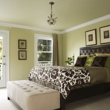
This second story master suite addition, complete with private balcony, is a restful retreat. The clean lined leather bed with silk linens is a comfortable contrast to the antique crystal chandelier, and antique bed side table.
Beth Singer Photography
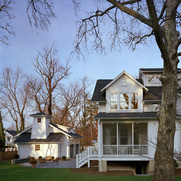
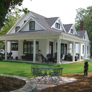
A simple one-story white clapboard 1920s cottage bungalow sat on a narrow straight street with many older homes, all of which meeting the street with a similar dignified approach. This house was the smallest of them all, built in 1922 as a weekend cottage, near the old East Falls Church rail station which provided direct access to Washington D.C. Its diminutive scale, low-pitched roof with the ridge parallel to the street, and lack of superfluous decoration characterized this cottage bungalow. Though the owners fell in love with the charm of the original house, their growing family presented an architectural dilemma: how do you significantly expand a charming little 1920’s Craftsman style house that you love without totally losing the integrity that made it so perfect?
The answer began to formulate after a review of the houses in the turn-of-the-century neighborhood; every older house was two stories tall, each built in a different style, each beautifully proportioned, each much larger than this cottage bungalow. Most of the neighborhood houses had been significantly renovated or expanded. Growing this one-story house would certainly not adversely affect the architectural character of the neighborhood. Given that, the house needed to maintain a diminutive scale in order to appear friendly and avoid a dominating presence.
The simplistic, crisp, honest materials and details of the little house, all painted white, would be saved and incorporated into a new house. Across the front of the house, the three public spaces would be saved, connected along an axis anchored on the left by the living room fireplace, with the dining room and the sitting room to the right. These three rooms are punctuated by thirteen windows, which for this house age and style, really suggests a more modern aesthetic.
Hoachlander Davis Photography
A simple one-story white clapboard 1920s cottage bungalow sat on a narrow straight street with many older homes, all of which meeting the street with a similar dignified approach. This house was the smallest of them all, built in 1922 as a weekend cottage, near the old East Falls Church rail station which provided direct access to Washington D.C. Its diminutive scale, low-pitched roof with the ridge parallel to the street, and lack of superfluous decoration characterized this cottage bungalow. Though the owners fell in love with the charm of the original house, their growing family presented an architectural dilemma: how do you significantly expand a charming little 1920’s Craftsman style house that you love without totally losing the integrity that made it so perfect?
The answer began to formulate after a review of the houses in the turn-of-the-century neighborhood; every older house was two stories tall, each built in a different style, each beautifully proportioned, each much larger than this cottage bungalow. Most of the neighborhood houses had been significantly renovated or expanded. Growing this one-story house would certainly not adversely affect the architectural character of the neighborhood. Given that, the house needed to maintain a diminutive scale in order to appear friendly and avoid a dominating presence.
The simplistic, crisp, honest materials and details of the little house, all painted white, would be saved and incorporated into a new house. Across the front of the house, the three public spaces would be saved, connected along an axis anchored on the left by the living room fireplace, with the dining room and the sitting room to the right. These three rooms are punctuated by thirteen windows, which for this house age and style, really suggests a more modern aesthetic.
Hoachlander Davis Photography.
Find the right local pro for your project
Vienna Addition Skill Construction & Design, LLC, Design/Build a two-story addition to include remodeling the kitchen and connecting to the adjoining rooms, creating a great room for this family of four. After removing the side office and back patio, it was replaced with a great room connected to the newly renovated kitchen with an eating area that doubles as a homework area for the children. There was plenty of space left over for a walk-in pantry, powder room, and office/craft room. The second story design was for an Adult’s Only oasis; this was designed for the parents to have a permitted Staycation. This space includes a Grand Master bedroom with three walk-in closets, and a sitting area, with plenty of room for a king size bed. This room was not been completed until we brought the outdoors in; this was created with the three big picture windows allowing the parents to look out at their Zen Patio. The Master Bathroom includes a double size jet tub, his & her walk-in shower, and his & her double vanity with plenty of storage and two hideaway hampers. The exterior was created to bring a modern craftsman style feel, these rich architectural details are displayed around the windows with simple geometric lines and symmetry throughout. Craftsman style is an extension of its natural surroundings. This addition is a reflection of indigenous wood and stone sturdy, defined structure with clean yet prominent lines and exterior details, while utilizing low-maintenance, high-performance materials. We love the artisan style of intricate details and the use of natural materials of this Vienna, VA addition. We especially loved working with the family to Design & Build a space that meets their family’s needs as they grow.
Complete conversion from single story bungalow to two story home. Addition included an enlarged kitchen with dining area, mud room and side entry, stairway, office area, master suite, 2 additional bedrooms with jack & jill bath, laundry.
This residence was a complete gut renovation of a 4-story row house in Park Slope, and included a new rear extension and penthouse addition. The owners wished to create a warm, family home using a modern language that would act as a clean canvas to feature rich textiles and items from their world travels. As with most Brooklyn row houses, the existing house suffered from a lack of natural light and connection to exterior spaces, an issue that Principal Brendan Coburn is acutely aware of from his experience re-imagining historic structures in the New York area. The resulting architecture is designed around moments featuring natural light and views to the exterior, of both the private garden and the sky, throughout the house, and a stripped-down language of detailing and finishes allows for the concept of the modern-natural to shine.
Upon entering the home, the kitchen and dining space draw you in with views beyond through the large glazed opening at the rear of the house. An extension was built to allow for a large sunken living room that provides a family gathering space connected to the kitchen and dining room, but remains distinctly separate, with a strong visual connection to the rear garden. The open sculptural stair tower was designed to function like that of a traditional row house stair, but with a smaller footprint. By extending it up past the original roof level into the new penthouse, the stair becomes an atmospheric shaft for the spaces surrounding the core. All types of weather – sunshine, rain, lightning, can be sensed throughout the home through this unifying vertical environment. The stair space also strives to foster family communication, making open living spaces visible between floors. At the upper-most level, a free-form bench sits suspended over the stair, just by the new roof deck, which provides at-ease entertaining. Oak was used throughout the home as a unifying material element. As one travels upwards within the house, the oak finishes are bleached to further degrees as a nod to how light enters the home.
The owners worked with CWB to add their own personality to the project. The meter of a white oak and blackened steel stair screen was designed by the family to read “I love you” in Morse Code, and tile was selected throughout to reference places that hold special significance to the family. To support the owners’ comfort, the architectural design engages passive house technologies to reduce energy use, while increasing air quality within the home – a strategy which aims to respect the environment while providing a refuge from the harsh elements of urban living.
This project was published by Wendy Goodman as her Space of the Week, part of New York Magazine’s Design Hunting on The Cut.
Photography by Kevin Kunstadt
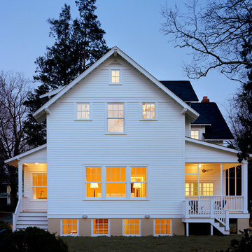
While cleaning out the attic of this recently purchased Arlington farmhouse, an amazing view was discovered: the Washington Monument was visible on the horizon.
The architect and owner agreed that this was a serendipitous opportunity. A badly needed renovation and addition of this residence was organized around a grand gesture reinforcing this view shed. A glassy “look out room” caps a new tower element added to the left side of the house and reveals distant views east over the Rosslyn business district and beyond to the National Mall.
A two-story addition, containing a new kitchen and master suite, was placed in the rear yard, where a crumbling former porch and oddly shaped closet addition was removed. The new work defers to the original structure, stepping back to maintain a reading of the historic house. The dwelling was completely restored and repaired, maintaining existing room proportions as much as possible, while opening up views and adding larger windows. A small mudroom appendage engages the landscape and helps to create an outdoor room at the rear of the property. It also provides a secondary entrance to the house from the detached garage. Internally, there is a seamless transition between old and new.
Photos: Hoachlander Davis Photography
Sponsored
Westerville, OH
T. Walton Carr, Architects
Franklin County's Preferred Architectural Firm | Best of Houzz Winner
Cynthia Karegeannes
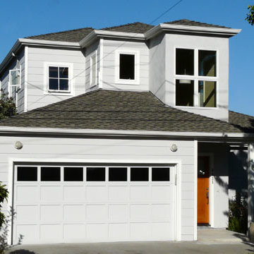
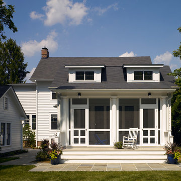
Example of a country white two-story wood exterior home design in Atlanta
Example of a country white two-story wood exterior home design in Atlanta
New primary bedroom with beautiful view of the treetops
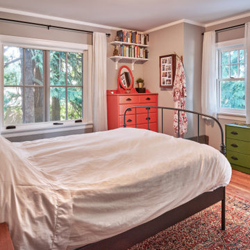
Arts and crafts bedroom photo in Seattle
Arts and crafts bedroom photo in Seattle
This residence was a complete gut renovation of a 4-story row house in Park Slope, and included a new rear extension and penthouse addition. The owners wished to create a warm, family home using a modern language that would act as a clean canvas to feature rich textiles and items from their world travels. As with most Brooklyn row houses, the existing house suffered from a lack of natural light and connection to exterior spaces, an issue that Principal Brendan Coburn is acutely aware of from his experience re-imagining historic structures in the New York area. The resulting architecture is designed around moments featuring natural light and views to the exterior, of both the private garden and the sky, throughout the house, and a stripped-down language of detailing and finishes allows for the concept of the modern-natural to shine.
Upon entering the home, the kitchen and dining space draw you in with views beyond through the large glazed opening at the rear of the house. An extension was built to allow for a large sunken living room that provides a family gathering space connected to the kitchen and dining room, but remains distinctly separate, with a strong visual connection to the rear garden. The open sculptural stair tower was designed to function like that of a traditional row house stair, but with a smaller footprint. By extending it up past the original roof level into the new penthouse, the stair becomes an atmospheric shaft for the spaces surrounding the core. All types of weather – sunshine, rain, lightning, can be sensed throughout the home through this unifying vertical environment. The stair space also strives to foster family communication, making open living spaces visible between floors. At the upper-most level, a free-form bench sits suspended over the stair, just by the new roof deck, which provides at-ease entertaining. Oak was used throughout the home as a unifying material element. As one travels upwards within the house, the oak finishes are bleached to further degrees as a nod to how light enters the home.
The owners worked with CWB to add their own personality to the project. The meter of a white oak and blackened steel stair screen was designed by the family to read “I love you” in Morse Code, and tile was selected throughout to reference places that hold special significance to the family. To support the owners’ comfort, the architectural design engages passive house technologies to reduce energy use, while increasing air quality within the home – a strategy which aims to respect the environment while providing a refuge from the harsh elements of urban living.
This project was published by Wendy Goodman as her Space of the Week, part of New York Magazine’s Design Hunting on The Cut.
Photography by Kevin Kunstadt
Recipient of the 2009 First Place Award for Design Excellence, House Addition Category from the National Association of Remodeling Industry, San Francisco Chapter.
A Second Story Master Bedroom, Master Bath Addition with Entry and Office Loft to an existing Mid-Century Bungalow in Alameda.
The challenge of this project was to fulfill the clients' desire for a unique and modern second story addition that would blend harmoniously with the original 1930s bungalow. On the exterior, the addition appropriates the traditional materials of the existing home, while using contemporary proportions and lines to speak to a modern sensibility. Staggered massing and terraced roofs add to the visual interest and a harmonious balance in the design. On the interior, rich natural materials like oak and mahogany add warmth to the clean lines of the design. The design carefully frames stunning views of the reservoir and surrounding hills. In each room, multi-directional natural light, views and cross-ventilation increase the comfort and expansiveness of the spaces
Photography by: Studio Ceja
Recipient of the 2009 First Place Award for Design Excellence, House Addition Category from the National Association of Remodeling Industry, San Francisco Chapter.
A Second Story Master Bedroom, Master Bath Addition with Entry and Office Loft to an existing Mid-Century Bungalow in Alameda.

Sponsored
Columbus, OH
Dave Fox Design Build Remodelers
Columbus Area's Luxury Design Build Firm | 17x Best of Houzz Winner!
Design by Joanna Hartman
Photography by Ryann Ford
Styling by Adam Fortner
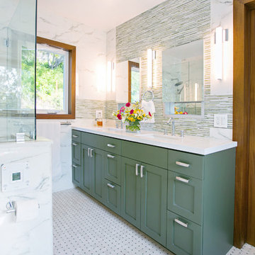
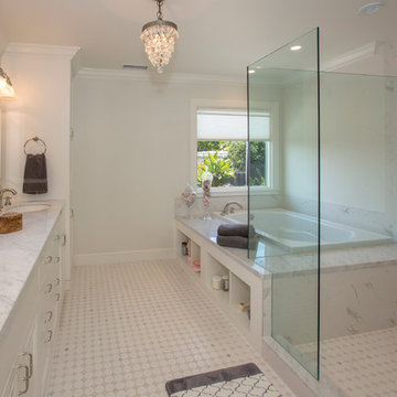
This bath features 3cm Bianco Carrera Marble at the vanities, Restoration Hardware, Ann Sacks "Savoy" 3X6 and 2x4 tile in Dove on shower walls and backsplash, D190 Payette Liner for shower walls and niche, 3" Carrara Hex honed and polished floor and shower floor tile, Benjamin Moore "River Reflections" paint, and Restoration Hardware chrome Dillon sconces.
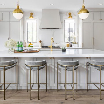
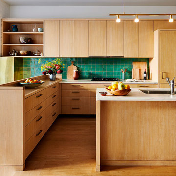
This stylish, family friendly kitchen is also an entertainer’s dream! This young family desired a bright, spacious kitchen that would function just as well for the family of 4 everyday, as it would for hosting large events (in a non-covid world). Apart from these programmatic goals, our aesthetic goal was to accommodate all the function and mess into the design so everything would be neatly hidden away behind beautiful cabinetry and panels.
The navy, bifold buffet area serves as an everyday breakfast and coffee bar, and transforms into a beautiful buffet spread during parties (we’ve been there!). The fridge drawers are great for housing milk and everyday items during the week, and both kid and adult beverages during parties while keeping the guests out of the main cooking zone. Just around the corner you’ll find the high gloss navy bar offering additional beverages, ice machine, and barware storage – cheers!
Super durable quartz with a marbled look keeps the kitchen looking neat and bright, while withstanding everyday wear and tear without a problem. The practical waterfall ends at the island offer additional damage control in bringing that hard surface all the way down to the beautiful white oak floors.
Underneath three large window walls, a built-in banquette and custom table provide a comfortable, intimate dining nook for the family and a few guests while the stunning chandelier ties in nicely with the other brass accents in the kitchen. The thin black window mullions offer a sharp, clean contrast to the crisp white walls and coordinate well with the dark banquette.
Thin, tall windows on either side of the range beautifully frame the stunningly simple, double curvature custom hood, and large windows in the bar/butler’s pantry allow additional light to really flood the space and keep and airy feel. The textured wallpaper in the bar area adds a touch of warmth, drama and interest while still keeping things simple.
This brownstone, located in Harlem, consists of five stories which had been duplexed to create a two story rental unit and a 3 story home for the owners. The owner hired us to do a modern renovation of their home and rear garden. The garden was under utilized, barely visible from the interior and could only be accessed via a small steel stair at the rear of the second floor. We enlarged the owner’s home to include the rear third of the floor below which had walk out access to the garden. The additional square footage became a new family room connected to the living room and kitchen on the floor above via a double height space and a new sculptural stair. The rear facade was completely restructured to allow us to install a wall to wall two story window and door system within the new double height space creating a connection not only between the two floors but with the outside. The garden itself was terraced into two levels, the bottom level of which is directly accessed from the new family room space, the upper level accessed via a few stone clad steps. The upper level of the garden features a playful interplay of stone pavers with wood decking adjacent to a large seating area and a new planting bed. Wet bar cabinetry at the family room level is mirrored by an outside cabinetry/grill configuration as another way to visually tie inside to out. The second floor features the dining room, kitchen and living room in a large open space. Wall to wall builtins from the front to the rear transition from storage to dining display to kitchen; ending at an open shelf display with a fireplace feature in the base. The third floor serves as the children’s floor with two bedrooms and two ensuite baths. The fourth floor is a master suite with a large bedroom and a large bathroom bridged by a walnut clad hall that conceals a closet system and features a built in desk. The master bath consists of a tiled partition wall dividing the space to create a large walkthrough shower for two on one side and showcasing a free standing tub on the other. The house is full of custom modern details such as the recessed, lit handrail at the house’s main stair, floor to ceiling glass partitions separating the halls from the stairs and a whimsical builtin bench in the entry.
Originally built in 1929, this simple two story center hall white wood clapboard colonial satisfied all of the early 20th century requirements; formal front elevation with full porch, central foyer/stair hall bounded by formal rooms, private bedroom space on the second floor, and, no relationship to the backyard.
Americans love their early century houses, but they do not love the way they function, forsaking usable modern first floor spaces such as kitchen, mudroom, family room, powder room, and a strong connection to the back yard.
In this case, the solid house ignored the backyard with its original 1920’s kitchen dumping out onto the left side of the house; there was a total lack of connection. The project program asked for a new kitchen and the other missing pieces, but most importantly, a clear, strong connection to the vast rear lawn with an assemblage of spaces starting with the kitchen flowing into the family room, then flowing into the screened porch that spilled onto the rear porch, and then culminates to the hardscape and softscape of the vast lush lawn.
The new architecture is simple like the house; a new gabled volume of open space for the family room that feels connected and then disengaged from the house by a gasket addition holding the kitchen and utility entrance; a strong center access through the spaces carrying the focus from indoors to outdoors; traditional forms creating a crisp modern aesthetic of material, light, form and detail.
The addition is respectful to the original house, but not without imposing its own place in time, commanding the rear elevation in a diminutive manner.
All photos by Hoachlander Davis Photography.
Showing Results for "Second Story Addition Modern"

Sponsored
Columbus, OH
Dave Fox Design Build Remodelers
Columbus Area's Luxury Design Build Firm | 17x Best of Houzz Winner!
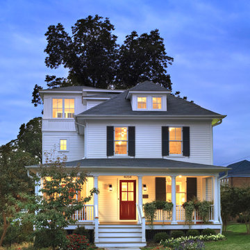
Originally built in 1889 a short walk from the old East Falls Church rail station, the vaguely reminiscent gothic Victorian was a landmark in a neighborhood of late 19th century wood frame homes. The two story house had been changed many times over its 116 year life with most of the changes diminishing the style and integrity of the original home. Beginning during the mid-twentieth century, few of the changes could be seen as improvements. The wonderfully dominate front tower was obscured by a bathroom shed roof addition. The exterior skin was covered with asbestos siding, requiring the removal of any wood detailing projecting from its surface. Poorly designed diminutive additions were added to the rear creating small, awkward, low ceiling spaces that became irrelevant to the modern user. The house was in serious need of a significant renovation and restoration.
A young family purchased the house and immediately realized the inadequacies; sub-par spaces, kitchen, bathrooms and systems. The program for this project was closely linked to aesthetics, function and budget. The program called for significantly enlarging the house with a major new rear addition taking the place of the former small additions. Critically important to the program was to not only protect the integrity of the original house, but to restore and expand the house in such a way that the addition would be seamless. The completed house had to fulfill all of the requirements of a modern house with significant living spaces, including reconfigured foyer, living room and dining room on the first floor and three modified bedrooms on the second floor. On the rear of the house a new addition created a new kitchen, family room, mud room, powder room and back stair hall. This new stair hall connected the new and existing first floor to a new basement recreation room below and a new master bedroom suite with laundry and second bathroom on the second floor.
The entire exterior of the house was stripped to the original sheathing. New wood windows, wood lap siding, wall trim including roof eave and rake trim were installed. Each of the details on the exterior of the house matched the original details. This fact was confirmed by researching the house and studying turn-of-the-century photographs. The second floor addition was removed, facilitating the restoration of the four sided mansard roof tower.
The final design for the house is strong but not overpowering. As a renovated house, the finished product fits the neighborhood, restoring its standing as a landmark, satisfying the owner’s needs for house and home.
Hoachlander Davis Photography
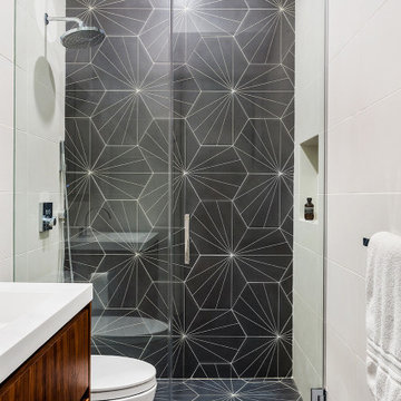
Bathroom - transitional white tile bathroom idea in Santa Barbara with white cabinets, white walls and an undermount sink
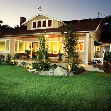
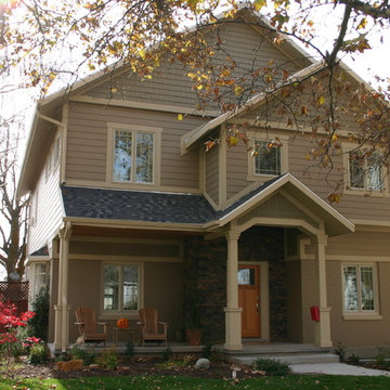
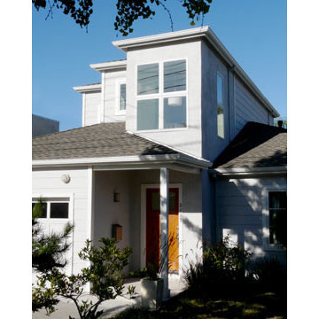
This La Canada home was transformed with a second-story addition, seamlessly installed to the rear. The roof was extended further upward and toward the rear. A master suite, two bedrooms and another bath were added, creating a 900 square-foot addition to the home.
1