


Search results for "Renovate my house" in Home Design Ideas
After six years of living in their Huntley IL home, Chris and Meghan were tired of their dark, dingy, outdated kitchen and it was finally time for a long-anticipated change. “The kitchen is the place where we live, it’s where we do everything,” Meghan said. “It was important that it be a space where we wanted to be.” Meghan loves cooking and enjoys including their girls in healthy meal prepping, this led them to want a brighter, more enjoyable kitchen with increased functionality and improved storage.
For Chris especially, the laundry room was an entirely dysfunctional eyesore. “We had a washer and a dryer, but it was all kind-of cobbled together!” Chris said. “There were always laundry piles everywhere, we weren’t really sure what we wanted to do in there, but it was time for us to make a change.” The mess of the space was stressful every time they walked in the door from the garage each day. Kids’ backpacks and shoes piled up haphazardly in the makeshift boot-bench closet left the family feeling disorganized and stressed. They needed space for folding clothes and locker cubbies to help keep the family organized.
Having known Christine and Todd in the Huntley community for years, Chris and Meghan were familiar with their work. “We already trusted them personally and having seen their projects for years we knew they did top notch work. After we reviewed the initial round of designs, we knew that hiring them was definitely the right choice,” Meghan and Chris said. Although Chris had done a lot of work in their home himself, the kitchen and laundry room renovation was such a large undertaking that he didn’t want to steal time away from his family to spend what would surely be many long weekends doing the job himself. “That would not have been a wise choice for us,” Chris laughed.
“Our designer, Michelle was very, very, easy to work with; anything we wanted to see or weren’t sure about, she went above and beyond to make this easy for us. She was easy to get hold of and always quick to respond,” the couple said. Michelle pulled ideas that mirrored the couple’s taste and style and was adept at directing the couple to limited choices that didn’t overwhelm them and kept the process moving. “I have a hard time making decisions. Michelle made the decision-making process so easy. I loved how she listened to what I liked and then presented three great options for me to choose from,” Meghan said.
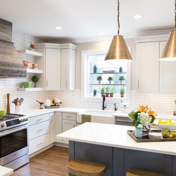
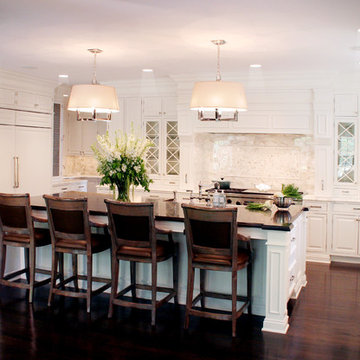
The main objectives for the kitchen were better storage solutions, they wanted the space to reflect their lifestyle and taste, and they wanted it to last for years with low maintenance. One of the first steps in creating a more functional kitchen was relocating the refrigerator, creating an improved workflow for the busy family.
“We didn’t know that we could even move the refrigerator to a new location where it is now, that was something that we never would have thought of,” Chris said. “The new refrigerator location makes the kitchen feel so much bigger. We didn’t add any space, but our whole kitchen with the new design just seems like it’s so much larger than before!” Meghan said.
The perimeter mist colored cabinets helped warm and brighten the entire room, while the graphite colored cabinets on the island added contrast. Using this fresh, clean color palette satisfied the couple’s desire for a bright space that was the exact opposite of what they had before. Organization accessories were also added to the cabinets such as a spice drawer tray and roll outs to create hidden convenience.
“I absolutely love the hidden spices – it makes cooking so much more enjoyable!” Chris said. “And all the pull outs, and the double trash bin, who would think you could get so excited about organization!” the couple said in unison.
One thing they hated in their original kitchen was how dark the space felt. Added lighting on the ceiling with the new light fixtures combined with the lighter cabinetry colors throughout solved this problem. “Our new kitchen has this warm, almost cozy feeling that our old kitchen never had, it’s just a space that I love spending my time in now,” Meghan said. The light airy feeling was accentuated with the use of floating white shelves on either side of the decorative range hood. “We have so much cabinetry space, the new design is amazing we actually have more storage space than we will ever need,” Meghan said.
The island was extended to create more work surface and added space for stool seating. “The new island changes how we live. Now the kids can be in the kitchen with us, doing homework, eating breakfast, and the three of us have special dinners there when Chris is working late,” Meghan said.
The Carrara Marmi Quartz countertops were chosen because they are, not only beautiful, but are made from hard-working material that doesn’t require maintenance. The white subway tile backsplash that wraps to the ceiling behind the focal point cooktop range/hood compliments the crisp white countertops perfectly, while brushed brass hardware and light fixtures keep the design fresh and new.
The couple had a few fears at the beginning of the project, as most homeowners do. Their biggest fear was being out of their kitchen and laundry room for an extended time. The crew made it very easy for the family to work in a limited space keeping the washer and dryer hooked up the majority of the time, and also getting appliances working with minimal downtime.
“They above and beyond accommodated us to get us through the process,” Meghan said. “They did a great job making sure we were as comfortable as possible throughout the process,” Chris added.
“Our project manager DJ did a great job. He was very good at updating us on schedule changes, getting guys in as quickly as possible. Everyone that stepped in the house was nice and did great work,” said Chris. They thought Advance’s carpenter was phenomenal and were impressed when he took a conceptual idea from a photograph and worked with designer Michelle to create a one of a kind range/hood that has become the topic of conversation with friends and family who visit the new kitchen. “He was in our house literally every day for several weeks. He was easy to work with and good at what he did,” Meghan and Chris said.
The focal point of the kitchen; a hand-crafted, custom-built ventilation hood was clad with handpicked reclaimed barnwood. Advance Design’s carpenter built the framework and the cladding to create a one-of-a-kind design element that the couple loves.
“I think it was especially fun for him to create something unique from scratch, showcasing his talent in this area,” Meghan said. “I love that my kitchen is not like everyone else’s. I got to pick out the wood on my hood and watch it being built and was able to choose what pieces of wood went where on it. It’s totally unique.”
Red Oak flooring was toothed-in throughout the kitchen and the rest of the first floor anywhere changes were made. Then the whole floor was refinished to tone down the orange undertones in the existing floor stain, ultimately changing the color complexion of the entire first floor. The result is a completely new feeling to the entire home.
Renovating the laundry room was extremely important to Meghan and Chris, but they had trouble visualizing what the possibilities were for the seemingly small space. Michelle produced beautiful 3D illustrations that helped them envision the space in a whole new way.
“I must have told Michelle 100 times that I am a visual person, seeing the designs in 3D made it so easy to make decisions and see what we could really do with our space,” Meghan said.
A dividing wall and doorway were removed between the existing laundry room and hallway formerly containing a coat closet, providing space to design specialized graphite colored cabinetry matching the kitchen island to house custom storage cubbies for each family member. Adding the tall utility cabinetry in the new laundry area helped solve the storage issue, tucking away cleaning supplies, household items, and even the cat got its own cubby.
“I love how everything is now hidden in its own space. I can’t tell you how much I hated coming home and seeing everything sitting around on counters,” Chris said.
Electrical outlets were planned for the inside of utility cabinets, so devices could charge in hidden locations. Stacking the washer and dryer allowed for wider countertop space to provide a folding area and a special space for clothes to hang. “The way I do laundry has been completely transformed! I can actually fold clothes and hang them now right out of the washer and dryer,” Meghan said.
“The end result in the kitchen and the laundry/mud room was an updated light and bright space, with a smarter work flow that better meets the needs of this family,” Michelle said.
“I would totally recommend Advance Design,” Meghan said. “Sometimes I sit and just look at my kitchen and laundry room and think ‘Wow, I can’t believe I get to live here!’ It’s an understatement to say we love our new space.”
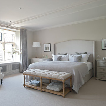
Example of a huge farmhouse master carpeted bedroom design in Gloucestershire with gray walls
Jacob Lilley Architects
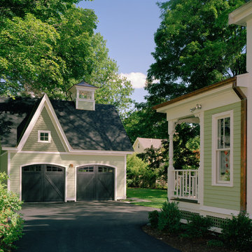
Location: Concord, MA, USA
The renovation to this classic Victorian House included and an expansion of the current kitchen, family room and breakfast area. These changes allowed us to improve the existing rear elevation and create a new backyard patio. A new, detached two-car carriage house was designed to compliment the main house and provide some much needed storage.
Find the right local pro for your project
renovation and addition / builder - EODC, LLC.
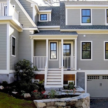
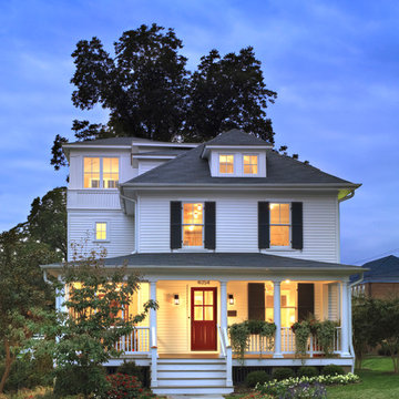
Mid-sized elegant gray three-story wood house exterior photo in Boston with a shingle roof
Mid-sized elegant gray three-story wood house exterior photo in Boston with a shingle roof
The restoration of this 200 year old home was inspired by a Greek revival style, characteristic of early American architecture. A local housewright and historian worked together with Daniel Contelmo during the restoration in order to preserve the home's antiquity. Most of the foundation remains the original fieldstone, and the exposed hand-hewn beams were carefully removed, restored, and replaced. Traditional Pine Plains windows and a wrap-around porch display the pastoral 10 acre site, complete with lake and Catskill mountain views. Although the interior of the house was completely renovated, a New-Old house technique was used by distressing 20 inch-wide floorboards, installing two Rumford fireplaces, and using milk paint on cabinetry. Prior to renovating the home a magnificent timberframe barn was erected in the location where an original 1800s barn had burned down 100 years previously.
"My Plaster finishes took me all the way to Dubai!! I'm back and ready to rock for you!! This finish is "Tuscany" from Texston Co. you'll never find a better plaster company!!!!!
Reload the page to not see this specific ad anymore
The house was a traditional Foursquare. The heavy Mission-style roof parapet, oppressive dark porch and interior trim along with an unfortunate addition did not foster a cheerful lifestyle. Upon entry, the immediate focus of the Entry Hall was an enclosed staircase which arrested the flow and energy of the home. As you circulated through the rooms of the house it was apparent that there were numerous dead ends. The previous addition did not compliment the house, in function, scale or massing.
AIA Gold Medal Winner for Interior Architectural Element.
For the whole story visit www.clawsonarchitects.com
Charles Hilton Architects & Renee Byers LAPC
From grand estates, to exquisite country homes, to whole house renovations, the quality and attention to detail of a "Significant Homes" custom home is immediately apparent. Full time on-site supervision, a dedicated office staff and hand picked professional craftsmen are the team that take you from groundbreaking to occupancy. Every "Significant Homes" project represents 45 years of luxury homebuilding experience, and a commitment to quality widely recognized by architects, the press and, most of all....thoroughly satisfied homeowners. Our projects have been published in Architectural Digest 6 times along with many other publications and books. Though the lion share of our work has been in Fairfield and Westchester counties, we have built homes in Palm Beach, Aspen, Maine, Nantucket and Long Island.
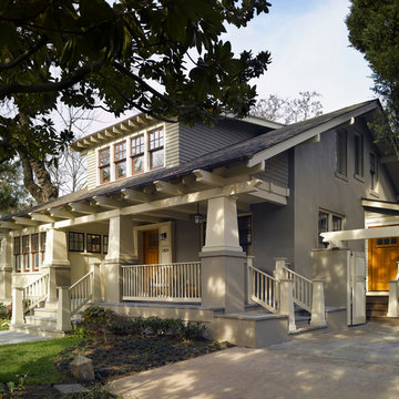
The bungalow after renovation. You can see two of the upper gables that were added but still fit the size and feel of the home. Soft green siding color with gray sash allows the blue of the door to pop.
Photography by Josh Vick
LEED Certified renovation of existing house.
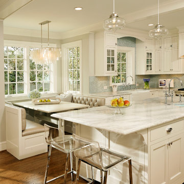
Elegant kitchen photo in DC Metro with mosaic tile backsplash, quartzite countertops, a farmhouse sink, recessed-panel cabinets, white cabinets, blue backsplash and white countertops
Elegant kitchen photo in DC Metro with mosaic tile backsplash, quartzite countertops, a farmhouse sink, recessed-panel cabinets, white cabinets, blue backsplash and white countertops
This whole house renovation done by Harry Braswell Inc. used Virginia Kitchen's design services (Erin Hoopes) and materials for the bathrooms, laundry and kitchens. The custom millwork was done to replicate the look of the cabinetry in the open concept family room. This completely custom renovation was eco-friend and is obtaining leed certification.
Photo's courtesy Greg Hadley
Construction: Harry Braswell Inc.
Kitchen Design: Erin Hoopes under Virginia Kitchens
The Cleveland Park neighborhood of Washington, D.C boasts some of the most beautiful and well maintained bungalows of the late 19th century. Residential streets are distinguished by the most significant craftsman icon, the front porch.
Porter Street Bungalow was different. The stucco walls on the right and left side elevations were the first indication of an original bungalow form. Yet the swooping roof, so characteristic of the period, was terminated at the front by a first floor enclosure that had almost no penetrations and presented an unwelcoming face. Original timber beams buried within the enclosed mass provided the
only fenestration where they nudged through. The house,
known affectionately as ‘the bunker’, was in serious need of
a significant renovation and restoration.
A young couple purchased the house over 10 years ago as
a first home. As their family grew and professional lives
matured the inadequacies of the small rooms and out of date systems had to be addressed. The program called to significantly enlarge the house with a major new rear addition. The completed house had to fulfill all of the requirements of a modern house: a reconfigured larger living room, new shared kitchen and breakfast room and large family room on the first floor and three modified bedrooms and master suite on the second floor.
Front photo by Hoachlander Davis Photography.
All other photos by Prakash Patel.
Reload the page to not see this specific ad anymore
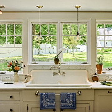
This salvaged kitchen sink was found awhile ago by the client who new she wanted to use it if ever she renovated. Integrated beautifully into the Danby marble countertop and backsplash with new fixtures it is a real joy to clean up.
This kitchen was formerly a dark paneled, cluttered, divided space with little natural light. By eliminating partitions and creating an open floorplan, as well as adding modern windows with traditional detailing, providing lovingly detailed built-ins for the clients extensive collection of beautiful dishes, and lightening up the color palette we were able to create a rather miraculous transformation.
Renovation/Addition. Rob Karosis Photography
When my client had to move from her company office to work at home, she set up in the dining room. Despite her best efforts, this was not the long-term solution she was looking for. My client realized she needed a dedicated space not on the main floor of the home. On one hand, having your office space right next to the kitchen is handy. On the other hand, it made separating work and home life was not that easy.
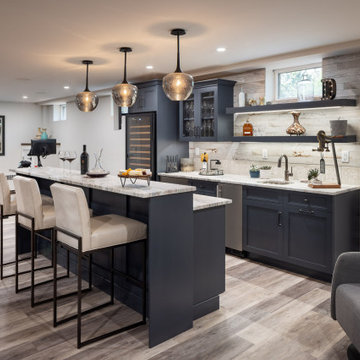
The house was a ranch. In essence, the basement would run entire length of the home. As we came down the steps, we entered a time capsule. The house was built in the 1950’s. The walls were covered with original knotty pine paneling. There was a wood burning fireplace and considering this was a basement, high ceilings. In addition, there was everything her family could not store at their own homes. As we wound though the space, I though “wow this has potential”, Eventually, after walking through the laundry room we came to a small nicely lit room. This would be the office.
My client looked at me and asked what I thought. Undoubtedly, I said, this can be a great workspace, but do you really want to walk through this basement and laundry to get here? Without reservation, my client said where do we start?
Once the design was in place, we started the renovation. The knotty pine paneling had to go. Specifically, to add some insulation and control the dampness and humidity. The laundry room wall was relocated to create a hallway to the office.
At the far end of the room, we designated a workout zone. Weights, mats, exercise bike and television are at the ready for morning or afternoon workouts. The space can be concealed by a folding screen for party time. Doors to an old closet under the stairs were relocated to the workout area for hidden storage. Now we had nice wall for a beautiful console and mirror for storage and serving during parties.
In order to add architectural details, we covered the old ugly support columns with simple recessed millwork panels. This detail created a visual division between the bar area and the seating area in front of the fireplace. The old red brick on the fireplace surround was replaced with stack stone. A mantle was made from reclaimed wood. Additional reclaimed wood floating shelves left and right of the fireplace provides decorative display while maintaining a rustic element balancing the copper end table and leather swivel rocker.
We found an amazing rug which tied all of the colors together further defining the gathering space. Russet and burnt orange became the accent color unifying each space. With a bit of whimsy, a rather unusual light fixture which looks like roots from a tree growing through the ceiling is a conversation piece.
The office space is quite and removed from the main part of the basement. There is a desk large enough for multiple screens, a small bookcase holding office supplies and a comfortable chair for conference calls. Because working from home requires many online meetings, we added a shiplap wall painted in Hale Navy to contrast with the orange fabric on the chair. We finished the décor with a painting from my client’s father. This is the background online visitors will see.
The last and best part of the renovation is the beautiful bar. My client is an avid collector of wine. She already had the EuroCave refrigerator, so I incorporated it into the design. The cabinets are painted Temptation Grey from Benjamin Moore. The counter tops are my favorite hard working quartzite Brown Fantasy. The backsplash is a combination of rustic wood and old tin ceiling like porcelain tiles. Together with the textures of the reclaimed wood and hide poofs balanced against the smooth finish of the cabinets, we created a comfortable luxury for relaxing.
There is ample storage for bottles, cans, glasses, and anything else you can think of for a great party. In addition to the wine storage, we incorporated a beverage refrigerator, an ice maker, and a sink. Floating shelves with integrated lighting illuminate the back bar. The raised height of the front bar provides the perfect wine tasting and paring spot. I especially love the pendant lights which look like wine glasses.
Finally, I selected carpet for the stairs and office. It is perfect for noise reduction. Meanwhile for the overall flooring, I specifically selected a high-performance vinyl plank floor. We often use this product as it is perfect to install on a concrete floor. It is soft to walk on, easy to clean and does not reduce the overall height of the space.
In the design stages many details were incorporated in this classic kitchen to give it dimension since the surround cabinets, counters and backsplash were white. Polished nickel plumbing, hardware and custom grilles on feature cabinets along with the island pendants add shine, while finer details such as inset doors, furniture kicks on non-working areas and lofty crown details add a layering effect in the millwork. Surround counters as well as 3" x 6" backsplash tile are Calacutta Gold stone, while island counter surface is walnut. Conveniences include a 60" Wolf range, a 36" Subzero refrigerator and freezer and two farmhouse sinks by Kallista. The kitchen also boasts two dishwashers (one in the island and one to the right of the sink cabinet under the window) and a coffee bar area with a built-in Miele. Photo by Pete Maric.
Who lives there: Asha Mevlana and her Havanese dog named Bali
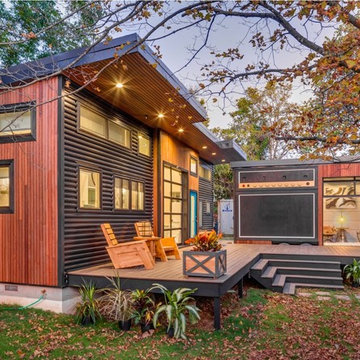
Location: Fayetteville, Arkansas
Size: Main house (400 sq ft), Trailer (160 sq ft.), 1 loft bedroom, 1 bath
What sets your home apart: The home was designed specifically for my lifestyle.
My inspiration: After reading the book, "The Life Changing Magic of Tidying," I got inspired to just live with things that bring me joy which meant scaling down on everything and getting rid of most of my possessions and all of the things that I had accumulated over the years. I also travel quite a bit and wanted to live with just what I needed.
About the house: The L-shaped house consists of two separate structures joined by a deck. The main house (400 sq ft), which rests on a solid foundation, features the kitchen, living room, bathroom and loft bedroom. To make the small area feel more spacious, it was designed with high ceilings, windows and two custom garage doors to let in more light. The L-shape of the deck mirrors the house and allows for the two separate structures to blend seamlessly together. The smaller "amplified" structure (160 sq ft) is built on wheels to allow for touring and transportation. This studio is soundproof using recycled denim, and acts as a recording studio/guest bedroom/practice area. But it doesn't just look like an amp, it actually is one -- just plug in your instrument and sound comes through the front marine speakers onto the expansive deck designed for concerts.
My favorite part of the home is the large kitchen and the expansive deck that makes the home feel even bigger. The deck also acts as a way to bring the community together where local musicians perform. I love having a the amp trailer as a separate space to practice music. But I especially love all the light with windows and garage doors throughout.
Design team: Brian Crabb (designer), Zack Giffin (builder, custom furniture) Vickery Construction (builder) 3 Volve Construction (builder)
Design dilemmas: Because the city wasn’t used to having tiny houses there were certain rules that didn’t quite make sense for a tiny house. I wasn’t allowed to have stairs leading up to the loft, only ladders were allowed. Since it was built, the city is beginning to revisit some of the old rules and hopefully things will be changing.
Photo cred: Don Shreve
Showing Results for "Renovate My House"
Reload the page to not see this specific ad anymore
This residence was a complete gut renovation of a 4-story row house in Park Slope, and included a new rear extension and penthouse addition. The owners wished to create a warm, family home using a modern language that would act as a clean canvas to feature rich textiles and items from their world travels. As with most Brooklyn row houses, the existing house suffered from a lack of natural light and connection to exterior spaces, an issue that Principal Brendan Coburn is acutely aware of from his experience re-imagining historic structures in the New York area. The resulting architecture is designed around moments featuring natural light and views to the exterior, of both the private garden and the sky, throughout the house, and a stripped-down language of detailing and finishes allows for the concept of the modern-natural to shine.
Upon entering the home, the kitchen and dining space draw you in with views beyond through the large glazed opening at the rear of the house. An extension was built to allow for a large sunken living room that provides a family gathering space connected to the kitchen and dining room, but remains distinctly separate, with a strong visual connection to the rear garden. The open sculptural stair tower was designed to function like that of a traditional row house stair, but with a smaller footprint. By extending it up past the original roof level into the new penthouse, the stair becomes an atmospheric shaft for the spaces surrounding the core. All types of weather – sunshine, rain, lightning, can be sensed throughout the home through this unifying vertical environment. The stair space also strives to foster family communication, making open living spaces visible between floors. At the upper-most level, a free-form bench sits suspended over the stair, just by the new roof deck, which provides at-ease entertaining. Oak was used throughout the home as a unifying material element. As one travels upwards within the house, the oak finishes are bleached to further degrees as a nod to how light enters the home.
The owners worked with CWB to add their own personality to the project. The meter of a white oak and blackened steel stair screen was designed by the family to read “I love you” in Morse Code, and tile was selected throughout to reference places that hold special significance to the family. To support the owners’ comfort, the architectural design engages passive house technologies to reduce energy use, while increasing air quality within the home – a strategy which aims to respect the environment while providing a refuge from the harsh elements of urban living.
This project was published by Wendy Goodman as her Space of the Week, part of New York Magazine’s Design Hunting on The Cut.
Photography by Kevin Kunstadt
While cleaning out the attic of this recently purchased Arlington farmhouse, an amazing view was discovered: the Washington Monument was visible on the horizon.
The architect and owner agreed that this was a serendipitous opportunity. A badly needed renovation and addition of this residence was organized around a grand gesture reinforcing this view shed. A glassy “look out room” caps a new tower element added to the left side of the house and reveals distant views east over the Rosslyn business district and beyond to the National Mall.
A two-story addition, containing a new kitchen and master suite, was placed in the rear yard, where a crumbling former porch and oddly shaped closet addition was removed. The new work defers to the original structure, stepping back to maintain a reading of the historic house. The dwelling was completely restored and repaired, maintaining existing room proportions as much as possible, while opening up views and adding larger windows. A small mudroom appendage engages the landscape and helps to create an outdoor room at the rear of the property. It also provides a secondary entrance to the house from the detached garage. Internally, there is a seamless transition between old and new.
Photos: Hoachlander Davis Photography
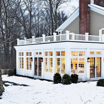
Sun Room.
Exteiror Sunroom
-Photographer: Rob Karosis
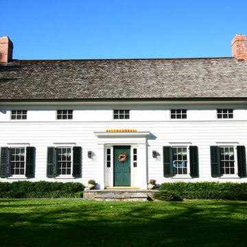
Elegant two-story wood exterior home photo in New York
Elegant two-story wood exterior home photo in New York
1