Shop Products
Houzz Logo Print
kittycat76

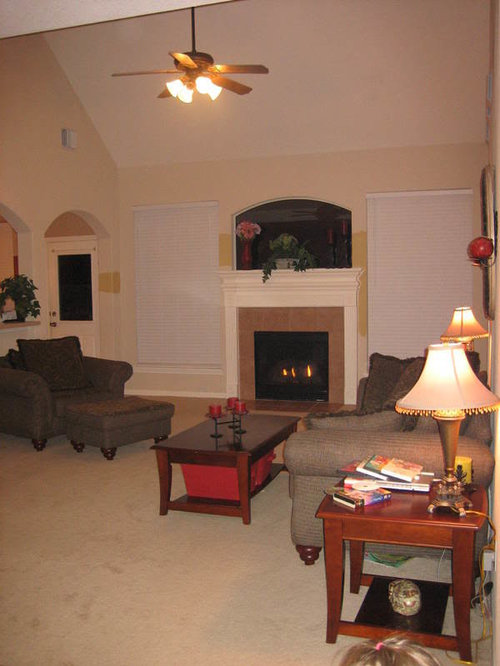
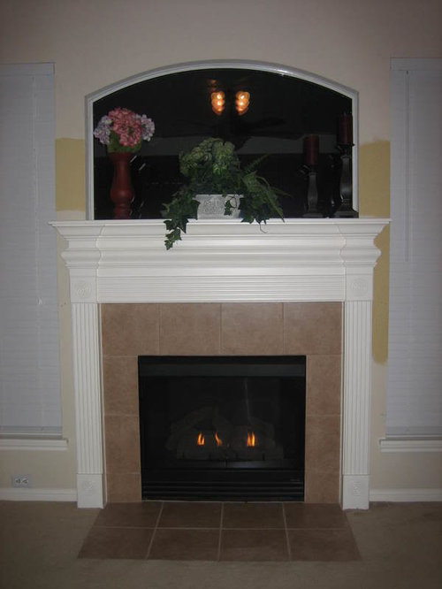
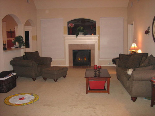
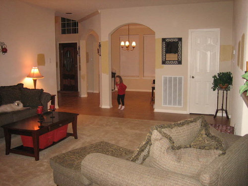
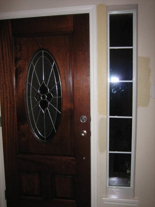
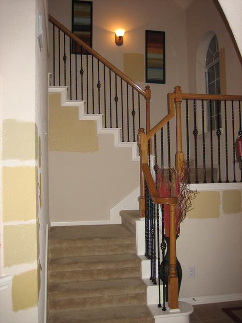
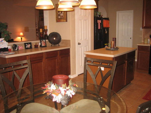
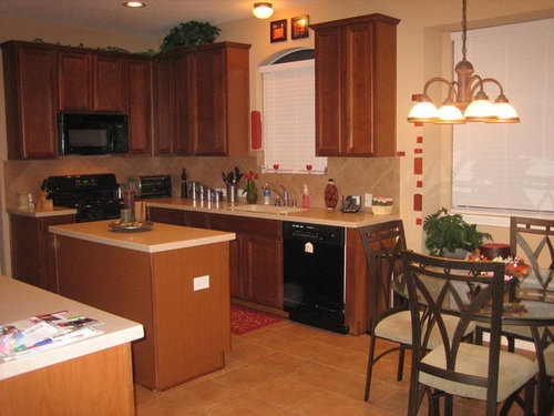
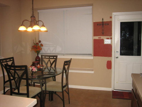
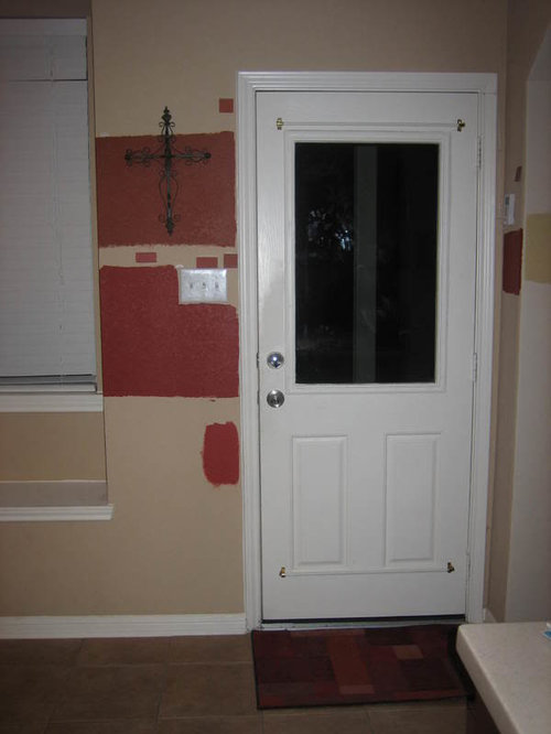
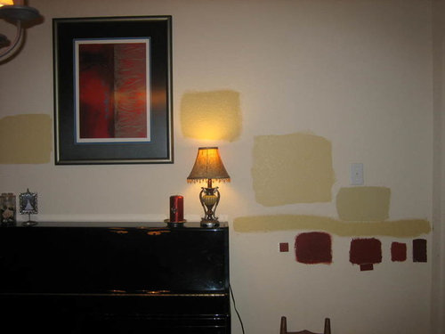
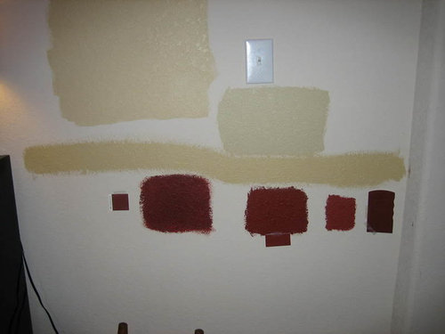
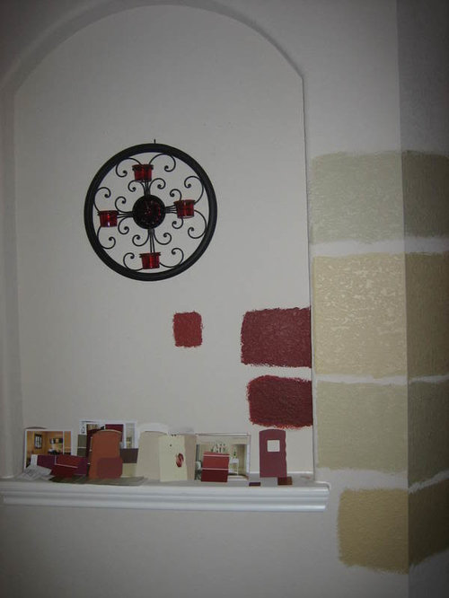
Lots of PICS of paint tests - please help me choose!

kittycat76
16 years ago

OK so my house looks like a patchwork quilt now LOL! I just could not decide with those tiny paint chips so I got several sample quarts and went to town! =) I am pretty set on doing Blonde in the foyer and staircase area, and Restrained Gold in the living room. But I want your opinions based on these pics. Would it look better if I did one or the other all the way through? And which one?

Here is the living room. RG is the color on the right side of the mantle. Keep in mind that we are getting new chocolate brown leather furniture soon (a sectional with chaise) and new tables...

You can see how it opens to the kitchen and to the dining room, so our colors have to flow well:

Here is what Blonde looks like, on the column and by the mirror:

And right next to the door:

And Blonde on the stairs:

The kitchen is a whole different story LOL. I love the tone of the Georgian Brick but it's way too dark. Do you think they could do it at 50% and it would look good? Or do you think the darkness is OK? I am just afraid that with the kitchen being dark and with the LR being Restrained Gold, which is also kind of dark, the whole place is going to be very dark LOL!

Spanish Red on the left and Georgian Brick on the right:

http://i94.photobucket.com/albums/l94/bigcitykitty76/IMG_0623.jpg

Here is what the rest of the kitchen looks like, to give you an idea:

Georgian Brick on top, Spanish Red in middle, Tucson Red on bottom:

And one last thing... The open DR and art niche. Which red goes best with the Restrained Gold? Is it TOO bold to paint the interior of the niche one of these reds, with Blonde surrounding it?

Any advice would be GREATLY appreciated! The painters are coming on Thursday - agh!!!!

Comments (27)

  • msrose
    16 years ago

    I'm going to let the experts may suggestions on the gold colors, because they both look beautiful to me. If I had to pick one of the reds, I'd pick Georgian Brick. Have you looked at Flower Pot by chance?

    Laurie

    Here is a link that might be useful: Flower Pot in Jan's house

  • threedgrad
    16 years ago

    RG and Blonde are good choices for the areas you have chosen. Not feeling the red in the kitchen; the cabinets and floor hold the color. I actually like the kitchen color you have. Does the niche have a built in light? If not the red might be too dark although I like it - pick the rusty/orangiest red you have. I am thinking a green or gold in the kitchen.
    Here is your other pic:

  • mommyto4boys
    16 years ago

    I love your home and color schemes...very simialr to what I plan to do too. I think the blonde & restrained gold look super. I love red, but I'm having a little trouble telling what is what color in the "red" pictures. From what I can tell I like the Georgian Brick. I'm usually not worried about using color and reds, but I'd be a little worried about the red in your kitchen. Your cabinets are so beautiful and I'm concerned that they won't be hidden on the wall and the room may end up too dark. The niche would look awesome and a formal dining room too in the red color. You are doing great and I can't wait to see the finished project.

    Oh...for the kitchen just an idea to use the red color as window treatments and accessories rather than the walls?!!?

  • kittycat76
    Original Author
    16 years ago

    OK, so it's not just me that is worried about the red in my kitchen LOL! There is something about it that just isn't working for me, but I have always wanted a red kitchen so I don't know what to do. Should I just pull the Restrained Gold color through to the kitchen too? I need something that will flow well with RG since the rooms are adjacent and very open. And I can't leave it the color it is, because it doesn't flow well with the RG and Blonde that are going to be next to it. It has more of a whole wheat tone, while the others are mustardy. Any suggestions on specific colors, something other than red, for the kitchen?

    Laurie - I am getting a sample quart of Flower Pot tomorrow, as well as Red Barn. If I can't use them in the kitchen, maybe I will use them beneath the chair rail in the DR. Tomorrow is my last day to decide before the painters come - agh!!

    I forgot to mention that in the DR, we are doing a chair rail with RG above it, and one of those reds below it. I just can't decide which shade of red is best... In that pic, there is SW Crabby Apple on the left, SW Fireweed in the middle, BM Spanish Red next to that, and SW Rustic Red on the right.

  • oceanna
    16 years ago

    Kitty, I could see you pulling the RG all the way through. It's a lovely color. Then you could do something above your kitchen window like one of these, depending on how formal you want to look...

    {{!gwi}}

    {{!gwi}}

  • oceanna
    16 years ago

    Since you like the red, would there be a way you could run another color, say a very pale celedon or a tan 2/3 of the way up the wall, put a chair rail, then put the red above that? That would still give you the warmth, and the color you like, but the red wouldn't be overpowering. I have my tv paused right now on a room with a pale celedon on the lower and a red on the upper part of the wall and whereas it might not sound so great it sure looks great. Could be influenced by the black and tan and olive carpet under the kitchen chairs and table, too.

  • Kathleen McGuire
    16 years ago

    I like the gold with your cabinets. I think putting a red in there won't do your beautiful cabinets justice. As for the niche, I would do a darker color on the same strip of whatever you decide on for the surounding walls. Someone here , can't remeber who right now, has a mustardy gold with cabinets similar to yours. Hopefully they can post a pic. It looks really beautiful. I would bring in touches of red in the WT's. Since you love red, I would put the red in your DR, upper and lower wall. Don't break it up with the mustard. Bring in the mustard in beautiful WT's. Like a mustard and red toile or damask pattern or a solid with contrasting fringe or wide border. In the kitchen, a valance with a red background a mustard mixed in and in the DR the mustard background with red mixed in. A sort of flip flop of each room. It will create a flow from room to room. Hopefully, you can decipher what I am trying to say. :) You have a beautiful home.

  • papercrane
    16 years ago

    I just painted my powder room BM Spanish Red and while it is a beautiful color there, I do not think that it or Tucson Red (a bit higher on the same card) would do well in a large kitchen area. Have you considered BM Tyler Taupe for your kitchen? I have oak cabinets and the Tyler Taupe makes them look warm and beautiful. Give it a try - it has that richness that I think you may be looking for with the reds, but without the overwhelming aspect. I also think it would coordinate well with the SW Blonde.

    Just a thought.

  • mimi_2006
    16 years ago

    I love the Georgia Brick but I think it'll look too dark with your cabinets and floor. I know you said you liked a red kitchen but what about a green like threegrad suggested? I could see the RG and Blonde mixing very well with a med to light sagey green like maybe SW svelte sage. I'm sure there's many other similar greens but that's the one I'm familiar with and the depth of color I'm picturing. I think the golds you've chosen look great, show us finished pics!

  • kittycat76
    Original Author
    16 years ago

    Thanks for all the responses. I just have so much to think about! At least now I know that I'm not really feeling the red in the kitchen... I couldn't put my finger on it but it must be the dark cabinets and the dark tile. When I go to the paint store today, I'll get some sagey greens and some taupes and see how those look. Now I have to prime over all that red LOL!

    Oceanna - Great minds think alike LOL. That is exactly the type of WT I am planning for above the kitchen sink. Where did you find that one (only the first image is showing)? I have envisioned that sort of thing there all along, so that it defines the arch without covering it up too much, but I'm having a hard time finding those online or in the stores. Or do I have to have them custom made?

    So y'all think that a sagey green kitchen would flow well with RG next to it and all the reds?

  • tinker_2006
    16 years ago

    RS Gold and Blonde are the two colors I am planning on using. I also like the idea of red in my kitchen, but don't think it will work. My cabinets are a medium tone cherry and I think I will try SW Mannered Gold in the kitchen.. hope that works! Love here what all the experts here have to say!

  • tropical_diva
    16 years ago

    This is too funny! I am on the way to SW to get 5 gallons of Restrained Gold for my living room. Stopped by my office to check my email and browse the forums once again..... (I chose RG because of ya'll!) and there was this post! Now I'm questioning my paint choice! I also read the other thread about Tobacco Road. ugh! anyway.... my walls also look like a quilt !

    I am going with the RG since that's what I chose. Hope it works. This is the 2nd time in a year to paint the living room.

    Kittycat - SW Crabby Apple is BEAUTIFUL! Here is a picture of my kitchen (unfinished).

    Restrained gold on left Blonde on right
    {{!gwi}}

    A nice look at crabby Apple
    {{!gwi}}

    {{!gwi}}

    my quilt hah!
    {{!gwi}}

    OK I'm off to the paint store....

  • kittycat76
    Original Author
    16 years ago

    Tinker, that's a good idea about Mannered Gold... It's one or 2 shades down from RG and it would flow well. I'm afraid it might be a bit too orangey for my taste but I might get a sample today to try it out. Thanks!

  • tropical_diva
    16 years ago

    Oh you have no idea what I've been through to get the right color in my kitchen. First I was going with the Tuscan look as you see the gold on the left. Well.. I painted yellow then went to use a glaze and it turned ORANGE! I thought I could live with it but .. NOPE! So then I painted a Russet red.... amazingly ... it was too pink. So then I came here and did a LOT of research on reds and came up with Crabby Apple. I really love it! You see I have this problem.. I try to THINK and plan about the paint and probably over analize... but if it's not right it makes me feel yukky. For instance once I got the Crabby Apple on the walls.. I FEEL GREAT when I go into the room. Do any of you decorate like that? The process is not fun ( if you make wrong choices like I did) but the end result is fab!

    See below for the tail of the kitchen....

    The ikky blue flowered wallpaper HAD to go!
    {{!gwi}}

    {{!gwi}}

    {{!gwi}}

    {{!gwi}}

    Good plan gone wrong... and while I'm a Longhorn fan, the burnt orange just wasn't ME. I TRIED to like it, I really did. (It was a LOT of work!)
    {{!gwi}}
    This red wasn't working for me. It looked muddy and in the daytime it had a pink hue.
    {{!gwi}}

    See above for the almost finished product!

    OK got the paint and goods ($240 worth ugh) and now time to get everything ready for the painters. Back soon!

    Here is a link that might be useful: This is the Living Room in Progress!

  • kittycat76
    Original Author
    16 years ago

    LOL, my DH and I both went to school at UT (hook 'em Horns!!) and in our last house I painted my craft room burnt orange. I loved it LOL. But yeah, in a kitchen it's a different story! And red is SO hard to get just right. I love the Crabby Apple in your kitchen though!! It looks great with RG too. I can't wait to see your new pics with RG!

    See, people don't understand why I am stressing about this so much, but if you make the wrong decision, it's a PITA to fix it! Especially since we have to hire painters to do the really tall rooms. Grrr. We are spending a LOT of money to get this painting done and I don't want to have to redo it!

    I went and got 5 more sample quarts at SW today so we'll see how it goes. I'll post some more pics later today when I get them up.

    Thanks everyone!

  • willamettemom
    16 years ago

    I just had Restrained Gold painted through my whole downstairs , staircase, and upstairs hall (new home). I like it very much, but if I were to do it over again I think I would go with Blonde in the entryway and on the staircase and upstairs hall because it is a bit dark there.

    Restrained Gold is beautiful where there is plenty of light.

    Teresa :)

  • kittycat76
    Original Author
    16 years ago

    Teresa, that is my thought exactly. I love RG but I'm afraid it would be took dark in the foyer and staircase area, even though that area gets lots of light because of the large windows. That's why I'm thinking of using Blonde there instead, but I actually got a sample quart of RG at 50% strength today to see if I like it...

  • PRO
    Lori A. Sawaya
    16 years ago

    Don't even know how many homes I've put RG in at this point. I will tell you that I don't put RG and Blonde together much any more unless there is substantial natural light. Reason being you can hardly tell the difference between the two. In a couple of homes that's worked out well. Blonde was just a snidge lighter than RG so it all looked like the same color, but in the individual spaces the lightness of Blonde helped *lift* that area whereas the RG would have been too dark.

    If a definite difference between areas is desired, I pair RG with Believeable Buff. BB ended up being what several people thought Blonde would have/should have looked like next to RG. Had a couple clients repaint Blonde with BB because they thought there would be more of a difference. I suggested only partial repaints for them because RG worked out great just needed to tweak the contrast with BB.

    If you sample in your space and you can easily see a diff between Blonde and RG, it should be fine. Just be aware and really look before you decide. Don't assume RG and Blonde are a good pairing just because of how they are ordered on the strip.

  • kittycat76
    Original Author
    16 years ago

    Funcolors, that is a good point about Blonde and RG. In some areas, you can barely tell a difference between them, but in other areas of my house, you can tell a big difference. Lighting makes all the difference! In fact, I think our situation is EXACTLY like the first one you mentioned... Blonde is just slightly lighter than RG but really "lifts" the foyer and staircase area, while RG would be too dark in those areas. So I think the 2 colors will work well together in our home. Of course, I keep going back and forth on this so who knows LOL! I love both colors, but I wonder if I should just use one of them throughout instead of using both... The problem is choosing which one though LOL.

    I believe I have the paint swatch for BB somewhere... Let me go see how that would look.

    I just talked to the painter and they are coming at 8:30 tomorrow to start setting up, then he is going to pick up the paint, so I have until then to decide. AGH, Lord help me LOL!

  • tropical_diva
    16 years ago

    So the painter finally arrived and says... "personally, I don't like this color" ( Restrained Gold)! Hah whatEVER!! I'm goin' with it.. don't stop me! I'll post pics when it's done. I will even start a new thread! Sorry Kitty I kinda took over.

    -Karen in Austin

  • mimi_2006
    16 years ago

    LOL Just tell the painter he doesn't get to vote! What does he know? You've got the GW forum :-)

  • kittycat76
    Original Author
    16 years ago

    What? Who doesn't like Restrained Gold LOL? I'm sure he'll change his mind when it's all up on the walls. And if not...who cares LOL. I can't wait to see pics!!!

    Oh and BTW, I tried a new color for the kitchen today...SW Flower Pot. It's really pretty!!! A little lighter and orangier (if that's a word) than the others I had sampled. I really like it!!!! I'll post pics in a sec...

  • tropical_diva
    16 years ago

    I acutally got a sample pint of Flower Pot after seeing it here and before I chose the Crabby Apple.. it just was not intense enough for me. And after having chose what I thought to be more of a brown/russet red.. I wanted to be safe!

    Kitty, How's the progress with the paint? My painter showed up late, left early and said he would be back last night but that never happened. Hopefully today he will be more dependable. Only the edging is done in the LR at this point. Keep me updated! I want to see!

    -Karen

  • kittycat76
    Original Author
    16 years ago

    Karen, mine showed up a bit late too. And he is annoying me b/c he doesn't agree with my paint choices - grrr! He really likes the RG and wants to do it everywhere, not do Blonde in the foyer/staircase and RG in the LR... He said we have a lot of light and he thinks the darker would look better. You are doing it everywhere, right? How does it look???? Pics, please! ;-)

    OK and in the light of day, I'm not sure Flower Pot is the way to go for the kitchen either. He liked Georgian Brick better...LOL! Apparently I have a very opinionated painter!!!

    Oh and get this...they are only doing 1 coat! He said it costs more for 2 coats, so the prices they quoted me were for one. WTH?! Well now I am stuck with them b/c I'm having a big party here next week so I don't have time to shop around again.

    He just left to get the RG... We are going to see what it looks like in the LR and then make the decision about pulling it into the other areas.

    AGH this kitchen color is driving me crazy!!!!!!!!!!!!!!!!!

  • tropical_diva
    16 years ago

    Kitty have you looked at Crabby Apple? I'm just sayin...

    and totally off topic here but I thought there was a button you could select to be notified when others respond to message threads? I can't find it and I have to go searching through all the messages to find you!

  • tropical_diva
    16 years ago

    Oh and REDS are the WORST you DEFINITELy need at LEAST 2 coats ( sorry to be the bearer of bad news.) You will not see the right color until 2 or 3 coats are on.

  • kittycat76
    Original Author
    16 years ago

    Well since we are just doing the red beneath the chair rail, I'm going to have them do 2 coats. I think I am not doing red in the kitchen anymore. It just doesn't look right for some reason, with the dark cabinets and the color of the tile.

    I am waffling between Crabby Apple and Fireweed for below the chair rail. The painter likes fireweed, but what does he know LOL.