


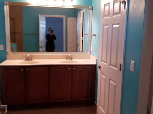
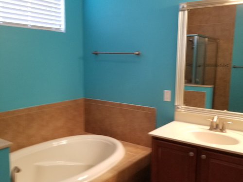
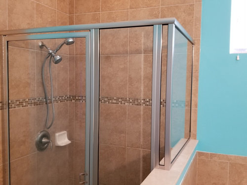
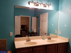
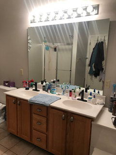
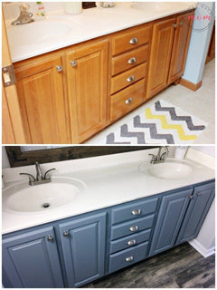
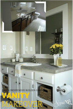
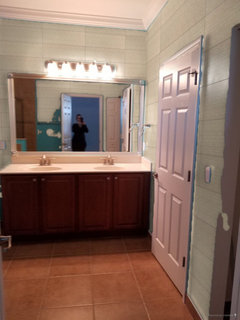
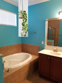
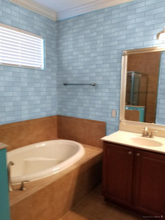
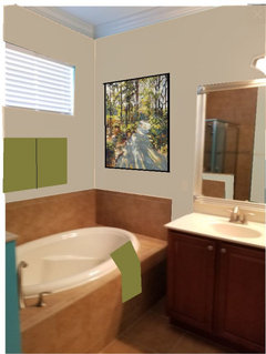
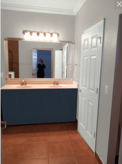
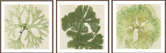
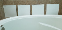
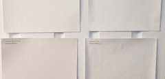
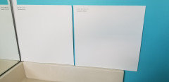
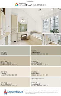
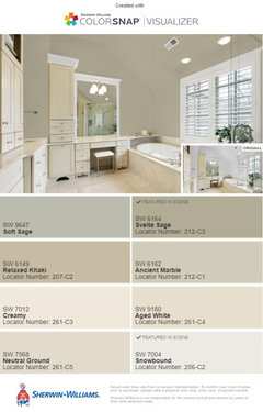
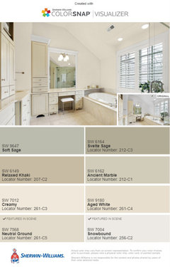
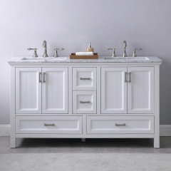
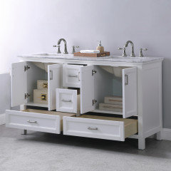
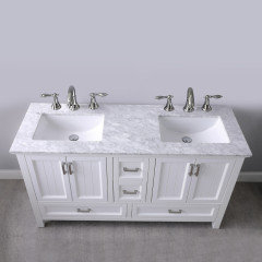
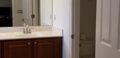
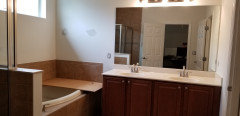
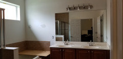
What are some cosmetic ways we can update this bathroom?
Gina N
2 years ago

Featured Answer
Sort by:Oldest
Comments (65)
Related Professionals
Creve Coeur Window Treatments · San Jose Window Treatments · View Park-Windsor Hills Interior Designers & Decorators · Seal Beach Architects & Building Designers · Shakopee Furniture & Accessories · Wilmington Furniture & Accessories · Arizona City General Contractors · Montclair General Contractors · Phenix City General Contractors · Randolph General Contractors · Stoughton General Contractors · Carlisle Kitchen & Bathroom Designers · Fairland Kitchen & Bathroom Remodelers · Rowland Heights Cabinets & Cabinetry · Warr Acres Cabinets & Cabinetry
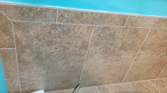
Gina N
2 years agoGina N
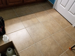
2 years agoGina N
2 years agolast modified: 2 years agoGina N
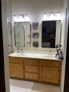
2 years agoGina N
2 years agoGina N
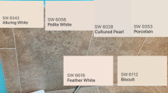
2 years agoGina N
2 years agoGina N
2 years agoGina N
2 years agolast modified: 2 years agoGina N
2 years agoGina N
2 years agoGina N
2 years agolast modified: 2 years agoGina N
2 years agoGina N
2 years agoGina N
2 years agolast modified: 2 years agoGina N
2 years agoGina N
2 years agolast modified: 2 years agoGina N
2 years agoGina N
2 years ago


Related Stories
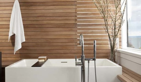
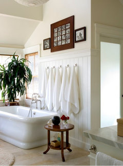
BATHROOM DESIGNBliss Out in Your Bath: 18 Ways to 'Spa Up' Your Bathroom
Can't get to the spa? Bring it to you. You can spend the saved money on new towels, candles and lavish lathers
Full Story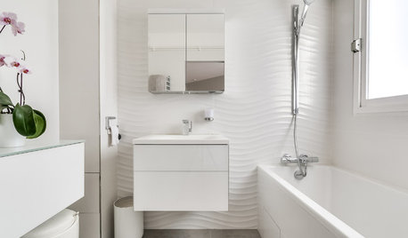
BATHROOM DESIGN12 Ways to Make Any Bathroom Look Bigger
These designer tricks can help you expand your space without moving any walls
Full Story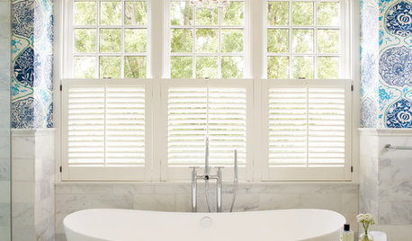
WALL TREATMENTSCan You Use Wallpaper in a Bathroom?
Here’s what to know about this beautiful way to uplift your bath, including which type to choose and where to put it
Full Story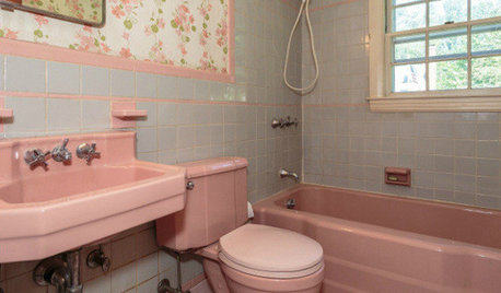
BATHROOM COLOR8 Ways to Spruce Up an Older Bathroom (Without Remodeling)
Mint tiles got you feeling blue? Don’t demolish — distract the eye by updating small details
Full Story
BATHROOM WORKBOOK12 Ways to Get a Luxe Bathroom Look for Less
Your budget bathroom can have a high-end feel with the right tile, stone, vanity and accessories
Full Story
BATHROOM DESIGN15 Cheap and Easy Ways to Makeover Your Bathroom
Makeover Magic Can Happen When You Think Outside the Bathroom Box
Full Story
BEFORE AND AFTERS8 Bathroom Updates Have Ideas for Every Style
All white, classic vintage and brightly eclectic are just some of the new looks sported by the transformed bathrooms you'll find here
Full Story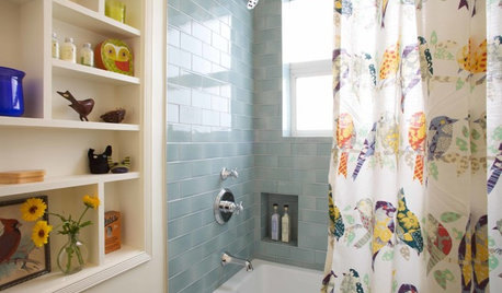
BATHROOM DESIGNRenting? 10 Ways to Spruce Up Your Bathroom
If your rental’s bathroom is blah, don’t give up. Small design moves can make a big difference
Full Story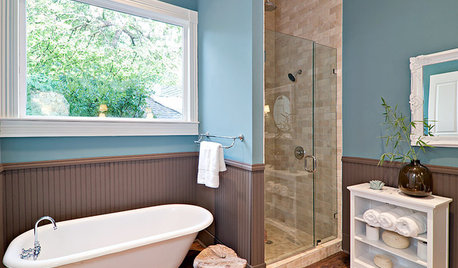
4 Easy Ways to Renew Your Bathroom Without Remodeling
Take your bathroom from drab to fab without getting out the sledgehammer or racking up lots of charges
Full Story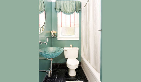
More Discussions

Jennifer Hogan