


Case Study: The Fearless Approach to Bold Color
Bland has no place in this San Diego home. See how the designer uses vivid hues with cohesiveness and without overwhelming

Interior designer Kristy Kropat's favorite color is orange — and raspberry, and lime green and teal. Basically, she loves all bright colors, and that adoration of bold hues (and disdain for beige) is noticeably reflected in her designs.
"I am a risk taker, but most people don't like to take risks in their own home," Kropat says. "People are afraid of using too much color, because they are worried they will get tired of them, especially with more permanent pieces. But in order to get a unique design, you need to push yourself out of the box sometimes."
Kropat definitely has no problem doing that: Her own San Diego home is full of blues, greens, oranges and reds. If you're a part of the beige-is-the-way society, now is the time to stop reading — or continue for some bold ways to step away from neutrals.
For her own home's exterior, Kropat wanted the colors to be true to the '60s architecture and colors of that era, so she accented the mostly gray house with a green feature wall. To ensure cohesiveness, she let the exterior material dictate the color: The stucco part of the home is all gray, while the front wall (made of fiber cement board) is painted green to highlight the change in texture.
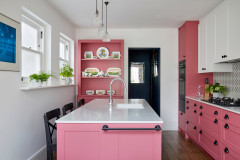
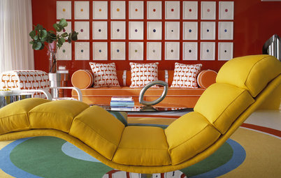
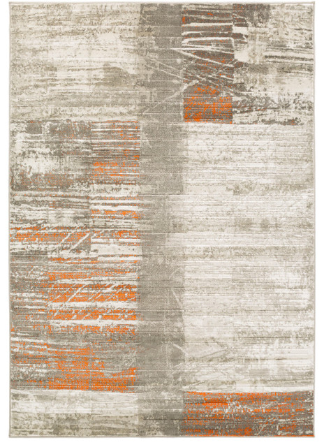
Kropat likes to have a more complex design with around three to four colors inside. There's no steadfast rule, but with two or three main colors, an additional accent color makes a huge difference by bringing depth and interest to the space. In her home each room is different; in the living room (shown), she emphasizes warm orange and raspberry with lime-green accents.
One of Kropat's best color tricks: If you want toned-down color, add it on horizontal, not vertical surfaces. For example, an orange wall (a vertical field) can be in-your-face overwhelming. An orange countertop (a horizontal field) covers less noticeable surface area and is therefore toned down, despite the bright color.
Her kitchen supports this idea. The orange counter seems bold yet looks understated with gray walls, white cabinets and a clear and white glass tile backsplash.
Not afraid of intense color? Go for that colorful feature wall.
Her kitchen supports this idea. The orange counter seems bold yet looks understated with gray walls, white cabinets and a clear and white glass tile backsplash.
Not afraid of intense color? Go for that colorful feature wall.
Kropat immediately fell in love with this bright paisley wallpaper, and it influenced the design of the rest of the room. To avoid color and pattern overload in such a small space, she went with bright but pattern-free blue curtains and held back a bit with white bedding and a custom white bed.
"I wanted the wallpaper to be the focal point, and with too much color, the wallpaper loses center stage," she explains.
"I wanted the wallpaper to be the focal point, and with too much color, the wallpaper loses center stage," she explains.
Although most people get their color fix via their walls, Kropat has kept most of the walls in her main living space neutral. "The wall shouldn't be the focal point — after all, it's just a wall," she says. A colorful accent "should be something more interesting, like artwork or a piece of furniture," she says.
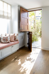
Painting the front door is an option almost anyone, even the most color wary, can pull off. Anything goes when it comes to the color, but be sure the color combination for the exterior siding and front door is interesting and complementary.
How to choose a front door color
How to choose a front door color
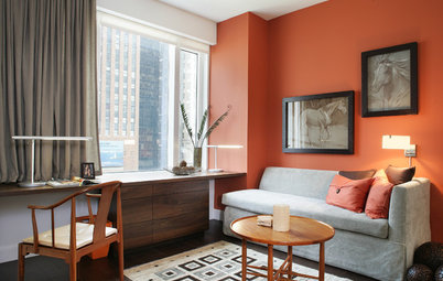
Love both warm and cool colors? Don't feel like you have to choose one or the other — opt for both.
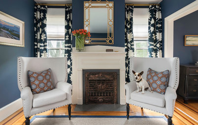
To make such contrasting color schemes work, avoid dramatic shifts. "Each room needs to talk to each other. There needs to be a transition, especially if they share walls," says Kropat.
Here just a dash of warm tones (in the red and yellow paintings) ensures that a cool blue family room blends well with the orange-accented kitchen next door. The two rooms also have the same wall color, which helps with the transition.
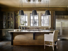
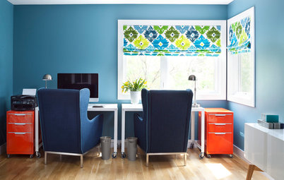
This little office nook in a 4-foot-wide hallway offers lessons on clever storage and tone-on-tone color. Pairing multiple shades of the same color is a fun and interesting approach, while the orange hue complements the nearby kitchen.
Kropat's family uses this area as a drop zone for backpacks, purses and mail. A roll-up metal door keeps clutter out of sight when it's closed.
Kropat's family uses this area as a drop zone for backpacks, purses and mail. A roll-up metal door keeps clutter out of sight when it's closed.
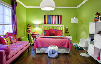
As the active playspace, the playroom has an abundance of bright colors and plenty of toys; the boys' bedroom, on the other hand, has quieter tones and no toys. This methodical design reinforces the point of the two rooms: The playroom is for activity, whereas the bedroom is for sleeping.
You can also apply this idea to an adult's bedroom — separate your office and sleeping spot, and avoid overstimulating colors for ultimate relaxation.
You can also apply this idea to an adult's bedroom — separate your office and sleeping spot, and avoid overstimulating colors for ultimate relaxation.
In the boys' bedroom, the colors give off a more relaxed vibe. More subdued than the playroom doesn't mean boring, though; fun blue and green stripes pair well with orange accents for a kid-friendly space.
More: An Antique Cape Cod House Explodes With Color
More: An Antique Cape Cod House Explodes With Color


"I really don't like when people only think about resale. They're afraid to design for themselves, but you should live for you — not someone you don't even know who will buy your house someday."