


Houzz Tours
Houzz Tour: Townhouse in a 19th-Century Dairy Redesigned
An architectural team opens up a couple’s unique home to maximize light and give it a more spacious feel

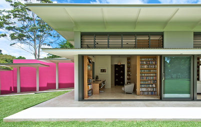
When this couple returned home to Toronto after a decade-long stint in the Middle East, they were ready to give their townhouse a refresh. Their unique home is located in a 19th-century dairy building in the city’s Riverdale District. The dairy had been converted into three three-story townhouses during the 1980s. The homeowners had worked with architectural and landscape architectural firm PLANT Architect on their unit’s small garden in 2011 and brought them back to design a fourth-floor addition.
When that addition turned out to be prohibitively expensive, the architectural design team had to regroup. Instead of adding more space, they came up with clever design solutions to create lighter and more sophisticated interiors that function better and feel more spacious. “It was a real game-changer,” says architect Lisa Rapoport, who collaborated with architectural designer Lisa Dietrich on the project. They played off the beautiful arched windows, the high ceilings and the couple’s art collection. A redesigned staircase, a thoughtful lighting scheme and new cherry and walnut millwork were just a few of the impactful changes they made.
When that addition turned out to be prohibitively expensive, the architectural design team had to regroup. Instead of adding more space, they came up with clever design solutions to create lighter and more sophisticated interiors that function better and feel more spacious. “It was a real game-changer,” says architect Lisa Rapoport, who collaborated with architectural designer Lisa Dietrich on the project. They played off the beautiful arched windows, the high ceilings and the couple’s art collection. A redesigned staircase, a thoughtful lighting scheme and new cherry and walnut millwork were just a few of the impactful changes they made.
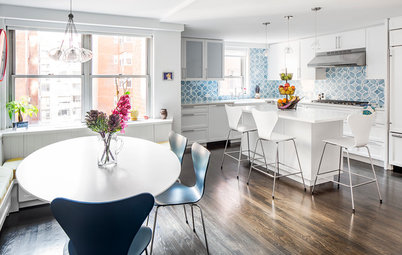
This floor plan for the ground level shows the kitchen on the left and the dining area on the right, the front door at the bottom and the stairway at the top.
The front entry provides some division between the kitchen and dining spaces. Much of Toronto’s housing is relatively slim row houses, so the designers were used to working with long, narrow spaces. However, because of the placement of the front door, this space reads as wide and shallow rather than long and narrow.
In spite of this difference, the house had other things in common with long, narrow Toronto homes — there’s often not a coat closet, mudroom or powder room on the first floor. This couple has a powder room in the basement, and they have coat hooks and shoe racks along the basement staircase.
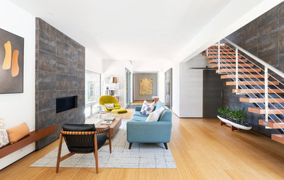
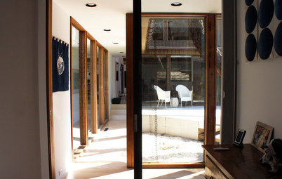
The transformation of the staircase had a big impact on all three levels of the home. One of the most significant changes was installing a generous skylight above it. This allows the staircase to function as a light well, bringing daylight from the roof down to the ground floor. They also transformed the look of the staircase, turning it into an architectural asset. On the ground floor, they took inspiration from the slatted wood and glass on the existing front door, adding vertical wood slats to create an open feeling for the staircase.
Throughout the house, the designers played with the relationship between white, wood and light. They treated the windows differently on each level. On the ground floor, the windows are wood, stained to match the walnut on the front door. The windowsills are white and blend in with the walls. This emphasizes the arched shapes of the windows and draws the eye to them.
Browse rectangular dining tables in the Houzz Shop
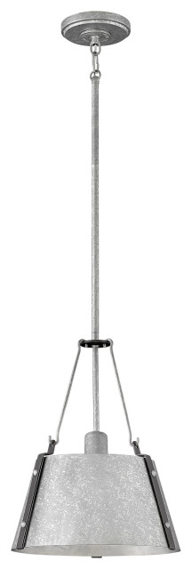
Not wanting to distract from their client’s artwork or the arched windows, the designers were particular about the lighting selections. Each floor has one type of sculptural fixture that plays off the art collection and architecture and sets a certain tone.
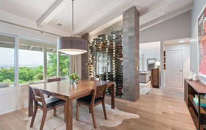
Over the dining table, they hung a dramatic Vitis pendant by Rich Brilliant Willing. Because the dining table will remain in a fixed spot, they were able to dangle the striking rope-like cords down below head-grazing level. The sculptural fixture stands out, but because it’s white, it also blends in with the architecture in a pleasing way.
Over the dining table, they hung a dramatic Vitis pendant by Rich Brilliant Willing. Because the dining table will remain in a fixed spot, they were able to dangle the striking rope-like cords down below head-grazing level. The sculptural fixture stands out, but because it’s white, it also blends in with the architecture in a pleasing way.
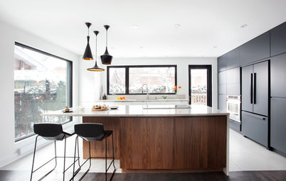
The homeowners had renovated the kitchen and bathrooms after buying the place years ago, so they did not need further reworking. The cherry of the existing kitchen cabinets inspired the designers to use the species in the renovations, including on the vertical slats along the stairs. “The graining on cherry wood is so beautiful,” Dietrich says.
The original floors on the ground level were in terrible shape, so the designers replaced them with white oak. They continued the material on the stairs. The solid stairs conceal the basement staircase below and also help soundproof that space, which contains an extra bedroom and a powder room.
The original floors on the ground level were in terrible shape, so the designers replaced them with white oak. They continued the material on the stairs. The solid stairs conceal the basement staircase below and also help soundproof that space, which contains an extra bedroom and a powder room.
A cherry staircase railing peeks out beneath a white powder-coated steel grip. As the staircase rounds the corner, there’s a transition from a full white wall to a partial wall of cherry. Lighting tucked beneath the handrail illuminates the wood.
Here’s a closer look at how the cherry and powder-coated steel work together. “If you have to have something, why not make it great? You touch it all the time,” Dietrich says of the unique handrail.
On the second level, seen on this floor plan, there’s a study made cozy by wood on the left and a long living room on the right. Because this floor already had cherry built-ins on the study end, Rapoport and Dietrich designed cherry millwork throughout the floor, shown here in the darker brown. This helped create a free-flowing connected feeling between the study and the living room.
The skylight over the stairwell bathes it in natural light. Wall sconces, designed by Sung Jang and Martin Thaler for Artemide, add playful sculptural shapes.
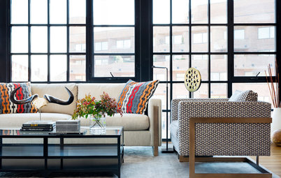
A wide cherry post marks the top of the staircase on the right side. It also creates an edge for a new glass-paneled wall that visually opens up the staircase to the living room. The stairwell serves as a gallery space for the art collection. The glass panels open up the view to the art from the living room.
Arriving at the second floor in this spot is similar to arriving on the ground floor through the front door — the orientation makes the space read wide and shallow rather than long and narrow.
Arriving at the second floor in this spot is similar to arriving on the ground floor through the front door — the orientation makes the space read wide and shallow rather than long and narrow.
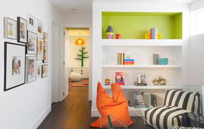
The gallery wall extends beyond the staircase into the study space. “We thought of being on this floor as being inside a cabinet of curiosities,” Rapoport says. The inspiration came from the existing grid of cherry bookshelves behind the desk. On the left, new cherry millwork continues the “living in the cabinet” theme, frames the windows, covers ductwork and provided strategic places to install recessed lighting. “We didn’t add any track lighting. And we only added recessed lights into wood, which made it feel like it was part of the inside-the-cabinet feeling rather than part of the ceiling,” Rapoport says.
The ceiling height on this floor is a generous 10 feet. “You have to do something special in such a tall space,” Dietrich says.
Rather than defining distinct zones of activity with statement light fixtures, they used lighting to provide continuity throughout this floor. They carried the same irregular bubble-like lights across the entire ceiling, “This allows a fluidity,” Rapoport says. The shapes of the lights create an irregular rhythm, floating like clouds overhead. Dietrich was on-site for the placement and determined which way each light should be turned to get the best composition. “That feeling of floating kept this floor feeling easy and relaxed,” she says.
In addition to the lighting, the cherry millwork ties everything in the long space together. “It was a way of creating a cabinet that you’re sitting in and ties everything together so that the room doesn’t fall apart,” Rapoport says.
Before, the stairwell wall was solid. Using glass panels made the space lighter, visually wider and lent a more spacious feeling. It also opened up this level to more light from the skylight.
Gregg Pendant Lights: Ludovica and Roberto Palomba for Foscarini
Before, the stairwell wall was solid. Using glass panels made the space lighter, visually wider and lent a more spacious feeling. It also opened up this level to more light from the skylight.
Gregg Pendant Lights: Ludovica and Roberto Palomba for Foscarini
Rapoport and Dietrich specified white for the window trim on this level. This makes the eye concentrate on the view and enhances the feeling of being inside a cabinet of curiosities.
The designers were deliberate about which lighting would light the walls and which lights would have their own glowing sculptural forms. The owners commissioned ceramic artwork by Talia Silva for this wall. The lights recessed in the cherry soffit wash it in light.
The designers were deliberate about which lighting would light the walls and which lights would have their own glowing sculptural forms. The owners commissioned ceramic artwork by Talia Silva for this wall. The lights recessed in the cherry soffit wash it in light.
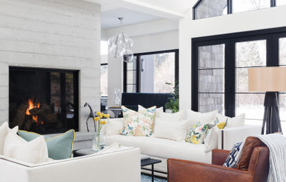
Cherry wood continues around the lower part of the space as wainscoting. Note the way it becomes thicker to form the window sills. Combined with throw pillows, it provides a backrest in some spots on the sofa. A rug with a honeycomb pattern anchors the living room, providing just the right amount of delineation in the free-flowing space.
“One of their friends said that the second floor reminded them of a fancy gentleman’s club where you’d meet your lawyer,” Rapoport says with a laugh. In addition to feeling like a cabinet of curiosities, this was the relaxed-yet-sophisticated vibe they were going for. Plus, one of the two gentlemen who lives here is indeed a lawyer.
Browse sectional sofas
The line of cherry wainscoting continues along the next wall and lines up with a partially recessed custom media cabinet composed of cherry wrapped in powder-coated steel. Lining elements up like this is pleasing to the eye and enhances the relaxing feeling. A cleverly placed niche helps conceal the TV, which can be extended out from the recess on an arm.
The white oak staircase that leads to the third level has open risers, which let light from the skylight wash down to the ground level. The art gallery wall continues up the staircase.
The third level contains the homeowners’ bedroom suite and a multifunctional room that serves as an office, dressing room and guest room. The ceilings on this floor are lower, measuring 8 feet high.
On the third level, the fantastic original wide-planked pine subflooring was in good shape, so they kept it. There was also a sliding walnut door from the previous bathroom renovation.
“The pine floors have a lot of reddish tones and the walnut is very brown. It’s what you’d picture in a gentleman’s cigar room,” Rapoport says. Because the two species worked well together, they used walnut for all the new millwork.
“The pine floors have a lot of reddish tones and the walnut is very brown. It’s what you’d picture in a gentleman’s cigar room,” Rapoport says. Because the two species worked well together, they used walnut for all the new millwork.
“The third floor had lower ceilings and square windows, so we added new walnut headers that go up to the ceiling and did the same thing over the doors,” Rapoport says. These wood headers draw the eye upward and make the ceilings feel higher.
The ceiling height also influenced the lighting choices. “We were working with a more compressed ceiling height but still needed the lighting to come down from the ceilings. We also knew they would be something the homeowners would be looking up at when lying down,” Dietrich says. “The lights we chose are very sculptural but also flat and worked great in here.” Odile Decq designed the ceiling lights in both bedrooms for LucePlan.
The ceiling height also influenced the lighting choices. “We were working with a more compressed ceiling height but still needed the lighting to come down from the ceilings. We also knew they would be something the homeowners would be looking up at when lying down,” Dietrich says. “The lights we chose are very sculptural but also flat and worked great in here.” Odile Decq designed the ceiling lights in both bedrooms for LucePlan.
A sliding walnut panel conceals the closet in the bedroom. Recessed lights in the new walnut soffits wash the walls in light.
The second bedroom mainly serves as an office and dressing room with expansive closet space for the homeowners. The white shelves hide a Murphy bed. The shelf wall swings out into the room, and the bed folds down from the opposite side. In other words, they do not need to clear off these shelves before folding out the bed.
This room had an existing skylight. The designers once again placed recessed lights only in the wood. And the only light that graces the ceiling is another sculptural light by Odile Decq.
This room had an existing skylight. The designers once again placed recessed lights only in the wood. And the only light that graces the ceiling is another sculptural light by Odile Decq.
The room is lined in walnut closets. The recessed lighting in the soffits continues around the room.
The unit’s narrow garden kicked off the firm’s involvement in this project in 2011. “This garden is like a bento box. It has a lot of stuff in it and all of it is small, but when you put it together it makes a meal,” Rapoport says. She used a composition of diagonal lines to slice through the small garden, organizing it in interesting ways.
A decade after completing the garden, it was ready for a bit of a refresh. “The tree had grown, making it shadier, so we replaced the plants that were no longer working,” she says.
Find a local landscape designer
A decade after completing the garden, it was ready for a bit of a refresh. “The tree had grown, making it shadier, so we replaced the plants that were no longer working,” she says.
Find a local landscape designer
In order to save money and be sustainable back in 2011, Rapoport had broken up the existing pavers in the garden to turn them into edging pieces. But they had reached the end of their second life. So she replaced them with Cor-Ten steel for a crisper, more modern look.
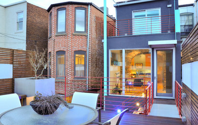
The left side of the photo reveals a bit of the new front entry steps, which work well with the building’s foundation. Granular paving preserved the existing tree’s roots. The diagonal lines organize different parts of the garden.
Back in 2011, the firm had added the long chunky bench for additional seating, and a matching table to provide a spot to put down platters when using the grill. They had also covered an unsightly shed with more attractive perforated metal. The refreshed garden is a welcoming entry to the renewed home.
More on Houzz
Tour more homes
Hire a local design pro
Shop for your home
More on Houzz
Tour more homes
Hire a local design pro
Shop for your home


House at a Glance
Who lives here: A couple
Location: Riverdale District in Toronto
Size: 1,432 square feet (133 square meters); two bedrooms, one bathroom, plus a bedroom and powder room in the basement
Designers: Lisa Rapoport and Lisa Dietrich of PLANT Architect
The existing building had charming 19th-century brick architecture with expansive arched windows. In addition to the interiors, the design team refreshed the unit’s compact garden and redesigned the exterior entry stairs. On the homeowners’ must-have list was space to display their extensive art collection. This was a tricky request because the windows took up a lot of their wall space.
Find a local architect