


Search results for "Accent tile above range" in Home Design Ideas
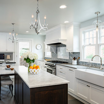
Eat-in kitchen - large traditional dark wood floor eat-in kitchen idea in Portland with stainless steel appliances, recessed-panel cabinets, white cabinets, white backsplash, subway tile backsplash, granite countertops, an undermount sink, two islands and black countertops
Molly Winters Photography
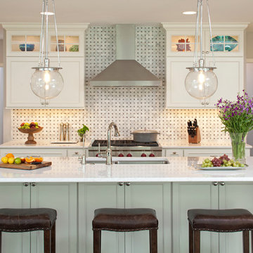
Example of a mid-sized 1950s single-wall ceramic tile eat-in kitchen design in Austin with a farmhouse sink, flat-panel cabinets, white cabinets, quartz countertops, white backsplash, glass tile backsplash, stainless steel appliances and an island
Example of a mid-sized 1950s single-wall ceramic tile eat-in kitchen design in Austin with a farmhouse sink, flat-panel cabinets, white cabinets, quartz countertops, white backsplash, glass tile backsplash, stainless steel appliances and an island
Paint-Sherwin Williams Tony Taupe, Cabinetry-Kitchen Craft, Alabaster w/Pewter Glaze and Cappuccino w/Chocolate Glaze, Lighting-Pottery Barn's Hundi Lantern's and Kichler's Circolo chandelier, Tile-Emser Tile, Glass 3 x 6 Fog, Granite-Arctic Cream. Thanks for looking! Jo McKeown/Great Spaces! Special Thanks to Reed Lewis Photography
Find the right local pro for your project
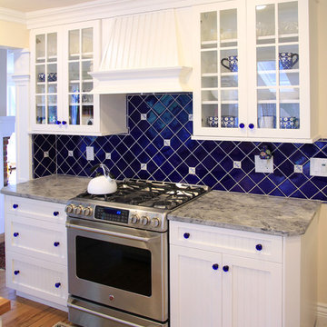
This project included custom locally made bead board cabinets, custom hand made cobalt blue ceramic tile backsplash, Super White "leathered" granite counter tops, and new 3 1/2" red oak flooring.
Lincoln Barbour Photography
Kitchen - traditional kitchen idea in Portland with a farmhouse sink and an island
Kitchen - traditional kitchen idea in Portland with a farmhouse sink and an island
A sophisticated yet relaxed home for a busy family. Designed with the goal of unifying the spaces, the kitchen, family room, and dining rooms are the heart of this home. White cabinetry and a gorgeous tile pattern are easily blended with stainless accents to create a fresh, easy home, great for entertaining family and friends.
Landmark Photography
Learn more about our showroom and kitchen and bath design: http://www.mingleteam.com
Peter Rymwid
Mid-sized transitional slate floor eat-in kitchen photo in New York with a farmhouse sink, shaker cabinets, dark wood cabinets and granite countertops
Mid-sized transitional slate floor eat-in kitchen photo in New York with a farmhouse sink, shaker cabinets, dark wood cabinets and granite countertops
Reload the page to not see this specific ad anymore
This transitional style living space is a breath of fresh air, beginning with the open concept kitchen featuring cool white walls, bronze pendant lighting and classically elegant Calacatta Dorada Quartz countertops by Vadara. White frameless cabinets by DeWils continue the soothing, modern color palette, resulting in a kitchen that balances a rustic Spanish aesthetic with bright, modern finishes. Mission red cement tile flooring lends the space a pop of Southern California charm that flows into a stunning stairwell highlighted by terracotta tile accents that complement without overwhelming the ceiling architecture above. The bathroom is a soothing escape with relaxing white relief subway tiles offset by wooden skylights and rich accents.
PROJECT DETAILS:
Style: Transitional
Tile/Backsplash: white relief subway
Paint Colors: White
Photographer: J.R. Maddox
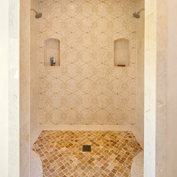
Photo by Jim Bartsch
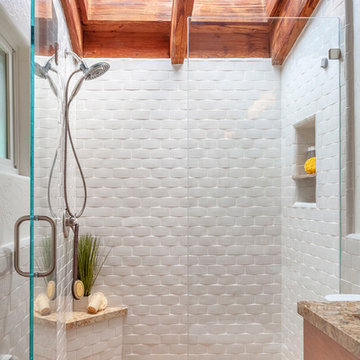
Tuscan beige tile alcove shower photo in Santa Barbara with beige walls
Tuscan beige tile alcove shower photo in Santa Barbara with beige walls
Honorable Mention - Design Visions 2010 - NKBA
Grabill cabinetry with Blue eyes granite tops
This kitchen as every appliance you could possibly need. This kitchen was designed to be the center of the entertainment area.
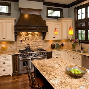
This kitchen features Venetian Gold Granite Counter tops, White Linen glazed custom cabinetry on the parameter and Gunstock stain on the island, the vent hood and around the stove. The Flooring is American Walnut in varying sizes. There is a natural stacked stone on as the backsplash under the hood with a travertine subway tile acting as the backsplash under the cabinetry. Two tones of wall paint were used in the kitchen. Oyster bar is found as well as Morning Fog.
Photography by Tre Dunham | Interior Design by Carolyn Albert-Kincl Design
Trendy bathroom photo in Austin with an undermount sink, flat-panel cabinets, light wood cabinets and beige walls
Trendy bathroom photo in Austin with an undermount sink, flat-panel cabinets, light wood cabinets and beige walls
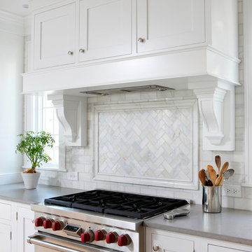
Marble subway tiles in a herringbone pattern are an understated focal point above this range. Flanked by tall, vertical windows, this cooking space is flooded with natural light.
Learn more about the projects created by award winning Normandy Remodeling Designer Stephanie Bryant, CKD: http://www.normandyremodeling.com/stephaniebryant/
Reload the page to not see this specific ad anymore
Troy Thies Photography
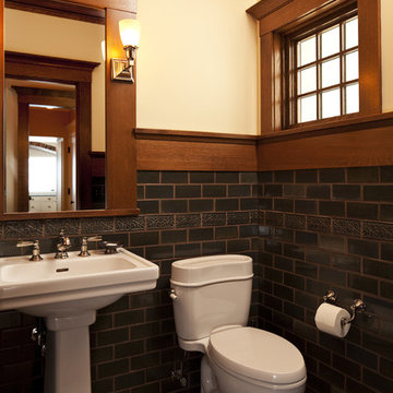
Inspiration for a craftsman subway tile powder room remodel in Other with a pedestal sink
Inspiration for a craftsman subway tile powder room remodel in Other with a pedestal sink
The owners of this kitchen had spent the money to upgrade the finishes in their kitchen upon building the home 12 years ago, but after living in the space for several years they realized how nonfunctional the layout really was. The (then) two preschool aged children had grown into busy, hungry teenagers with many friends who also liked to hang out at the house. So the family needed a more functional kitchen with better traffic flow, space for daily activities revolving around the kitchen at different times of day, and a kitchen that could accommodate cooking for and serving large groups. Furthermore, the dark, traditional finishes no longer reflected the homeowners’ style. They requested a brighter, more relaxed, coastal style that reflected their love of the seaside cities they like to visit.
Originally, the kitchen was U-shaped with a narrow island in the middle. The island created narrow aisles that bottle-necked at the dishwasher, refrigerator, and cooktop areas. There was a pass-through from the foyer into the kitchen, but the owners never liked that the pass-through was also located so close to the powder room. The awkward proximity was unappealing and made guests feel uncomfortable.
The kitchen’s storage was made up of lots of narrow cabinets, apothecary drawers, clipped corner units, and very few drawers. It lacked useful storage for the larger items the family used on a daily basis. And the kitchen’s only pantry was small closet that had only builder-grade, narrow shelving with no illumination to be able to see the contents inside.
Overall, the kitchen’s lighting plan was poorly executed. Only six recessed cans illuminated the entire kitchen and nook areas. The under cabinet lighting was not evenly distributed either. In fact, the builder had mis-placed the under cabinet lighting around the decorative pilasters which made for choppy, dark cubbies. Further, the builder didn’t include any lighting over the sink or the bar area, which meant whoever was doing the dishes was always in their own shadow. That, coupled with the steep overhang of the game room above made the bar area feel like a dim, cavernous space that wasn’t inviting or task oriented. The kitchen looked out into the main living space, but the raised bar and a narrow wall (which held the only large cabinet in the kitchen) created more of a barrier than a relationship to the living room or breakfast nook. In fact, one couldn’t even see the breakfast nook from the cooktop or sink areas due to its orientation. The raised bar top was too narrow to comfortably sit to either dine at or chat from due to the lack of knee space. The the homeowners confided that the kitchen felt more like a dark, dirty prison than place where the family, or their guests, wanted to gather and commune.
The clients' needs and desires were:
➢ to create a kitchen that would be a space the family loved to be in; to relate to the adjacent spaces all around, and to have better flow for entertaining large groups
➢ to remove the walls between the breakfast nook and living area and to be able to utilize the natural light from the windows in both those areas
➢ to incorporate a functional chopping block for prepping fresh food for home cooked meals, an island with a large sink and drain board, 2 pull out trash cans, and seating for at least the 2 teens to eat or do homework
➢ to design a kitchen and breakfast nook with an airy, coastal, relaxed vibe that blended with the rest of the house's coastal theme
➢ to integrate a layered lighting plan which would include ample general illumination, specific task lighting, decorative lighting, and lots of illuminated storage
➢ to design a kitchen with not only more storage for all the husband’s kitchen gadgets and collection of oils and spices, but smart storage, including a coffee/breakfast bar and a place to store and conceal the toaster oven and microwave
➢ to find a way to utilize the large open space between the kitchen, pantry area, and breakfast nook
Twelve Stones Designs achieved the owner's goals by:
➢ removing the walls between the kitchen and living room to allow the natural light to filter in from the adjacent rooms and to create a connection between the kitchen, nook, and living spaces for a sense of unity and communion
➢ removing the existing pantry and designing 3 large pantry style cabinets with LED tape lights and rollout drawers to house lots of kitchen appliances, gadgets, and tons of groceries. We also took the cabinets all the way up to the 9’ ceiling for additional storage for seasonal items and bulk storage.
➢ designing 2 islands - 1 with a gorgeous black walnut chopping block that houses a drawer for chopping and carving knives and a custom double pull out trash unit for point of use utilization - and 1 that houses the dishwasher, a large Blanco Gourmet sink with integrated drain board, woven baskets for fresh root vegetables and kitchen towels, plenty of drawer storage for kitchen items, and bar seating for up to 4 diners.
➢ closing off the space between the kitchen and the powder room to create a beautiful new private alcove for the powder room as well as adding some decorative storage. This also gave us space to include more tall storage near the new range for precision placement of the husband’s extensive oil and spice collection as well as a location for a combo-steam oven the wife wanted for baking and cooking healthy meals.
The project is enhanced functionally by:
➢ incorporated USB and standard receptacles for the kids’ laptops and phone charging in the large island
➢ designing the small island to include additional open shelving for items used on a daily basis such as a variety of bowls, plates, and colanders. This set up also works well for the husband who prefers to “plate” his dinners in restaurant-style fashion before presenting them to the table.
➢ the integration of specific storage units, such as double stacked cutlery drawers, a custom spice pull-out, a Kuerig coffee and tea pod drawer, and custom double stacked utensil drawers
➢ moving the refrigerator to the old oven location - this eliminated the bottle neck as well as created a better relationship to the eating table. It also utilizes the floor space between the pantry, nook, and kitchen
➢ creating a banquet style breakfast nook - this banquette seating not only doubles the amount of seating for large gatherings but it better utilizes the odd space between the kitchen and the previous nook area. It also helps to create a distinct pathway from the mudroom room through the pantry area, kitchen, nook, and living room.
➢ the coffee/breakfast bar area which includes the perfect location for the concealed microwave and toaster oven, convenient storage for the coffee pods and tea accoutrements. Roll-out drawers below also house the smoothie maker, hot water kettle, and a plethora of smoothie-making ingredients such as protein powders, smoothie additives, etc. Furthermore, the drawers below the Keurig house measuring utensil, cutlery, baking supplies and tupperware storage.
➢ incorporating lots of wide drawers and pullouts to accommodate large cookware.
➢ utilizing as much vertical space as possible by building storage to the ceiling which accommodates the family’s abundant amount of serving platters, baking sheets, bakeware, casserole dishes, and additional cutting boards.
The project is enhanced aesthetically by:
➢ new 5-piece Versailles pattern porcelain tile that now seamlessly joins the entire down stairs area together creating a bright, cohesiveness feeling instead of choppy separated spaces - it also adds a coastal feeling
➢ designing a cabinet to conceal the microwave and toaster oven
➢ the coastal influenced light fixtures over the nook table and island
➢ the sandy colors of the Langdon Cambria countertops. The swirling pattern and sparkling quartz pieces remind the homeowner of black-and-tan sandy beaches
➢ the striped banquet seating whose creamy white background and blue-green stripes were the inspiration for the cabinet and wall colors.
➢ All the interior doors were painted black to coordinate with the blacks and grays in the backsplash tile and countertop. This also adds a hint of tailored formality to an otherwise casual space.
➢ the use of WAC's Oculux small aperture LED units for the overhead lighting complimented with Diode LED strips for task lighting under the cabinets and inside the pantry and glass wall cabinets. All of the lighting applications are on separate dimmer switches.
Innovative uses of materials or construction methods by Realty Restoration LLC:
➢ Each 1-1/2” x 3” block of reclaimed end-grain black walnut that makes up the center island chopping block was hand milled and built in the shop. It was designed to look substantial and proportional to the surrounding elements, executed by creating the 4 inch tall top with a solid wood chamfered edge band.
➢ The metal doors on either side of the vent hood were also custom designed for this project and built in the Realty Restoration LLC shop. They are made 1x2, 11-gauge mild steel with ribbed glass. Weighing 60 lbs a piece, heavy duty cabinet hinges were added to support the weight of the door and keep them from sagging.
➢ Under-cabinet receptacles were added along the range wall in order to have a clean, uninterrupted backsplash.
Design obstacles to overcome:
➢ Because we were removing the demising walls between the kitchen and living room, we had to find a way to plumb and vent the new island. We did this by tunneling through the slab (the slab had post tension cables which prevented us from just trenching) to run a new wet vent through a nearby structural wall. We pulled the existing hot and cold lines between upper floor joists and ran them down the structural wall as well and up through a conduit in the tunnel.
➢ Since we were converting from wall overs to a gas range it allowed us to utilize the 220 feed for the wall ovens to provide a new sub panel for all the new kitchen circuits
➢ Due to framing deficiencies inherited from the original build there was a 1-1/2” differential in the floor-to-ceiling height over a 20 foot span; by utilizing the process of cutting and furring coupled with the crown moulding details on the cabinet elevations we were able to mask the problem and provide seamless transitions between the cabinet components.
Evidence of superior craftsmanship:
➢ uniquely designed, one-of-a-kind metal “X” end panels on the large island. The end panels were custom made in the Realty Restoration LLC shop and fitted to the exact dimensions of the island. The welding seams are completely indistinguishable - the posts look like they are cut from a single sheet of metal
➢ square metal posts on the small island were also custom made and designed to compliment and carry through the metal element s throughout the kitchen
➢ the beautiful, oversized end panels on the pantry cabinets which give the breakfast nook a tailored look
➢ integrating a large format 5 piece Versailles tile pattern to seamlessly flow from the existing spaces into the new kitchen space
➢ By constructing a custom cabinet that jogged around a corner we could not remodel (housing the entry way coat closet) we were able to camouflage the adjacent wall offset within the upper and lower cabinets. By designing around the existing jog in the structural walls we accomplished a few things: we were able to find the space to house, and hide, the microwave and toaster oven yet still have a clean cohesive appearance from the kitchen side. Additionally, the owners were able to keep their much needed coat closet and we didn’t have to increase the budget with unnecessary structural work.
Custom inset door cabinets, 2 toned marmoleum flooring. Copper bar sink. Sonoma tile backsplash. Copper accents. Mahogany wood work
Example of a classic kitchen design in Portland with glass-front cabinets, stainless steel appliances, granite countertops, beige cabinets, beige backsplash and subway tile backsplash
Example of a classic kitchen design in Portland with glass-front cabinets, stainless steel appliances, granite countertops, beige cabinets, beige backsplash and subway tile backsplash
Alex Hayden
Example of a mid-sized classic light wood floor eat-in kitchen design in Seattle with blue backsplash, stainless steel appliances, an undermount sink, shaker cabinets, white cabinets, onyx countertops, stone tile backsplash and no island
Example of a mid-sized classic light wood floor eat-in kitchen design in Seattle with blue backsplash, stainless steel appliances, an undermount sink, shaker cabinets, white cabinets, onyx countertops, stone tile backsplash and no island
Showing Results for "Accent Tile Above Range"
Sponsored
Over 300 locations across the U.S.
Schedule Your Free Consultation
Ferguson Bath, Kitchen & Lighting Gallery
Ferguson Bath, Kitchen & Lighting Gallery
Make no mistake: Heidi’s passion was the basis of the project.
Heidi loves to cook. Given a choice, she might live full-time in the kitchen. She revels in creating culinary delights for family and friends. She lives to entertain.
Her kitchen is her castle. It has to be just right. But, it wasn’t.
For starters, she wanted a different stove. Looking around, other things jumped out. This wasn’t the cooking mecca she envisioned. There were better options available. The ball started rolling.
“I needed a bigger island and a bigger stove,” Heidi said. “That led to ‘We need a bigger kitchen.’”
This wasn’t a new revelation. She had been researching kitchens for some time. She didn’t have all the details, but she had a plan.
“My vision was to have it very clean and simple, but I wanted some artistic flair,” she explained.
Our task was to design the kitchen her passion demanded. It needed more countertop space. It needed more storage space. It needed functional elements that were big, bold and suited to the needs of an active, passionate user.
So, first things first. We started with a Viking Professional stove and oven that would make Julia Child proud. “I told Kevin (her husband) it’s coming with us if we move,” Heidi said. The custom stove hood was custom-made on site of wood and dual-color Venetian plaster, with a Ventahood exhaust inside. Two corbels accent its artistic look and feel, hewing to Heidi’s desire to make the kitchen both fully functional and pleasing to the eye.
When working at the deluxe Viking unit, Heidi doesn’t have to go far for pots and pans, either. The new island has three large base drawers built into it directly across from the range. She can literally turn around, take what she needs from the drawers, and go right back to work.
We nearly doubled the cabinet space in the kitchen, offering many more storage and organizational options. The drawers are all soft-close, full-extension design. The doors are soft-close. The upper cabinet above the refrigerator has vertical tray dividers, easing the sometimes arduous task of sorting trays and cookie sheets.
Heidi sought an antique look for her cabinetry. To achieve this, we utilized maple cabinets with a mink wash treatment and ancient bronze hardware. We ordered matching panels for the dishwasher and refrigerator doors, creating a seamless look with the cabinetry.
We maintained visual interest by staggering the heights of the different cabinets. Upper cabinets feature double-stack crown moldings. Some cabinets have rain glass inserts to display decorative items within.
Meanwhile, the entire area was brightened with a plethora of new lighting. Eight recessed lights in the 9-foot ceiling illuminate the counter space. Undercabinet lights brighten any food preparation work. In-cabinet lighting spotlights decorative items within glass-door cabinetry. Above-cabinet lights offer just the right ambiance to complete the scene.
Above the island hang two distinctive, eye-catching chandeliers that definitely set off the kitchen’s mix of antiquity and artistry. Heidi simply would not be denied these fixtures, with their oil-rubbed bronze finish and Renaissance-era feel. “Everybody doubted me on them,” she said. “My kitchen’s not that big. I had to have these big, beautiful, glamorous lights. They make the room extra special.”
The island itself took a bit of doing. Ultimately, we created a two-tier structure that provided invaluable food preparation and staging space, plus a dining area that allowed the owners to get rid of a kitchen table that had fallen out of favor. The 120-inch length of the island allows it to meet these dual needs. The island offers plenty of room for people to gather around during parties, with wide open spaces that offer guests ready access to food and drink. The increased seating space offers Heidi’s family a comfortable dining table, with more than enough room for plates and serving dishes. She bought accompanying chairs that blend with the island’s cherry base and the granite countertop’s multicolored brown hues. Two corbels built into posts on the island base give it a sturdy, dignified look.
Heidi selected the white tumbled travertine subway field tile that makes up the backsplash ringing the main kitchen area. During its installation, she personally directed the placement of floral bronze metal accent pieces scattered into the backsplash. She helped create a six-tile decorative mural insert above the expansive range of her new Viking range.
We put in a farmer’s sink with space galore for food, dishes or whatever Heidi desired. The structure and decorative feet of the sink, plus the mounted corbels above, create a furniture resemblance. “I just love my sink,” she said. “It’s big, it’s nice, and my family just loves it because they can help with the dishes and can easily reach into it.”
Space wasn’t necessarily the final frontier in Heidi’s kitchen, but she definitely wanted more. We removed a wall from a pantry, transforming its small dark space into additional cabinets and counter area. Heidi keeps small appliances on the new counter and prepares her daughters’ lunches there.
The rest of the former pantry was converted into a laundry area and new mudroom. By stacking the washer and dryer in the laundry area, space was freed up next to it to add new storage cabinets and a countertop for laundry sorting.
On the other side of the mudroom, we opened and renovated a previous cramped closet for greater functionality and efficiency. By adding shelving and hanging hooks near the top, and storage drawers at the bottom, the variety and quantity of items it can accommodate was multiplied several times. This allowed the closet space to be narrowed by 18 inches, widening an adjacent hallway to the dining room. The top of the drawers doubles as a bench, further enhancing the area’s usability.
The entire mudroom area can be closed off to the kitchen via a pocket door built into the reworked closet. The door has full-view etched glass, allowing light into the mudroom and visibility from the kitchen.
The flooring in the kitchen and new mudroom – formerly engineered hardwood – was replaced with stonefire noce ceramic tile. Its color was chosen to blend in with the family room carpet, now a true neighbor after we took out a wall between the two rooms.
The remainder of the living room wall was converted into two pillars that were custom-built on site and resemble the posts on the island. Removing the wall was a last-minute call by the owners. After living with the results for just a short time, Heidi called it “the best decision ever.” It’s not hard to see why – both the newly-remodeled kitchen and the family room seem larger, with a smarter and more efficient traffic flow.
Accenting the freshly-opened space is a new sliding patio door whose color matches its casings. Its grid design matches those in nearby windows.
The door casings bear the literal touch of the homeowners, who saved thousands of dollars by painting many parts of the project. Heidi personally painted the walls, window casings, base molding, shoe molding, pocket door and mudroom. She applied many coats of Venetian plaster to the stove range hood to create its soft, velvety look.
We saved the homeowners at least $500 by researching the corbels used in the kitchen. After learning the steep price charged for corbels by the cabinet manufacturer, we found an online catalog that offered them for substantially less. Heidi gladly chose from the catalog, and this decorative touch was added at a great savings.
In addition, we worked to keep the project within budget by providing Heidi with material allowances for the countertops, plumbing fixtures and all tiles. She had no problem working within these parameters – a win-win situation for all concerned.
When all is said and done, the greatest achievement is hearing Heidi talk about the joy her new kitchen has brought her, and how it has benefited her family. “It’s exactly what I wanted,” she said, standing in front of the kitchen and spreading her arms wide to take in the expanse. “My vision is this right here.”
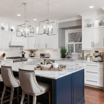
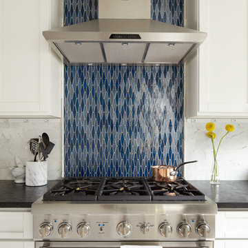
When designing this beautiful kitchen, we knew that our client’s favorite color was blue. Upon entering the home, it was easy to see that great care had been taken to incorporate the color blue throughout. So, when our Designer Sherry knew that our client wanted an island, she jumped at the opportunity to add a pop of color to their kitchen.
Having a kitchen island can be a great opportunity to showcase an accent color that you love or serve as a way to showcase your style and personality. Our client chose a bold saturated blue which draws the eye into the kitchen. Shadow Storm Marble countertops, 3x6 Bianco Polished Marble backsplash and Waypoint Painted Linen floor to ceiling cabinets brighten up the space and add contrast. Arabescato Carrara Herringbone Marble was used to add a design element above the range.
The major renovations performed on this kitchen included:
A peninsula work top and a small island in the middle of the room for the range was removed. A set of double ovens were also removed in order for the range to be moved against the wall to allow the middle of the kitchen to open up for the installment of the large island. Placing the island parallel to the sink, opened up the kitchen to the family room and made it more inviting.
Nat Rea Photography: http://www.natrea.com/
Inspiration for a timeless kitchen remodel in Providence with beaded inset cabinets, stainless steel appliances, a single-bowl sink, white cabinets, marble countertops, white backsplash and subway tile backsplash
Inspiration for a timeless kitchen remodel in Providence with beaded inset cabinets, stainless steel appliances, a single-bowl sink, white cabinets, marble countertops, white backsplash and subway tile backsplash
4