
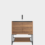


Someone please stop me if our color is a disaster (pic)
danielle00
15 years ago

Sort by:Oldest
Comments (27)
Related Stories
DISASTER PREP & RECOVERY7 Ways to Help Someone Hit by a Hurricane
The best things you can do in the wake of devastation are sometimes the most surprising
Full Story
REMODELING GUIDES8 Lessons on Renovating a House from Someone Who's Living It
So you think DIY remodeling is going to be fun? Here is one homeowner's list of what you may be getting yourself into
Full Story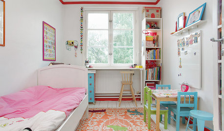
LIFEStop the Toy Takeover by Changing the Way You Think
Make over your approach and get gift givers onboard with your decluttering efforts by providing meaningful toy alternatives
Full Story
DISASTER PREP & RECOVERYHow to Prep for Disaster Insurance Claims
Tools and tips for making an inventory list, documenting damage to your home, and working with your adjuster
Full Story
GARDENING GUIDESGreat Design Plant: Silphium Perfoliatum Pleases Wildlife
Cup plant provides structure, cover, food and water to help attract and sustain wildlife in the eastern North American garden
Full Story
GARDENING GUIDESHow to Stop Worrying and Start Loving Clay Soil
Clay has many more benefits than you might imagine
Full Story
HOUSEPLANTSMother-in-Law's Tongue: Surprisingly Easy to Please
This low-maintenance, high-impact houseplant fits in with any design and can clear the air, too
Full Story
SUMMER GARDENINGHouzz Call: Please Show Us Your Summer Garden!
Share pictures of your home and yard this summer — we’d love to feature them in an upcoming story
Full Story
HOME OFFICESQuiet, Please! How to Cut Noise Pollution at Home
Leaf blowers, trucks or noisy neighbors driving you berserk? These sound-reduction strategies can help you hush things up
Full Story
BATHROOM DESIGNUpload of the Day: A Mini Fridge in the Master Bathroom? Yes, Please!
Talk about convenience. Better yet, get it yourself after being inspired by this Texas bath
Full StoryMore Discussions

sailormann
rmkitchen
Related Professionals
Federal Heights Kitchen & Bathroom Designers · Fresno Kitchen & Bathroom Designers · White House Kitchen & Bathroom Designers · Sunrise Manor Kitchen & Bathroom Remodelers · Forest Hill Kitchen & Bathroom Remodelers · Bellevue Kitchen & Bathroom Remodelers · Key Biscayne Kitchen & Bathroom Remodelers · Toledo Kitchen & Bathroom Remodelers · Turlock Kitchen & Bathroom Remodelers · Wilmington Kitchen & Bathroom Remodelers · Cave Spring Kitchen & Bathroom Remodelers · Citrus Heights Cabinets & Cabinetry · Eureka Cabinets & Cabinetry · New Castle Cabinets & Cabinetry · Albertville Tile and Stone Contractorsdanielle00Original Author
lascatx
mamadadapaige
positano
danielle00Original Author
remodelfla
danielle00Original Author
mamadadapaige
mamadadapaige
kelleg69
danielle00Original Author
danielle00Original Author
rmkitchen
mamadadapaige
danielle00Original Author
pbrisjar
plllog
danielle00Original Author
gglks
marthavila
sombreuil_mongrel
arleneb
bmorepanic
growlery
danielle00Original Author