


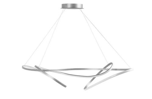
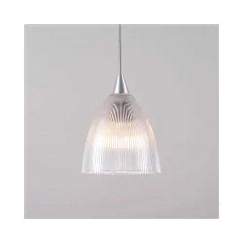
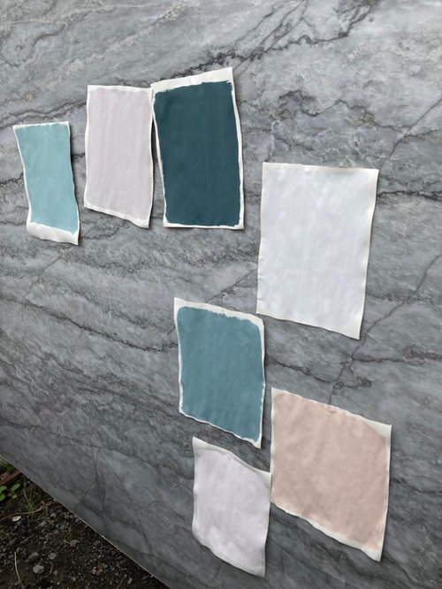
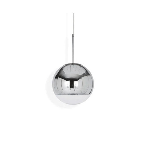
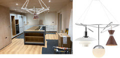
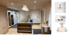
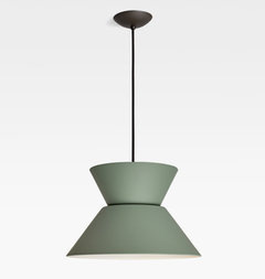
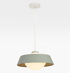
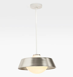
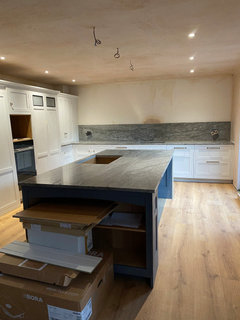
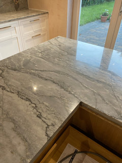
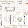
Which pendants over kitchen island?
Helen Williams
last year
last modified: last year


Featured Answer
Sort by:Oldest
Comments (66)
 PRO
PROJAN MOYER
last yearlast modified: last year
kl23
last yearRelated Professionals
Des Moines Furniture & Accessories · Temple Terrace Furniture & Accessories · Hot Springs Village Decks, Patios & Outdoor Enclosures · Justice Decks, Patios & Outdoor Enclosures · Oswego Decks, Patios & Outdoor Enclosures · Palos Verdes Estates Architects & Building Designers · Frankfort Kitchen & Bathroom Designers · Verona Kitchen & Bathroom Designers · Vineyard Kitchen & Bathroom Designers · South Sioux City Kitchen & Bathroom Designers · Franklin Furniture & Accessories · Claremont General Contractors · Duncanville General Contractors · Milton General Contractors · Natchitoches General Contractors- PRO
JAN MOYER
last yearlast modified: last year 
Helen Williams
last yearHelen Williams
last yearHelen Williams
last yearkl23
last yearHelen Williams
last yearlast modified: last year PRO
PROFlo Mangan
last yearHelen Williams
last year- PRO
JAN MOYER
last yearlast modified: last year  PRO
PRORL Relocation LLC
last yearlast modified: last year- PRO
Flo Mangan
last year - PRO
JAN MOYER
last year Helen Williams
last yearlast modified: last year- PRO
Flo Mangan
last year kl23
last yearkl23
last yearkl23
last yearHelen Williams
last yearHelen Williams
last yearHelen Williams
last year- PRO
JAN MOYER
last yearlast modified: last year Helen Williams
last year- PRO
JAN MOYER
last yearlast modified: last year Helen Williams
last year- PRO
RL Relocation LLC
last year kl23
last year
H D
last year- PRO
JAN MOYER
last yearlast modified: last year cindylouhoog
last year
RedRyder
last year- PRO
JAN MOYER
last year Y
last year


Related Stories
PHOTO FLIP20 Inspiring Kitchens With Stylish Pendant Lights Over the Island
Glowing pendants in beautiful colors, textures and styles raise the bar for modern kitchen island lighting
Full Story
PRODUCT PICKSGuest Picks: Dashing Lighting for Over the Kitchen Island
These single-connection pendants and chandeliers will cover your island lighting needs no matter what your kitchen’s style
Full Story
LIGHTINGSource List: 20 Pendants That Illuminate the Kitchen Island
See the ceiling lighting fixtures that are popular on Houzz and find out where to get them
Full Story
KITCHEN DESIGNKitchen Islands: Pendant Lights Done Right
How many, how big, and how high? Tips for choosing kitchen pendant lights
Full Story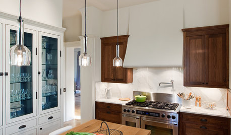
KITCHEN DESIGNPick the Right Pendant for Your Kitchen Island
Don't settle for bland builder-grade pendant lights when you can have your pick of colors and kinds to match your kitchen's style
Full Story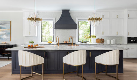
PENDANT LIGHTINGChoose the Right Pendant Lights for Your Kitchen Island
Get your island lighting scheme on track with tips on function, style, height and more
Full Story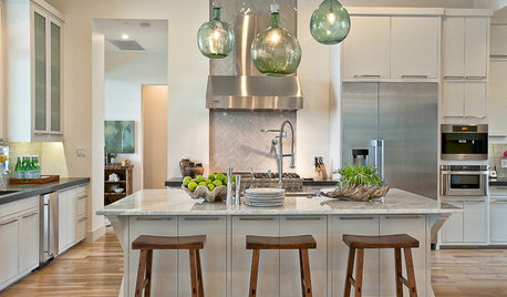
KITCHEN DESIGNKitchen Island Stools and Pendants That Pair Up Perfectly
Get ideas for island seating and lighting looks to combine in your kitchen
Full Story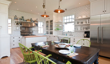
KITCHEN ISLANDSWhich Is for You — Kitchen Table or Island?
Learn about size, storage, lighting and other details to choose the right table for your kitchen and your lifestyle
Full Story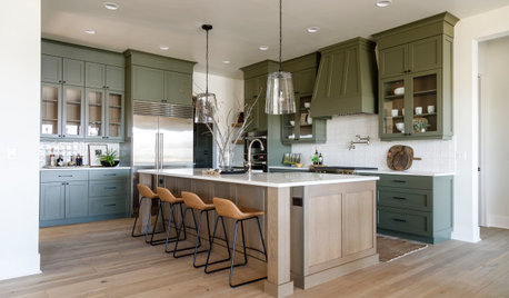
KITCHEN LAYOUTSMove Over, 3-Zone Kitchen. Meet the 5-Zone Kitchen
With open-plan kitchens so popular, has the classic kitchen triangle had its day?
Full Story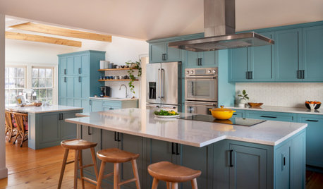
KITCHEN MAKEOVERSKitchen of the Week: Baker’s Dream Kitchen With Two Islands
A kitchen-family room makeover adds happy' aqua cabinetry and a dedicated baking space to a Massachusetts farmhouse
Full StoryMore Discussions

barncatz