


Houzz Tours

Houzz Tour: Brian Dittmar's Relaxed Classic Style
Three Houses, One Designer, and Six Great Decorating Strategies

Too often, more traditional style gets a bit of a bad rap in modern design circles. Caught up in the progression of design techniques, sometimes the most successful elements of past get swept to the side. However, some of the most lasting and approachable designs are those that pay tribute to tradition while incorporating current and personal touches.
The work of California designer Brian Dittmar Design, Inc. is an example of this successful blend. Dittmar's work has a definite classic approach, but instead of coming across as old-fashioned and stodgy, his designs feel comfortable and interesting. Since his style blends with the style of the client, some of his work leans more towards contemporary, but as these three San Francisco homes show, his designs always create a livable and comfortable home.
"I often spend some time contemplating what the room itself wants to be," says Dittmar. "It certainly doesn't work to force a room to be something it isn't! Each project teaches you something new or shows you a new way to do something." In these homes, Dittmar's consistent use of tailored details on upholstery, patina, warm lighting, clean-lined furniture, texture, and graphic patterns all combine to create a new classic style that works with three very different interiors.
In the living room, a grownup and neutral palette stays fresh with light-filled windows, soft drapes and simple artwork. A combination of newer products from Robert Allen and Burton James with antique pieces gives the room a comfortable, lived-in feel that isn't always achievable with all-new pieces. "Patina refers to a level of age and wear, such as you find in antique furniture," says Dittmar. "Having pieces with patina instantly gives the room a lived-in feeling. The worst thing is to furnish a room with everything brand new. It has no soul or character and more closely resembles a furniture store, not a home."
The structured canopy on this bed, made with fabric from Beacon Hill, echoes the tailoring on the roman shades made with the same fabric and pulls together this cheerful guest bedroom. "Whenever possible, I also like to add bespoke tailor-like details on upholstered pieces, window treatments and pillows," says Dittmar. "I like to use contrast welting, accent edge banding, applied tape trims, fringe, buttons and nailheads, and such. Those details take ordinary pieces and make them so much more special and custom looking."
A quilted duvet and upholstered headboard work beautifully with the antique-style four-poster bed in the master bedroom. A worn oak nightstand (a perfect example of patina) and soft plaid curtains from Kravet soften the structured bedframe. While it's certainly a traditional bedroom, the use of antiques, soft colors, and touchable textiles takes it from pompous to approachable. "Even if you can't afford true antiques, you can get a similar feeling by shopping for furniture at your local flea market or consignment shop," says Dittmar. "You can even order certain pieces from some of the better online catalogues like Wisteria or Gump's. They won't be truly antique, but they have done a pretty good job at reproducing the feel."
A large mirror and matching vanity next to the bed help spread light throughout the room. The light blue paint provides a soothing and calming feel and helps spread light. "When I meet a new client and they say, 'I want a red dining room' or 'let's paint the kitchen blue,'" says Dittmar, "I do have to point out that we should test a color in the space first and see before they get their heart set on it, as every color doesn't always work well in every space."
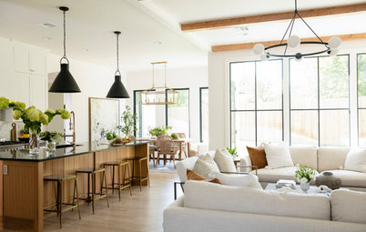
Home No. 2: Lighting and clean lines in a Noe Valley apartment
While some of Dittmar's work leans toward contemporary, he still uses the same basic principles to carry his classic and relaxed style through the home. This home was a schoolhouse in the 1920s that was later converted to condos. Located in the Noe Valley area of San Francisco, the design uses the same principles of tailored upholstery, patina, and livability, but is also a great example of Dittmar's emphasis on the importance of lighting.
"Lighting is key," he says. "It has to be done right to create a warm and welcoming space." The overhead fixture in the dining room is from Hubbardton Forge, and casts a soft and adjustable light over the dining space and modern artwork by James Rosenquist.
Dittmar's warm lighting method comes in multiple levels: overhead lighting, mid-level lighting (such as table or floor lamps) and uplights. Ceiling cans are a great overhead lighting option, but if you decide to go with them, Dittmar recommends installing trims that can be angled, so the light can reflect off walls rather than directing straight down and creating unflattering downlight.
And don't forget dimmers! "My motto is always: dimmers, dimmers, dimmers," says Dittmar. "Nothing makes me cringe more than walking into a room (dining rooms in particular) with the lights all ablaze! No one feels good in that harsh, bright light, so put a dimmer on it and it will change the mood for the better — guaranteed."
And don't forget dimmers! "My motto is always: dimmers, dimmers, dimmers," says Dittmar. "Nothing makes me cringe more than walking into a room (dining rooms in particular) with the lights all ablaze! No one feels good in that harsh, bright light, so put a dimmer on it and it will change the mood for the better — guaranteed."
Even when working with a slightly more contemporary tone, Dittmar makes sure to use pieces with an architectural quality, and designed with clean and classic lines. Citing Neoclassical, Biedermeier, and Art Deco as some of his favorite styles, the pieces in this home's living room — such as the classic couch frame from A. Rudin, and Kravet coffee table — reflect a quiet formality in a more simpler sense of traditionalism than the living room from the Presidio Heights house.
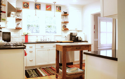
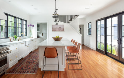
In the Noe Valley kitchen, Dittmar used Flint from Benjamin Moore to define the space. White cabinets from Segale Brothers and CeasarStone counters round out the fresh but classic look. All appliances are from GE and Thermador.
Home No. 3: Texture and pattern in Buena Vista
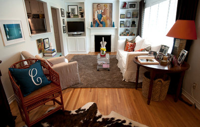
The value of texture is clear in every nook and cranny of the living room in this apartment near Buena Vista Park in San Francisco. Dittmar stuck to a consistent color palette of soft grays and red accents, but mixed textures in both textiles and furniture to create a rich, layered effect.
"A mistake many people make when shopping in retail environments is to just order all the upholstered pieces in the stock fabrics," says Dittmar. "Those are all fine, but when all of your main upholstered pieces are done in fabrics like that, it tends to have a boring and flat look because they all have a similar texture. By custom ordering one or two of the pieces in a more interesting and textural fabric, you can get a more layered and interesting look."
Dittmar originally started out in graphic design, and worked in the industry for many years, and loves using geometric patterns in fabrics, wallpaper, and carpet. Boldly patterned accent pillows are a simple way to add another level of visual interest to the living room, contrasting beautifully with the rich Romo velvet of the couch. "In every room, there should be a contrast — of soft and smooth with rough and nubby, shiny with matte, and so on," says Dittmar.
If you look carefully in each of Dittmar's projects, you'll see a few classically designed clocks — such as this antique from the 1800s — placed here and there. "I've had a fascination with clocks since I was a child," says Dittmar, "so I've incorporated them into many of the projects I've done." In fact, his love for clocks is so great, he did his entire room in a timepiece theme for the San Francisco Decorator Showcase in 2010.
More ideas:
Simply Luxurious: Girly Modern Style
More ideas:
Simply Luxurious: Girly Modern Style
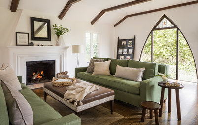


The owners of this elegant home in San Francisco's Presidio Heights neighborhood wanted a look that was traditional but still livable. Dittmar incorporated soft colors, textiles, and beautiful patina with more structured and classic elements, such as tailored upholstery.
In this office, the combination of clean and classic desk set and fun colors breathes new life into what could easily become an old-fashioned look. The pop of the dark wood in the secretary and the structured upholstery on the desk chair — both by Thomas O'Brien for Hickory Chair — keep this little nook from becoming too girly.