


Search results for "Basic change dependent" in Home Design Ideas
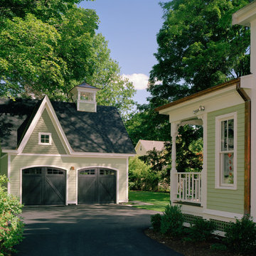
Jacob Lilley Architects
Location: Concord, MA, USA
The renovation to this classic Victorian House included and an expansion of the current kitchen, family room and breakfast area. These changes allowed us to improve the existing rear elevation and create a new backyard patio. A new, detached two-car carriage house was designed to compliment the main house and provide some much needed storage.
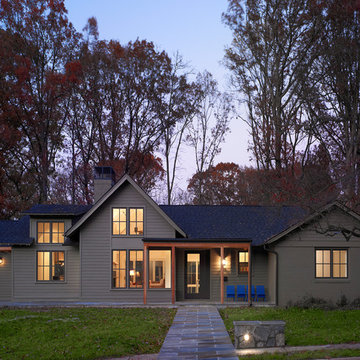
The renovation of the Woodland Residence centered around two basic ideas. The first was to open the house to light and views of the surrounding woods. The second, due to a limited budget, was to minimize the amount of new footprint while retaining as much of the existing structure as possible.
The existing house was in dire need of updating. It was a warren of small rooms with long hallways connecting them. This resulted in dark spaces that had little relationship to the exterior. Most of the non bearing walls were demolished in order to allow for a more open concept while dividing the house into clearly defined private and public areas. The new plan is organized around a soaring new cathedral space that cuts through the center of the house, containing the living and family room spaces. A new screened porch extends the family room through a large folding door - completely blurring the line between inside and outside. The other public functions (dining and kitchen) are located adjacently. A massive, off center pivoting door opens to a dramatic entry with views through a new open staircase to the trees beyond. The new floor plan allows for views to the exterior from virtually any position in the house, which reinforces the connection to the outside.
The open concept was continued into the kitchen where the decision was made to eliminate all wall cabinets. This allows for oversized windows, unusual in most kitchens, to wrap the corner dissolving the sense of containment. A large, double-loaded island, capped with a single slab of stone, provides the required storage. A bar and beverage center back up to the family room, allowing for graceful gathering around the kitchen. Windows fill as much wall space as possible; the effect is a comfortable, completely light-filled room that feels like it is nestled among the trees. It has proven to be the center of family activity and the heart of the residence.
Hoachlander Davis Photography
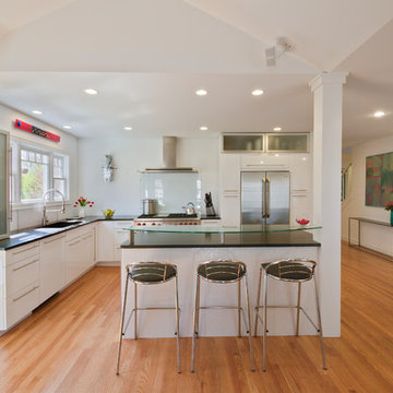
This photo is taken from the newly-added family room. The column in the kitchen island is where the old house ended. The dining room is to the right, and the family room is behind the photographer.
Featured Project on Houzz
http://www.houzz.com/ideabooks/19481561/list/One-Big-Happy-Expansion-for-Michigan-Grandparents
Interior Design: Lauren King Interior Design
Contractor: Beechwood Building and Design
Photo: Steve Kuzma Photography
Find the right local pro for your project
This family friendly kitchen design by K&W Interiors was selected as the Grand Prize Winner by Alaska's Best Kitchens Magazine for Fall/Winter 2012 and featured on the cover.
"A family with five children bought this home 2.5 years ago knowing that a kitchen renovation was in the near future. This outdated space with an unfriendly layout needed to be drastically changed to accommodate this large family's needs.
Having a list in hand of the requirements for their new space, the homeowners found designer Sheree' Baker of K&W Interiors to work with them. As a well trained design professional, Baker helped with all the details, such as choosing new countertops and selecting new appliances. The homeowner really disliked the old white tile counters. "They'll never come clean" she said. But, not only are the new quartz countertops easy to keep clean, they add significant counter space..." - Alaska's Best Kitchens
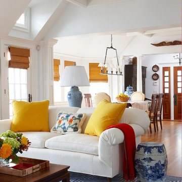
This living room vignette features a blue-and-white geometric patterned area rug; the first of many layers of color in this beach style home.
Inspiration for a timeless brown floor living room remodel in Miami with white walls
Inspiration for a timeless brown floor living room remodel in Miami with white walls
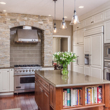
There are so many design elements to this kitchen, I almost don’t know where to start. Bright and airy with crisp clean white cabinets, the kitchen is open and welcoming. Still crisp but gently contrasting, the stainless steel appliance add depth amid the white. To keep this kitchen warm, natural oak covers the floors and a toasted wheat color washes the walls. And then there is the architectural elements. You know. That post and beam in the middle of the room. It’s the center of attention.When you walk into a room your eyes roam around, establishing the size and shape of the room as your feet take you forward. From the front door of this home straight ahead you encountered this wall. The dining area to the right gives you a glimpse of things to come. Where there is a dining room you will usually find a kitchen.
The architecture of years gone by consistently hides the kitchen, the heart of the home, behind walls. I sympathize with my Mom, and all the other Moms, who have had to spend so much time tucked into a tight kitchen, away from the family. This wall had to go, but it was structural. We needed its support but not its bulk.So we got rid of the bulk and only the bulk. Instead of a wall we have a post and beam, offering all of the structure we need. We could have installed a huge steel beam and reconfigure the joists to upset the beam, but why? The small beam and post add an incredible architectural element. It’s turning lemons into lemon, we simply made the most of what we had. It may be functional but it’s so fantastic. It looks like we created the effect just for the drama.
The original kitchen may have had a working triangle and some counter space, but it was fairly small, with each area only a step or two away. The dark cabinets made the space feel even smaller and the butcher block patterned laminate counter tops were very dated. The appliances were feeling their age as well, from a coil burner electric stove to a top freezer refrigerator. To keep this kitchen within its space, a half wall separated it from the dining area.
With the wall gone we borrowed some space from the living room and extended what was a U shaped kitchen into an L. At the living room window we start our new kitchen. We kept a small part of the wall to support the other end of our decorative beam. Sandwiched between a large pantry and our new French door refrigerator, the wall disappears. With our new open floor plan a sizable island was in order.
We split our cooking areas and installed a continuous grill gas cooktop into the island. A sleek island hood takes care of exhaust and adds an extra element to our architectural feature. Under the cooktop we added over-sized drawers for pots and pan storage. The frameless cabinets from New River Cabinetry are maple, painted white, with the Herndon door style. With the cooktop safely nestled into our island, we still had to add an oven.
We used the space where the old range sat for a large single oven of stainless steel and glass. If it worked for one, why not two? We created a home for a microwave in the wall cabinets. It’s perfect for heating leftovers so close to the refrigerator.An important consideration for hot spots in your kitchen is landing zones. Each of our cooking areas have generous landing zones, one on each side of the cooktop and an entire counter area above or below the ovens, depending on which one you’re using.We wanted to give the sink area more room so the half wall had to come out. We moved the trash and recycle cans into a cabinet, removed the heavy soffits and kept the sink under the window.With that little bit of extra space we were able to add a larger cabinet above the dishwasher and slide it all down. This used to be where the carpeting met the vinyl floor, but all of it is gone. Long oak planks eliminate that final divide between the kitchen and the dining area, while adding visual length to the area. White wall cabinets on each side of the window reflect the sunlight for a brighter view.
With all of the darker cabinetry the backsplash walls had been painted white. Even still, there was a darkness in the corners and it wasn’t very exciting. We wanted to add visual interest and reflect the new under-cabinet lighting, eliminating the shadows in this corner.With 1″x 2″ Arabescato Honed marble mosaics and those under-cabinet lights, we achieved the perfect balance. The marble has subtle swirls in gray and beige on a clean white background, but with the honed finish the light is softly reflected instead of glaring. For granite, we chose the soft gray tones of Luna Pearl. The speckles of gray and beige are a gentle contrast to the white cabinets and emulate the color of the stainless steel.Between the carpet, red half wall, dark railing and dated light fixture, the dining area felt tired. Since the kitchen lacked sufficient storage, a large utility cabinet crowded the table space without adding any decorate elements.Although it didn’t get any bigger, our dining area feels fresher and more open too. With the oak flooring joining the area to the rest of our space and the toasted wheat on the walls, the white table and chairs compliment the cabinetry while contrasting the warmer colors. We replaced the chandelier with recessed lighting and changed that railing too.With our new open floor plan, we ended up with a fairly open area in between our foyer closet and the living room window. Not one to miss an opportunity, we filled the space with a multi-functional work space.
With the sunlight streaming in this bright corner works for anything this family needs.
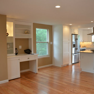
Photo Credit to RJK Construction, Inc.
Architect: Rick Shean & Christopher Simmonds, Christopher Simmonds Architect Inc.
Photography By: Peter Fritz
“Feels very confident and fluent. Love the contrast between first and second floor, both in material and volume. Excellent modern composition.”
This Gatineau Hills home creates a beautiful balance between modern and natural. The natural house design embraces its earthy surroundings, while opening the door to a contemporary aesthetic. The open ground floor, with its interconnected spaces and floor-to-ceiling windows, allows sunlight to flow through uninterrupted, showcasing the beauty of the natural light as it varies throughout the day and by season.
The façade of reclaimed wood on the upper level, white cement board lining the lower, and large expanses of floor-to-ceiling windows throughout are the perfect package for this chic forest home. A warm wood ceiling overhead and rustic hand-scraped wood floor underfoot wrap you in nature’s best.
Marvin’s floor-to-ceiling windows invite in the ever-changing landscape of trees and mountains indoors. From the exterior, the vertical windows lead the eye upward, loosely echoing the vertical lines of the surrounding trees. The large windows and minimal frames effectively framed unique views of the beautiful Gatineau Hills without distracting from them. Further, the windows on the second floor, where the bedrooms are located, are tinted for added privacy. Marvin’s selection of window frame colors further defined this home’s contrasting exterior palette. White window frames were used for the ground floor and black for the second floor.
MARVIN PRODUCTS USED:
Marvin Bi-Fold Door
Marvin Sliding Patio Door
Marvin Tilt Turn and Hopper Window
Marvin Ultimate Awning Window
Marvin Ultimate Swinging French Door

Sponsored
Columbus, OH
Dave Fox Design Build Remodelers
Columbus Area's Luxury Design Build Firm | 17x Best of Houzz Winner!
Joseph Eastburn Photography
Enclosed kitchen - eclectic enclosed kitchen idea in Other with an integrated sink and colored appliances
Enclosed kitchen - eclectic enclosed kitchen idea in Other with an integrated sink and colored appliances
In the Blackhawk neighborhood of Danville, a home’s interior changes dramatically with a modern renovation that opens up the spaces, adds natural light, and highlights the outside world. Removing walls, adding more windows including skylights, and using a white and dark brown base-palette evokes a light, airy, but grounded experience to take in the beautiful landscapes of Danville.
The design of the formal dining room ultimately set off a chain of resizing throughout the building process for the Schneiders. "First, we bumped our dining room wall out 5 feet to accommodate our large, family oriented dining room table & chairs", Gayle explains, "and with the house plan being symmetrically designed, we then bumped the left side of the house out 5 feet as well, to mirror the change of the right side of the house." As a result, other rooms, such as the kitchen and upstairs loft, gained space and usability.
Gayle and Gary continued similar materials from the adjacent living room for a unified look. Personal treasures are kept on display in the cabinet from Restoration Hardware, while natural elements and materials highlight the center of the table.
Chandelier: see the Veranda Linear Chandelier, by Pottery Barn
Adrienne DeRosa Photography © 2013 Houzz
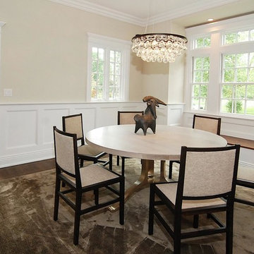
Restored Dining Room
Eclectic dark wood floor dining room photo in New York with beige walls
Eclectic dark wood floor dining room photo in New York with beige walls
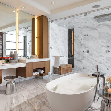
The layout of the master bathroom was created to be perfectly symmetrical which allowed us to incorporate his and hers areas within the same space. The bathtub crates a focal point seen from the hallway through custom designed louvered double door and the shower seen through the glass towards the back of the bathroom enhances the size of the space. Wet areas of the floor are finished in honed marble tiles and the entire floor was treated with any slip solution to ensure safety of the homeowners. The white marble background give the bathroom a light and feminine backdrop for the contrasting dark millwork adding energy to the space and giving it a complimentary masculine presence.
Storage is maximized by incorporating the two tall wood towers on either side of each vanity – it provides ample space needed in the bathroom and it is only 12” deep which allows you to find things easier that in traditional 24” deep cabinetry. Manmade quartz countertops are a functional and smart choice for white counters, especially on the make-up vanity. Vanities are cantilevered over the floor finished in natural white marble with soft organic pattern allow for full appreciation of the beauty of nature.
This home has a lot of inside/outside references, and even in this bathroom, the large window located inside the steam shower uses electrochromic glass (“smart” glass) which changes from clear to opaque at the push of a button. It is a simple, convenient, and totally functional solution in a bathroom.
The center of this bathroom is a freestanding tub identifying his and hers side and it is set in front of full height clear glass shower enclosure allowing the beauty of stone to continue uninterrupted onto the shower walls.
Photography: Craig Denis
Sponsored
Columbus, OH
Dave Fox Design Build Remodelers
Columbus Area's Luxury Design Build Firm | 17x Best of Houzz Winner!
We took this kitchen area from a basic space and updated it with beautiful new appliances, tile, backsplash, and countertop. The majority of the cabinetry stayed in place. We did move the location of the microwave to allow for a commercial hood and we replaced the refrigerator area with a built in for a Sub Zero also adding a wine area beside it. The existing island was added on with eating space and built in trash area. The island was finished off with a beautiful piece of wood on top. We added higher profile crown on all cabinets and changed out the doors at the desk.

Textural, soft tones create a calming and cosy environment, inspired by long, white Scandinavian winters.
Winter Wonderland Living Room Pack contains: 'Winter Wonderland' by Kevin Russ, Nordic side table set, ceramic & timber table lamp, wooden faux antler, 2 x handmade Column Vases by Sophie Moran, Mediterranean Fig Scented candle by The S Collection, reindeer skin, woven basket, Octagonal Trivet by Marble Basics, Giambattista Valli coffee table book by Lee Radziwill, 'Esther' 45 x 45cm, 'Chloe' 50 x 50cm & 'Mia' 50 x 50cm cushions by Nathan + Jac.
P. Seletskiy
Eat-in kitchen - large traditional l-shaped porcelain tile eat-in kitchen idea in Philadelphia with granite countertops, an undermount sink, raised-panel cabinets, white cabinets, beige backsplash, porcelain backsplash, stainless steel appliances, an island and green countertops
Eat-in kitchen - large traditional l-shaped porcelain tile eat-in kitchen idea in Philadelphia with granite countertops, an undermount sink, raised-panel cabinets, white cabinets, beige backsplash, porcelain backsplash, stainless steel appliances, an island and green countertops
Photo Credit - Katrina Mojzesz
topkatphoto.com
Interior Design - Katja van der Loo
Papyrus Home Design
papyrushomedesign.com
Homeowner & Design Director -
Sue Walter, subeeskitchen.com
Showing Results for "Basic Change Dependent"

Example of a minimalist kitchen design in Sacramento with flat-panel cabinets, white cabinets and metallic backsplash
Peter Dressel Photography
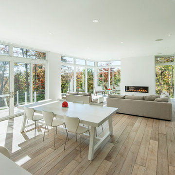
Family room - contemporary family room idea in New York with white walls
Family room - contemporary family room idea in New York with white walls
To dwell and establish connections with a place is a basic human necessity often combined, amongst other things, with light and is performed in association with the elements that generate it, be they natural or artificial. And in the renovation of this purpose-built first floor flat in a quiet residential street in Kennington, the use of light in its varied forms is adopted to modulate the space and create a brand new dwelling, adapted to modern living standards.
From the intentionally darkened entrance lobby at the lower ground floor – as seen in Mackintosh’s Hill House – one is led to a brighter upper level where the insertion of wide pivot doors creates a flexible open plan centred around an unfinished plaster box-like pod. Kitchen and living room are connected and use a stair balustrade that doubles as a bench seat; this allows the landing to become an extension of the kitchen/dining area - rather than being merely circulation space – with a new external view towards the landscaped terrace at the rear.
The attic space is converted: a modernist black box, clad in natural slate tiles and with a wide sliding window, is inserted in the rear roof slope to accommodate a bedroom and a bathroom.
A new relationship can eventually be established with all new and existing exterior openings, now visible from the former landing space: traditional timber sash windows are re-introduced to replace unsightly UPVC frames, and skylights are put in to direct one’s view outwards and upwards.
photo: Gianluca Maver
36