


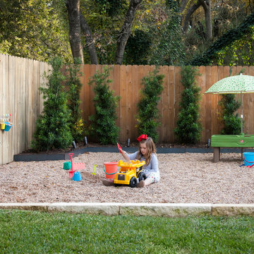
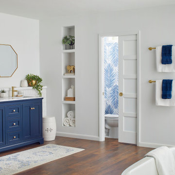
Search results for "Enjoying lifestyle" in Home Design Ideas
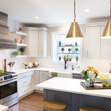
After six years of living in their Huntley IL home, Chris and Meghan were tired of their dark, dingy, outdated kitchen and it was finally time for a long-anticipated change. “The kitchen is the place where we live, it’s where we do everything,” Meghan said. “It was important that it be a space where we wanted to be.” Meghan loves cooking and enjoys including their girls in healthy meal prepping, this led them to want a brighter, more enjoyable kitchen with increased functionality and improved storage.
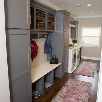
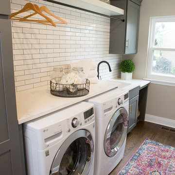
For Chris especially, the laundry room was an entirely dysfunctional eyesore. “We had a washer and a dryer, but it was all kind-of cobbled together!” Chris said. “There were always laundry piles everywhere, we weren’t really sure what we wanted to do in there, but it was time for us to make a change.” The mess of the space was stressful every time they walked in the door from the garage each day. Kids’ backpacks and shoes piled up haphazardly in the makeshift boot-bench closet left the family feeling disorganized and stressed. They needed space for folding clothes and locker cubbies to help keep the family organized.
Having known Christine and Todd in the Huntley community for years, Chris and Meghan were familiar with their work. “We already trusted them personally and having seen their projects for years we knew they did top notch work. After we reviewed the initial round of designs, we knew that hiring them was definitely the right choice,” Meghan and Chris said. Although Chris had done a lot of work in their home himself, the kitchen and laundry room renovation was such a large undertaking that he didn’t want to steal time away from his family to spend what would surely be many long weekends doing the job himself. “That would not have been a wise choice for us,” Chris laughed.
“Our designer, Michelle was very, very, easy to work with; anything we wanted to see or weren’t sure about, she went above and beyond to make this easy for us. She was easy to get hold of and always quick to respond,” the couple said. Michelle pulled ideas that mirrored the couple’s taste and style and was adept at directing the couple to limited choices that didn’t overwhelm them and kept the process moving. “I have a hard time making decisions. Michelle made the decision-making process so easy. I loved how she listened to what I liked and then presented three great options for me to choose from,” Meghan said.
The main objectives for the kitchen were better storage solutions, they wanted the space to reflect their lifestyle and taste, and they wanted it to last for years with low maintenance. One of the first steps in creating a more functional kitchen was relocating the refrigerator, creating an improved workflow for the busy family.
“We didn’t know that we could even move the refrigerator to a new location where it is now, that was something that we never would have thought of,” Chris said. “The new refrigerator location makes the kitchen feel so much bigger. We didn’t add any space, but our whole kitchen with the new design just seems like it’s so much larger than before!” Meghan said.
The perimeter mist colored cabinets helped warm and brighten the entire room, while the graphite colored cabinets on the island added contrast. Using this fresh, clean color palette satisfied the couple’s desire for a bright space that was the exact opposite of what they had before. Organization accessories were also added to the cabinets such as a spice drawer tray and roll outs to create hidden convenience.
“I absolutely love the hidden spices – it makes cooking so much more enjoyable!” Chris said. “And all the pull outs, and the double trash bin, who would think you could get so excited about organization!” the couple said in unison.
One thing they hated in their original kitchen was how dark the space felt. Added lighting on the ceiling with the new light fixtures combined with the lighter cabinetry colors throughout solved this problem. “Our new kitchen has this warm, almost cozy feeling that our old kitchen never had, it’s just a space that I love spending my time in now,” Meghan said. The light airy feeling was accentuated with the use of floating white shelves on either side of the decorative range hood. “We have so much cabinetry space, the new design is amazing we actually have more storage space than we will ever need,” Meghan said.
The island was extended to create more work surface and added space for stool seating. “The new island changes how we live. Now the kids can be in the kitchen with us, doing homework, eating breakfast, and the three of us have special dinners there when Chris is working late,” Meghan said.
The Carrara Marmi Quartz countertops were chosen because they are, not only beautiful, but are made from hard-working material that doesn’t require maintenance. The white subway tile backsplash that wraps to the ceiling behind the focal point cooktop range/hood compliments the crisp white countertops perfectly, while brushed brass hardware and light fixtures keep the design fresh and new.
The couple had a few fears at the beginning of the project, as most homeowners do. Their biggest fear was being out of their kitchen and laundry room for an extended time. The crew made it very easy for the family to work in a limited space keeping the washer and dryer hooked up the majority of the time, and also getting appliances working with minimal downtime.
“They above and beyond accommodated us to get us through the process,” Meghan said. “They did a great job making sure we were as comfortable as possible throughout the process,” Chris added.
“Our project manager DJ did a great job. He was very good at updating us on schedule changes, getting guys in as quickly as possible. Everyone that stepped in the house was nice and did great work,” said Chris. They thought Advance’s carpenter was phenomenal and were impressed when he took a conceptual idea from a photograph and worked with designer Michelle to create a one of a kind range/hood that has become the topic of conversation with friends and family who visit the new kitchen. “He was in our house literally every day for several weeks. He was easy to work with and good at what he did,” Meghan and Chris said.
The focal point of the kitchen; a hand-crafted, custom-built ventilation hood was clad with handpicked reclaimed barnwood. Advance Design’s carpenter built the framework and the cladding to create a one-of-a-kind design element that the couple loves.
“I think it was especially fun for him to create something unique from scratch, showcasing his talent in this area,” Meghan said. “I love that my kitchen is not like everyone else’s. I got to pick out the wood on my hood and watch it being built and was able to choose what pieces of wood went where on it. It’s totally unique.”
Red Oak flooring was toothed-in throughout the kitchen and the rest of the first floor anywhere changes were made. Then the whole floor was refinished to tone down the orange undertones in the existing floor stain, ultimately changing the color complexion of the entire first floor. The result is a completely new feeling to the entire home.
Renovating the laundry room was extremely important to Meghan and Chris, but they had trouble visualizing what the possibilities were for the seemingly small space. Michelle produced beautiful 3D illustrations that helped them envision the space in a whole new way.
“I must have told Michelle 100 times that I am a visual person, seeing the designs in 3D made it so easy to make decisions and see what we could really do with our space,” Meghan said.
A dividing wall and doorway were removed between the existing laundry room and hallway formerly containing a coat closet, providing space to design specialized graphite colored cabinetry matching the kitchen island to house custom storage cubbies for each family member. Adding the tall utility cabinetry in the new laundry area helped solve the storage issue, tucking away cleaning supplies, household items, and even the cat got its own cubby.
“I love how everything is now hidden in its own space. I can’t tell you how much I hated coming home and seeing everything sitting around on counters,” Chris said.
Electrical outlets were planned for the inside of utility cabinets, so devices could charge in hidden locations. Stacking the washer and dryer allowed for wider countertop space to provide a folding area and a special space for clothes to hang. “The way I do laundry has been completely transformed! I can actually fold clothes and hang them now right out of the washer and dryer,” Meghan said.
“The end result in the kitchen and the laundry/mud room was an updated light and bright space, with a smarter work flow that better meets the needs of this family,” Michelle said.
“I would totally recommend Advance Design,” Meghan said. “Sometimes I sit and just look at my kitchen and laundry room and think ‘Wow, I can’t believe I get to live here!’ It’s an understatement to say we love our new space.”
Established in 1895 as a warehouse for the spice trade, 481 Washington was built to last. With its 25-inch-thick base and enchanting Beaux Arts facade, this regal structure later housed a thriving Hudson Square printing company. After an impeccable renovation, the magnificent loft building’s original arched windows and exquisite cornice remain a testament to the grandeur of days past. Perfectly anchored between Soho and Tribeca, Spice Warehouse has been converted into 12 spacious full-floor lofts that seamlessly fuse old-world character with modern convenience.
Steps from the Hudson River, Spice Warehouse is within walking distance of renowned restaurants, famed art galleries, specialty shops and boutiques. With its golden sunsets and outstanding facilities, this is the ideal destination for those seeking the tranquil pleasures of the Hudson River waterfront.
Expansive private floor residences were designed to be both versatile and functional, each with 3- to 4-bedrooms, 3 full baths, and a home office. Several residences enjoy dramatic Hudson River views.
This open space has been designed to accommodate a perfect Tribeca city lifestyle for entertaining, relaxing and working.
This living room design reflects a tailored “old-world” look, respecting the original features of the Spice Warehouse. With its high ceilings, arched windows, original brick wall and iron columns, this space is a testament of ancient time and old world elegance.
The design choices are a combination of neutral, modern finishes such as the Oak natural matte finish floors and white walls, white shaker style kitchen cabinets, combined with a lot of texture found in the brick wall, the iron columns and the various fabrics and furniture pieces finishes used throughout the space and highlighted by a beautiful natural light brought in through a wall of arched windows.
The layout is open and flowing to keep the feel of grandeur of the space so each piece and design finish can be admired individually.
As soon as you enter, a comfortable Eames lounge chair invites you in, giving her back to a solid brick wall adorned by the “cappuccino” art photography piece by Francis Augustine and surrounded by flowing linen taupe window drapes and a shiny cowhide rug.
The cream linen sectional sofa takes center stage, with its sea of textures pillows, giving it character, comfort and uniqueness. The living room combines modern lines such as the Hans Wegner Shell chairs in walnut and black fabric with rustic elements such as this one of a kind Indonesian antique coffee table, giant iron antique wall clock and hand made jute rug which set the old world tone for an exceptional interior.
Photography: Francis Augustine
Expansive private floor residences were designed to be both versatile and functional, each with 3 to 4 bedrooms, 3 full baths, and a home office. Several residences enjoy dramatic Hudson River views.
This open space has been designed to accommodate a perfect Tribeca city lifestyle for entertaining, relaxing and working.
This living room design reflects a tailored “old world” look, respecting the original features of the Spice Warehouse. With its high ceilings, arched windows, original brick wall and iron columns, this space is a testament of ancient time and old world elegance.
The design choices are a combination of neutral, modern finishes such as the Oak natural matte finish floors and white walls, white shaker style kitchen cabinets, combined with a lot of texture found in the brick wall, the iron columns and the various fabrics and furniture pieces finishes used thorughout the space and highlited by a beautiful natural light brought in through a wall of arched windows.
The layout is open and flowing to keep the feel of grandeur of the space so each piece and design finish can be admired individually.
As soon as you enter, a comfortable Eames Lounge chair invites you in, giving her back to a solid brick wall adorned by the “cappucino” art photography piece by Francis Augustine and surrounded by flowing linen taupe window drapes and a shiny cowhide rug.
The cream linen sectional sofa takes center stage, with its sea of textures pillows, giving it character, comfort and uniqueness. The living room combines modern lines such as the Hans Wegner Shell chairs in walnut and black fabric with rustic elements such as this one of a kind Indonesian antique coffee table, giant iron antique wall clock and hand made jute rug which set the old world tone for an exceptional interior.
Photography: Francis Augustine
Find the right local pro for your project
Photographer: Jay Goodrich
This 2800 sf single-family home was completed in 2009. The clients desired an intimate, yet dynamic family residence that reflected the beauty of the site and the lifestyle of the San Juan Islands. The house was built to be both a place to gather for large dinners with friends and family as well as a cozy home for the couple when they are there alone.
The project is located on a stunning, but cripplingly-restricted site overlooking Griffin Bay on San Juan Island. The most practical area to build was exactly where three beautiful old growth trees had already chosen to live. A prior architect, in a prior design, had proposed chopping them down and building right in the middle of the site. From our perspective, the trees were an important essence of the site and respectfully had to be preserved. As a result we squeezed the programmatic requirements, kept the clients on a square foot restriction and pressed tight against property setbacks.
The delineate concept is a stone wall that sweeps from the parking to the entry, through the house and out the other side, terminating in a hook that nestles the master shower. This is the symbolic and functional shield between the public road and the private living spaces of the home owners. All the primary living spaces and the master suite are on the water side, the remaining rooms are tucked into the hill on the road side of the wall.
Off-setting the solid massing of the stone walls is a pavilion which grabs the views and the light to the south, east and west. Built in a position to be hammered by the winter storms the pavilion, while light and airy in appearance and feeling, is constructed of glass, steel, stout wood timbers and doors with a stone roof and a slate floor. The glass pavilion is anchored by two concrete panel chimneys; the windows are steel framed and the exterior skin is of powder coated steel sheathing.
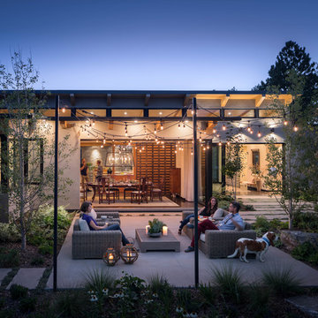
The lifestyle shift to empty-nesters inspires the
creation of a dream space to entertain and enjoy. Photographed by David Lauer Photography
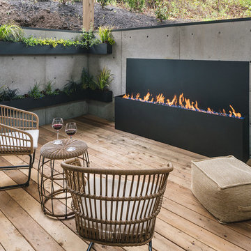
Inspiration for a contemporary backyard concrete patio remodel in Denver with no cover
Inspiration for a contemporary backyard concrete patio remodel in Denver with no cover
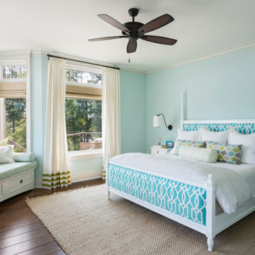
Inspiration for a coastal dark wood floor and brown floor bedroom remodel in Charleston with blue walls
After six years of living in their Huntley IL home, Chris and Meghan were tired of their dark, dingy, outdated kitchen and it was finally time for a long-anticipated change. “The kitchen is the place where we live, it’s where we do everything,” Meghan said. “It was important that it be a space where we wanted to be.” Meghan loves cooking and enjoys including their girls in healthy meal prepping, this led them to want a brighter, more enjoyable kitchen with increased functionality and improved storage.
For Chris especially, the laundry room was an entirely dysfunctional eyesore. “We had a washer and a dryer, but it was all kind-of cobbled together!” Chris said. “There were always laundry piles everywhere, we weren’t really sure what we wanted to do in there, but it was time for us to make a change.” The mess of the space was stressful every time they walked in the door from the garage each day. Kids’ backpacks and shoes piled up haphazardly in the makeshift boot-bench closet left the family feeling disorganized and stressed. They needed space for folding clothes and locker cubbies to help keep the family organized.
Having known Christine and Todd in the Huntley community for years, Chris and Meghan were familiar with their work. “We already trusted them personally and having seen their projects for years we knew they did top notch work. After we reviewed the initial round of designs, we knew that hiring them was definitely the right choice,” Meghan and Chris said. Although Chris had done a lot of work in their home himself, the kitchen and laundry room renovation was such a large undertaking that he didn’t want to steal time away from his family to spend what would surely be many long weekends doing the job himself. “That would not have been a wise choice for us,” Chris laughed.
“Our designer, Michelle was very, very, easy to work with; anything we wanted to see or weren’t sure about, she went above and beyond to make this easy for us. She was easy to get hold of and always quick to respond,” the couple said. Michelle pulled ideas that mirrored the couple’s taste and style and was adept at directing the couple to limited choices that didn’t overwhelm them and kept the process moving. “I have a hard time making decisions. Michelle made the decision-making process so easy. I loved how she listened to what I liked and then presented three great options for me to choose from,” Meghan said.
The main objectives for the kitchen were better storage solutions, they wanted the space to reflect their lifestyle and taste, and they wanted it to last for years with low maintenance. One of the first steps in creating a more functional kitchen was relocating the refrigerator, creating an improved workflow for the busy family.
“We didn’t know that we could even move the refrigerator to a new location where it is now, that was something that we never would have thought of,” Chris said. “The new refrigerator location makes the kitchen feel so much bigger. We didn’t add any space, but our whole kitchen with the new design just seems like it’s so much larger than before!” Meghan said.
The perimeter mist colored cabinets helped warm and brighten the entire room, while the graphite colored cabinets on the island added contrast. Using this fresh, clean color palette satisfied the couple’s desire for a bright space that was the exact opposite of what they had before. Organization accessories were also added to the cabinets such as a spice drawer tray and roll outs to create hidden convenience.
“I absolutely love the hidden spices – it makes cooking so much more enjoyable!” Chris said. “And all the pull outs, and the double trash bin, who would think you could get so excited about organization!” the couple said in unison.
One thing they hated in their original kitchen was how dark the space felt. Added lighting on the ceiling with the new light fixtures combined with the lighter cabinetry colors throughout solved this problem. “Our new kitchen has this warm, almost cozy feeling that our old kitchen never had, it’s just a space that I love spending my time in now,” Meghan said. The light airy feeling was accentuated with the use of floating white shelves on either side of the decorative range hood. “We have so much cabinetry space, the new design is amazing we actually have more storage space than we will ever need,” Meghan said.
The island was extended to create more work surface and added space for stool seating. “The new island changes how we live. Now the kids can be in the kitchen with us, doing homework, eating breakfast, and the three of us have special dinners there when Chris is working late,” Meghan said.
The Carrara Marmi Quartz countertops were chosen because they are, not only beautiful, but are made from hard-working material that doesn’t require maintenance. The white subway tile backsplash that wraps to the ceiling behind the focal point cooktop range/hood compliments the crisp white countertops perfectly, while brushed brass hardware and light fixtures keep the design fresh and new.
The couple had a few fears at the beginning of the project, as most homeowners do. Their biggest fear was being out of their kitchen and laundry room for an extended time. The crew made it very easy for the family to work in a limited space keeping the washer and dryer hooked up the majority of the time, and also getting appliances working with minimal downtime.
“They above and beyond accommodated us to get us through the process,” Meghan said. “They did a great job making sure we were as comfortable as possible throughout the process,” Chris added.
“Our project manager DJ did a great job. He was very good at updating us on schedule changes, getting guys in as quickly as possible. Everyone that stepped in the house was nice and did great work,” said Chris. They thought Advance’s carpenter was phenomenal and were impressed when he took a conceptual idea from a photograph and worked with designer Michelle to create a one of a kind range/hood that has become the topic of conversation with friends and family who visit the new kitchen. “He was in our house literally every day for several weeks. He was easy to work with and good at what he did,” Meghan and Chris said.
The focal point of the kitchen; a hand-crafted, custom-built ventilation hood was clad with handpicked reclaimed barnwood. Advance Design’s carpenter built the framework and the cladding to create a one-of-a-kind design element that the couple loves.
“I think it was especially fun for him to create something unique from scratch, showcasing his talent in this area,” Meghan said. “I love that my kitchen is not like everyone else’s. I got to pick out the wood on my hood and watch it being built and was able to choose what pieces of wood went where on it. It’s totally unique.”
Red Oak flooring was toothed-in throughout the kitchen and the rest of the first floor anywhere changes were made. Then the whole floor was refinished to tone down the orange undertones in the existing floor stain, ultimately changing the color complexion of the entire first floor. The result is a completely new feeling to the entire home.
Renovating the laundry room was extremely important to Meghan and Chris, but they had trouble visualizing what the possibilities were for the seemingly small space. Michelle produced beautiful 3D illustrations that helped them envision the space in a whole new way.
“I must have told Michelle 100 times that I am a visual person, seeing the designs in 3D made it so easy to make decisions and see what we could really do with our space,” Meghan said.
A dividing wall and doorway were removed between the existing laundry room and hallway formerly containing a coat closet, providing space to design specialized graphite colored cabinetry matching the kitchen island to house custom storage cubbies for each family member. Adding the tall utility cabinetry in the new laundry area helped solve the storage issue, tucking away cleaning supplies, household items, and even the cat got its own cubby.
“I love how everything is now hidden in its own space. I can’t tell you how much I hated coming home and seeing everything sitting around on counters,” Chris said.
Electrical outlets were planned for the inside of utility cabinets, so devices could charge in hidden locations. Stacking the washer and dryer allowed for wider countertop space to provide a folding area and a special space for clothes to hang. “The way I do laundry has been completely transformed! I can actually fold clothes and hang them now right out of the washer and dryer,” Meghan said.
“The end result in the kitchen and the laundry/mud room was an updated light and bright space, with a smarter work flow that better meets the needs of this family,” Michelle said.
“I would totally recommend Advance Design,” Meghan said. “Sometimes I sit and just look at my kitchen and laundry room and think ‘Wow, I can’t believe I get to live here!’ It’s an understatement to say we love our new space.”
Outdoor patio with gas fireplace that lives right off the kitchen. Perfect for hosting or being outside privately, as it's secluded from neighbors. Wood floors, cement walls with a cover.
By taking over the former butler's pantry and relocating the rear entry, the new kitchen is a large, bright space with improved traffic flow and efficient work space.
This renovated brick rowhome in Boston’s South End offers a modern aesthetic within a historic structure, creative use of space, exceptional thermal comfort, a reduced carbon footprint, and a passive stream of income.
DESIGN PRIORITIES. The goals for the project were clear - design the primary unit to accommodate the family’s modern lifestyle, rework the layout to create a desirable rental unit, improve thermal comfort and introduce a modern aesthetic. We designed the street-level entry as a shared entrance for both the primary and rental unit. The family uses it as their everyday entrance - we planned for bike storage and an open mudroom with bench and shoe storage to facilitate the change from shoes to slippers or bare feet as they enter their home. On the main level, we expanded the kitchen into the dining room to create an eat-in space with generous counter space and storage, as well as a comfortable connection to the living space. The second floor serves as master suite for the couple - a bedroom with a walk-in-closet and ensuite bathroom, and an adjacent study, with refinished original pumpkin pine floors. The upper floor, aside from a guest bedroom, is the child's domain with interconnected spaces for sleeping, work and play. In the play space, which can be separated from the work space with new translucent sliding doors, we incorporated recreational features inspired by adventurous and competitive television shows, at their son’s request.
MODERN MEETS TRADITIONAL. We left the historic front facade of the building largely unchanged - the security bars were removed from the windows and the single pane windows were replaced with higher performing historic replicas. We designed the interior and rear facade with a vision of warm modernism, weaving in the notable period features. Each element was either restored or reinterpreted to blend with the modern aesthetic. The detailed ceiling in the living space, for example, has a new matte monochromatic finish, and the wood stairs are covered in a dark grey floor paint, whereas the mahogany doors were simply refinished. New wide plank wood flooring with a neutral finish, floor-to-ceiling casework, and bold splashes of color in wall paint and tile, and oversized high-performance windows (on the rear facade) round out the modern aesthetic.
RENTAL INCOME. The existing rowhome was zoned for a 2-family dwelling but included an undesirable, single-floor studio apartment at the garden level with low ceiling heights and questionable emergency egress. In order to increase the quality and quantity of space in the rental unit, we reimagined it as a two-floor, 1 or 2 bedroom, 2 bathroom apartment with a modern aesthetic, increased ceiling height on the lowest level and provided an in-unit washer/dryer. The apartment was listed with Jackie O'Connor Real Estate and rented immediately, providing the owners with a source of passive income.
ENCLOSURE WITH BENEFITS. The homeowners sought a minimal carbon footprint, enabled by their urban location and lifestyle decisions, paired with the benefits of a high-performance home. The extent of the renovation allowed us to implement a deep energy retrofit (DER) to address air tightness, insulation, and high-performance windows. The historic front facade is insulated from the interior, while the rear facade is insulated on the exterior. Together with these building enclosure improvements, we designed an HVAC system comprised of continuous fresh air ventilation, and an efficient, all-electric heating and cooling system to decouple the house from natural gas. This strategy provides optimal thermal comfort and indoor air quality, improved acoustic isolation from street noise and neighbors, as well as a further reduced carbon footprint. We also took measures to prepare the roof for future solar panels, for when the South End neighborhood’s aging electrical infrastructure is upgraded to allow them.
URBAN LIVING. The desirable neighborhood location allows the both the homeowners and tenant to walk, bike, and use public transportation to access the city, while each charging their respective plug-in electric cars behind the building to travel greater distances.
OVERALL. The understated rowhouse is now ready for another century of urban living, offering the owners comfort and convenience as they live life as an expression of their values.
Photography: Eric Roth Photo
Reload the page to not see this specific ad anymore
Lee Manning Photography
Example of a mid-sized farmhouse 3/4 ceramic tile and blue floor bathroom design in Los Angeles with a trough sink, a two-piece toilet and white walls
Example of a mid-sized farmhouse 3/4 ceramic tile and blue floor bathroom design in Los Angeles with a trough sink, a two-piece toilet and white walls
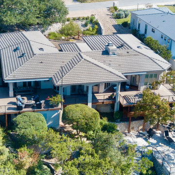
The Roger Lee designed house from 1962 was purchased by the current homeowners in almost original condition, as the previous owners elected to defer most maintenance projects over the years. The clients were able to see beyond the dated materials and finishes, single-paned glass and uninsulated walls and they approached Klopf Architecture to help them expand and update the entire home, one the family could settle into and enjoy for years to come. It was important that the new designs were aligned with Lee's original intent not only because of the client's appreciation for mid-century modern architecture, but also because the house was deemed historical. The Stanford Real Estate Office requires a stringent design review which safeguards the integrity of the community, which Klopf Architecture was happy to oblige going into their updated designs.
As with many original mid-century modern homes, the house was scaled to the 1960s lifestyle where rooms were smaller and openings to views were limited and tightly framed. The original conditions defined the direction the family of four would take in updating the house and making it comfortable for their modern lifestyle. Klopf designed a full gut remodel and major addition to bring the house into the 21st century and provide the living area needed for the client's family. The newly expanded house added just about 1,100 sf to create an airy, comfortable and family friendly house, taking full advantage of the beautiful southwestern views that extend out to the hills beyond. The enclosed garage created an additional 240 sf of covered space for long-term storage.
A cracked swimming pool created an eyesore taking up a majority of the backyard landscape, so it was one of the first elements to go during the transformation. Working with Outer Space Landscape Architects, the family asked for a mix of relaxing outdoor patio spaces that eventually blend into the native landscaping, extending their views outward toward the natural greenery of the trees beyond their property. Filling in the old pool was a smart way to expand the living spaces outward. The orientation of the house was designed to enjoy the views, but the original architecture provided the first homeowners with mere glimpses of the landscape outside.
Klopf was able to broaden those views, continuing and extending on the original architecture to take full advantage of the unobstructed natural views across the rear facade of the house. Small horizontal openings in the primary bedroom and office were replaced with much taller windows that now follow the angled roof line upward, extending across almost all of the facade. We worked with Western Windows, whose designs included an oblique-shaped, operable casement that allowed our design to rise with the slope. A new corner office added to the primary suite, offers a bright and functional work-from-home solution that looks out at the distant views and added natural light from the expanded window configuration that now wraps around the corner.
The existing lower level was designed by Lee as a utilitarian space, serving as a wet pool room with a drain in the center of the floor, bathroom, laundry and storage areas. Without the need for a pool room, Klopf was able to convert the area into a much more comfortable and functional living space with a new family room and guest suite. The new spaces enjoy easy access to a new outdoor patio through floor to ceiling, full-width glass sliders.
Continuing along the rear facade, a previously exposed deck extending from the living room and hallway provided access to the backyard through a single set of stairs leading toward the side of the house which made sense when the pool was in place. The new deck was re-envisioned as an extension of the main living room and now serves as a second outdoor living room. A new slatted pergola above provides the homeowners welcome relief from the hot afternoon sun. A second set of stairs now creates a better connection to the redesigned lower level. Klopf was able to reconfigure the spaces, extending the living room outward toward the views, where the family now claims it as the heart of the home, spending a large majority of their time outdoors.
Back inside, the original wood-burning Malm fireplace was beautifully restored and a gas burner installed to comply with California's strict air standards. It now rests in front of a wall of Heath accent tiles where a dated red brick wall used to stand. A new taller window brings more light and views into the refreshed interior living room. The original glass doors opposite the fireplace were replaced by larger sliders that when fully opened, create a seamless transition to the new outdoor living area so the two spaces feel like one connected space. The original utilitarian kitchen was needlessly tucked into the far back corner and closed-off, out of sight from the living room, so the clients asked Klopf to open it up and expand the kitchen forward so it felt more connected. Today the much larger kitchen is connected to the living area where a short wall with a cutout offers a visual glimpse into the kitchen and a handy pass-through counter for serving guests. A new breakfast nook was also added to create another spot where the family can gather for casual meals. Just outside, a new built-in outdoor grill and prep area extends the kitchen outside and connects to a new outdoor dining spot nestled amongst the trees, taking advantage of the views out back.
Klopf was able to expand the other two bedrooms, add a new laundry room and half-bath and convert the carport to an enclosed garage to add more storage areas which was lost when the pool house was converted to the family and guest room.
To maintain a historical connection to the original designs, the exterior siding was repeated on all exterior walls, a full-height stained glass window at the front entryway restored, and an interior slatted screen element repeated outside at the exterior entry courtyard and over the new outdoor living room to create a shade trellis. The new house stands proudly and shines against it's new landscaping features, while respecting and expanding on the original intent of Roger Lee's designs epitomizing the comforts of indoor-outdoor living in Northern California.
Completion year: 2020
Klopf Architecture project team: John Klopf, Klara Kevane, Noel Andrade
Contractor: ORB Construction, Brendan O'Reilly
Structural engineer: Sezen and Moon
Landscape architect: Outer space
Furnishings and decoration: Urbanism Designs
Photographer: Mariko Reed
After six years of living in their Huntley IL home, Chris and Meghan were tired of their dark, dingy, outdated kitchen and it was finally time for a long-anticipated change. “The kitchen is the place where we live, it’s where we do everything,” Meghan said. “It was important that it be a space where we wanted to be.” Meghan loves cooking and enjoys including their girls in healthy meal prepping, this led them to want a brighter, more enjoyable kitchen with increased functionality and improved storage.
For Chris especially, the laundry room was an entirely dysfunctional eyesore. “We had a washer and a dryer, but it was all kind-of cobbled together!” Chris said. “There were always laundry piles everywhere, we weren’t really sure what we wanted to do in there, but it was time for us to make a change.” The mess of the space was stressful every time they walked in the door from the garage each day. Kids’ backpacks and shoes piled up haphazardly in the makeshift boot-bench closet left the family feeling disorganized and stressed. They needed space for folding clothes and locker cubbies to help keep the family organized.
Having known Christine and Todd in the Huntley community for years, Chris and Meghan were familiar with their work. “We already trusted them personally and having seen their projects for years we knew they did top notch work. After we reviewed the initial round of designs, we knew that hiring them was definitely the right choice,” Meghan and Chris said. Although Chris had done a lot of work in their home himself, the kitchen and laundry room renovation was such a large undertaking that he didn’t want to steal time away from his family to spend what would surely be many long weekends doing the job himself. “That would not have been a wise choice for us,” Chris laughed.
“Our designer, Michelle was very, very, easy to work with; anything we wanted to see or weren’t sure about, she went above and beyond to make this easy for us. She was easy to get hold of and always quick to respond,” the couple said. Michelle pulled ideas that mirrored the couple’s taste and style and was adept at directing the couple to limited choices that didn’t overwhelm them and kept the process moving. “I have a hard time making decisions. Michelle made the decision-making process so easy. I loved how she listened to what I liked and then presented three great options for me to choose from,” Meghan said.
The main objectives for the kitchen were better storage solutions, they wanted the space to reflect their lifestyle and taste, and they wanted it to last for years with low maintenance. One of the first steps in creating a more functional kitchen was relocating the refrigerator, creating an improved workflow for the busy family.
“We didn’t know that we could even move the refrigerator to a new location where it is now, that was something that we never would have thought of,” Chris said. “The new refrigerator location makes the kitchen feel so much bigger. We didn’t add any space, but our whole kitchen with the new design just seems like it’s so much larger than before!” Meghan said.
The perimeter mist colored cabinets helped warm and brighten the entire room, while the graphite colored cabinets on the island added contrast. Using this fresh, clean color palette satisfied the couple’s desire for a bright space that was the exact opposite of what they had before. Organization accessories were also added to the cabinets such as a spice drawer tray and roll outs to create hidden convenience.
“I absolutely love the hidden spices – it makes cooking so much more enjoyable!” Chris said. “And all the pull outs, and the double trash bin, who would think you could get so excited about organization!” the couple said in unison.
One thing they hated in their original kitchen was how dark the space felt. Added lighting on the ceiling with the new light fixtures combined with the lighter cabinetry colors throughout solved this problem. “Our new kitchen has this warm, almost cozy feeling that our old kitchen never had, it’s just a space that I love spending my time in now,” Meghan said. The light airy feeling was accentuated with the use of floating white shelves on either side of the decorative range hood. “We have so much cabinetry space, the new design is amazing we actually have more storage space than we will ever need,” Meghan said.
The island was extended to create more work surface and added space for stool seating. “The new island changes how we live. Now the kids can be in the kitchen with us, doing homework, eating breakfast, and the three of us have special dinners there when Chris is working late,” Meghan said.
The Carrara Marmi Quartz countertops were chosen because they are, not only beautiful, but are made from hard-working material that doesn’t require maintenance. The white subway tile backsplash that wraps to the ceiling behind the focal point cooktop range/hood compliments the crisp white countertops perfectly, while brushed brass hardware and light fixtures keep the design fresh and new.
The couple had a few fears at the beginning of the project, as most homeowners do. Their biggest fear was being out of their kitchen and laundry room for an extended time. The crew made it very easy for the family to work in a limited space keeping the washer and dryer hooked up the majority of the time, and also getting appliances working with minimal downtime.
“They above and beyond accommodated us to get us through the process,” Meghan said. “They did a great job making sure we were as comfortable as possible throughout the process,” Chris added.
“Our project manager DJ did a great job. He was very good at updating us on schedule changes, getting guys in as quickly as possible. Everyone that stepped in the house was nice and did great work,” said Chris. They thought Advance’s carpenter was phenomenal and were impressed when he took a conceptual idea from a photograph and worked with designer Michelle to create a one of a kind range/hood that has become the topic of conversation with friends and family who visit the new kitchen. “He was in our house literally every day for several weeks. He was easy to work with and good at what he did,” Meghan and Chris said.
The focal point of the kitchen; a hand-crafted, custom-built ventilation hood was clad with handpicked reclaimed barnwood. Advance Design’s carpenter built the framework and the cladding to create a one-of-a-kind design element that the couple loves.
“I think it was especially fun for him to create something unique from scratch, showcasing his talent in this area,” Meghan said. “I love that my kitchen is not like everyone else’s. I got to pick out the wood on my hood and watch it being built and was able to choose what pieces of wood went where on it. It’s totally unique.”
Red Oak flooring was toothed-in throughout the kitchen and the rest of the first floor anywhere changes were made. Then the whole floor was refinished to tone down the orange undertones in the existing floor stain, ultimately changing the color complexion of the entire first floor. The result is a completely new feeling to the entire home.
Renovating the laundry room was extremely important to Meghan and Chris, but they had trouble visualizing what the possibilities were for the seemingly small space. Michelle produced beautiful 3D illustrations that helped them envision the space in a whole new way.
“I must have told Michelle 100 times that I am a visual person, seeing the designs in 3D made it so easy to make decisions and see what we could really do with our space,” Meghan said.
A dividing wall and doorway were removed between the existing laundry room and hallway formerly containing a coat closet, providing space to design specialized graphite colored cabinetry matching the kitchen island to house custom storage cubbies for each family member. Adding the tall utility cabinetry in the new laundry area helped solve the storage issue, tucking away cleaning supplies, household items, and even the cat got its own cubby.
“I love how everything is now hidden in its own space. I can’t tell you how much I hated coming home and seeing everything sitting around on counters,” Chris said.
Electrical outlets were planned for the inside of utility cabinets, so devices could charge in hidden locations. Stacking the washer and dryer allowed for wider countertop space to provide a folding area and a special space for clothes to hang. “The way I do laundry has been completely transformed! I can actually fold clothes and hang them now right out of the washer and dryer,” Meghan said.
“The end result in the kitchen and the laundry/mud room was an updated light and bright space, with a smarter work flow that better meets the needs of this family,” Michelle said.
“I would totally recommend Advance Design,” Meghan said. “Sometimes I sit and just look at my kitchen and laundry room and think ‘Wow, I can’t believe I get to live here!’ It’s an understatement to say we love our new space.”
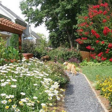
The gravel path was created along my normal route so no one had to retrain me. I love that the slate nuggets don't get stuck between my toes and Mom's really happy now that I don't drag mud into the house! ... Bailey the dog.
THIS PHOTO IS FEATURED IN TWO HOUZZ EDITORIALS! Here are the links!
(1) HOW TO HELP YOUR DOG BE A GOOD NEIGHBOR http://www.houzz.com/ideabooks/17846321/list/How-to-Help-Your-Dog-Be-a-Good-Neighbor
(2) 8 BACKYARD IDEAS TO DELIGHT YOUR DOG
https://www.houzz.com/ideabooks/8824871/list?
Photographer: Danna Cain, Home & Garden Design, Inc.
Showing Results for "Enjoying Lifestyle"
Item 3 of 7
This bathroom was an award winner in the bathroom category for 2014, by "Westchester Home Magazine."
Classic Informality A traditionally designed New York home combines formal and informal spaces to suit a busy family's lifestyle
Photographer: Roger William Photography
Stylist: Anna Molvik
Front yard gardening can be fun and functional! Add edibles into the mix, and enjoy nibbling your way through your yard!
Photo of a victorian front yard stone landscaping in Minneapolis for summer.
Photo of a victorian front yard stone landscaping in Minneapolis for summer.
The Roger Lee designed house from 1962 was purchased by the current homeowners in almost original condition, as the previous owners elected to defer most maintenance projects over the years. The clients were able to see beyond the dated materials and finishes, single-paned glass and uninsulated walls and they approached Klopf Architecture to help them expand and update the entire home, one the family could settle into and enjoy for years to come. It was important that the new designs were aligned with Lee's original intent not only because of the client's appreciation for mid-century modern architecture, but also because the house was deemed historical. The Stanford Real Estate Office requires a stringent design review which safeguards the integrity of the community, which Klopf Architecture was happy to oblige going into their updated designs.
As with many original mid-century modern homes, the house was scaled to the 1960s lifestyle where rooms were smaller and openings to views were limited and tightly framed. The original conditions defined the direction the family of four would take in updating the house and making it comfortable for their modern lifestyle. Klopf designed a full gut remodel and major addition to bring the house into the 21st century and provide the living area needed for the client's family. The newly expanded house added just about 1,100 sf to create an airy, comfortable and family friendly house, taking full advantage of the beautiful southwestern views that extend out to the hills beyond. The enclosed garage created an additional 240 sf of covered space for long-term storage.
A cracked swimming pool created an eyesore taking up a majority of the backyard landscape, so it was one of the first elements to go during the transformation. Working with Outer Space Landscape Architects, the family asked for a mix of relaxing outdoor patio spaces that eventually blend into the native landscaping, extending their views outward toward the natural greenery of the trees beyond their property. Filling in the old pool was a smart way to expand the living spaces outward. The orientation of the house was designed to enjoy the views, but the original architecture provided the first homeowners with mere glimpses of the landscape outside.
Klopf was able to broaden those views, continuing and extending on the original architecture to take full advantage of the unobstructed natural views across the rear facade of the house. Small horizontal openings in the primary bedroom and office were replaced with much taller windows that now follow the angled roof line upward, extending across almost all of the facade. We worked with Western Windows, whose designs included an oblique-shaped, operable casement that allowed our design to rise with the slope. A new corner office added to the primary suite, offers a bright and functional work-from-home solution that looks out at the distant views and added natural light from the expanded window configuration that now wraps around the corner.
The existing lower level was designed by Lee as a utilitarian space, serving as a wet pool room with a drain in the center of the floor, bathroom, laundry and storage areas. Without the need for a pool room, Klopf was able to convert the area into a much more comfortable and functional living space with a new family room and guest suite. The new spaces enjoy easy access to a new outdoor patio through floor to ceiling, full-width glass sliders.
Continuing along the rear facade, a previously exposed deck extending from the living room and hallway provided access to the backyard through a single set of stairs leading toward the side of the house which made sense when the pool was in place. The new deck was re-envisioned as an extension of the main living room and now serves as a second outdoor living room. A new slatted pergola above provides the homeowners welcome relief from the hot afternoon sun. A second set of stairs now creates a better connection to the redesigned lower level. Klopf was able to reconfigure the spaces, extending the living room outward toward the views, where the family now claims it as the heart of the home, spending a large majority of their time outdoors.
Back inside, the original wood-burning Malm fireplace was beautifully restored and a gas burner installed to comply with California's strict air standards. It now rests in front of a wall of Heath accent tiles where a dated red brick wall used to stand. A new taller window brings more light and views into the refreshed interior living room. The original glass doors opposite the fireplace were replaced by larger sliders that when fully opened, create a seamless transition to the new outdoor living area so the two spaces feel like one connected space. The original utilitarian kitchen was needlessly tucked into the far back corner and closed-off, out of sight from the living room, so the clients asked Klopf to open it up and expand the kitchen forward so it felt more connected. Today the much larger kitchen is connected to the living area where a short wall with a cutout offers a visual glimpse into the kitchen and a handy pass-through counter for serving guests. A new breakfast nook was also added to create another spot where the family can gather for casual meals. Just outside, a new built-in outdoor grill and prep area extends the kitchen outside and connects to a new outdoor dining spot nestled amongst the trees, taking advantage of the views out back.
Klopf was able to expand the other two bedrooms, add a new laundry room and half-bath and convert the carport to an enclosed garage to add more storage areas which was lost when the pool house was converted to the family and guest room.
To maintain a historical connection to the original designs, the exterior siding was repeated on all exterior walls, a full-height stained glass window at the front entryway restored, and an interior slatted screen element repeated outside at the exterior entry courtyard and over the new outdoor living room to create a shade trellis. The new house stands proudly and shines against it's new landscaping features, while respecting and expanding on the original intent of Roger Lee's designs epitomizing the comforts of indoor-outdoor living in Northern California.
Completion year: 2020
Klopf Architecture project team: John Klopf, Klara Kevane, Noel Andrade
Contractor: ORB Construction, Brendan O'Reilly
Structural engineer: Sezen and Moon
Landscape architect: Outer space
Furnishings and decoration: Urbanism Designs
Photographer: Mariko Reed
1