


Search results for "Use the dead space landscaping ideas" in Home Design Ideas
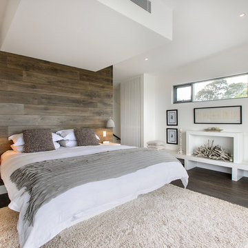
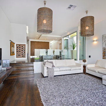
This room plays off a white backdrop against textures, recycled timbers and soft grey accessories. Add the faux fireplace and the room is made for sweet dreams!
Photography by Sue Murray - imagineit.net.au
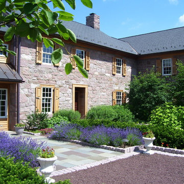
This project presented unique opportunities that are not often found in residential landscaping. The homeowners were not only restoring their 1840's era farmhouse, a piece of their family’s history, but also enlarging and updating the home for modern living. The landscape designers continued this idea by creating a space that is a modern day interpretation of an 1840s era farm rather then a strict recreation. The resulting design combines elements of farm living from that time, as well as acknowledging the property’s history as a horse farm, with staples of 21st century landscapes such as space for outdoor living, lighting, and newer plant varieties.
Guests approach from the main driveway which winds through the property and ends at the main barn. There is secondary gated driveway just for the homeowners. Connected to this main driveway is a narrower gravel lane which leads directly to the residence. The lane passes near fruit trees planted in broken rows to give the illusion that they are the remains of an orchard that once existed on the site. The lane widens at the entrance to the gardens where there is a hitching post built into the fence that surrounds the gardens and a watering trough. The widened section is intended as a place to park a golf cart or, in a nod to the home’s past, tie up horses before entering. The gravel lane passes between two stone pillars and then ends at a square gravel court edged in cobblestones. The gravel court transitions into a wide flagstone walk bordered with yew hedges and lavender leading to the front door.
Directly to the right, upon entering the gravel court, is located a gravel and cobblestone edged walk leading to a secondary entrance into the residence. The walk is gated where it connects with the gravel court to close it off so as not to confuse visitors and guests to the main residence and to emphasize the primary entrance. An area for a bench is provided along this walk to encourage stopping to view and enjoy the gardens.
On either side of the front door, gravel and cobblestone walks branch off into the garden spaces. The one on the right leads to a flagstone with cobblestone border patio space. Since the home has no designated backyard like most modern suburban homes the outdoor living space had to be placed in what would traditionally be thought of as the front of the house. The patio is separated from the entrance walk by the yew hedge and further enclosed by three Amelanchiers and a variety of plantings including modern cultivars of old fashioned plants such as Itea and Hydrangea. A third entrance, the original front door to the 1840’s era section, connects to the patio from the home’s kitchen, making the space ideal for outdoor dining.
The gravel and cobblestone walk branching off to the left of the front door leads to the vegetable and perennial gardens. The idea for the vegetable garden was to recreate the tradition of a kitchen garden which would have been planted close to the residence for easy access. The vegetable garden is surrounded by mixed perennial beds along the inside of the wood picket fence which surrounds the entire garden space. Another area designated for a bench is provided here to encourage stopping and viewing. The home’s original smokehouse, completely restored and used as a garden shed, provides a strong architectural focal point to the vegetable garden. Behind the smokehouse is planted lilacs and other plants to give mass and balance to the corner and help screen the garden from the neighboring subdivision. At the rear corner of the garden a wood arbor was constructed to provide a structure on which to grow grapes or other vines should the homeowners choose to.
The landscape and gardens for this restored farmhouse and property are a thoughtfully designed and planned recreation of a historic landscape reinterpreted for modern living. The idea was to give a sense of timelessness when walking through the gardens as if they had been there for years but had possibly been updated and rejuvenated as lifestyles changed. The attention to materials and craftsmanship blend seamlessly with the residence and insure the gardens and landscape remain an integral part of the property. The farm has been in the homeowner’s family for many years and they are thrilled at the results and happy to see respect given to the home’s history and to its meticulous restoration.
Homeowners with kids and active life wanting progressive style to facilitate outdoor living. We fused the traditional neighborhood and home style with a contemporary feel offering an upscale, clean, defined look and the result was awesome!
Landscape Architect and Landscape Designer Values:
Any given Landscape Architect or Landscape Designer may have a different approach, but Landscape Designer and Landscape Contractor, Brett Berry of Berry Outdoor Living creates living areas that feel connected to the home. As a Landscape Designer and Landscape Contractor working with a Landscape Architect, we try to create the space so it feels relaxed. It should feel like it's been in place with the home for years and not an "add-on".
As a Landscape Contractor that merges old and new construction into the landscape design, the goal is to build a space people want to spend time, whether at the bar of the outdoor kitchen, fire pit, patio, or covered porch. When a space becomes a large part of the homeowners' daily life, a Landscape Architect or Landscape Designer, or Landscape Contractor, knows a project has been completed with excellence. I work closely with a Landscape Architect through the design process to ensure the space has the correct "feel".
A Landscape Architect and Landscape Designer must design the space to flow from the inside of the home out. The patio and outdoor living space feels like an extension of the home, or another "room" of the home and feels wrapped with fresh, low-maintenance landscaping.
In Kansas City patio, and landscaping design, there is a clear trend toward a cleaner, more defined look influenced by a more modern era viewpoint that values a non-cluttered look and feel. So, as a Landscape Contractor, in our circle of clients, we've seen a definite shift toward cleaner, artisan-crafted backyards and fewer "boxy", shrub-heavy yards. A Landscape Architect with a keen sense designs this effect.
landscape modern landscape Kansas city berry landscape photos, Houzz landscape design ideas pictures remodel décor, Houzz landscape design photos, Houzz outdoor photos, outdoor landscape design photos, Houzz outdoor photos, Houzz landscape design ideas pictures remodel décor outdoor photos, landscape design outdoor photos, Houzz pictures landscape, landscape back yard, landscape residential, landscape contractor, landscape design, landscape designer, landscaper, landscaping, landscape architect, landscape contractor, landscape photos, modern landscape photos, Staker landscape photos, Kansas City landscape photos, landscape photos back yard, landscape photos residential, landscape design ideas pictures, landscape pictures, landscape design ideas residential, landscape design ideas Staker residence, Houzz landscape photos, Houzz landscape pictures, Houzz landscape, Houzz landscape design ideas pictures, Houzz landscape design ideas pictures Staker residence
Find the right local pro for your project
Our Houston landscaping team was recently honored to collaborate with renowned architectural firm Murphy Mears. Murphy Mears builds superb custom homes throughout the country. A recent project for a Houston resident by the name of Borow involved a custom home that featured an efficient, elegant, and eclectic modern architectural design. Ms. Borow is very environmentally conscious and asked that we follow some very strict principles of conservation when developing her landscaping design plan.
In many ways you could say this Houston landscaping project was green on both an aesthetic level and a functional level. We selected affordable ground cover that spread very quickly to provide a year round green color scheme that reflected much of the contemporary artwork within the interior of the home. Environmentally speaking, our project was also green in the sense that it focused on very primitive drought resistant plant species and tree preservation strategies. The resulting yard design ultimately functioned as an aesthetic mirror to the abstract forms that the owner prefers in wall art.
One of the more notable things we did in this Houston landscaping project was to build the homeowner a gravel patio near the front entrance to the home. The homeowner specifically requested that we disconnect the irrigation system that we had installed in the yard because she wanted natural irrigation and drainage only. The gravel served this wish superbly. Being a natural drain in its own respect, it provided a permeable surface that allowed rainwater to soak through without collecting on the surface.
More importantly, the gravel was the only material that could be laid down near the roots of the magnificent trees in Ms. Borow’s yard. Any type of stone, concrete, or brick that is used in more typical Houston landscaping plans would have been out of the question. A patio made from these materials would have either required cutting into tree roots, or it would have impeded their future growth.
The specific species chosen for ground cover also bear noting. The two primary plants used were jasmine and iris. Monkey grass was also used to a small extent as a border around the edge of the house. Irises were planted in front of the house, and the jasmine was planted beneath the trees. Both are very fast growing, drought resistant species that require very little watering. However, they do require routine pruning, which Ms. Borow said she had no problem investing in.
Such lawn alternatives are frequently used in Houston landscaping projects that for one reason or the other require something other than a standard planting of carpet grass. In this case, the motivation had nothing to do with finances, but rather a conscientious effort on Ms. Borow’s part to practice water conservation and tree preservation.
Other hardscapes were then introduced into this green design to better support the home architecture. A stepping stone walkway was built using plain concrete pads that are very simple and modern in their aesthetic. These lead up to the front stair case with four inch steps that Murphy Mears designed for maximum ergonomics and comfort.
There were a few softscape elements that we added to complete the Houston landscaping design. A planting of River Birch trees was introduced near the side of the home. River Birch trees are very attractive, light green trees that do not grow that tall. This eliminates any possible conflict between the tree roots and the home foundation.
Murphy Mears also built a very elegant fence that transitioned the geometry of the house down to the city sidewalk. The fence sharply parallels the linear movement of the house. We introduced some climbing vines to help soften the fence and to harmonize its aesthetic with that of the trees, ground cover, and grass along the sidewalk.
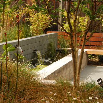
This small tract home backyard was transformed into a lively breathable garden. A new outdoor living room was created, with silver-grey brazilian slate flooring, and a smooth integral pewter colored concrete wall defining and retaining earth around it. A water feature is the backdrop to this outdoor room extending the flooring material (slate) into the vertical plane covering a wall that houses three playful stainless steel spouts that spill water into a large basin. Koi Fish, Gold fish and water plants bring a new mini ecosystem of life, and provide a focal point and meditational environment. The integral colored concrete wall begins at the main water feature and weaves to the south west corner of the yard where water once again emerges out of a 4” stainless steel channel; reinforcing the notion that this garden backs up against a natural spring. The stainless steel channel also provides children with an opportunity to safely play with water by floating toy boats down the channel. At the north eastern end of the integral colored concrete wall, a warm western red cedar bench extends perpendicular out from the water feature on the outside of the slate patio maximizing seating space in the limited size garden. Natural rusting Cor-ten steel fencing adds a layer of interest throughout the garden softening the 6’ high surrounding fencing and helping to carry the users eye from the ground plane up past the fence lines into the horizon; the cor-ten steel also acts as a ribbon, tie-ing the multiple spaces together in this garden. The plant palette uses grasses and rushes to further establish in the subconscious that a natural water source does exist. Planting was performed outside of the wire fence to connect the new landscape to the existing open space; this was successfully done by using perennials and grasses whose foliage matches that of the native hillside, blurring the boundary line of the garden and aesthetically extending the backyard up into the adjacent open space.
Brightly colored accessories work in concert with the plantings to bring this social space to life.
This project received a 2013 Hardscape North America Design Award, and a 2014 ILCA Award of Excellence. It is also slated for publication in Chicagoland Gardening Magazine and Total Landscape Care Magazine.
Site design by John Algozzini, lighting design by Kevin Manning.
Sponsored
Columbus, OH
Dave Fox Design Build Remodelers
Columbus Area's Luxury Design Build Firm | 17x Best of Houzz Winner!
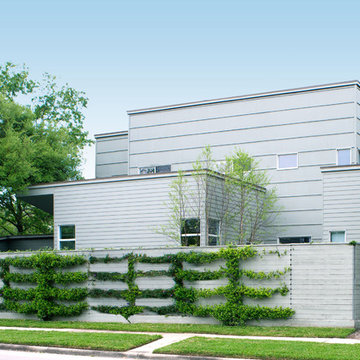
A local Houston art collector hired us to create a low maintenance, sophisticated, contemporary landscape design. She wanted her property to compliment her eclectic taste in architecture, outdoor sculpture, and modern art. Her house was built with a minimalist approach to decoration, emphasizing right angles and windows instead of architectural keynotes. The west wing of the house was only one story, while the east wing was two-story. The windows in both wings were larger than usual, so that visitors could see her art collection from the home’s exterior. Near one of the large rear windows, there was an abstract metal sculpture designed in the form of a spiral.
When she initially contacted us, the surrounding property had only a few trees and indigenous grass as vegetation. This was actually a good beginning point with us, because it allowed us to develop a contemporary landscape design that featured a very linear, crisp look supportive of the home and its contents. We began by planting a garden around the large contemporary sculpture near the window. Landscape designers planted horsetail reed under windows, along the sides of the home, and around the corners. This vegetation is very resilient and hardy, and requires little trimming, weeding, or mulching. This helped unite the diverse elements of sculpture, contemporary architecture, and landscape design into a more fluid harmony that preserved the proportions of each unique element, but eliminated any tendency for the elements to clash with one another.
We then added two stonework designs to the landscape surrounding the contemporary art collection and home. The first was a linear walkway we build from concrete pads purchased through a retail vendor as a cost-saving benefit to our client. We created this walkway to follow the perimeter of the home so that visitors could walk around the entire property and admire the outdoor sculptures and the collections of modern art visible through the windows. This was especially enjoyable at night, when the entire home was brightly lit from within.
To add a touch of tranquility and quite repose to the stark right angles of the home and surrounding contemporary landscape, we designed a special seating area toward the northwest corner of the property. We wanted to create a sense of contemplation in this area, so we departed from the linear and angular designs of the surrounding landscape and established a theme of circular geometry. We laid down gravel as ground cover, then placed large, circular pads arranged like giant stepping stones that led up to a stone patio filled with chairs. The shape of the granite pads and the contours of the graveled area further complimented the spirals and turns in the outdoor metal sculpture, and balanced the entire contemporary landscape design with proportional geometric forms of lines, angles, and curves.
This particular contemporary landscape design also has a sense of movement attached to it. All stonework leads to a destination of some sort. The linear pathway provides a guided tour around the home, garden, and modern art collection. The granite pathway stones create movement toward separate space where the entire experience of art, vegetation, and architecture can be viewed and experienced as a unity.
Contemporary landscaping designs like create form out of feeling by using basic geometric forms and variations of forms. Sometimes very stark forms are used to create a sense of absolutism or contrast. At other times, forms are blended, or even distorted to suggest a sense of complex emotion, or a sense of multi-dimensional reality. The exact nature of the design is always highly subjective, and developed on a case-by-case basis with the client.
Kitchen - transitional kitchen idea in Other with shaker cabinets, white cabinets and black countertops
Never in their wildest dreams could the clients have ever imagined the possibilities that existed for their tired, segregated and completely non-functional kitchen. The remodeling of the entire space not only presented the opportunity to create a kitchen that the owners had only dream of, but one that would reflect the quality of the home.
The brief was very clear: to create an open-plan kitchen that integrated into the living room whilst still remaining a defined space; provided direct physical and visual access to the newly landscaped outdoor pool and alfresco area without being a thoroughfare; satisfied the requirements of an enthusiastic and demanding gourmand by creating a kitchen that “feels like home" yet still packs a punch for the purposes of entertaining friends and business associates.
The original kitchen resided at the rear of the home in a small closed in room which bar a small opening remained completely separated from the living room making it virtually impossible for the owners to entertain. To pave the way for the sought after open-plan living the dividing wall that separated the kitchen and living room was bought down – a concept the clients had never even considered until now.
The new galley style design required access from several directions. The result is an innovative solution based on a design where the kitchen can be approached from all angles, allowing it to merge with the surrounding living areas as well as offer full view of the beautifully landscaped backyard.
The juxtaposition of parallel and perpendicular forms creates a pleasing aesthetic within the room making the most of light and air within the space.
At the heart of it all is the large unusual ‘L shaped’ island bench which anchors the utility of the kitchen and provides a solid foundation on which the rest of the room comes to life. As the activity hub of the kitchen, it serves dual purposes of preparation and breakfast bar/casual seating (for the master of the home) as well as providing additional serving space, particularly when entertaining.
Finished with a soft lacquered linear timber veneer, the island bench feature adds a sense of solidity to the room and contrasts perfectly with the block colour grey tones used in the remaining high gloss lacquered cabinetry and tiled floor. In addition to providing an interesting textural element to the space, the raised veneer section on the island cleverly conceals the cleaning/sink zone and ensures the preparation mess is hidden from view when entertaining
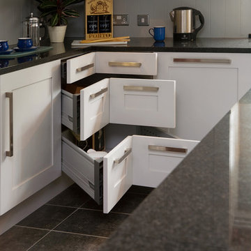
A fully functional ‘working wall’ of cabinets provides the perfect storage solution in a narrow space. Pantry storage plays a major role with a variety of pull out inner drawers. A number of high end Miele appliances have been integrated into the wall enhancing the cutting edge European look whilst also providing all the functional requirements of the clients demanding cooking style. To make the heights of the combi oven and combi steam (including warming drawer) align, a custom stainless steel drawer was designed for under the combi oven. The effect of this is a seamless look, as if the drawer is part of the appliances themselves.
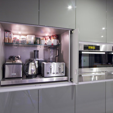
Well considered functional details add practicality to the room such as the appliance cupboard where pivot sliding doors cleverly conceal a pull out stainless steel bench top. The cupboard serves dual purposes keeping everyday appliances such as the toaster and kettle hidden from view, yet easily accessible whilst also providing another work centre for the client.
Elements of the cabinetry extend to the sunroom where a custom made day bed has been incorporated into the existing bay window area creating visual continuity and cohesion
The project demonstrated some design constraints that had to be overcome. As the house is on a concrete slab there were some initial mechanical challenges reconfiguring the kitchen, as the original layout would significantly restrict what we wanted to achieve. Plumbing was trenched into the slab taking into account the necessary fall for the distance it was being moved and wiring for the electrical was also trenched in to both the slab and the block wall that backed onto the new ‘working wall’.
Another consideration was the desire to retain the existing parquetry flooring throughout the home while replacing the old clip-lock floating floor that resided in the old kitchen. As a solution 600X600 ‘steel grey’ polished tiles were used throughout the kitchen space. Careful placement of the tiles was necessary to ensure visually correct placement delineating the kitchen from the living area, creating a defined space sought after by the clients.
Working closely with the owners the stylized selection of materials and finishes reflects the client’s personal style. The strong colour palette is functional and elegant and complements the modern lines. The deep charcoals make a dramatic statement and are brought to life by the stark white bench tops and warm timber tones in the veneer.
In keeping with the streamlined finish requested by the owners, shadow line finger pulls create a flush finish along the surface of the cabinets and ensure that nothing protrudes into the work areas. Overhead cupboards have been fitted with tip-on touch catches to maintain the minimal look.
The overall transformation shows what is possible when adaptive design techniques focus on the possibilities within an entire space and not an existing room. The design reflects the very best in contemporary kitchen design, clever utilization of space through innovative and multi-functional structural elements. A unique approach to the application of materials, colours and textures result in a space that is efficient, attractive and above all else perfectly suited to the owners needs. The owners not only have a light-filled space, but now have all the inspiration they need to gather their family and friends for a meal and entertain in ultimate style.
The brief was very clear: to create an open-plan kitchen that integrated into the living room whilst still remaining a defined space; provided direct physical and visual access to the newly landscaped outdoor pool and alfresco area without being a thoroughfare; satisfied the requirements of an enthusiastic and demanding gourmand by creating a kitchen that “feels like home" yet still packs a punch for the purposes of entertaining friends and business associates.
The original kitchen resided at the rear of the home in a small closed in room which bar a small opening remained completely separated from the living room making it virtually impossible for the owners to entertain. To pave the way for the sought after open-plan living the dividing wall that separated the kitchen and living room was bought down – a concept the clients had never even considered until now.
The new galley style design required access from several directions. The result is an innovative solution based on a design where the kitchen can be approached from all angles, allowing it to merge with the surrounding living areas as well as offer full view of the beautifully landscaped backyard.
The juxtaposition of parallel and perpendicular forms creates a pleasing aesthetic within the room making the most of light and air within the space.
At the heart of it all is the large unusual ‘L shaped’ island bench which anchors the utility of the kitchen and provides a solid foundation on which the rest of the room comes to life. As the activity hub of the kitchen, it serves dual purposes of preparation and breakfast bar/casual seating (for the master of the home) as well as providing additional serving space, particularly when entertaining.
Finished with a soft lacquered linear timber veneer, the island bench feature adds a sense of solidity to the room and contrasts perfectly with the block colour grey tones used in the remaining high gloss lacquered cabinetry and tiled floor. In addition to providing an interesting textural element to the space, the raised veneer section on the island cleverly conceals the cleaning/sink zone and ensures the preparation mess is hidden from view when entertaining
A fully functional ‘working wall’ of cabinets provides the perfect storage solution in a narrow space. Pantry storage plays a major role with a variety of pull out inner drawers. A number of high end Miele appliances have been integrated into the wall enhancing the cutting edge European look whilst also providing all the functional requirements of the clients demanding cooking style. To make the heights of the combi oven and combi steam (including warming drawer) align, a custom stainless steel drawer was designed for under the combi oven. The effect of this is a seamless look, as if the drawer is part of the appliances themselves.
Well considered functional details add practicality to the room such as the appliance cupboard where pivot sliding doors cleverly conceal a pull out stainless steel bench top. The cupboard serves dual purposes keeping everyday appliances such as the toaster and kettle hidden from view, yet easily accessible whilst also providing another work centre for the client.
Elements of the cabinetry extend to the sunroom where a custom made day bed has been incorporated into the existing bay window area creating visual continuity and cohesion
The project demonstrated some design constraints that had to be overcome. As the house is on a concrete slab there were some initial mechanical challenges reconfiguring the kitchen, as the original layout would significantly restrict what we wanted to achieve. Plumbing was trenched into the slab taking into account the necessary fall for the distance it was being moved and wiring for the electrical was also trenched in to both the slab and the block wall that backed onto the new ‘working wall’.
Another consideration was the desire to retain the existing parquetry flooring throughout the home while replacing the old clip-lock floating floor that resided in the old kitchen. As a solution 600X600 ‘steel grey’ polished tiles were used throughout the kitchen space. Careful placement of the tiles was necessary to ensure visually correct placement delineating the kitchen from the living area, creating a defined space sought after by the clients.
Working closely with the owners the stylized selection of materials and finishes reflects the client’s personal style. The strong colour palette is functional and elegant and complements the modern lines. The deep charcoals make a dramatic statement and are brought to life by the stark white bench tops and warm timber tones in the veneer.
In keeping with the streamlined finish requested by the owners, shadow line finger pulls create a flush finish along the surface of the cabinets and ensure that nothing protrudes into the work areas. Overhead cupboards have been fitted with tip-on touch catches to maintain the minimal look.
The overall transformation shows what is possible when adaptive design techniques focus on the possibilities within an entire space and not an existing room. The design reflects the very best in contemporary kitchen design, clever utilization of space through innovative and multi-functional structural elements. A unique approach to the application of materials, colours and textures result in a space that is efficient, attractive and above all else perfectly suited to the owners needs. The owners not only have a light-filled space, but now have all the inspiration they need to gather their family and friends for a meal and entertain in ultimate style.
This lovely Malvern home saw a total transformation of all wet areas, including the main bathroom, ensuite, kitchen, and laundry.
A professional couple with two young children, our clients tasked us with turning their newly bought Malvern property into their dream home. The property was in great condition, but the interiors were outdated and lacked the functionality to support a young family’s busy lifestyle.
Because this was their forever home, we designed the spaces collaboratively with our clients focusing on nailing their aesthetic brief while providing them with a high level of functionality to suit their present and future needs.
Our brief:
The design needed to be child-friendly but with a sophisticated aesthetic
All materials needed to be durable and have longevity
A fresh, modern look with textures was a must
The clients love cooking, so a kitchen that was functional as well as beautiful was paramount.
The kitchen really is the central hub of this busy home, so we wanted to create a modern, bright, and welcoming space where all the family could gather and share quality time.
The first thing to go was the outdated, curved floor-to-ceiling window, which didn’t align with our client’s vision for their dream home. We replaced it with large modern bi-fold stacking doors that let natural light seep in.
We also removed an impractical external double door and replaced it with a tightly waterproofed servery bi-fold window, which our clients loved.
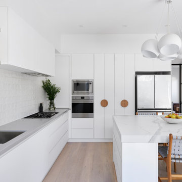
The existing U-shaped kitchen was impractical with only one access, which created accessibility issues. Our solution was to completely redesign the kitchen to create an L-shaped layout with a large central island and two accesses for even flow.
The table-like island was a priority in our client’s wish list because they wanted a spot where they could sit together and share meals and where the children could do homework after school. They loved the idea of sitting facing each other instead of in a line like you do in standard islands. That’s why we installed a custom-made powder-coated steel leg on the island, which looks beautiful and allows the family to sit on either side of it.
To update the room’s aesthetics, we selected high-quality and durable materials for a fresh and modern look. The sleek white cabinetry features a super matt melamine finish with anti-fingerprint technology, which is low-maintenance, easy to clean and great for when there are kids in the house.
To maximise every inch for functionality, we included smart storage solutions throughout the cabinetry, as well as a spacious pantry that can be tucked away when not in use.
To create visual intrigue and add a textured layer to the space, we juxtaposed the smooth surfaces of the cabinetry and porcelain benchtop with a textured, hand-made look tiled splashback. The splashback is easy to maintain thanks to its epoxy grout, which is waterproof and repels dirt and grime. We also included lovely natural timber handles to add an organic touch to the design.
We wanted the room to feel bright and happy, so LED downlights were evenly distributed throughout, complete with dimmers for when mood lighting was needed. We also used LED strip lighting under all overhead cabinetry and an automatic light in the pantry.
The finishing touch was the lovely hub pendant above the island, which certainly takes the room’s aesthetics to the next level.
To continue with the same modern tactile look in the laundry, we used a handmade square tile paired with led lighting to showcase the texture in the tile.
Because the space also needed to be easy to maintain (and child friendly), we used super matt melamine with anti-fingerprint technology for the cabinetry with porcelain benchtops for ultimate durability. We used large-format tiles, which are easy to maintain and create the illusion of space, perfect for this small room.
Lack of storage was solved with large floor to ceiling cupboards, which allowed us to use every inch of the room. To add a warm touch to this bright and airy space, we used circular timber handles.
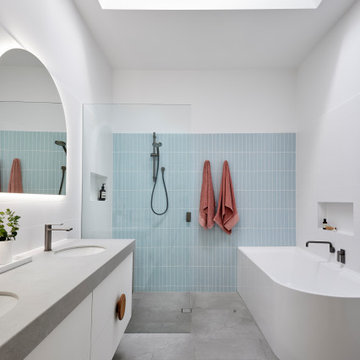
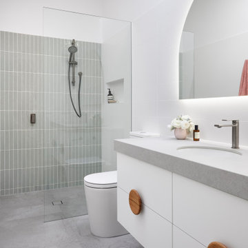
For the family bathroom and the ensuite, we continued the child-friendly theme by utilising large-format tiles pair with anti-fingerprint finishes for the cabinetry.
In line with the modern aesthetic of the kitchen and laundry, we wanted to create a sophisticated space that felt unique to the home. Because we also wanted the bathrooms to feel calm and serene, we introduced curves in the design for a softer look and feel.
The circular shape theme proposed by the custom mirrors continues in the basin, large free-standing bath and natural timber handles.
The client loved the idea of using gunmetal finishes instead of the traditional chrome finish, so we selected gunmetal tapware which looks amazing paired with the custom arch mirrors.
The led lighting around the mirrors provides function and form, being a decorative feature that creates mood lighting and additional task lighting. LED downlights were also evenly distributed throughout the spaces- all with dimmers for versatility.
Drawers were the preferred method of storage, and they include concealed power points for practicality which was a critical point of our brief.
This open space area was divided up by the use of split levels yet managed to retain its open plan feel and sense of space. The use of the timber textures in a variety of ways against the clean white base ensured that the space was connected and balanced. This resulted in an airy, open yet cosy space.
Photography by Sue Murray - Imagineit.net.au
Sponsored
Columbus, OH
Free consultation for landscape design!
Peabody Landscape Group
Franklin County's Reliable Landscape Design & Contracting
This lovely Malvern home saw a total transformation of all wet areas, including the main bathroom, ensuite, kitchen, and laundry.
A professional couple with two young children, our clients tasked us with turning their newly bought Malvern property into their dream home. The property was in great condition, but the interiors were outdated and lacked the functionality to support a young family’s busy lifestyle.
Because this was their forever home, we designed the spaces collaboratively with our clients focusing on nailing their aesthetic brief while providing them with a high level of functionality to suit their present and future needs.
Our brief:
The design needed to be child-friendly but with a sophisticated aesthetic
All materials needed to be durable and have longevity
A fresh, modern look with textures was a must
The clients love cooking, so a kitchen that was functional as well as beautiful was paramount.
The kitchen really is the central hub of this busy home, so we wanted to create a modern, bright, and welcoming space where all the family could gather and share quality time.
The first thing to go was the outdated, curved floor-to-ceiling window, which didn’t align with our client’s vision for their dream home. We replaced it with large modern bi-fold stacking doors that let natural light seep in.
We also removed an impractical external double door and replaced it with a tightly waterproofed servery bi-fold window, which our clients loved.
The existing U-shaped kitchen was impractical with only one access, which created accessibility issues. Our solution was to completely redesign the kitchen to create an L-shaped layout with a large central island and two accesses for even flow.
The table-like island was a priority in our client’s wish list because they wanted a spot where they could sit together and share meals and where the children could do homework after school. They loved the idea of sitting facing each other instead of in a line like you do in standard islands. That’s why we installed a custom-made powder-coated steel leg on the island, which looks beautiful and allows the family to sit on either side of it.
To update the room’s aesthetics, we selected high-quality and durable materials for a fresh and modern look. The sleek white cabinetry features a super matt melamine finish with anti-fingerprint technology, which is low-maintenance, easy to clean and great for when there are kids in the house.
To maximise every inch for functionality, we included smart storage solutions throughout the cabinetry, as well as a spacious pantry that can be tucked away when not in use.
To create visual intrigue and add a textured layer to the space, we juxtaposed the smooth surfaces of the cabinetry and porcelain benchtop with a textured, hand-made look tiled splashback. The splashback is easy to maintain thanks to its epoxy grout, which is waterproof and repels dirt and grime. We also included lovely natural timber handles to add an organic touch to the design.
We wanted the room to feel bright and happy, so LED downlights were evenly distributed throughout, complete with dimmers for when mood lighting was needed. We also used LED strip lighting under all overhead cabinetry and an automatic light in the pantry.
The finishing touch was the lovely hub pendant above the island, which certainly takes the room’s aesthetics to the next level.
To continue with the same modern tactile look in the laundry, we used a handmade square tile paired with led lighting to showcase the texture in the tile.
Because the space also needed to be easy to maintain (and child friendly), we used super matt melamine with anti-fingerprint technology for the cabinetry with porcelain benchtops for ultimate durability. We used large-format tiles, which are easy to maintain and create the illusion of space, perfect for this small room.
Lack of storage was solved with large floor to ceiling cupboards, which allowed us to use every inch of the room. To add a warm touch to this bright and airy space, we used circular timber handles.
For the family bathroom and the ensuite, we continued the child-friendly theme by utilising large-format tiles pair with anti-fingerprint finishes for the cabinetry.
In line with the modern aesthetic of the kitchen and laundry, we wanted to create a sophisticated space that felt unique to the home. Because we also wanted the bathrooms to feel calm and serene, we introduced curves in the design for a softer look and feel.
The circular shape theme proposed by the custom mirrors continues in the basin, large free-standing bath and natural timber handles.
The client loved the idea of using gunmetal finishes instead of the traditional chrome finish, so we selected gunmetal tapware which looks amazing paired with the custom arch mirrors.
The led lighting around the mirrors provides function and form, being a decorative feature that creates mood lighting and additional task lighting. LED downlights were also evenly distributed throughout the spaces- all with dimmers for versatility.
Drawers were the preferred method of storage, and they include concealed power points for practicality which was a critical point of our brief.
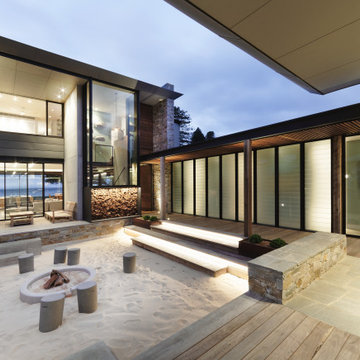
Courtyard - Sand Pit
Beach House at Avoca Beach by Architecture Saville Isaacs
Project Summary
Architecture Saville Isaacs
https://www.architecturesavilleisaacs.com.au/
The core idea of people living and engaging with place is an underlying principle of our practice, given expression in the manner in which this home engages with the exterior, not in a general expansive nod to view, but in a varied and intimate manner.
The interpretation of experiencing life at the beach in all its forms has been manifested in tangible spaces and places through the design of pavilions, courtyards and outdoor rooms.
Architecture Saville Isaacs
https://www.architecturesavilleisaacs.com.au/
A progression of pavilions and courtyards are strung off a circulation spine/breezeway, from street to beach: entry/car court; grassed west courtyard (existing tree); games pavilion; sand+fire courtyard (=sheltered heart); living pavilion; operable verandah; beach.
The interiors reinforce architectural design principles and place-making, allowing every space to be utilised to its optimum. There is no differentiation between architecture and interiors: Interior becomes exterior, joinery becomes space modulator, materials become textural art brought to life by the sun.
Project Description
Architecture Saville Isaacs
https://www.architecturesavilleisaacs.com.au/
The core idea of people living and engaging with place is an underlying principle of our practice, given expression in the manner in which this home engages with the exterior, not in a general expansive nod to view, but in a varied and intimate manner.
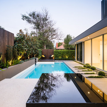
The house is designed to maximise the spectacular Avoca beachfront location with a variety of indoor and outdoor rooms in which to experience different aspects of beachside living.
Client brief: home to accommodate a small family yet expandable to accommodate multiple guest configurations, varying levels of privacy, scale and interaction.
A home which responds to its environment both functionally and aesthetically, with a preference for raw, natural and robust materials. Maximise connection – visual and physical – to beach.
The response was a series of operable spaces relating in succession, maintaining focus/connection, to the beach.
The public spaces have been designed as series of indoor/outdoor pavilions. Courtyards treated as outdoor rooms, creating ambiguity and blurring the distinction between inside and out.
A progression of pavilions and courtyards are strung off circulation spine/breezeway, from street to beach: entry/car court; grassed west courtyard (existing tree); games pavilion; sand+fire courtyard (=sheltered heart); living pavilion; operable verandah; beach.
Verandah is final transition space to beach: enclosable in winter; completely open in summer.
This project seeks to demonstrates that focusing on the interrelationship with the surrounding environment, the volumetric quality and light enhanced sculpted open spaces, as well as the tactile quality of the materials, there is no need to showcase expensive finishes and create aesthetic gymnastics. The design avoids fashion and instead works with the timeless elements of materiality, space, volume and light, seeking to achieve a sense of calm, peace and tranquillity.
Architecture Saville Isaacs
https://www.architecturesavilleisaacs.com.au/
Focus is on the tactile quality of the materials: a consistent palette of concrete, raw recycled grey ironbark, steel and natural stone. Materials selections are raw, robust, low maintenance and recyclable.
Light, natural and artificial, is used to sculpt the space and accentuate textural qualities of materials.
Passive climatic design strategies (orientation, winter solar penetration, screening/shading, thermal mass and cross ventilation) result in stable indoor temperatures, requiring minimal use of heating and cooling.
Architecture Saville Isaacs
https://www.architecturesavilleisaacs.com.au/
Accommodation is naturally ventilated by eastern sea breezes, but sheltered from harsh afternoon winds.
Both bore and rainwater are harvested for reuse.
Low VOC and non-toxic materials and finishes, hydronic floor heating and ventilation ensure a healthy indoor environment.
Project was the outcome of extensive collaboration with client, specialist consultants (including coastal erosion) and the builder.
The interpretation of experiencing life by the sea in all its forms has been manifested in tangible spaces and places through the design of the pavilions, courtyards and outdoor rooms.
The interior design has been an extension of the architectural intent, reinforcing architectural design principles and place-making, allowing every space to be utilised to its optimum capacity.
There is no differentiation between architecture and interiors: Interior becomes exterior, joinery becomes space modulator, materials become textural art brought to life by the sun.
Architecture Saville Isaacs
https://www.architecturesavilleisaacs.com.au/
https://www.architecturesavilleisaacs.com.au/
Our Houston landscaping team was recently honored to collaborate with renowned architectural firm Murphy Mears. Murphy Mears builds superb custom homes throughout the country. A recent project for a Houston resident by the name of Borow involved a custom home that featured an efficient, elegant, and eclectic modern architectural design. Ms. Borow is very environmentally conscious and asked that we follow some very strict principles of conservation when developing her landscaping design plan.
In many ways you could say this Houston landscaping project was green on both an aesthetic level and a functional level. We selected affordable ground cover that spread very quickly to provide a year round green color scheme that reflected much of the contemporary artwork within the interior of the home. Environmentally speaking, our project was also green in the sense that it focused on very primitive drought resistant plant species and tree preservation strategies. The resulting yard design ultimately functioned as an aesthetic mirror to the abstract forms that the owner prefers in wall art.
One of the more notable things we did in this Houston landscaping project was to build the homeowner a gravel patio near the front entrance to the home. The homeowner specifically requested that we disconnect the irrigation system that we had installed in the yard because she wanted natural irrigation and drainage only. The gravel served this wish superbly. Being a natural drain in its own respect, it provided a permeable surface that allowed rainwater to soak through without collecting on the surface.
More importantly, the gravel was the only material that could be laid down near the roots of the magnificent trees in Ms. Borow’s yard. Any type of stone, concrete, or brick that is used in more typical Houston landscaping plans would have been out of the question. A patio made from these materials would have either required cutting into tree roots, or it would have impeded their future growth.
The specific species chosen for ground cover also bear noting. The two primary plants used were jasmine and iris. Monkey grass was also used to a small extent as a border around the edge of the house. Irises were planted in front of the house, and the jasmine was planted beneath the trees. Both are very fast growing, drought resistant species that require very little watering. However, they do require routine pruning, which Ms. Borow said she had no problem investing in.
Such lawn alternatives are frequently used in Houston landscaping projects that for one reason or the other require something other than a standard planting of carpet grass. In this case, the motivation had nothing to do with finances, but rather a conscientious effort on Ms. Borow’s part to practice water conservation and tree preservation.
Other hardscapes were then introduced into this green design to better support the home architecture. A stepping stone walkway was built using plain concrete pads that are very simple and modern in their aesthetic. These lead up to the front stair case with four inch steps that Murphy Mears designed for maximum ergonomics and comfort.
There were a few softscape elements that we added to complete the Houston landscaping design. A planting of River Birch trees was introduced near the side of the home. River Birch trees are very attractive, light green trees that do not grow that tall. This eliminates any possible conflict between the tree roots and the home foundation.
Murphy Mears also built a very elegant fence that transitioned the geometry of the house down to the city sidewalk. The fence sharply parallels the linear movement of the house. We introduced some climbing vines to help soften the fence and to harmonize its aesthetic with that of the trees, ground cover, and grass along the sidewalk.
Showing Results for "Use The Dead Space Landscaping Ideas"
Sponsored
Columbus, OH
Free consultation for landscape design!
Peabody Landscape Group
Franklin County's Reliable Landscape Design & Contracting
Looking for a unique garden that embraced the harsh location and unique architectural characteristics of the contemporary home, the owner employed the expertise of Tim Davies and Levi Carter of Tim Davies Landscaping to design and build this stunning landscape.
Being in close proximity to the coast, the planting palette needed to be closely considered to create a landscape that would be able to withstand the conditions. The client was determined to have a mature finish to the garden. In order to achieve this, Tim and Levi sourced a range of mature trees from around the state that were suitable for relocation. These species included Poinciana, Olive, Frangipani and Magnolia trees. Custom ornamentation also creates focal points throughout, while large graphite granite bowls and a custom solid granite planter alongside the pool work to tie the spaces together.
This minimal, contemporary design by Tim Davies Landscaping combines high-quality finishes with mature, lush planting to create habitable spaces that work aesthetically.
Grab Photography
Overview
Extension and complete refurbishment.
The Brief
The existing house had very shallow rooms with a need for more depth throughout the property by extending into the rear garden which is large and south facing. We were to look at extending to the rear and to the end of the property, where we had redundant garden space, to maximise the footprint and yield a series of WOW factor spaces maximising the value of the house.
The brief requested 4 bedrooms plus a luxurious guest space with separate access; large, open plan living spaces with large kitchen/entertaining area, utility and larder; family bathroom space and a high specification ensuite to two bedrooms. In addition, we were to create balconies overlooking a beautiful garden and design a ‘kerb appeal’ frontage facing the sought-after street location.
Buildings of this age lend themselves to use of natural materials like handmade tiles, good quality bricks and external insulation/render systems with timber windows. We specified high quality materials to achieve a highly desirable look which has become a hit on Houzz.
Our Solution
One of our specialisms is the refurbishment and extension of detached 1930’s properties.
Taking the existing small rooms and lack of relationship to a large garden we added a double height rear extension to both ends of the plan and a new garage annex with guest suite.
We wanted to create a view of, and route to the garden from the front door and a series of living spaces to meet our client’s needs. The front of the building needed a fresh approach to the ordinary palette of materials and we re-glazed throughout working closely with a great build team.
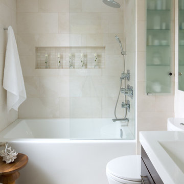
This small space bathroom features many small space tricks, including the perfect combination of mirror and glass, a beautiful floating vanity and an ample amount of storage in all of the right places. Photography by Brandon Barre.
8