


Dining Room needs updating
vwhippiechick
9 years ago


Sort by:Oldest
Comments (30)
Related Stories

DINING ROOMSA Dozen Dining Room Updates
Give your dining area a face-lift with these DIY ideas
Full Story
DECORATING GUIDESDesign Dilemma: I Need Lake House Decor Ideas!
How to Update a Lake House With Wood, Views, and Just Enough Accessories
Full Story
MAN SPACESWhy Men Really Do Need a Cave
Don't dismiss cars, bars and the kegerator — a man space of some kind is important for emotional well-being at home
Full Story
HOUZZ TOURSMy Houzz: Budget-Friendly Decorating Updates for a Great Room in Texas
Antiques rub elbows with new furnishings in this Dallas ranch, where the living and dining area got a $5,000 makeover
Full Story
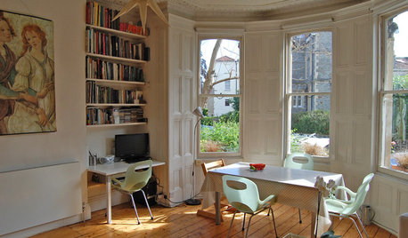
DINING ROOMSDesign Dilemma: My Dining Room Needs Revamping!
Watch a dining-room makeover unfold in the Houzz Questions forum
Full Story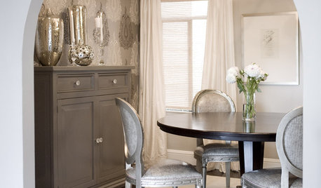
DINING ROOMSDesign Dilemma: I Need Ideas for a Gray Living/Dining Room!
See How to Have Your Gray and Fun Color, Too
Full Story
MOST POPULARHow Much Room Do You Need for a Kitchen Island?
Installing an island can enhance your kitchen in many ways, and with good planning, even smaller kitchens can benefit
Full Story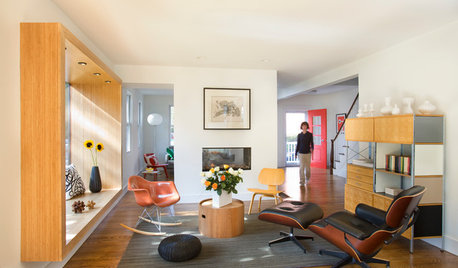
LIVING ROOMSRoom of the Day: Living Room Update for an 1800s New England House
Major renovation gives owners the open, contemporary feel they love
Full Story
MOVING10 Rooms That Show You Don’t Need to Move to Get More Space
Daydreaming about moving or expanding but not sure if it’s practical right now? Consider these alternatives
Full StoryMore Discussions


radley
BeverlyFLADeziner
Related Professionals
Cusseta Interior Designers & Decorators · Hagerstown Interior Designers & Decorators · Eagan Furniture & Accessories · Peachtree City Furniture & Accessories · San Diego Furniture & Accessories · Gages Lake Furniture & Accessories · Rancho Santa Margarita Furniture & Accessories · Temple Terrace Furniture & Accessories · Diamond Bar Lighting · Greenville Lighting · Laguna Beach Lighting · Pasadena Lighting · San Francisco Lighting · Feasterville Trevose Window Treatments · Riverhead Window Treatmentsamykath
vwhippiechickOriginal Author
BeverlyFLADeziner
Holly- Kay
nosoccermom
pps7
tibbrix
vwhippiechickOriginal Author
tibbrix
radley
vwhippiechickOriginal Author
tibbrix
vwhippiechickOriginal Author
melsouth
BeverlyFLADeziner
Oakley
vwhippiechickOriginal Author
vwhippiechickOriginal Author
User
Mayaa
crl_
BeverlyFLADeziner
daisychain01
vwhippiechickOriginal Author
Laurie
onedogedie
onedogedie
musicteacher