Shop Products
Houzz Logo Print
janealexa_gw

trim & ceiling color to go w/sw nomadic desert - please help!

janealexa
12 years ago

I know this is a paint question, but I think I will get more responses here...

We are choosing SW Nomadic Desert for our wall color (a medium beige color). For most of the house the floor will be natural red oak floor except for the bathrooms which will have beige faux travertine porcelain tile. The doors are dark stained wood like our cabinets. We have 10 foot ceilings, some areas are tray ceilings.

Trim will be @ baseboard and around doors. There is no trim around the windows, but there will be wood windowsills which will be stained the same as the dark stained doors.

Now my question is, what color(s) should be the ceiling and trim be?

I originally wanted white ceilings and white trim.

However, my painter is suggesting to go 2 shades lighter for the ceiling (Divine white, the lightest color on the strip). He is also suggesting to go the same wall color on the trim but a different finish. He said the walls would be like an eggshell and the trim would be like a semi-gloss. Thus they would look a little different from each other. He feels the white ceilings and white trim would be too much contrast.

What would you do? If you have any pics related to this, please post! I need to make a decision this weekend.

THANK YOU!!

Comments (37)

  • janealexa
    Original Author
    12 years ago
    last modified: 9 years ago

    patty_cakes, thanks so much for your response. That sounds beautiful!

    Just to clarify, my painter is suggesting that I do Nomadic Desert on the walls AND the trim. He says since the finishes will be different on the walls and trim, they will "look" different even though they are the same color. Then he suggests the ceiling be 2 shades lighter (Divine White).

    I'll look at the the paint strip to see the darker colors for the trim, thank you for your input!

    Originally, this is what I was considering (dark doors, taupe walls, white ceiling/trim). I see what you're saying about white ceiling/trim being on the traditional side. But in the pic below, it is more of a contemporary look, especially since there is no crown (we won't have crown either).

    [

    [(https://www.houzz.com/photos/guest-bedroom-rustic-bedroom-denver-phvw-vp~81272)

    [contemporary bedroom design[(https://www.houzz.com/photos/contemporary-bedroom-ideas-phbr1-bp~t_715~s_2103) by denver architect Forum Phi

  • bird_lover6
    12 years ago
    last modified: 9 years ago

    I would do the stain or white paint, but I would not paint the woodwork the same color, although it will be easier for your painter since any sloppiness won't be so apparent. :(

  • janealexa
    Original Author
    12 years ago
    last modified: 9 years ago

    Thank you for your response bird_lover6!

    I think I am going to go with my original plan and do white ceilings and trim (flat on the ceiling and semi-gloss on the trim). The walls are medium beige, the tile in baths/laundry room are beige, the doors/cabinets are dark, the kitchen/laundry/bathroom granite countertops are dark (tan brown)...so I think the white will break up the darkness nicely and make everything look crisp and clean. If I paint the trim beige like the walls, I think it will darken up our spaces, especially in areas where there isn't much light.

    DOES ANYONE HAVE ANY SUGGESTIONS FOR A NICE WHITE COLOR FOR THE CEILINGS AND TRIM?

    I am remembering a time when I took a picture to get custom framed. I had something in mind and the framer completely disagreed with me. I told him the colors of the room it was going in and he said, "NEVER custom frame a picture to match a room, you custom frame to bring out certain colors in the picture." The room it was going in has taupe walls, brown leather, some black furniture with steel blue and bronze accents. He insisted on a rust/reddish color mat with a gold frame.There were tiny little areas of the picture that were red and he said to bring that out because it is "unexpected." I wanted to bring out the blue which was a large part of the picture and he said that was "boring." He told me to trust him and that I could have it reframed for free if I didn't like it...in my gut I knew I wouldn't like it but I trusted him...turned out AWFUL and I ended up framing it the way I originally wanted it - with a steel blue mat and black/bronze frame! The only difference here is if I don't like the result, the painter WON'T re-do the job for free -that would be a very unfortunate and expensive mistake!

    I've always liked "Pottery Barn" mixed with "Crate and Barrel" styles which in my mind would lead to taupe walls with crisp white ceilings/trim. I think I'll stick with my gut on this one. Here are some pics of spaces with white ceilings/trim and I think they look great!

    [

    [(https://www.houzz.com/photos/contemporary-family-room-contemporary-family-room-san-francisco-phvw-vp~207265)

    [contemporary family room design[(https://www.houzz.com/photos/contemporary-family-room-ideas-phbr1-bp~t_720~s_2103) by san francisco design-build Urrutia Design

    [

    [(https://www.houzz.com/photos/transitional-bedroom-transitional-bedroom-san-francisco-phvw-vp~207365)

    [contemporary bedroom design[(https://www.houzz.com/photos/contemporary-bedroom-ideas-phbr1-bp~t_715~s_2103) by san francisco design-build Urrutia Design

    This one is interesting, the ceiling in the living room doesn't appear to be the same white as the trim:

    [

    [(https://www.houzz.com/photos/seeley-living-room-a-traditional-living-room-chicago-phvw-vp~214101)

    [traditional living room design[(https://www.houzz.com/photos/traditional-living-room-ideas-phbr1-bp~t_718~s_2107) by chicago interior designer Michael Abrams Limited

    [

    [(https://www.houzz.com/photos/olentangy-falls--delaware-oh-traditional-home-office-columbus-phvw-vp~235644)

    [contemporary home office design[(https://www.houzz.com/photos/contemporary-home-office-ideas-phbr1-bp~t_732~s_2103) by other metros general contractor Weaver Custom Homes

    [

    [(https://www.houzz.com/photos/mill-valley-ca-transitional-bedroom-san-francisco-phvw-vp~206998)

    [contemporary bedroom design[(https://www.houzz.com/photos/contemporary-bedroom-ideas-phbr1-bp~t_715~s_2103) by san francisco design-build Urrutia Design

    Here is a pic of same color trim as walls, dark walls, and a light ceiling...I don't think I like it...

    [

    [(https://www.houzz.com/photos/amoroso-design-contemporary-entry-san-francisco-phvw-vp~43615)

    [contemporary entry design[(https://www.houzz.com/photos/contemporary-entryway-ideas-phbr1-bp~t_741~s_2103) by san francisco interior designer Amoroso Design

  • janealexa
    Original Author
    12 years ago
    last modified: 9 years ago

    In our current home we have Glidden European White walls (light taupe) and BM Chantilly Lace (a bright white) on the ceiling. In the new house we are going with a darker color on the walls so I think the Chantilly Lace will be too bright.

    I was considering the color of switch plates, outlets, HVAC, etc - they are going to be white so I don't want the trim and ceiling to be too different, otherwise some things will tend to look dingy if I go with some white here and some off-white there. I definitely want to stay away from anything with a yellow undertone. Found this older thread which addressed my concerns. After looking around the web and seeing some pics, I think I will go with Alabaster for the ceiling and trim. It is white but not as stark and bright as the Chantilly Lace. OK, another decision down:)

    Here is a link that might be useful: white paint color thread

  • janealexa
    Original Author
    12 years ago
    last modified: 9 years ago

    Forgot to mention Alabaster is a SW color. Here is a pic from another gardenwebber (persnicketydesign - hope you don't mind me posting your beautiful pic!) who used Alabaster for their trim. Our trim is nothing like this, but thought it showed off the color Alabaster very well.

  • lolauren
    12 years ago
    last modified: 9 years ago

    My last house was SW Nomadic Desert throughout, including the ceiling. The trim was a bright white. The contrast (although not too strong) was lovely!!!

    I will see if I have any photos handy, but I'm not sure I do...

    PS. IMO, your painter's idea sounds.... unappealing.

  • patty_cakes
    12 years ago
    last modified: 9 years ago

    Hi Jane, is it the white that's the Alabaster? My trim looks to be allmost the exact color of the walls!

    I would have to agree w/you~~the dark trim in the pic you posted is definitely contemporary. Is that what you're wanting?

    The same color on walls/trim is a good idea also. When I lived in CA, and was selling my condo, that's what i did, and then wondered why I didn't do it sooner~~it's a nice look. I used a very light, warm tan since I wanted to bring in light to a dark space.

    Switchplates were a very big deal to me, also! They came in 4 colors~~white, ivory, brown, and ecru~~I chose the ecru, and they blend in w/wall color very well. If you've decided on white trim, definitely do white plates. If you're like me, it's all about retaining a uniform/consistent look. ;o)

  • janealexa
    Original Author
    12 years ago
    last modified: 9 years ago

    lolauren,
    thanks for your message, I would love to see pics if you have any! What colors do you have in your current house?

    patty_cakes,
    Yes, the alabaster is the white. I'm sure the dark trim looks beautiful in your home as you described! Unfortunately I don't think that will work in our house because everything else is so dark. I think we need something lighter to break up the dark colors:)

    I like a uniform/consistent look too:) So I think I will stick with the white. I looked at the other switch plates the electrician offers...the almond and ivory colors just don't match the wall color so I will just get white to match the trim.

    No, I'm not going for a true contemporary look...more of a pottery barn/crate & barrel style which is traditional but not too traditional if that makes any sense:)

  • lolauren
    12 years ago
    last modified: 9 years ago

    Here are a couple....

    {{gwi:1849758}}
    {{gwi:1849759}}

    That paint looks different in my photos... depending upon if I used flash or if there was natural light.

    The paint I went with in my current home is similar, but lighter and less warm (more gray.) It is still a beige, though. Pittsburgh Paints: Moth Gray.

  • InteriorStylist
    12 years ago
    last modified: 9 years ago

    If it were me, I'd do the ceiling & trim in Divine White. The trim in semi, the ceiling in flat. PLEASE.

    ~Jeana

  • patty_cakes
    12 years ago
    last modified: 9 years ago

    Hi Jane, looked closer at the pics you posted and think i'm getting it! When I picture PB/RH/C&B I think of cooler(rather than warm)colors like the first pic, *grayed* colors, beautiful w/white! ;o)

  • chispa
    12 years ago
    last modified: 9 years ago

    I just repainted all my trim BM Simply White. A crisp white, but not stark, and doesn't appear to have any weird undertones. I did the ceilings in the same white. Flat ceiling, semi-gloss trim and flat/matte walls. If you do a search there are lots of people who have used the Simply White and are very happy with it. Lots of photos too.

  • janealexa
    Original Author
    12 years ago
    last modified: 9 years ago

    lolauren, thanks for posting pics! It's amazing how different colors look in different spaces/light. In your pics ND appears to have a pink undertone, did it look that way in person?

  • janealexa
    Original Author
    12 years ago
    last modified: 9 years ago

    Jeana, thanks for your message, then what color would you do outlets/switch covers?

    patty_cakes, interestingly though, nomadic desert seems to be more of a warm color to me...

    chispa, I'll have to check it out, thanks!

  • janealexa
    Original Author
    12 years ago
    last modified: 9 years ago

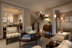
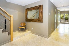
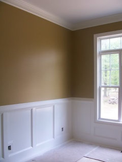
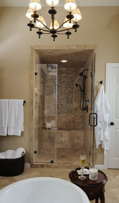
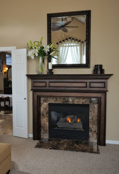
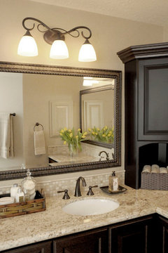
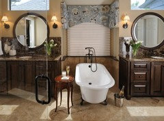
    Here are some pics of Nomadic Desert. In general I like the way it looks with dark wood and travertine. But look how different the color looks in each pic:

    [

    [(https://www.houzz.com/products/sw6107-nomadic-desert-by-sherwin-williams-prvw-vr~265295)

    [paints stains and glazes design[(https://www.houzz.com/products/paint-prbr0-br~t_505) by Sherwin-Williams
    href='https://www.houzz.com/products/paint-prbr0-br~t_505'>paints stains and glazes design by Sherwin-Williams

    [

    [(https://www.houzz.com/photos/master-bath-remodel-traditional-bathroom-houston-phvw-vp~116550)

    [traditional bathroom design[(https://www.houzz.com/photos/traditional-bathroom-ideas-phbr1-bp~t_712~s_2107) by houston interior designer Carla Aston, Aston Design Studio

    [

    [(https://www.houzz.com/photos/master-bedroom-and-bathroom-traditional-bedroom-houston-phvw-vp~116546)

    [contemporary bedroom design[(https://www.houzz.com/photos/contemporary-bedroom-ideas-phbr1-bp~t_715~s_2103) by houston interior designer Carla Aston, Aston Design Studio

    [

    [(https://www.houzz.com/photos/master-bath-remodel-traditional-bathroom-houston-phvw-vp~117387)

    [traditional bathroom design[(https://www.houzz.com/photos/traditional-bathroom-ideas-phbr1-bp~t_712~s_2107) by houston interior designer Carla Aston, Aston Design Studio

    [

    [(https://www.houzz.com/photos/master-bath-remodel-traditional-bathroom-houston-phvw-vp~116552)

    [traditional bathroom design[(https://www.houzz.com/photos/traditional-bathroom-ideas-phbr1-bp~t_712~s_2107) by houston interior designer Carla Aston, Aston Design Studio

  • lolauren
    12 years ago
    last modified: 9 years ago

    RE: pink... To me, it had a slightly orange-y look at night... I suppose that actually was a pink undertone, though. It was definitely a "warm" beige.

  • janealexa
    Original Author
    12 years ago
    last modified: 9 years ago

    Here's another ND thread...

    Here is a link that might be useful: Another ND thread

  • lolauren
    12 years ago
    last modified: 9 years ago

    I think that thread does a good job illustrating how different the paint can look in different lighting!

  • janealexa
    Original Author
    12 years ago
    last modified: 9 years ago

    lolauren, I agree! So important to see how a color looks in your own actual space. European White appears to be a light beige/taupe in my current house as well as at work (I liked it so much I painted it at work too!) But the same color looks gray in the new house - too gray. We have a paint swatch of ND painted in different parts of the new house. However, it is hard because floors, furniture, cabinets, etc are not in. And we can't look at it in artificial light since electrical is not in yet. We've just looked at the swatches at different times of day. So far I THINK I like it...but not sure if it's too dark and/or too warm. It's such a commitment, makes me nervous!

  • janealexa
    Original Author
    12 years ago
    last modified: 9 years ago

    OK, now I'm not so sure about Nomadic Desert. I looked at the swatches several times at different times of the day (the swatches are in 3 different rooms with varying natural light)...I can't figure it out...too dark? too warm? But then sometimes I really like it. Wish I could see it in artificial light.

    I am going to have the painter do a few more swatches for comparison. I'm considering: SW Softer Tan, SW Macadamia (both on same color strip, a little less warm), and SW Kilim Beige (very popular beige, one shade lighter than Nomadic Desert on the strip).

    Here are some links that I found to be useful:
    Top 25 SW colors
    http://activerain.com/blogsview/1170200/top-25-popular-sherwin-williams-paint-colors

    10 "no-fail" beige colors (with numerous comments):
    http://www.homegoods.com/blog/2009/03/15/10-no-fail-beige-paint-colors-youll-love/

    Thread about SW beiges and creams:
    http://ths.gardenweb.com/forums/load/decor/msg0520474016576.html

    Taupes and browns:
    http://ths.gardenweb.com/forums/load/decor/gal1118204018989.html

  • janealexa
    Original Author
    12 years ago
    last modified: 9 years ago

    Here is the swatch of ND in our space (great room). The picture also shows samples of our cabinets, faux travertine tile (to be in laundry room and bathrooms), glass/stone mosaic tile for backsplash in master bath (will be lined with matching travertine pencil liner), 2x4 tumbled travertine backsplash for kitchen. The granite sample is too hard to see, but it is tan brown. Picture was taken in the mid-afternoon. It seems to dark to me, maybe too warm (pink undertone), too matchy matchy with tile?? What do you think?

    Here is a link that might be useful: ND swatch in our space

  • lolauren
    12 years ago
    last modified: 9 years ago

    your link is broken for me.. says I don't have permission to view...

  • bird_lover6
    12 years ago
    last modified: 9 years ago

    I think many of these tans look lovely with SW Westhighland White. I chose Westhighland White because it goes with all the colors in my house, including the Nomadic Tan which I will use to paint one of my rooms in the near future.

    I like Westhighland White because it is quite white without being stark - just a hint of cream with no yellow or gray undertones (in my light).

    Good luck!

  • janealexa
    Original Author
    12 years ago
    last modified: 9 years ago

    oops, let me just post them here:

    Here is a better picture of our tan brown granite

    I went to the house today and realized ND really is too dark and/or too warm. At the house I also looked at the following on little paint chips:
    BM Bennington Gray-too dark, looks gray, with green undertone

    BM Grant Beige (1 shade lighter than Bennington Gray on same strip)-looks gray with green undertone

    SW Whole Wheat - too yellow

    SW Relaxed Khaki - too green

    I am going to ask for the painter to paint swatches of the following:
    SW Kilim Beige (1 shade lighter than ND on the same strip, so I'm afraid it might have a pink undertone)

    SW Softer Tan & SW Macadamia - on the same strip, light and medium beige respectively, less warm than ND

    Dunn Edwards Cochise - medium beige, less warm than ND

  • lolauren
    12 years ago
    last modified: 9 years ago

    You could have them cut the color down too (lighten it)... but that won't fix the "pink"ness. The color looks like it matches well, but that doesn't matter if it's too dark for you. Does your large tile have a warm tone to it?

    BTW, is that a sample of hardwood flooring on the right? or cabinets? (For what? The square shape is throwing me off... it's beautiful, whatever it is.)

  • InteriorStylist
    12 years ago
    last modified: 9 years ago

    I would then do the switchplates in the Divine White (or whatever trim color you choose) cause it will blend with the outlets & switches themselves.

    Softer Tan & Kilim Beige are also nice choices. Use Reveal light bulbs for the best artificial light.

    For ceilings I generally like to use the lightest tint on the color strip & as for trim - I was negligent to ask in my previous post what color trim is in adjoining rooms. I like to keep trim consistent to unify spaces. And Westhighland White is a WONDERFUL choice for trim to use as a trim color in any room because it is crisp but warm & seems to go with anything - thanks for the reminder birdlover6!!!

    ~Jeana

  • janealexa
    Original Author
    12 years ago
    last modified: 9 years ago

    lolauren, thank you for your feedback! I think I am leaning towards your similar decision for your current house - something lighter and a little less warm. But my husband doesn't want anything that looks gray, although I've always loved grayish taupe colors.

    I'm keeping my fingers crossed that one of the new colors will work! They want to start painting on Tues!!

    Interestingly, the tile looks great with grayish colors b/c there is a little gray in it, but it also looks great with warm colors. It does not however look good with anything that has green or yellow undertones.

    The square piece of wood is a sample of our cabinets, alder with custom stain, glad you like it:) Our doors and windowsills will be the same stain (although may come out differently due to different types of wood).

    Jeana, thanks for your input as well! Trim will be consistent through the house - still not sure of the color yet. I have to check out Westhighland White!

  • patty_cakes
    12 years ago
    last modified: 9 years ago

    Unfortunately, until the color goes on the walls, in the room's natural day/evening light, you won't know it's true undertone. And once it's painted on 4 walls it will really become emphasized. Painting one little splotch on a wall isn't going to give you the color you're going to live with, and unfortunately, you won't know the *true* color until the room is completely painted. I know, it sucks. ;o)

  • janealexa
    Original Author
    12 years ago
    last modified: 9 years ago

    bird_lover6 & Jeana, Westhighland White is not in the SW fan deck that I have:( Read some posts about SW Pavilion Beige for a nice beige wall color (I think that was the name, I think it was Pavilion something), but that's not in this fan deck either. Not sure if I will have time to go get paint chips since painters want to start painting on Tues! May just stick with SW Alabaster for the ceilings and trim. Thanks for the info though!

    patty_cakes - I know :( Wish I could see the paint with everything in, furniture, cabinets, flooring, lighting, etc! For now, just trying to pic a color that at least looks nice with my samples (cabinet, tile, etc). I'm hopeful it will all work out:) I'll keep you all posted:)

  • janealexa
    Original Author
    12 years ago
    last modified: 9 years ago

    you've all been so helpful, will you please check out my other thread, would love to hear your opinion on backsplashes! Thanks so much!

    Here is a link that might be useful: my other thread

  • janealexa
    Original Author
    12 years ago
    last modified: 9 years ago

    I stopped by the house yesterday after work just before it started getting dark. The painter painted HUGE samples from the floor to the ceiling. In that light I liked the Kilim Beige the best, but I will stop by again today to see the colors in daylight with my tile samples.

    In that light:
    Macademia looked nice,definitely less warm than ND, but I think it's too dark to do for the entire house.

    Softer tan also looked nice, seemed to have a yellow undertone

    Kilim beige looked the best, seemed to have a little gray undertone compared to the other colors...but still looked beige vs gray

    Chochise also looked nice but seemed to be the warmest of the 4 colors with a pink undertone.

    I'll go back today to make a final decision, painting will start today or tomorrow!

  • janealexa
    Original Author
    12 years ago
    last modified: 9 years ago

    I went to the house this morning to check out the colors with my tile samples.

    Macademia - too dark for our space
    Cochise - had a peachy, pink undertone

    I was torn between Softer Tan and Kilim Beige. When comparing the two, Softer Tan had more of a yellow undertone and Kilim Beige had more of a gray undertone with some warmth to it if that makes any sense.

    In the end I chose SW Kilim Beige for the wall color, it went better with my tile samples. I can see why it is one of SW's best sellers, such a nice color.

    I chose SW Alabaster for the trim and ceiling. The Alabaster sample on the ceiling looked like a nice crisp white without being too bright.

    Thank you all for your help!

  • InteriorStylist
    12 years ago
    last modified: 9 years ago

    Sorry I have not been back to answer about Westhighland White. There is a small newer fan deck called "Color Conccepts" & that is where Westhighland White is.

    Hope all's going well!!!

    ~Jeana

  • janealexa
    Original Author
    12 years ago
    last modified: 9 years ago

    Thanks for the info Jeana!

  • janealexa
    Original Author
    12 years ago
    last modified: 9 years ago

    Just to follow up, Kilim Beige on the walls with Alabaster trim/ceiling looks great in the new house! I love the colors with the dark walnut doors/cabinets and bronze fixtures. They just hooked up electrical so it looks nice with artificial light as well. Sometimes I regret not looking into SW Pavilion Beige, but I don't know why I do that to myself...what's done is done and I should be so relieved that Kilim Beige looks great!

    When they first painted I thought I saw peach undertones and I panicked. But I did not see that again. It is definitely warm, but I can't detect any real undertones. Flooring isn't in yet, so I'm curious to see how the color will change.

    patty_cakes, you wrote in a previous post above:
    "As for the color/colors, just a very pleasant, warm tan that has a beautiful candlelight hue in the evening. Good luck. ;o)"
    I thought of your comment when we saw the house for the first time last night with artificial light...kilim beige does have that beautiful candlelight hue in the evening!

    I will post pics soon. Thanks again to everyone, I appreciate your input and advice!

  • DOUG and MELBA MAULDIN
    3 years ago

    We built a 4000 sq ft. home in Colorado. We had dark, high gloss wood floors, dark furniture. The Sherwin Willuams pain colir we used with Nomadic Desert was "Dover White". We used it on the ceilings and on the trim. It was absolutely beautiful and very, very classy!! We had several compliments on our paint color choice. You cannot go wrong with "Dover White"!