


Houzz Tours

Houzz Tour: Making the Most of Every Inch in 1,250 Square Feet
Designers use meticulous space planning, minimalist style and custom features to open up and brighten a duplex

Smart space planning was the key to maximizing every inch in this 1,250-square-foot Vancouver, British Columbia, duplex. The homeowners also wanted to lighten up the home, update the style and create strong connections to their recently redone backyard. As interior designers Sarah Gallop and Jamie Judd reconfigured the layout and gave the space a clean, minimalist style, they also added artful custom features that dazzle.
Before: This was the view from the front door. The biggest problem with the layout was a large block that took up space in the middle of the first floor — the end of it is seen here with the mirrored door. It contained the powder room, a coat closet and utilities. “This thing was right in the middle of the first floor. It inhibited the flow and our ability to use the full depth of the space,” Gallop says.
The block narrowed the great room to about 10½ feet wide. And the hallway it formed to the right was a waste of space. The desk under the window served as the home’s only office space.
The block narrowed the great room to about 10½ feet wide. And the hallway it formed to the right was a waste of space. The desk under the window served as the home’s only office space.
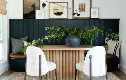
After: The designers removed the block to open up the floor plan. But they also wanted to create a sense of entry at the front door, so they designed a new slatted white oak room divider that has a semiopen feel, allowing for views and daylight to be shared between the entry and great room. The new floors throughout the space are white oak.
Hire a local carpenter
Hire a local carpenter
Before: Looking at a floor plan is worth a thousand words, so let’s dive in before we get any further into the house. The block in the center measured about 4 by 10 feet and contained the coat closet, powder room and utilities. The small, L-shaped kitchen was in the bottom right corner, which was dark because almost all the windows were in the great room running along the top of the plan. The top left corner contained the desk that served as the home office. Because one of the homeowners worked from home full time, the main living space had a cluttered look.
After: The designers removed the powder room block to open everything up. With much more floor space to work with, they moved the kitchen toward the middle of the house and used the corner where it had been for the powder room and storage.
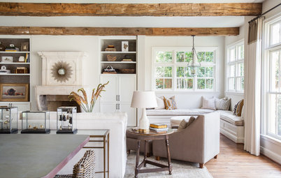
Before: The fireplace was along the back wall of the house. It can be seen at top center in the “before” floor plan. “The fireplace location split up the windows — we couldn’t fully open up to the backyard,” Gallop says. “Having the private backyard was a luxury and we wanted to create stronger connection to it. The location of the fireplace also made it difficult to furnish the room.”
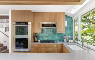
After: By relocating the fireplace, the designers were able to create a long, continuous wall of windows that open up the views to the yard. “It also allowed us to pull the kitchen forward for better connection to the backyard and the natural light,” Gallop says. The new kitchen location is convenient for serving people on the patio.
Shop for dining chairs
Shop for dining chairs
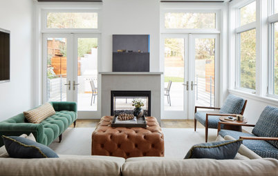
Gallop and Judd determined that moving the fireplace to this side of the great room would give the homeowners a cozy den within the large, open space. Because it’s on the side of the house that faces the neighbors, it didn’t cut down on potential window locations.
“Furniture placement was tricky in here, but this side of the room gave us enough room for two chairs and the reclining sofa our clients wanted,” Judd says. The armchairs can swivel to face the fireplace, the view outdoors or the sofa for conversation.
Browse coffee tables in the Houzz Shop
“Furniture placement was tricky in here, but this side of the room gave us enough room for two chairs and the reclining sofa our clients wanted,” Judd says. The armchairs can swivel to face the fireplace, the view outdoors or the sofa for conversation.
Browse coffee tables in the Houzz Shop
The new fireplace surround is porcelain with a polished stone look. The designers kept the lines clean and streamlined in keeping with the minimalist aesthetic. The chocolate brown accent color adds contrast in the light space and helps cozy up the TV den area within the great room. “This wall also provides a focal point, and the brown color made it cohesive with the slatted wall,” Judd says. “It also tied in the veining on the fireplace surround. And it kept the TV from sticking out as a big black box as it would have on a lighter wall.”
On the back left, the slatted room divider helps form the den area and adds visual interest to the room.
On the back left, the slatted room divider helps form the den area and adds visual interest to the room.
Before: The kitchen had been wedged into a corner of the space, cut off by the big powder room block.
After: The vignette seen in the previous photo was in the back corner of the space seen here. Now that corner contains the relocated powder room. Gallop and Judd came up with an island that serves as the back of a built-in banquette. This helped them fit a dining space into the great room.
Before: Here’s the powder room block and the hallway it formed to the right.
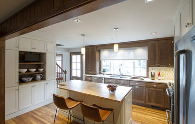
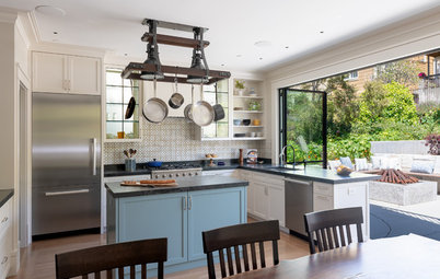
After: Removing the powder room block opened up space for the eat-in kitchen. The designers wrapped the new range hood in quartz that matches the countertops and backsplash. Using the same surface for all these elements lightened things up and contributed to the kitchen’s elegant minimalism.
The designers added windows between the counters and upper cabinets on either side of the range to let in more light.
The designers added windows between the counters and upper cabinets on either side of the range to let in more light.
The panel-front fridge fits right in with the cabinetry. Every inch of storage in the home mattered — the slim doors to the right are deep pullout pantry cabinets.
The sink is in a peninsula and is part of a work triangle layout. Anyone prepping food or washing dishes can enjoy the views out to the backyard. The peninsula also has a waterfall quartz countertop that creates a seating area.
This photo shows how the kitchen, dining area and den work together within the open floor plan. Before, the powder room block was in the middle of this space, blocking the view of the staircase.
This photo shows how the kitchen, dining area and den work together within the open floor plan. Before, the powder room block was in the middle of this space, blocking the view of the staircase.
Now there are expansive views toward the newly renovated backyard, as well as easy access from inside.
Before: The existing staircase didn’t fit in with the home’s new contemporary style.
After: The designers saw the staircase as an opportunity to do something beautiful. “We played with different ways to make the wall a feature and tie it in with other features, including the slatted wall,” Judd says.
They designed a 3D wall with MDF and had it painted a warm gray. New white oak treads and risers match the new flooring. Glass railings provide an open view of this feature from both floors of the house.
They designed a 3D wall with MDF and had it painted a warm gray. New white oak treads and risers match the new flooring. Glass railings provide an open view of this feature from both floors of the house.
The drama of the staircase continues all the way up to the second-floor ceiling. A contemporary light with a double-curve shape complements the feature wall. “The light provides a moment, draws the eye around and looks cool from different angles,” Judd says.
This is the primary bedroom. “It was really important to our clients to use as much space as possible for closets,” Judd says. The designers crafted storage around the bed to form an alcove. On either side of the bed are closets, with more storage for out-of-season clothing overhead. The dark wood seen inside the bed alcove provides warm contrast, much like the staircase feature wall and fireplace accent wall do. The designers also built in the nightstands and lighting to save space and maintain the clean, minimalist look.
On the other side of the room, they took space from the adjacent bedroom’s closets to create a wall of built-in closets. “Setting them up as cabinetry saved about 4½ inches over using framed closets with full doors — the built-ins have thinner doors. Again, every inch counted,” Gallop says.
On the other side of the room, they took space from the adjacent bedroom’s closets to create a wall of built-in closets. “Setting them up as cabinetry saved about 4½ inches over using framed closets with full doors — the built-ins have thinner doors. Again, every inch counted,” Gallop says.
Before: There’s one bathroom upstairs that had a door into the hallway as well as the primary bedroom. The homeowners wanted a bigger shower stall with a built-in bench. And they didn’t have much use for the pocket door between their bedroom and this bathroom.
After: This was one room where the designers didn’t change the layout much. “We found a smaller tub so that we could create a larger shower stall,” Judd says. “This is Kohler’s Greek drop-in tub. It’s not very long but it’s quite deep.”
Note the way the designers covered the tub surround in large-format porcelain tile with marble-like veining — it makes the tub surround appear to be carved from one big block of stone. The block extends into the shower stall, forming the bench that was on the homeowners’ must-have list. The designers also gave them a curbless shower stall.
Bathtub: Greek, Kohler
One of the homeowners worked from home full time, and both were happy to get the home office space out of the great room. By installing a Murphy bed in the second bedroom, Gallop and Judd allowed it to work both as a true guest room and as a home office. They designed a built-in desk and shelves, using wood for contrast like they did downstairs and in the primary bedroom alcove. Repeating these materials and colors created a pleasingly cohesive feel throughout the home. The location under the window provides more backyard views.
Because they had taken over this bedroom’s existing closet space for the primary bedroom, they also included closet cabinets around the Murphy bed.
Check out our beginner’s guide to get started on your home project
Because they had taken over this bedroom’s existing closet space for the primary bedroom, they also included closet cabinets around the Murphy bed.
Check out our beginner’s guide to get started on your home project
Before: Things to note in this upstairs floor plan are the guest bedroom closets and the pocket door between the primary bedroom and bath. That door didn’t save much travel time between the two spaces.
After: The guest room’s closets now belong to the primary bedroom, and the pocket door into the bathroom was removed. This floor plan also shows the location of the vanity in the bathroom, which doesn’t appear in the photographs.
More on Houzz
Tour more modern homes
Hire a local design pro
Shop for your home
More on Houzz
Tour more modern homes
Hire a local design pro
Shop for your home

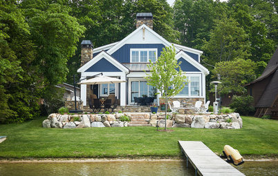


House at a Glance
Who lives here: A couple
Location: Vancouver, British Columbia
Size: 1,250 square feet (116 square meters); two bedrooms, 1½ bathrooms
Designer: Top Shelf Design
The home occupies the back half of a duplex. “Our clients recently had given their backyard a makeover,” Gallop says. “They wanted to be able to view it and to create stronger connections to it from inside.”
To get a good sense of their clients’ style, the designers had them share Houzz ideabooks full of spaces they liked, along with comments. Then they dug in and asked about the specific aspects they liked about each photo. “We could see they liked a clean and bright, minimalist look,” Gallop says.
Space planning was of the utmost importance. “This home had a modest footprint, so it was really important that we make the most of every inch,” Judd says.
Find a local interior designer on Houzz