


Kitchen of the Week: Remodel Respects a Home’s Victorian Style
An earlier kitchen addition is updated to add modern function and blend in better with the home’s elegant architecture

Most of this San Francisco family’s Victorian home, including its main floor’s triple parlor, was quite grand, but its kitchen was a different story. “Originally, these homes didn’t have kitchens on the main level. In this one, it had clearly been added on to the back later,” architect John Lum says. Another adjacent addition included an unused conservatory space that was cold and narrow.
Lum’s goal was to update the period home for modern family life while preserving and enhancing its beautiful architectural details. “The main request from the family — a couple and their two children — was to have comfortable space in the kitchen for gathering, because the existing kitchen did not feel comfortable,” he says. The plans included partially opening up the kitchen to the family room for good flow throughout the main floor. The architectural details tell a story of a new modern kitchen meeting the original Victorian-era architecture of the rest of the home.
Lum’s goal was to update the period home for modern family life while preserving and enhancing its beautiful architectural details. “The main request from the family — a couple and their two children — was to have comfortable space in the kitchen for gathering, because the existing kitchen did not feel comfortable,” he says. The plans included partially opening up the kitchen to the family room for good flow throughout the main floor. The architectural details tell a story of a new modern kitchen meeting the original Victorian-era architecture of the rest of the home.
Before: In this photo, the window over the sink is in about the same spot as the windows over the sink in the previous photo. The kitchen had been added on to the house, so it didn’t have any original Victorian details to preserve.
The wall behind the range divided the kitchen from the haphazard conservatory addition. “The conservatory was too narrow and too cold to get much use out of,” Lum says.
The wall behind the range divided the kitchen from the haphazard conservatory addition. “The conservatory was too narrow and too cold to get much use out of,” Lum says.
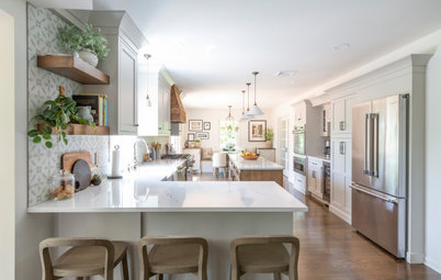
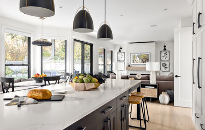
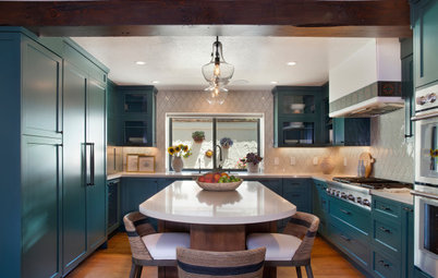
After: Lum removed that wall to create one large, open kitchen space along the back of the house. The ceiling beam seen here shows where the wall used to be. Now the former conservatory space serves as the dining area. The entire space enjoys the wonderful light from the new row of windows along the side of the house.
“The original windows in the house are double-hung, but because of building codes, we needed to install fire-rated windows along the sides,” the architect says. “We went for a Moderne style because they give the same glamorous feel that the Eastlake-style architectural details do in the rest of this home.”
The Eastlake style of the original house was popular between 1870 and 1905. Because the kitchen was a later addition, the windows tell a story of bringing in the Moderne style later, sometime between the 1920s and 1940s. The strong yet simple lines of these Moderne-style windows also work well with the more modern style of the new kitchen.
Windows: Western aluminum picture and casement; cabinets: Kenwood Cabinetry
Browse counter stools in the Houzz Shop
Before: To get a better idea of the changes to the floor plan, take a look at this rendering of the previous layout. The conservatory was at the top left and the kitchen was below it. Also, note the connections between the family room, the hallway and the kitchen at the center of the plan. The black outline in the center is the family room fireplace.
Down on the bottom right side of the kitchen, two doors led to the staircase and a hallway. As part of the renovation, Lum reworked the staircase from the ground level up to the fourth floor. The dashed line beneath the fireplace near the center of the plan represents where a built-in china cabinet had been. This had closed the family room off from the kitchen. The double doors above the fireplace led from the family room into the conservatory.
Down on the bottom right side of the kitchen, two doors led to the staircase and a hallway. As part of the renovation, Lum reworked the staircase from the ground level up to the fourth floor. The dashed line beneath the fireplace near the center of the plan represents where a built-in china cabinet had been. This had closed the family room off from the kitchen. The double doors above the fireplace led from the family room into the conservatory.
After: This plan shows how Lum removed the wall between the conservatory and kitchen and added a structural beam. A dining area occupies the former sunroom space at the top of the plan. An L-shaped workspace along the bottom left wraps the corner, with a large island in the center.
In addition, Lum removed the built-in china cabinet to create a new opening between the family room and the kitchen next to the fireplace. He kept the opening on the other side of the fireplace, leading to the dining area of the kitchen.
In addition, Lum removed the built-in china cabinet to create a new opening between the family room and the kitchen next to the fireplace. He kept the opening on the other side of the fireplace, leading to the dining area of the kitchen.
The family uses this portion of the home’s grand triple parlor as the family room. The renovations created the opening to the left of the fireplace. And now that the former conservatory is part of the kitchen, the double French doors to the right of the fireplace are a second opening between the two rooms. “Now it all flows through and the family occupies the back of the house,” Lum says.
This photo also shows the Eastlake-style trim work that runs throughout the house. Lum preserved it wherever possible and enhanced it. For example, he preserved the stained-glass transom over the doors on the right side of the room.
Shop for a sectional sofa
This photo also shows the Eastlake-style trim work that runs throughout the house. Lum preserved it wherever possible and enhanced it. For example, he preserved the stained-glass transom over the doors on the right side of the room.
Shop for a sectional sofa
After: Here you can see the new cased opening, to the right of the wine bar. It replaced the existing china cabinet (on the “before” plan, the red dashed line beneath the fireplace). To ease the transition between the original Eastlake-style architecture of the parlor and the more modern style of the kitchen, Lum trimmed out the thick opening with Eastlake-style millwork.
Also, there are double doors that tuck into either side of the cased opening — the family can close off the kitchen from the family room if desired. This photo shows one of the doors tucked into the casing — look closely on the right side of it to see the doorknob.
Find a local countertop pro
Also, there are double doors that tuck into either side of the cased opening — the family can close off the kitchen from the family room if desired. This photo shows one of the doors tucked into the casing — look closely on the right side of it to see the doorknob.
Find a local countertop pro
Before: A bank of cabinets and a banquette occupied this side of the kitchen.
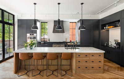
After: Now the range alcove is the focal point of that wall. The Calacatta Oro marble extends from the countertops up the backsplash. This choice of material ties the kitchen to the Victorian era. The pendant lights are a fresh take on a classic silhouette, and their brass finishes suit the home’s vintage.
“We also extended the cabinets all the way up to the ceiling, which is 10 feet high. And we used all wood on the cabinets instead of mixing in colors or glass,” Lum says. “We felt like this gave it kind of a library-like feel when viewed from other rooms.” The wood is walnut veneer, and the panel-front fridge, at right, blends in seamlessly with the cabinetry.
The new oak floors match the home’s original floors. “The original floors have a lot of inlaid designs and elaborate borders,” Lum says. “In the kitchen we just used the same field to match without those details.”
Pendant lights: Precision, Visual Comfort; faucet: Newport Brass
After: The new Moderne-style windows are a better fit.
They also provide a beautiful garden view. “There’s a very grand Victorian home that belonged to the late Jessica McClintock next door, and it has a beautiful English-style garden,” Lum says. “It’s nice that the dining area looks over this garden, because this house only has an elevated deck off the back of the house and not much of a yard.”
New to home remodeling? Learn the basics
The large island (9 by 4⅓ feet) suits the scale of the space, providing the family with exactly what it wanted: a gathering spot for hanging out with one another or with friends when entertaining. “They have plenty of storage in here — especially because of the extra width in this island — it has room for storage on the seating side,” Lum says.
The work side of the island includes a microwave drawer and the dishwasher, conveniently located across from the sink. Floor-to-ceiling pantry cabinets on the left and an appliance garage on the right flank the range alcove.
To sum up, the new design has a good relationship with the older architecture of the home because:
Tour more homes
Hire a local design pro
Shop for your home
To sum up, the new design has a good relationship with the older architecture of the home because:
- Finishes like marble and brass connect to Victorian-era finishes.
- The shape of the large pendant lights is classic.
- The floors and details around the new cased opening match the rest of the home.
- The proportions of the high ceilings and size of the kitchen were inspired by the grandeur of the triple parlor.
- Moderne-style windows lend an added-over-time look.
- The extensive wood in the kitchen has a library-like feel.
- Original details like the transom over the double French doors were preserved.
Tour more homes
Hire a local design pro
Shop for your home


Kitchen at a Glance
Who lives here: A family of four
Location: San Francisco
Size: 423 square feet (39 square meters)
Designers: John Lum Architecture (architecture), Laura Hunt Design (interior design)
Contractor: Georgiou Construction
Lum and interior designer Laura Hunt faced the challenge of making the new space flow with the rest of the main floor physically and stylistically. They also needed to find a way to make a kitchen with a more modern style work hand in hand with the Victorian-era architecture of the rest of the home. “The original Victorian details in the house were Eastlake style, which is grand and glamorous,” Lum says.
The most dramatic change to the kitchen plan was taking over the adjacent conservatory space. Look at the top right corner of this photo to see a glimpse of the new beam — this marks where the kitchen’s exterior wall met the conservatory.
Find a local architect on Houzz