


Search results for "Maximizing a small space" in Home Design Ideas
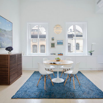
A young couple with three small children purchased this full floor loft in Tribeca in need of a gut renovation. The existing apartment was plagued with awkward spaces, limited natural light and an outdated décor. It was also lacking the required third child’s bedroom desperately needed for their newly expanded family. StudioLAB aimed for a fluid open-plan layout in the larger public spaces while creating smaller, tighter quarters in the rear private spaces to satisfy the family’s programmatic wishes. 3 small children’s bedrooms were carved out of the rear lower level connected by a communal playroom and a shared kid’s bathroom. Upstairs, the master bedroom and master bathroom float above the kid’s rooms on a mezzanine accessed by a newly built staircase. Ample new storage was built underneath the staircase as an extension of the open kitchen and dining areas. A custom pull out drawer containing the food and water bowls was installed for the family’s two dogs to be hidden away out of site when not in use. All wall surfaces, existing and new, were limited to a bright but warm white finish to create a seamless integration in the ceiling and wall structures allowing the spatial progression of the space and sculptural quality of the midcentury modern furniture pieces and colorful original artwork, painted by the wife’s brother, to enhance the space. The existing tin ceiling was left in the living room to maximize ceiling heights and remain a reminder of the historical details of the original construction. A new central AC system was added with an exposed cylindrical duct running along the long living room wall. A small office nook was built next to the elevator tucked away to be out of site.
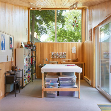
Designed to maximize function with minimal impact, the studio serves up adaptable square footage in a wrapping almost healthy enough to eat.
The open interior space organically transitions from personal to communal with the guidance of an angled roof plane. Beneath the tallest elevation, a sunny workspace awaits creative endeavors. The high ceiling provides room for big ideas in a small space, while a cluster of windows offers a glimpse of the structure’s soaring eave. Solid walls hugging the workspace add both privacy and anchors for wall-mounted storage. Towards the studio’s southern end, the ceiling plane slopes downward into a more intimate gathering space with playfully angled lines.
The building is as sustainable as it is versatile. Its all-wood construction includes interior paneling sourced locally from the Wood Mill of Maine. Lengths of eastern white pine span up to 16 feet to reach from floor to ceiling, creating visual warmth from a material that doubles as a natural insulator. Non-toxic wood fiber insulation, made from sawdust and wax, partners with triple-glazed windows to further insulate against extreme weather. During the winter, the interior temperature is able to reach 70 degrees without any heat on.
As it neared completion, the studio became a family project with Jesse, Betsy, and their kids working together to add the finishing touches. “Our whole life is a bit of an architectural experiment”, says Jesse, “but this has become an incredibly useful space.”
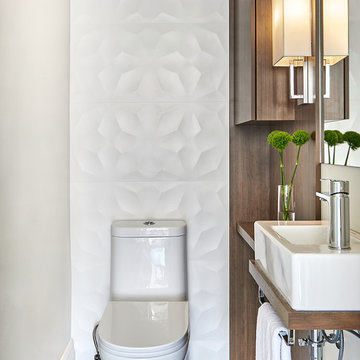
A small space deserves just as much attention as a large space. This powder room is long and narrow. We didn't have the luxury of adding a vanity under the sink which also wouldn't have provided much storage since the plumbing would have taken up most of it. Using our creativity we devised a way to introduce corner/upper storage while adding a counter surface to this small space through custom millwork. We added visual interest behind the toilet by stacking three dimensional white porcelain tile.
Photographer: Stephani Buchman
Find the right local pro for your project
A small pied-e-terre received an out-sized makeover. We opened the tiny kitchen to give it the feel and workability of a much larger space. Both the bath and the kitchen are true to the very traditional and charming Beacon Hill aesthetic.
Eric Roth Photography
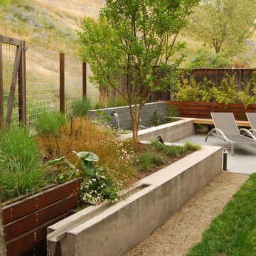
This small tract home backyard was transformed into a lively breathable garden. A new outdoor living room was created, with silver-grey brazilian slate flooring, and a smooth integral pewter colored concrete wall defining and retaining earth around it. A water feature is the backdrop to this outdoor room extending the flooring material (slate) into the vertical plane covering a wall that houses three playful stainless steel spouts that spill water into a large basin. Koi Fish, Gold fish and water plants bring a new mini ecosystem of life, and provide a focal point and meditational environment. The integral colored concrete wall begins at the main water feature and weaves to the south west corner of the yard where water once again emerges out of a 4” stainless steel channel; reinforcing the notion that this garden backs up against a natural spring. The stainless steel channel also provides children with an opportunity to safely play with water by floating toy boats down the channel. At the north eastern end of the integral colored concrete wall, a warm western red cedar bench extends perpendicular out from the water feature on the outside of the slate patio maximizing seating space in the limited size garden. Natural rusting Cor-ten steel fencing adds a layer of interest throughout the garden softening the 6’ high surrounding fencing and helping to carry the users eye from the ground plane up past the fence lines into the horizon; the cor-ten steel also acts as a ribbon, tie-ing the multiple spaces together in this garden. The plant palette uses grasses and rushes to further establish in the subconscious that a natural water source does exist. Planting was performed outside of the wire fence to connect the new landscape to the existing open space; this was successfully done by using perennials and grasses whose foliage matches that of the native hillside, blurring the boundary line of the garden and aesthetically extending the backyard up into the adjacent open space.
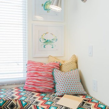
Cuddle up with a book on this colorful Beach decor window seat. This custom made reading nook built on storage is the perfect place to cozy up and read a book or play on your phone. Outlets for your phone or other devices and an accordion arm lamp to shed some light on the task at hand. The vibrant cool and warm colors of red, turquoise, yellow, white, and black bring everything together in this tiny space. Maximize the space you live in with storage, style, and function.
Designed by Space Consultant Danielle Perkins @ DANIELLE Interior Design & Decor.
Photographed by Taylor Abeel Photography.
When my client had to move from her company office to work at home, she set up in the dining room. Despite her best efforts, this was not the long-term solution she was looking for. My client realized she needed a dedicated space not on the main floor of the home. On one hand, having your office space right next to the kitchen is handy. On the other hand, it made separating work and home life was not that easy.
The house was a ranch. In essence, the basement would run entire length of the home. As we came down the steps, we entered a time capsule. The house was built in the 1950’s. The walls were covered with original knotty pine paneling. There was a wood burning fireplace and considering this was a basement, high ceilings. In addition, there was everything her family could not store at their own homes. As we wound though the space, I though “wow this has potential”, Eventually, after walking through the laundry room we came to a small nicely lit room. This would be the office.
My client looked at me and asked what I thought. Undoubtedly, I said, this can be a great workspace, but do you really want to walk through this basement and laundry to get here? Without reservation, my client said where do we start?
Once the design was in place, we started the renovation. The knotty pine paneling had to go. Specifically, to add some insulation and control the dampness and humidity. The laundry room wall was relocated to create a hallway to the office.
At the far end of the room, we designated a workout zone. Weights, mats, exercise bike and television are at the ready for morning or afternoon workouts. The space can be concealed by a folding screen for party time. Doors to an old closet under the stairs were relocated to the workout area for hidden storage. Now we had nice wall for a beautiful console and mirror for storage and serving during parties.
In order to add architectural details, we covered the old ugly support columns with simple recessed millwork panels. This detail created a visual division between the bar area and the seating area in front of the fireplace. The old red brick on the fireplace surround was replaced with stack stone. A mantle was made from reclaimed wood. Additional reclaimed wood floating shelves left and right of the fireplace provides decorative display while maintaining a rustic element balancing the copper end table and leather swivel rocker.
We found an amazing rug which tied all of the colors together further defining the gathering space. Russet and burnt orange became the accent color unifying each space. With a bit of whimsy, a rather unusual light fixture which looks like roots from a tree growing through the ceiling is a conversation piece.
The office space is quite and removed from the main part of the basement. There is a desk large enough for multiple screens, a small bookcase holding office supplies and a comfortable chair for conference calls. Because working from home requires many online meetings, we added a shiplap wall painted in Hale Navy to contrast with the orange fabric on the chair. We finished the décor with a painting from my client’s father. This is the background online visitors will see.
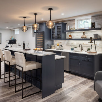
The last and best part of the renovation is the beautiful bar. My client is an avid collector of wine. She already had the EuroCave refrigerator, so I incorporated it into the design. The cabinets are painted Temptation Grey from Benjamin Moore. The counter tops are my favorite hard working quartzite Brown Fantasy. The backsplash is a combination of rustic wood and old tin ceiling like porcelain tiles. Together with the textures of the reclaimed wood and hide poofs balanced against the smooth finish of the cabinets, we created a comfortable luxury for relaxing.
There is ample storage for bottles, cans, glasses, and anything else you can think of for a great party. In addition to the wine storage, we incorporated a beverage refrigerator, an ice maker, and a sink. Floating shelves with integrated lighting illuminate the back bar. The raised height of the front bar provides the perfect wine tasting and paring spot. I especially love the pendant lights which look like wine glasses.
Finally, I selected carpet for the stairs and office. It is perfect for noise reduction. Meanwhile for the overall flooring, I specifically selected a high-performance vinyl plank floor. We often use this product as it is perfect to install on a concrete floor. It is soft to walk on, easy to clean and does not reduce the overall height of the space.
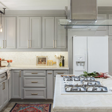
Embark on a culinary crave with this classic gray and white family kitchen. We chose a warm neutral color for the cabinetry and enhanced this warmth with champagne gold cabinet hardware. These warm gray cabinets can be found at your neighborhood Lowes while the champagne hardware are designed by Atlas. Add another accent of shine to your kitchen and check out the mother of pearl diamond mosaic tile backsplash by Jeffrey Court, as seen here. Adding this hint of sparkle to your small space will allow your kitchen to stay bright and chic. Don't be afraid to mix metals or color. This island houses the glass cook top with a stainless steel hood above the island, and we added a matte black as our finish for the Edison lighting as well as black bar stool seating to tie it all together. The Taj Mahal white Quartzite counter tops are a beauty. The contrast in color creates dimension to your small kitchen layout and will continually catch your eye.
Designed by Dani Perkins @ DANIELLE Interior Design & Decor
Taylor Abeel Photography
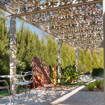
This shade arbor, located in The Woodlands, TX north of Houston, spans the entire length of the back yard. It combines a number of elements with custom structures that were constructed to emulate specific aspects of a Zen garden. The homeowner wanted a low-maintenance garden whose beauty could withstand the tough seasonal weather that strikes the area at various times of the year. He also desired a mood-altering aesthetic that would relax the senses and calm the mind. Most importantly, he wanted this meditative environment completely shielded from the outside world so he could find serenity in total privacy.
The most unique design element in this entire project is the roof of the shade arbor itself. It features a “negative space” leaf pattern that was designed in a software suite and cut out of the metal with a water jet cutter. Each form in the pattern is loosely suggestive of either a leaf, or a cluster of leaves.
These small, negative spaces cut from the metal are the source of the structure’ powerful visual and emotional impact. During the day, sunlight shines down and highlights columns, furniture, plantings, and gravel with a blend of dappling and shade that make you feel like you are sitting under the branches of a tree.
At night, the effects are even more brilliant. Skillfully concealed lights mounted on the trusses reflect off the steel in places, while in other places they penetrate the negative spaces, cascading brilliant patterns of ambient light down on vegetation, hardscape, and water alike.
The shade arbor shelters two gravel patios that are almost identical in space. The patio closest to the living room features a mini outdoor dining room, replete with tables and chairs. The patio is ornamented with a blend of ornamental grass, a small human figurine sculpture, and mid-level impact ground cover.
Gravel was chosen as the preferred hardscape material because of its Zen-like connotations. It is also remarkably soft to walk on, helping to set the mood for a relaxed afternoon in the dappled shade of gently filtered sunlight.
The second patio, spaced 15 feet away from the first, resides adjacent to the home at the opposite end of the shade arbor. Like its twin, it is also ornamented with ground cover borders, ornamental grasses, and a large urn identical to the first. Seating here is even more private and contemplative. Instead of a table and chairs, there is a large decorative concrete bench cut in the shape of a giant four-leaf clover.
Spanning the distance between these two patios, a bluestone walkway connects the two spaces. Along the way, its borders are punctuated in places by low-level ornamental grasses, a large flowering bush, another sculpture in the form of human faces, and foxtail ferns that spring up from a spread of river rock that punctuates the ends of the walkway.
The meditative quality of the shade arbor is reinforced by two special features. The first of these is a disappearing fountain that flows from the top of a large vertical stone embedded like a monolith in the other edges of the river rock. The drains and pumps to this fountain are carefully concealed underneath the covering of smooth stones, and the sound of the water is only barely perceptible, as if it is trying to force you to let go of your thoughts to hear it.
A large piece of core-10 steel, which is deliberately intended to rust quickly, rises up like an arced wall from behind the fountain stone. The dark color of the metal helps the casual viewer catch just a glimpse of light reflecting off the slow trickle of water that runs down the side of the stone into the river rock bed.
To complete the quiet moment that the shade arbor is intended to invoke, a thick wall of cypress trees rises up on all sides of the yard, completely shutting out the disturbances of the world with a comforting wall of living greenery that comforts the thoughts and emotions.
This custom vanity cleverly hides away a laundry hamper & drawers with built-in outlets, to provide all the necessities the owner needs.
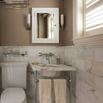
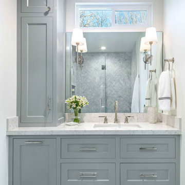
Mid-sized elegant master gray tile and marble tile marble floor, gray floor and single-sink bathroom photo in San Francisco with shaker cabinets, white walls, an undermount sink, quartz countertops, a hinged shower door, white countertops, a built-in vanity and gray cabinets
Mid-sized elegant master gray tile and marble tile marble floor, gray floor and single-sink bathroom photo in San Francisco with shaker cabinets, white walls, an undermount sink, quartz countertops, a hinged shower door, white countertops, a built-in vanity and gray cabinets
This small space demanded attention to detail and smart solutions, starting with the table and chairs. Too tiny for a standard kitchen table, we added a table that folds down against the wall with foldable chairs that can be hung on the wall when not in use. Typically neglected space between the refrigerator and the wall was turned into spice cabinets, ceiling height uppers maximize storage, and a mirrored backsplash creates the illusion of more space. But small spaces don't have to be vacant of character, as proven by the distressed aqua cabinetry and mismatched knobs.
This ceiling was designed and detailed by dSPACE Studio. We created a custom plaster mold that was fabricated by a Chicago plaster company and installed and finished on-site.

Convert a small space to a polished eye-catching and functional home office. We used white painted maple wood veneers and solid wood painted doors, moldings and trims to give the space a formal style. This home office boasts under cabinet LED lighting, doors with glass inserts, upper cabinets surrounded by wrap around shelving for books and accent pieces and sturdy maple wood drawers for storing office supplies or filing important documents.
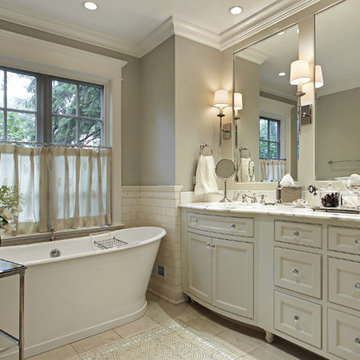
The challenge for this project was that, while the homeowner desired all of the luxury amenities of a deluxe master bath, space was extremely limited. Therefore efficient space planning was critical in achieving the final design. Use of custom painted cabinetry and carrara marble countertops were the basis for this compact yet luxurious bathroom design. Careful attention was given to the tone of the finishes in order to keep this eastern-exposure bathroom light and bright. White trim and crown moulding was used in contrast to the putty colored walls. In keeping with the era of the home, a hand-glazed white ceramic subway tile was used in the soaking tub alcove. Nickel plated bath, lavatory, tub and shower fixtures in the vintage style were used alongside modern amenities such as recessed halogen lighting, electric towel warmers and radiant-heated tile flooring.
Our clients had just recently closed on their new house in Stapleton and were excited to transform it into their perfect forever home. They wanted to remodel the entire first floor to create a more open floor plan and develop a smoother flow through the house that better fit the needs of their family. The original layout consisted of several small rooms that just weren’t very functional, so we decided to remove the walls that were breaking up the space and restructure the first floor to create a wonderfully open feel.
After removing the existing walls, we rearranged their spaces to give them an office at the front of the house, a large living room, and a large dining room that connects seamlessly with the kitchen. We also wanted to center the foyer in the home and allow more light to travel through the first floor, so we replaced their existing doors with beautiful custom sliding doors to the back yard and a gorgeous walnut door with side lights to greet guests at the front of their home.
Living Room
Our clients wanted a living room that could accommodate an inviting sectional, a baby grand piano, and plenty of space for family game nights. So, we transformed what had been a small office and sitting room into a large open living room with custom wood columns. We wanted to avoid making the home feel too vast and monumental, so we designed custom beams and columns to define spaces and to make the house feel like a home. Aesthetically we wanted their home to be soft and inviting, so we utilized a neutral color palette with occasional accents of muted blues and greens.
Dining Room
Our clients were also looking for a large dining room that was open to the rest of the home and perfect for big family gatherings. So, we removed what had been a small family room and eat-in dining area to create a spacious dining room with a fireplace and bar. We added custom cabinetry to the bar area with open shelving for displaying and designed a custom surround for their fireplace that ties in with the wood work we designed for their living room. We brought in the tones and materiality from the kitchen to unite the spaces and added a mixed metal light fixture to bring the space together
Kitchen
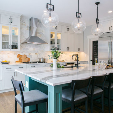
We wanted the kitchen to be a real show stopper and carry through the calm muted tones we were utilizing throughout their home. We reoriented the kitchen to allow for a big beautiful custom island and to give us the opportunity for a focal wall with cooktop and range hood. Their custom island was perfectly complimented with a dramatic quartz counter top and oversized pendants making it the real center of their home. Since they enter the kitchen first when coming from their detached garage, we included a small mud-room area right by the back door to catch everyone’s coats and shoes as they come in. We also created a new walk-in pantry with plenty of open storage and a fun chalkboard door for writing notes, recipes, and grocery lists.
Office
We transformed the original dining room into a handsome office at the front of the house. We designed custom walnut built-ins to house all of their books, and added glass french doors to give them a bit of privacy without making the space too closed off. We painted the room a deep muted blue to create a glimpse of rich color through the french doors
Powder Room
The powder room is a wonderful play on textures. We used a neutral palette with contrasting tones to create dramatic moments in this little space with accents of brushed gold.
Master Bathroom
The existing master bathroom had an awkward layout and outdated finishes, so we redesigned the space to create a clean layout with a dream worthy shower. We continued to use neutral tones that tie in with the rest of the home, but had fun playing with tile textures and patterns to create an eye-catching vanity. The wood-look tile planks along the floor provide a soft backdrop for their new free-standing bathtub and contrast beautifully with the deep ash finish on the cabinetry.
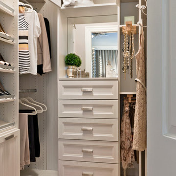
Photo byAngie Seckinger
Small walk-in designed for maximum use of space. Custom accessory storage includes double-decker jewelry drawer with velvet inserts, Maple pull-outs behind door for necklaces & scarves, vanity area with mirror, slanted shoe shelves, valet rods & hooks.
Cooking for Two
Location: Plymouth, MN, United States
When this couple’s last child graduated from college they began the process of looking for a new home. After a lengthy search they decided to stay with the neighborhood they loved, saving money by remodeling rather than starting over.
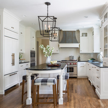
The top priorities on their wish list were adding character to their 1990’s era home with a classic white kitchen and a larger island while keeping within the existing footprint. With the intention of honing their cooking skills, they were also considering better appliances and two ovens.
Challenges and Solutions
Design a larger island with seating for at least two. The existing island was small and the area behind the seating was less than recommended clearances.
To solve this challenge, the seating area of the island was extended out into the open area of the kitchen. This created a larger island with seating for three, extra storage and a bookshelf across from the range.
The original kitchen had a range with microwave above, so adding another oven was a challenge with limited wall space.
Because the adjoining dining room is used infrequently, the homeowner was open to placing the second oven and microwave in the walkway. This made room for the small buffet between the built in refrigerator and ovens, creating one of her favorite areas.
The client requested a white painted kitchen but wanted to make sure it had warmth and character. To achieve this the following elements were chosen:
1) Cabinets painted with Benjamin Moore Capitol White, a luminous and warm shade of white.
2) The Range hood was painted with warm metallic shades to reflect the bronze of the Ashley Norton hardware.
3) Black Aqua Grantique granite was chosen for countertops because it looks like soapstone and adds contrast.
4) Walker Zanger Café tile in Latte was chosen for it’s handmade look with uneven edges.
5) The to-the-counter-cabinet with glass door shows off serving dishes and lends sophisticated charm.
The result is a welcoming classic kitchen, where this couple enjoys cooking more often and sharpening their skills with gourmet appliances.
Liz Schupanitz Designs
Photographed by: Andrea Rugg Photography
Showing Results for "Maximizing A Small Space"
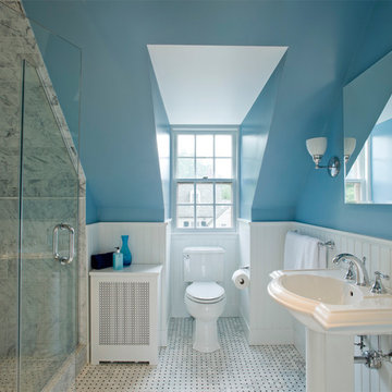
A small space was transformed into a retro throwback using Carerra marble, a basket weave pattern tile floor, pedestal sink, clean fixtures and bright blue wall color.
Conceived as a remodel and addition, the final design iteration for this home is uniquely multifaceted. Structural considerations required a more extensive tear down, however the clients wanted the entire remodel design kept intact, essentially recreating much of the existing home. The overall floor plan design centers on maximizing the views, while extensive glazing is carefully placed to frame and enhance them. The residence opens up to the outdoor living and views from multiple spaces and visually connects interior spaces in the inner court. The client, who also specializes in residential interiors, had a vision of ‘transitional’ style for the home, marrying clean and contemporary elements with touches of antique charm. Energy efficient materials along with reclaimed architectural wood details were seamlessly integrated, adding sustainable design elements to this transitional design. The architect and client collaboration strived to achieve modern, clean spaces playfully interjecting rustic elements throughout the home.
Greenbelt Homes
Glynis Wood Interiors
Photography by Bryant Hill
Renovated to accommodate a family of eight, this oceanfront home proudly overlooks the gateway to Marblehead Neck. This renovation preserves and highlights the character and charm of the existing circa 1900 gambrel while providing comfortable living for this large family. The finished product is a unique combination of fresh traditional, as exemplified by the contrast of the pool house interior and exterior.
Photo Credit: Eric Roth
1