


Search results for "Below average credit" in Home Design Ideas
The design challenge was to enhance the square footage, flow and livability in this 1,442 sf 1930’s Tudor style brick house for a growing family of four. A two story 1,000 sf addition was the solution proposed by the design team at Advance Design Studio, Ltd. The new addition provided enough space to add a new kitchen and eating area with a butler pantry, a food pantry, a powder room and a mud room on the lower level, and a new master suite on the upper level.
The family envisioned a bright and airy white classically styled kitchen accented with espresso in keeping with the 1930’s style architecture of the home. Subway tile and timely glass accents add to the classic charm of the crisp white craftsman style cabinetry and sparkling chrome accents. Clean lines in the white farmhouse sink and the handsome bridge faucet in polished nickel make a vintage statement. River white granite on the generous new island makes for a fantastic gathering place for family and friends and gives ample casual seating. Dark stained oak floors extend to the new butler’s pantry and powder room, and throughout the first floor making a cohesive statement throughout. Classic arched doorways were added to showcase the home’s period details.
On the upper level, the newly expanded garage space nestles below an expansive new master suite complete with a spectacular bath retreat and closet space and an impressively vaulted ceiling. The soothing master getaway is bathed in soft gray tones with painted cabinets and amazing “fantasy” granite that reminds one of beach vacations. The floor mimics a wood feel underfoot with a gray textured porcelain tile and the spacious glass shower boasts delicate glass accents and a basket weave tile floor. Sparkling fixtures rest like fine jewelry completing the space.
The vaulted ceiling throughout the master suite lends to the spacious feel as does the archway leading to the expansive master closet. An elegant bank of 6 windows floats above the bed, bathing the space in light.
Photo Credits- Joe Nowak
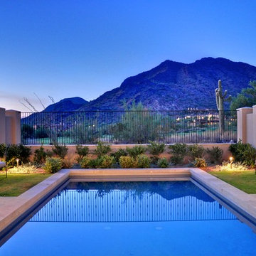
This custom classic residential home sits in Silverleaf Parks, in the Silverleaf Community located in Scotstdale, Arizona. The home boasts 2 large master suites, a home office, outdoor patio with a fireplace, 3 car garage, lush landscape, and amazing views of the Phoenix Metro Valley below. Photo Credit: Werner Segarra
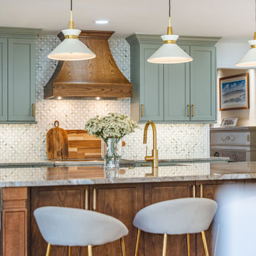
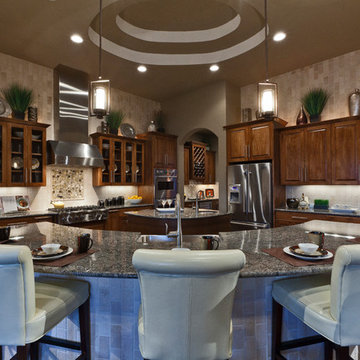
Hi everyone, I'm Sarah and Ogun we are here with fine line kitchens. So we are a couple working together. I do the interior design and remodeling of the space material selection meeting with the clients. And I handled operations outside, you know meaning all the construction work that is taking place the inside. The houses that we work in. I handle all the aspects of the construction, so today's project is very special. We're in Vienna and the client had a very big family. It's a family of seven that lives here. So we had a few aspects that we needed to keep in mind while designing this one. Having everybody be able to sit on the island. So we wanted plenty of seating all the way around. We didn't want anybody standing or anything like that. So what we did is we maximize the space. The center island is the biggest part of the kitchen. We use a natural stone to kind of give it a beautiful texture versus quartz. It's kind of standard white or kind of fabricated, so I wanted something very natural. We did this because I took my inspiration from the outside, so the inspiration if you look at the view right in front of me is there are so many greens there's a lot of brass accents and I wanted to bring this. Into this kitchen while designing it for my clients. She is very warm very. She wanted a very homey, comfy kind of look for the kitchen. So that's what we did today. As you can see, the cabinets are sage green, very light, so I still think it's a neutral, but it's a lighter color that again brings the outside in and we combine that with the oak right behind me so it's a slightly warm oak. It's not very dark. It's not very light. It's a medium brown and the same color went on the island. To kind of tie these two in and the backsplash, my favorite part is where you can see a little bit of design. It is, in my opinion still classic, but includes a pattern so the outside part is as we said in the beginning, is handled by my husband. I'd like him to speak a little bit about that. Thanks, Sarah, I want to talk to you guys a little bit about the construction part of this project. Originally this kitchen was located mostly in this area. They had their stove there sing. It was more of a peninsula layout in Sarah's and the customer vision they wanted. They wanted to get rid of the peninsula and they want to be able to have a huge island that can at least sit seven people because they're familiar with seven. So we wanted to make sure that we can achieve this design and bring it to life so that they can be happy with this layout. Some of the challenges we had, the house, the home being, you know, old home. There were a lot of you know the older electrical and plumbing that had to be replaced. We had to relocate the stove from here to this area. Over here we had put a nice foot fan that we had to relocate all the ductwork and the plumbing. Was being on the peninsula area. We had to relocate it to the center islands. So we achieved all this and kind of like bring it to bring in this kitchen up to date it looks beautiful. That's true, so yes, the old layout did not function for my clients because everything was kind of gathered on one side of the kitchen. So there was like a peninsula right there. So the end of this island kind of continued straight. And that was just the L shape. Kind of where everything was and there used to be another big table here, so they were using only kind of half of the space. So like I said at the beginning, our vision was to kind of feed everybody at the island, create some symmetry. 'cause I love that. So as you can see behind me, this is kind of the focal point symmetrical. Everything is kind of even we wanted to also panel the fridge here so it mimics the pantry and another size. So when you're looking at it, it is bringing again that symmetry back again. I hope you enjoyed this kitchen and this video and I'll see you soon. So how do you think this project turned out? It's nice. I like the color. I think it turned out nice. It's kind of like a little bit different color than what we always do. So I realize. Are you giving me a little bit of credit here that I did something different? Are you proud? I'm so proud of you. Other than that I like it. That they have kind of like a two sink. So if this was our kitchen, if we ever like you can have your own. I can have mine if we ever get into a fight then this can be like my own kitchen. Why are we gonna bring in a fight right now? So I'm cooking anyway. You're grilling most of the time, So what are you even talking about? My kitchen? That's my kitchen. You can just take the small sink. That's fine. It's always good to have your own space right there, so anyways. Thank you guys for watching. We hope to see you soon and if you have any questions please click the link below. It'll lead you to our website, house, YouTube and all of the social media is so nice to have you guys. We'll see you soon. Thanks bye bye-bye.
Find the right local pro for your project
The owners of this kitchen had spent the money to upgrade the finishes in their kitchen upon building the home 12 years ago, but after living in the space for several years they realized how nonfunctional the layout really was. The (then) two preschool aged children had grown into busy, hungry teenagers with many friends who also liked to hang out at the house. So the family needed a more functional kitchen with better traffic flow, space for daily activities revolving around the kitchen at different times of day, and a kitchen that could accommodate cooking for and serving large groups. Furthermore, the dark, traditional finishes no longer reflected the homeowners’ style. They requested a brighter, more relaxed, coastal style that reflected their love of the seaside cities they like to visit.
Originally, the kitchen was U-shaped with a narrow island in the middle. The island created narrow aisles that bottle-necked at the dishwasher, refrigerator, and cooktop areas. There was a pass-through from the foyer into the kitchen, but the owners never liked that the pass-through was also located so close to the powder room. The awkward proximity was unappealing and made guests feel uncomfortable.
The kitchen’s storage was made up of lots of narrow cabinets, apothecary drawers, clipped corner units, and very few drawers. It lacked useful storage for the larger items the family used on a daily basis. And the kitchen’s only pantry was small closet that had only builder-grade, narrow shelving with no illumination to be able to see the contents inside.
Overall, the kitchen’s lighting plan was poorly executed. Only six recessed cans illuminated the entire kitchen and nook areas. The under cabinet lighting was not evenly distributed either. In fact, the builder had mis-placed the under cabinet lighting around the decorative pilasters which made for choppy, dark cubbies. Further, the builder didn’t include any lighting over the sink or the bar area, which meant whoever was doing the dishes was always in their own shadow. That, coupled with the steep overhang of the game room above made the bar area feel like a dim, cavernous space that wasn’t inviting or task oriented. The kitchen looked out into the main living space, but the raised bar and a narrow wall (which held the only large cabinet in the kitchen) created more of a barrier than a relationship to the living room or breakfast nook. In fact, one couldn’t even see the breakfast nook from the cooktop or sink areas due to its orientation. The raised bar top was too narrow to comfortably sit to either dine at or chat from due to the lack of knee space. The the homeowners confided that the kitchen felt more like a dark, dirty prison than place where the family, or their guests, wanted to gather and commune.
The clients' needs and desires were:
➢ to create a kitchen that would be a space the family loved to be in; to relate to the adjacent spaces all around, and to have better flow for entertaining large groups
➢ to remove the walls between the breakfast nook and living area and to be able to utilize the natural light from the windows in both those areas
➢ to incorporate a functional chopping block for prepping fresh food for home cooked meals, an island with a large sink and drain board, 2 pull out trash cans, and seating for at least the 2 teens to eat or do homework
➢ to design a kitchen and breakfast nook with an airy, coastal, relaxed vibe that blended with the rest of the house's coastal theme
➢ to integrate a layered lighting plan which would include ample general illumination, specific task lighting, decorative lighting, and lots of illuminated storage
➢ to design a kitchen with not only more storage for all the husband’s kitchen gadgets and collection of oils and spices, but smart storage, including a coffee/breakfast bar and a place to store and conceal the toaster oven and microwave
➢ to find a way to utilize the large open space between the kitchen, pantry area, and breakfast nook
Twelve Stones Designs achieved the owner's goals by:
➢ removing the walls between the kitchen and living room to allow the natural light to filter in from the adjacent rooms and to create a connection between the kitchen, nook, and living spaces for a sense of unity and communion
➢ removing the existing pantry and designing 3 large pantry style cabinets with LED tape lights and rollout drawers to house lots of kitchen appliances, gadgets, and tons of groceries. We also took the cabinets all the way up to the 9’ ceiling for additional storage for seasonal items and bulk storage.
➢ designing 2 islands - 1 with a gorgeous black walnut chopping block that houses a drawer for chopping and carving knives and a custom double pull out trash unit for point of use utilization - and 1 that houses the dishwasher, a large Blanco Gourmet sink with integrated drain board, woven baskets for fresh root vegetables and kitchen towels, plenty of drawer storage for kitchen items, and bar seating for up to 4 diners.
➢ closing off the space between the kitchen and the powder room to create a beautiful new private alcove for the powder room as well as adding some decorative storage. This also gave us space to include more tall storage near the new range for precision placement of the husband’s extensive oil and spice collection as well as a location for a combo-steam oven the wife wanted for baking and cooking healthy meals.
The project is enhanced functionally by:
➢ incorporated USB and standard receptacles for the kids’ laptops and phone charging in the large island
➢ designing the small island to include additional open shelving for items used on a daily basis such as a variety of bowls, plates, and colanders. This set up also works well for the husband who prefers to “plate” his dinners in restaurant-style fashion before presenting them to the table.
➢ the integration of specific storage units, such as double stacked cutlery drawers, a custom spice pull-out, a Kuerig coffee and tea pod drawer, and custom double stacked utensil drawers
➢ moving the refrigerator to the old oven location - this eliminated the bottle neck as well as created a better relationship to the eating table. It also utilizes the floor space between the pantry, nook, and kitchen
➢ creating a banquet style breakfast nook - this banquette seating not only doubles the amount of seating for large gatherings but it better utilizes the odd space between the kitchen and the previous nook area. It also helps to create a distinct pathway from the mudroom room through the pantry area, kitchen, nook, and living room.
➢ the coffee/breakfast bar area which includes the perfect location for the concealed microwave and toaster oven, convenient storage for the coffee pods and tea accoutrements. Roll-out drawers below also house the smoothie maker, hot water kettle, and a plethora of smoothie-making ingredients such as protein powders, smoothie additives, etc. Furthermore, the drawers below the Keurig house measuring utensil, cutlery, baking supplies and tupperware storage.
➢ incorporating lots of wide drawers and pullouts to accommodate large cookware.
➢ utilizing as much vertical space as possible by building storage to the ceiling which accommodates the family’s abundant amount of serving platters, baking sheets, bakeware, casserole dishes, and additional cutting boards.
The project is enhanced aesthetically by:
➢ new 5-piece Versailles pattern porcelain tile that now seamlessly joins the entire down stairs area together creating a bright, cohesiveness feeling instead of choppy separated spaces - it also adds a coastal feeling
➢ designing a cabinet to conceal the microwave and toaster oven
➢ the coastal influenced light fixtures over the nook table and island
➢ the sandy colors of the Langdon Cambria countertops. The swirling pattern and sparkling quartz pieces remind the homeowner of black-and-tan sandy beaches
➢ the striped banquet seating whose creamy white background and blue-green stripes were the inspiration for the cabinet and wall colors.
➢ All the interior doors were painted black to coordinate with the blacks and grays in the backsplash tile and countertop. This also adds a hint of tailored formality to an otherwise casual space.
➢ the use of WAC's Oculux small aperture LED units for the overhead lighting complimented with Diode LED strips for task lighting under the cabinets and inside the pantry and glass wall cabinets. All of the lighting applications are on separate dimmer switches.
Innovative uses of materials or construction methods by Realty Restoration LLC:
➢ Each 1-1/2” x 3” block of reclaimed end-grain black walnut that makes up the center island chopping block was hand milled and built in the shop. It was designed to look substantial and proportional to the surrounding elements, executed by creating the 4 inch tall top with a solid wood chamfered edge band.
➢ The metal doors on either side of the vent hood were also custom designed for this project and built in the Realty Restoration LLC shop. They are made 1x2, 11-gauge mild steel with ribbed glass. Weighing 60 lbs a piece, heavy duty cabinet hinges were added to support the weight of the door and keep them from sagging.
➢ Under-cabinet receptacles were added along the range wall in order to have a clean, uninterrupted backsplash.
Design obstacles to overcome:
➢ Because we were removing the demising walls between the kitchen and living room, we had to find a way to plumb and vent the new island. We did this by tunneling through the slab (the slab had post tension cables which prevented us from just trenching) to run a new wet vent through a nearby structural wall. We pulled the existing hot and cold lines between upper floor joists and ran them down the structural wall as well and up through a conduit in the tunnel.
➢ Since we were converting from wall overs to a gas range it allowed us to utilize the 220 feed for the wall ovens to provide a new sub panel for all the new kitchen circuits
➢ Due to framing deficiencies inherited from the original build there was a 1-1/2” differential in the floor-to-ceiling height over a 20 foot span; by utilizing the process of cutting and furring coupled with the crown moulding details on the cabinet elevations we were able to mask the problem and provide seamless transitions between the cabinet components.
Evidence of superior craftsmanship:
➢ uniquely designed, one-of-a-kind metal “X” end panels on the large island. The end panels were custom made in the Realty Restoration LLC shop and fitted to the exact dimensions of the island. The welding seams are completely indistinguishable - the posts look like they are cut from a single sheet of metal
➢ square metal posts on the small island were also custom made and designed to compliment and carry through the metal element s throughout the kitchen
➢ the beautiful, oversized end panels on the pantry cabinets which give the breakfast nook a tailored look
➢ integrating a large format 5 piece Versailles tile pattern to seamlessly flow from the existing spaces into the new kitchen space
➢ By constructing a custom cabinet that jogged around a corner we could not remodel (housing the entry way coat closet) we were able to camouflage the adjacent wall offset within the upper and lower cabinets. By designing around the existing jog in the structural walls we accomplished a few things: we were able to find the space to house, and hide, the microwave and toaster oven yet still have a clean cohesive appearance from the kitchen side. Additionally, the owners were able to keep their much needed coat closet and we didn’t have to increase the budget with unnecessary structural work.
We extended the backsplash stone to the ceiling above the cabinets and also below the bar.
Elegant kitchen photo in Austin
Elegant kitchen photo in Austin
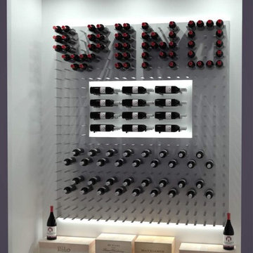
http://www.getSTACT.com
STACT wine racks are incredibly easy to specify and incorporate into wine cellars, wine rooms, kitchens, home bars, commercial bars, and restaurants. Our customers have found that when it comes to modern wine cellar solutions, our system offers a number of advantages versus other wine storage solutions available on the market, here are just a few:
✓ Quality - premium *furniture grade* solution is unique to the industry, with unrivalled refinement when it comes to materials, aesthetic and craftsmanship. Our panels feature a premium high-gloss painted finish (not a laminated surface). Each panel takes more than a week to complete, with meticulous attention to detail. Once numerous coats of lacquer have been applied, each panel is hand buffed to a mirror-like piano finish.
✓ Versatility - mount any way you wish, and designed to work equally well within both commercial and residential applications, our clients have found our modular system to be the most versatile, and easiest to specify, assemble, and install - whether for 9 bottles or 9,000 within a large scale wine cellar application (www.stact.co/cellars). Available on your choice of 10 finishes, mix and match STACT panels to create your own unique look (3,628,800 possible configurations).
✓ Convenience - designed for quick and easy *DIY installation*, our patented system comes ready-to-install to any drywall surface right out of the box, minimizing the costs associated with labor and installation when compared with many custom solutions you will find on the market. Avoiding the need for a dedicated wine cellar builder to produce and arrive on site for assembly and installation. In-stock items typically ship within 1 business day.
✓ Value - direct-to-client distribution model to effectively cut out retail markup. Builders and specifiers have found STACT to be a fraction of the price of what it would cost to develop and produce a comparable custom solution. Plus currently we are offering *free shipping worldwide*.
✓ Design pedigree - created by 2012 ICFF winning designer Eric Pfeiffer, our patented prefabricated ready-to-assemble modular design is unique to the industry.
✓ Space-saving - highest bottle capacity on the market (10.7 bottles / sq ft). Each panel supports 9-12 bottles depending on how they are configured.
✓ Security - superior bottle stability, versus other wall-mounted wine storage solutions on the market. The aircraft grade aluminum bottle support structure ensures a lower center of gravity there is a more substantial portion of the bottle resting below the contact points. Thus a minimalist design aesthetic is retained, while eliminating the need for unnecessary and unsightly materials/clutter such as rubber gaskets, straps, etc.
Credit: Vino Grotto Modern Wine Cellars
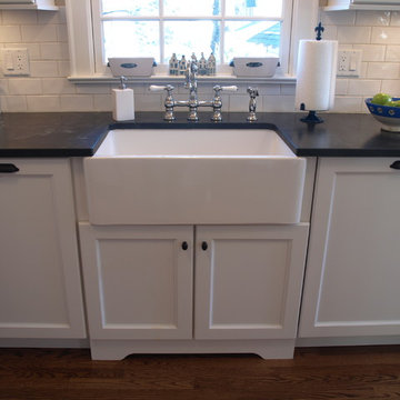
Even with a deep farmhouse sink, there is still room for that extra storage below. The pull out trash and built in dishwasher almost go without notice. The Jet Mist honed counter top acts as a clean break between the upper and lower portions of the white cabinets and back splash.
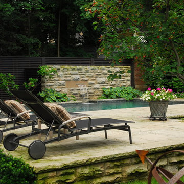
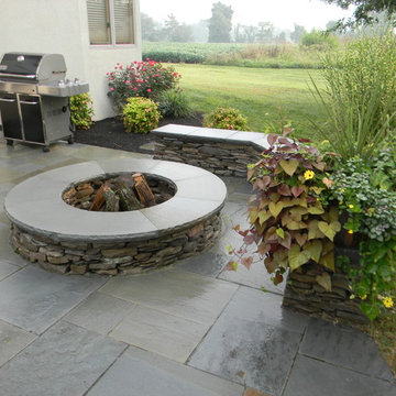
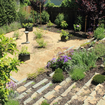
This is a Credit Valley ledgerock and flagstone raised patio and pool deck. The serviceberry tree is fruiting (edible) right now and adds a great splash of red in the late summer. The stained cedar fence has a plywood backer, which gives the illusion that it is vacant behind the slats. The cap-less ledgerock wall has a very unique feel to it, with the off-centre, sheer descent water feature. The planter for annuals has drip irrigation. Love how the rhododendron, to the left of the water feature, is really starting to stretch over the pool. We can see a sundial type garden ornament at the bottom of the photo, which was selected by the client.
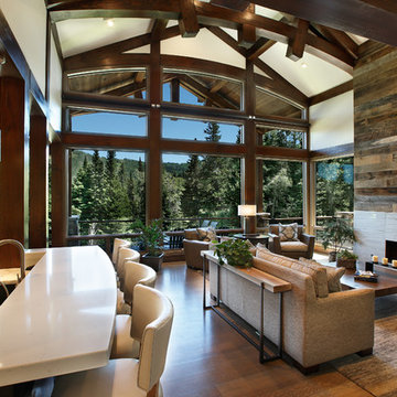
An open concept kitchen/dining area opens up onto a wooded back yard. Floor-to-ceiling windows admit lots of light.
Photo Credit: 2013 MHB PHOTO-GRAF | Marie-Hélène Bilodeau
This house west of Boston was originally designed in 1958 by the great New England modernist, Henry Hoover. He built his own modern home in Lincoln in 1937, the year before the German émigré Walter Gropius built his own world famous house only a few miles away. By the time this 1958 house was built, Hoover had matured as an architect; sensitively adapting the house to the land and incorporating the clients wish to recreate the indoor-outdoor vibe of their previous home in Hawaii.
The house is beautifully nestled into its site. The slope of the roof perfectly matches the natural slope of the land. The levels of the house delicately step down the hill avoiding the granite ledge below. The entry stairs also follow the natural grade to an entry hall that is on a mid level between the upper main public rooms and bedrooms below. The living spaces feature a south- facing shed roof that brings the sun deep in to the home. Collaborating closely with the homeowner and general contractor, we freshened up the house by adding radiant heat under the new purple/green natural cleft slate floor. The original interior and exterior Douglas fir walls were stripped and refinished.
Photo by: Nat Rea Photography
The kinetic sculpture on the left is lit from below by spot lights mounted on the stairwell. The living room beyond is illuminated by carefully aimed small aperture recessed accent lights. Indivar Sivanathan Photography, Feldman Architecture. Reuben Margolin sculpture artist.
Hively Landscapes
Project Entry: A Patio with a View
2013 PLNA Awards for Landscape Excellence Winner
Category: Residential Hardscaping $30,000 - $60,000
Project Description:
A situation I run into often, is a home owner that gets tired of their old decaying wooden deck and are looking for something more permanent. I wanted to change the entire dynamics of this outdoor living space. Taking out the deck and installing a level patio will get their view below the two large out trees that are located directly off the patio. Dropping the patio to level with grade allowed me to design a large comfortable landing to come out of the kitchen doors with a food platter or drinks.
Luckily the home owner wanted natural stone which fits this property perfectly. All the wood in the home and no siding along with the view of the pond and woods all around really gives this property a rustic feel which craves natural stone. The colors in the pattern cut flagstone really bring life to the space will keeping some formality as opposed to using an irregular flagstone.
The balance of the PA fieldstone walls dry staked and double sided adds character and functionality in many ways. The wall by the sunken hot tub provides great seating at eye level with the participants inside the tub. This also works well as an entrance point. The parts of the walls that parallel the house were designed without any landscaping against them to allow the home owners and guests to be able to sit on the wall facing the amazing view of the pond.
All the hard lines in the patio and walls are broken up with a soft arch and curved edge between the house and landscape bed. The Crape Myrtle in that bed creates a great buffer between the architecture in the home and the stonework in the patio. As the Crape Myrtle grows, the lower limbs will be removed to maintain the open view of the pond and patio area from the inside.
Large thermal rock faced bluestone caps and step treads put the icing on the cake. This creates a great tie with the flagstone as well as allows for comfortable seating and steps in to the home. The area that was once an old rotting deck is now a natural paradise to relax and enjoy the sights and sounds of nature.
Photo Credit: Hively Landscapes

The design challenge was to enhance the square footage, flow and livability in this 1,442 sf 1930’s Tudor style brick house for a growing family of four. A two story 1,000 sf addition was the solution proposed by the design team at Advance Design Studio, Ltd. The new addition provided enough space to add a new kitchen and eating area with a butler pantry, a food pantry, a powder room and a mud room on the lower level, and a new master suite on the upper level.
The family envisioned a bright and airy white classically styled kitchen accented with espresso in keeping with the 1930’s style architecture of the home. Subway tile and timely glass accents add to the classic charm of the crisp white craftsman style cabinetry and sparkling chrome accents. Clean lines in the white farmhouse sink and the handsome bridge faucet in polished nickel make a vintage statement. River white granite on the generous new island makes for a fantastic gathering place for family and friends and gives ample casual seating. Dark stained oak floors extend to the new butler’s pantry and powder room, and throughout the first floor making a cohesive statement throughout. Classic arched doorways were added to showcase the home’s period details.
On the upper level, the newly expanded garage space nestles below an expansive new master suite complete with a spectacular bath retreat and closet space and an impressively vaulted ceiling. The soothing master getaway is bathed in soft gray tones with painted cabinets and amazing “fantasy” granite that reminds one of beach vacations. The floor mimics a wood feel underfoot with a gray textured porcelain tile and the spacious glass shower boasts delicate glass accents and a basket weave tile floor. Sparkling fixtures rest like fine jewelry completing the space.
The vaulted ceiling throughout the master suite lends to the spacious feel as does the archway leading to the expansive master closet. An elegant bank of 6 windows floats above the bed, bathing the space in light.
Photo Credits- Joe Nowak
The view from the deck above onto the English rose garden reveals the simple clean lines of this formal traditional pattern. Four 'Clair Austin' English roses by David Austin are at the center, and are surrounded by four box custom planters with Star Jasmine. The garden is scented with roses, English lavender and Star Jasmine. The heath and heather planting amongst the planted bluestone steps separates the upper lawn terrace from the rose garden below, and creates the central dramatic feature of this Northern English Garden in California.
photo credit: Ami Saunders, MLA
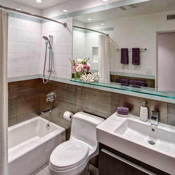
Objectives:
Provide landing space
Accommodate storage
Lighten up a windowless room
Trick the eye to expand the room
Design challenges:
Limitation of 5'x8' room envelope
Visually enlarging the space
Working with a moderate budget
Design solutions:
Install long glass shelf between tile surfaces
Usurp partial storage from adjacent linen closet
Wall mount sink cabinet
Use of textured tile and mirror providing reflective surfaces
Special features:
Mix of textured tile with a punch of silver below eye level
Provision of storage in small room
Clean contemporary and eye catching
Photo Credit: Preview First
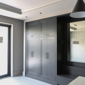
Full-width sliding door with curtain pocket detail. Dropped tray ceiling with cornice. Custom 3 metre high cabinets with double step detail and bronze ironmongery, built-in seat with drawers below, built-in antique mirror. Wide plank oak flooring. Bronze, feature lighting.
Photo credits: Rogers Architectural Photography
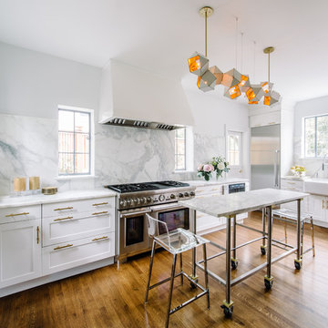
Photo credit: Robert Radifera Photography
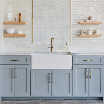
Example of a large transitional l-shaped medium tone wood floor and brown floor enclosed kitchen design in DC Metro with a farmhouse sink, white cabinets, marble countertops, white backsplash, marble backsplash, stainless steel appliances, an island and shaker cabinets
Example of a large transitional l-shaped medium tone wood floor and brown floor enclosed kitchen design in DC Metro with a farmhouse sink, white cabinets, marble countertops, white backsplash, marble backsplash, stainless steel appliances, an island and shaker cabinets
Showing Results for "Below Average Credit"
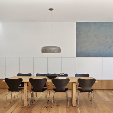
Wall units built flush into the wall of the dining room. Polyurethane white doors above with american oak drawer joinery below. Series 7 Chairs.
Design: Nobbs Radford Architects
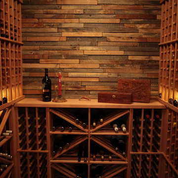
Half height wine racks allow for a useful countertop area and display of this beautiful reclaimed wood feature wall. Wine racks below the counter are a combination of diamond bins for bulk wine storage and slots for individual bottle storage.
Photo Credit: Jared Horst
This living room features a long ribbon fireplace sitting below a beautiful wall of reclaimed wood siding. Another main focal point is the large window cluster framed in timber that leads to the covered deck showing a beautiful mountain view.
Produced By: PrecisionCraft Log & Timber Homes
Photo Credit: Jim Fairchild
44