


Search results for "Typical promoting" in Home Design Ideas
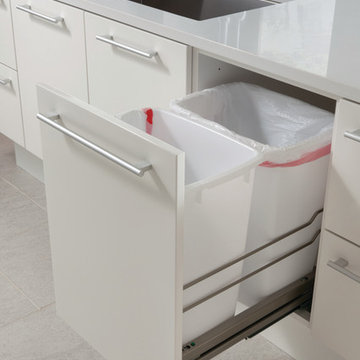
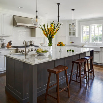
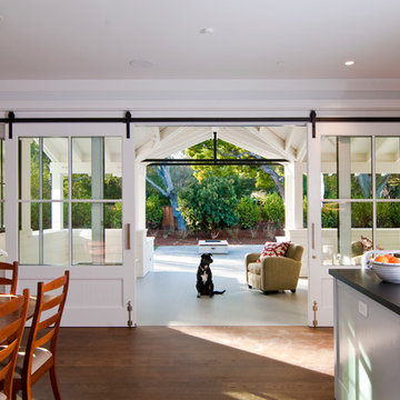
Kitchen featuring Wood-Mode 84 cabinets. Both islands feature the Vanguard MDF door style with a Gloss Nordic White finish. Island design houses a full height, double pullout trash cabinet. Flooring by Porcelanosa, Rapid Gris.
All pictures are copyright Wood-Mode. For promotional use only.
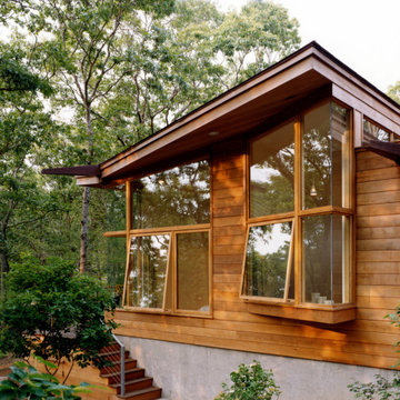
A rustic stone path meanders through a wooded site to arrive at the entry of this 2,800-square-foot home on Martha’s Vineyard, completed in 2001. The path sets the tone for the project itself: simple, functional, and integrated with the natural environment. The couple that commissioned the residence uses it as a summer getaway for family and friends. A master bedroom wing, a guest wing, and a central living, dining, and kitchen area provide a variety of spaces for living and entertaining. Augmenting these spaces are a porch, terrace, and roof deck—providing places for quite reading, gathering for drinks, or taking in unobstructed views of the night sky. The house generates human interaction and connections with the natural world. Ground level terraces and rooftop decks promote this interactivity while large sliding windows and doors literally bring the outdoors inside and encourage individuals to venture outside. The typical inside vs. outside boundaries of traditional buildings are dissolved.
Farm Kid Studios
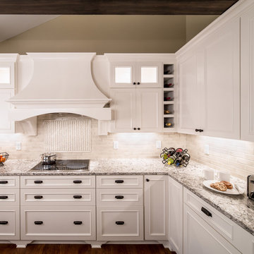
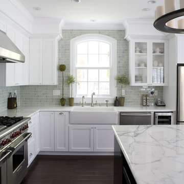
Inspiration for a transitional kitchen remodel in Minneapolis with recessed-panel cabinets, white cabinets, quartz countertops, white backsplash and travertine backsplash
Inspiration for a transitional kitchen remodel in Minneapolis with recessed-panel cabinets, white cabinets, quartz countertops, white backsplash and travertine backsplash
Find the right local pro for your project
This Dutch colonial was designed for a NBA Coach and his family. It was very important that the home be warm, tailored and friendly while remaining functional to create an atmosphere for entertainment as well as resale. This was accomplished by using the same paint color throughout the 11,000 sq.ft home while each space conveyed a different feeling. We are proud to say that the house sold within 7 days on the market.
Photographer: Jane Beiles
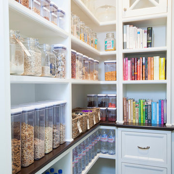
Example of a mid-sized classic kitchen pantry design in San Diego with open cabinets and white cabinets
Advice on interior design is available everywhere—from TV shows and websites to books, magazines and apps.
We love seeing people become engaged in design and educated on the wide range of possibilities. But we hope you’ll proceed with caution.
It’s not that style errors are a matter of life and death. It’s just that it’s easy to choose designs that aren’t necessarily reflective of your own personality and character. And since you’re typically stuck with your interior design decisions for years, styles that don’t quite fit can tend to grate on you.
Interiors that give one person comfort may unleash chaos in someone else. This goes beyond favorite colors or hot trends, right to the heart of interior design, where you find questions of composition, balance, repetition, space and more.
The goal is to find that unique combination of design elements that gives you comfort, support and balance.
In one home, that perfect balance was struck through the use of symmetry. A pair of comfortable swivel chairs sit beneath matching indigo patterned paintings. Matching bookcases below the paintings contain similar, but not identical, arrangements of books, vases and bowls. Woods and bronzes help warm up the simple white bookcase shelving.
Two matching poufs in front of the fireplace provide additional seating. The sofa is accented with a pair of pillows with a blue pattern that echoes the artwork.
The effect of the symmetry is to achieve order and simplicity, which I promote at every opportunity. After all, your home interiors should be the setting or the backdrop of your life—not center stage.
Antique bronze and blue are complementary colors. Together, they offer a rich palette of richness and depth, which brings out the beauty of wood and stone.
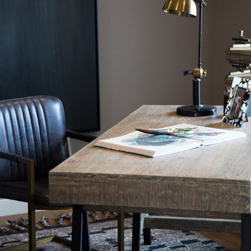
In the home office, a unique, whitewash-stained wooden desk rests on metal, Sawhorse-inspired legs for a warm, rustic look. The black leather chair features a contemporary silhouette with an antique brass frame. An adjustable desk lamp has bronze accents.
The bookcase combines a sleek, black metal frame with concrete shelves, for another unusual pairing. It’s kept uncluttered for an orderly, peaceful look. Items on the shelves include a bronze-accented lamp and a pair
of high gloss-finished wooden bookends.
The elegant artwork behind the desk is a simple midnight-blue and bronze with mottled white. Deep blues are again picked up in the rug, which adds a stately vibe with a modern pattern and satisfying texture.
Within the framework of symmetry, the living room repeats the blue-and-bronze color scheme.
A large midcentury brass clock above the fireplace keeps the natural stone visible, rather than hidden behind a painting or television, while its straight lines and color create a beautiful contrast.
The sofa is a soft, neutral blue. The pattern on the round brass side table features echoes the darker blue-patterned rug, as well as the rug in the office, tying the rooms together.
Indigo blue books adjacent to bronze vases on the shelves repeat the color scheme. The soapstone-topped coffee table echoes the shape of the fireplace. A pair of tall, matching floor lamps with long wooden bases, brass pulls and simple linen shades combine both the colors and symmetry found throughout the home.
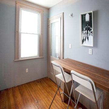
This small space demanded attention to detail and smart solutions, starting with the table and chairs. Too tiny for a standard kitchen table, we added a table that folds down against the wall with foldable chairs that can be hung on the wall when not in use. Typically neglected space between the refrigerator and the wall was turned into spice cabinets, ceiling height uppers maximize storage, and a mirrored backsplash creates the illusion of more space. But small spaces don't have to be vacant of character, as proven by the distressed aqua cabinetry and mismatched knobs.
Free ebook, Creating the Ideal Kitchen. DOWNLOAD NOW
Our clients and their three teenage kids had outgrown the footprint of their existing home and felt they needed some space to spread out. They came in with a couple of sets of drawings from different architects that were not quite what they were looking for, so we set out to really listen and try to provide a design that would meet their objectives given what the space could offer.
We started by agreeing that a bump out was the best way to go and then decided on the size and the floor plan locations of the mudroom, powder room and butler pantry which were all part of the project. We also planned for an eat-in banquette that is neatly tucked into the corner and surrounded by windows providing a lovely spot for daily meals.
The kitchen itself is L-shaped with the refrigerator and range along one wall, and the new sink along the exterior wall with a large window overlooking the backyard. A large island, with seating for five, houses a prep sink and microwave. A new opening space between the kitchen and dining room includes a butler pantry/bar in one section and a large kitchen pantry in the other. Through the door to the left of the main sink is access to the new mudroom and powder room and existing attached garage.
White inset cabinets, quartzite countertops, subway tile and nickel accents provide a traditional feel. The gray island is a needed contrast to the dark wood flooring. Last but not least, professional appliances provide the tools of the trade needed to make this one hardworking kitchen.
Designed by: Susan Klimala, CKD, CBD
Photography by: Mike Kaskel
For more information on kitchen and bath design ideas go to: www.kitchenstudio-ge.com
Architectural Design: Austin Design Group
Builder: Pillar Custom Homes
Interior Design: Chelsea+Remy Interior Design
Photography: Twist Tours
Inspiration for a contemporary kitchen remodel in Austin with stainless steel appliances
Inspiration for a contemporary kitchen remodel in Austin with stainless steel appliances
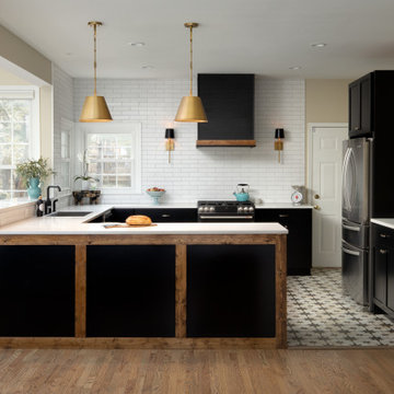
This client came to us with a very clear vision of what she wanted, but she needed help to refine and execute the design. At our first meeting she described her style as somewhere between modern rustic and ‘granny chic’ – she likes cozy spaces with nods to the past, but also wanted to blend that with the more contemporary tastes of her husband and children. Functionally, the old layout was less than ideal with an oddly placed 3-sided fireplace and angled island creating traffic jams in and around the kitchen. By creating a U-shaped layout, we clearly defined the chef’s domain and created a circulation path that limits disruptions in the heart of the kitchen. While still an open concept, the black cabinets, bar height counter and change in flooring all add definition to the space. The vintage inspired black and white tile is a nod to the past while the black stainless range and matte black faucet are unmistakably modern.
High on our client’s wish list was eliminating upper cabinets and keeping the countertops clear. In order to achieve this, we needed to ensure there was ample room in the base cabinets and reconfigured pantry for items typically stored above. The full height tile backsplash evokes exposed brick and serves as the backdrop for the custom wood-clad hood and decorative brass sconces – a perfect blend of rustic, modern and chic. Black and brass elements are repeated throughout the main floor in new hardware, lighting, and open shelves as well as the owners’ curated collection of family heirlooms and furnishings. In addition to renovating the kitchen, we updated the entire first floor with refinished hardwoods, new paint, wainscoting, wallcovering and beautiful new stained wood doors. Our client had been dreaming and planning this kitchen for 17 years and we’re thrilled we were able to bring it to life.
Hand scraped hardwood floor. Marble counter tops, traditional kitchen, crackle ceramic subway tile, farmhouse sink
Inspiration for a mid-sized timeless dark wood floor kitchen remodel in San Francisco with a farmhouse sink, stainless steel appliances, white countertops, shaker cabinets and white cabinets
Inspiration for a mid-sized timeless dark wood floor kitchen remodel in San Francisco with a farmhouse sink, stainless steel appliances, white countertops, shaker cabinets and white cabinets
Mid-sized elegant light wood floor great room photo in New York with beige walls and no fireplace
Photos by Julie Soefer
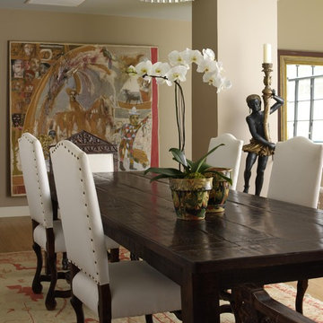
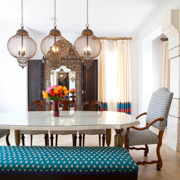
Dining room - mediterranean dining room idea in Houston with white walls
Dining room - mediterranean dining room idea in Houston with white walls
Casey Dunn Photography
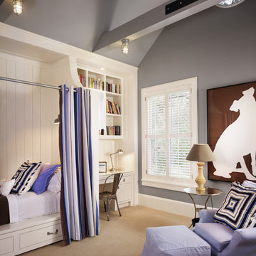
Kids' bedroom - mid-sized cottage gender-neutral carpeted kids' bedroom idea in Houston with gray walls
Kids' bedroom - mid-sized cottage gender-neutral carpeted kids' bedroom idea in Houston with gray walls
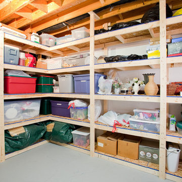
Basement storage solution that gives the necessary amount of organization for any homeowner.
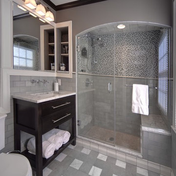
Inspiration for a small timeless garage remodel in Indianapolis
Inspiration for a small timeless garage remodel in Indianapolis
Showing Results for "Typical Promoting"
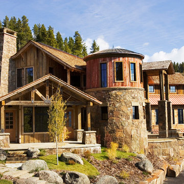
During initial talks for Lot 171, it was decided that there were certain steps that were very important to consider. The environment was to be protected, and when possible, enhanced. There was to be reduction in typical residential operating costs, while incorporating technologies that promote productivity in the home by internal and external networking. The building was to be engrained into the surrounding site, with materials that create a sense of permanence.
Recycled elements were used throughout the building, as well as energy efficient windows, ground source heat pumps, and Sterling engines for backup power. Local stone is used for the exterior, as well as existing boulders for landscaping.
This project is based on the two-pod system, with the Guest Residence separated from the Main Residence. The driveway is designed to meander through the existing old growth trees on the site, and under the Guest Residence, which creates a sense of entry. The Main Residence’s focal point is an old corn crib, clad in local stone at the base and recycled barn wood at the top. Inspired by the old growth on the site, four oversized stone piers frame the entry, continuing up to wood columns that are topped off with a roof canopy overhead.
Photo by Kene Sperry
1