
Color Pop: Bold Red Frames
Bright crimson frames add fun color to a space — with or without art inside

Red can look amazing. I personally tend to shy away from the color, opting for pink gloss over red lipstick and plum over scarlet in my wardrobe. But I can see its appeal. You just need a little pop of red to make a statement. A little red goes a long way in decorating, too. So I was curious to see what happens when you opt for a red frame around your artwork or mirrors. Here's what I found:
The bright red frame of this chalkboard stands out and feels right at home in this country-style entryway.
Since this wallpaper is such a bold, busy pattern, the red frame is one of the few elements that gives your eye a place to pause.
This red frame is empty of artwork — there's simply a mat inside, framing the wallpaper behind it.
This red frame is empty of artwork — there's simply a mat inside, framing the wallpaper behind it.
These mirrors share similar ornate red frames. The color makes these mirrors look especially glam. I also would love to see this arrangement on a light gray wall.
In this kiddo's room, I definitely notice the red frames before the artwork inside. (Not sure if that's good or bad?) I like how the bold red frames draw your eye.
The small red frames above the crib complement the adjacent accent wall.
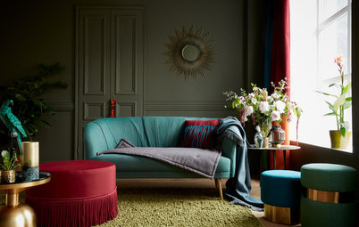
The ornate red frame only adds to the drama in this space. I like how this red frame feels a little moody.
Tip: An easy way to tone down red is to put it against a dark backdrop. Here, the space is very dark with charcoal black walls and floors.
Tip: An easy way to tone down red is to put it against a dark backdrop. Here, the space is very dark with charcoal black walls and floors.
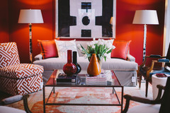
There's lots of red and white in this space. The bits of red, including the red frames, look modern against such a white backdrop.