


Search results for "Inside corner steps ideas" in Home Design Ideas
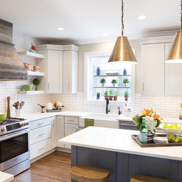
After six years of living in their Huntley IL home, Chris and Meghan were tired of their dark, dingy, outdated kitchen and it was finally time for a long-anticipated change. “The kitchen is the place where we live, it’s where we do everything,” Meghan said. “It was important that it be a space where we wanted to be.” Meghan loves cooking and enjoys including their girls in healthy meal prepping, this led them to want a brighter, more enjoyable kitchen with increased functionality and improved storage.
For Chris especially, the laundry room was an entirely dysfunctional eyesore. “We had a washer and a dryer, but it was all kind-of cobbled together!” Chris said. “There were always laundry piles everywhere, we weren’t really sure what we wanted to do in there, but it was time for us to make a change.” The mess of the space was stressful every time they walked in the door from the garage each day. Kids’ backpacks and shoes piled up haphazardly in the makeshift boot-bench closet left the family feeling disorganized and stressed. They needed space for folding clothes and locker cubbies to help keep the family organized.
Having known Christine and Todd in the Huntley community for years, Chris and Meghan were familiar with their work. “We already trusted them personally and having seen their projects for years we knew they did top notch work. After we reviewed the initial round of designs, we knew that hiring them was definitely the right choice,” Meghan and Chris said. Although Chris had done a lot of work in their home himself, the kitchen and laundry room renovation was such a large undertaking that he didn’t want to steal time away from his family to spend what would surely be many long weekends doing the job himself. “That would not have been a wise choice for us,” Chris laughed.
“Our designer, Michelle was very, very, easy to work with; anything we wanted to see or weren’t sure about, she went above and beyond to make this easy for us. She was easy to get hold of and always quick to respond,” the couple said. Michelle pulled ideas that mirrored the couple’s taste and style and was adept at directing the couple to limited choices that didn’t overwhelm them and kept the process moving. “I have a hard time making decisions. Michelle made the decision-making process so easy. I loved how she listened to what I liked and then presented three great options for me to choose from,” Meghan said.
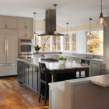
The main objectives for the kitchen were better storage solutions, they wanted the space to reflect their lifestyle and taste, and they wanted it to last for years with low maintenance. One of the first steps in creating a more functional kitchen was relocating the refrigerator, creating an improved workflow for the busy family.
“We didn’t know that we could even move the refrigerator to a new location where it is now, that was something that we never would have thought of,” Chris said. “The new refrigerator location makes the kitchen feel so much bigger. We didn’t add any space, but our whole kitchen with the new design just seems like it’s so much larger than before!” Meghan said.
The perimeter mist colored cabinets helped warm and brighten the entire room, while the graphite colored cabinets on the island added contrast. Using this fresh, clean color palette satisfied the couple’s desire for a bright space that was the exact opposite of what they had before. Organization accessories were also added to the cabinets such as a spice drawer tray and roll outs to create hidden convenience.
“I absolutely love the hidden spices – it makes cooking so much more enjoyable!” Chris said. “And all the pull outs, and the double trash bin, who would think you could get so excited about organization!” the couple said in unison.
One thing they hated in their original kitchen was how dark the space felt. Added lighting on the ceiling with the new light fixtures combined with the lighter cabinetry colors throughout solved this problem. “Our new kitchen has this warm, almost cozy feeling that our old kitchen never had, it’s just a space that I love spending my time in now,” Meghan said. The light airy feeling was accentuated with the use of floating white shelves on either side of the decorative range hood. “We have so much cabinetry space, the new design is amazing we actually have more storage space than we will ever need,” Meghan said.
The island was extended to create more work surface and added space for stool seating. “The new island changes how we live. Now the kids can be in the kitchen with us, doing homework, eating breakfast, and the three of us have special dinners there when Chris is working late,” Meghan said.
The Carrara Marmi Quartz countertops were chosen because they are, not only beautiful, but are made from hard-working material that doesn’t require maintenance. The white subway tile backsplash that wraps to the ceiling behind the focal point cooktop range/hood compliments the crisp white countertops perfectly, while brushed brass hardware and light fixtures keep the design fresh and new.
The couple had a few fears at the beginning of the project, as most homeowners do. Their biggest fear was being out of their kitchen and laundry room for an extended time. The crew made it very easy for the family to work in a limited space keeping the washer and dryer hooked up the majority of the time, and also getting appliances working with minimal downtime.
“They above and beyond accommodated us to get us through the process,” Meghan said. “They did a great job making sure we were as comfortable as possible throughout the process,” Chris added.
“Our project manager DJ did a great job. He was very good at updating us on schedule changes, getting guys in as quickly as possible. Everyone that stepped in the house was nice and did great work,” said Chris. They thought Advance’s carpenter was phenomenal and were impressed when he took a conceptual idea from a photograph and worked with designer Michelle to create a one of a kind range/hood that has become the topic of conversation with friends and family who visit the new kitchen. “He was in our house literally every day for several weeks. He was easy to work with and good at what he did,” Meghan and Chris said.
The focal point of the kitchen; a hand-crafted, custom-built ventilation hood was clad with handpicked reclaimed barnwood. Advance Design’s carpenter built the framework and the cladding to create a one-of-a-kind design element that the couple loves.
“I think it was especially fun for him to create something unique from scratch, showcasing his talent in this area,” Meghan said. “I love that my kitchen is not like everyone else’s. I got to pick out the wood on my hood and watch it being built and was able to choose what pieces of wood went where on it. It’s totally unique.”
Red Oak flooring was toothed-in throughout the kitchen and the rest of the first floor anywhere changes were made. Then the whole floor was refinished to tone down the orange undertones in the existing floor stain, ultimately changing the color complexion of the entire first floor. The result is a completely new feeling to the entire home.
Renovating the laundry room was extremely important to Meghan and Chris, but they had trouble visualizing what the possibilities were for the seemingly small space. Michelle produced beautiful 3D illustrations that helped them envision the space in a whole new way.
“I must have told Michelle 100 times that I am a visual person, seeing the designs in 3D made it so easy to make decisions and see what we could really do with our space,” Meghan said.
A dividing wall and doorway were removed between the existing laundry room and hallway formerly containing a coat closet, providing space to design specialized graphite colored cabinetry matching the kitchen island to house custom storage cubbies for each family member. Adding the tall utility cabinetry in the new laundry area helped solve the storage issue, tucking away cleaning supplies, household items, and even the cat got its own cubby.
“I love how everything is now hidden in its own space. I can’t tell you how much I hated coming home and seeing everything sitting around on counters,” Chris said.
Electrical outlets were planned for the inside of utility cabinets, so devices could charge in hidden locations. Stacking the washer and dryer allowed for wider countertop space to provide a folding area and a special space for clothes to hang. “The way I do laundry has been completely transformed! I can actually fold clothes and hang them now right out of the washer and dryer,” Meghan said.
“The end result in the kitchen and the laundry/mud room was an updated light and bright space, with a smarter work flow that better meets the needs of this family,” Michelle said.
“I would totally recommend Advance Design,” Meghan said. “Sometimes I sit and just look at my kitchen and laundry room and think ‘Wow, I can’t believe I get to live here!’ It’s an understatement to say we love our new space.”
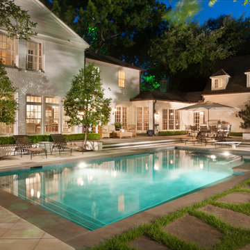
Originally designed by one of the most notable landscape architects in town, this once impressive project had faltered in recent years. The pool and spa still functioned well, and the client wanted to keep it intact. In addition, they wanted to keep as much of the existing landscaping as possible. The surrounding decks, walls, and steps were fair game. At first glance, one might think that our changes were simple material changes. Upon closer inspection, however, one can see the subtle, yet transformative changes that come together to update this classic pool in a tasteful, timeless manner, and improve the flow and usability of the deck areas, while softening the feel of the massive hardscape.
The subtle changes begin as soon as you walk out the back door of the house. The existing decking had a lot of what we call “tweeners”; areas that are overly generous walkways, yet not large enough to house furniture. The awkwardly small bluestone patio was expanded to accommodate a generous seating area, by pushing the step-down closer to the pool. Our talented stone mason carefully married the new bluestone into the existing, resulting in an imperceptible difference between the two. As you descend the new bluestone steps to the pool level, your bare feet will be thankful for the new smooth-finished limestone colored concrete, with a hand cut pattern carefully etched into its surface. The old red brick decking was so hot that the owners could not walk around the pool in bare feet. The brick coping was also replaced with an eased edge Pennsylvania Premier Stone which matches the new step treads throughout the project. Between the house and the pool, a large raised planter was reconfigured, giving additional space to the pool deck for a shaded lounge chair area.
Across the pool, a bank of rather tall painted brick retaining walls were cut down, shortened, and moved. This lessened the visual impact of the walls, which were rather overwhelming in the space, as well as opening up a new seating area, nestled under the arms of the massive pecan at the back of the property. Rather than continuing solid decking around the entire pool, the area near these walls has been transformed to large stone stepper pads set in a sea of beautiful St. Augustine lawn. This creates a visually softened area that is still suited to setting tables and chairs when the guest list calls for additional seating.
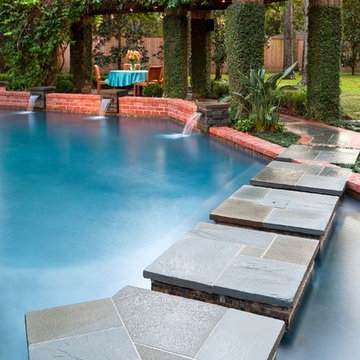
The spa area is quite possibly the most dramatic change on this project. Yet more raised planter walls divided this area into awkward spaces, unsuited to proper furniture placement. The planters were removed, new stone decks, once again expertly married into the existing, opening the area to house a large dining table and new built in bbq area. The spa itself was re-imagined with the bluestone coping, and painted brick veneer. The most impressive addition though is the new handmade glazed tiles that surround the existing cast stone water feature. This water feature was almost unnoticeable against the painted brick wall, but now the dramatic arch and pop of color draw the eye to this quaint little corner of the property.
The Berry family of Houston, Texas hired us to do swimming pool renovation in their backyard. The pool was badly in need of repair. Its surface, plaster, tile, and coping all needed reworking. The Berry’s had finally decided it was time to do something about this, so they contacted us to inquire about swimming pool restoration. We told them that we could certainly repair the damaged elements. After we took a closer look at the pool, however, we realized that more was required here than a cosmetic solution to wear and tear.
Because of some serious design flaws, the aesthetic of the pool worked against surrounding landscape design. The rear portion of the pool was framed by architectural wall, and the water was surrounded by a brick and bluestone patio. The problem lay in the fact that the wall was too tall.
It created a sense of separation from the remainder of the yard, and it obscured the view of a beautiful arbor that had been built beneath the trees behind the pool. It also hosted a contemporary-style, sheer-descent waterfall fountain that looked too modern for a traditional lawn and garden design. Restoring this wall to its proper relationship with the landscape would turn out to be one of the key elements to our swimming pool renovations work.
We began by lowering the wall the wall so you could see the arbor and trees in the backyard more clearly. We also did away with the sheer-descent waterfall that clashed with surrounding backyard landscape design. We decided that a more traditional fountain would be more appropriate to the setting, and more aesthetically apropos if it complimented the brick and bluestone patio.
To create this façade, we had to reconstruct the wall with bluestone columns rising up through the brick. These columns matched the bluestone in the patio, and added a stately form to the otherwise plain brick wall. Each column rose slightly higher than the top of the wall and was capped at the top. Thermal-finish weirs crafted in a flame detail jutted from under the capstones and poured water into the pool below.
To draw greater emphasis to the pool itself as a body of water, we continued our swimming pool renovation with an expansion of the brick coping. This drew greater emphasis to the body of water within its form, and helps focus awareness on the tranquility created by the fountain. We also removed the outdated diving board and replaced it with a diving rock. This was safer and more attractive than the board.
We also extended the entire pool and patio another 15 feet toward the right. This made the entire area a more relaxed and sweeping expanse of hardscape. While doing so, we expanded the brick coping around the pool from 8 inches to 12 inches. Because the spa had a rather unique shape, we decided to replace the coping here with custom brink interlace style that would fit its irregular design.
Now that the swimming pool renovation itself was complete, we sought to extend the new sense of expansiveness into the rest of the yard. To accomplish this, we built a walkway out of bluestone stepping pads that ran across the surface of the water to the arbor on the other side of the fountain wall.
This unique pathway created invitation to the world of the trees beyond the water’s edge, and counterbalanced the focal point of the pool area with the arbor as a secondary point of interest. We built a terrace and a dining area here so people could remain here in comfort for as long as they liked without having to run back to the patio or dash inside the kitchen for food and drinks.
Find the right local pro for your project
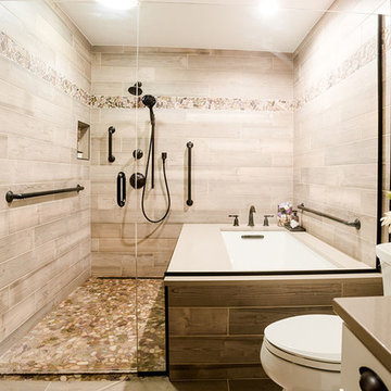
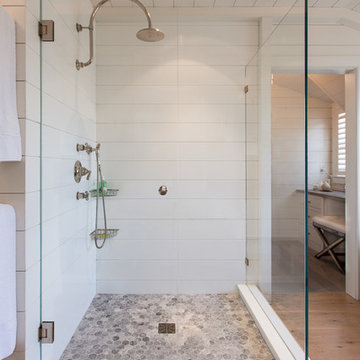
This master bath remodel features a beautiful corner tub inside a walk-in shower. The side of the tub also doubles as a shower bench and has access to multiple grab bars for easy accessibility and an aging in place lifestyle. With beautiful wood grain porcelain tile in the flooring and shower surround, and venetian pebble accents and shower pan, this updated bathroom is the perfect mix of function and luxury.
41 West Coastal Retreat Series reveals creative, fresh ideas, for a new look to define the casual beach lifestyle of Naples.
More than a dozen custom variations and sizes are available to be built on your lot. From this spacious 3,000 square foot, 3 bedroom model, to larger 4 and 5 bedroom versions ranging from 3,500 - 10,000 square feet, including guest house options.
Master bathroom suite with slab and mosaic Calacatta Marble floors, slab counters and tiled walls. Crystal chandeliers and sconces highlighting custom painted inset cabinets.
This project presented unique opportunities that are not often found in residential landscaping. The homeowners were not only restoring their 1840's era farmhouse, a piece of their family’s history, but also enlarging and updating the home for modern living. The landscape designers continued this idea by creating a space that is a modern day interpretation of an 1840s era farm rather then a strict recreation. The resulting design combines elements of farm living from that time, as well as acknowledging the property’s history as a horse farm, with staples of 21st century landscapes such as space for outdoor living, lighting, and newer plant varieties.
Guests approach from the main driveway which winds through the property and ends at the main barn. There is secondary gated driveway just for the homeowners. Connected to this main driveway is a narrower gravel lane which leads directly to the residence. The lane passes near fruit trees planted in broken rows to give the illusion that they are the remains of an orchard that once existed on the site. The lane widens at the entrance to the gardens where there is a hitching post built into the fence that surrounds the gardens and a watering trough. The widened section is intended as a place to park a golf cart or, in a nod to the home’s past, tie up horses before entering. The gravel lane passes between two stone pillars and then ends at a square gravel court edged in cobblestones. The gravel court transitions into a wide flagstone walk bordered with yew hedges and lavender leading to the front door.
Directly to the right, upon entering the gravel court, is located a gravel and cobblestone edged walk leading to a secondary entrance into the residence. The walk is gated where it connects with the gravel court to close it off so as not to confuse visitors and guests to the main residence and to emphasize the primary entrance. An area for a bench is provided along this walk to encourage stopping to view and enjoy the gardens.
On either side of the front door, gravel and cobblestone walks branch off into the garden spaces. The one on the right leads to a flagstone with cobblestone border patio space. Since the home has no designated backyard like most modern suburban homes the outdoor living space had to be placed in what would traditionally be thought of as the front of the house. The patio is separated from the entrance walk by the yew hedge and further enclosed by three Amelanchiers and a variety of plantings including modern cultivars of old fashioned plants such as Itea and Hydrangea. A third entrance, the original front door to the 1840’s era section, connects to the patio from the home’s kitchen, making the space ideal for outdoor dining.
The gravel and cobblestone walk branching off to the left of the front door leads to the vegetable and perennial gardens. The idea for the vegetable garden was to recreate the tradition of a kitchen garden which would have been planted close to the residence for easy access. The vegetable garden is surrounded by mixed perennial beds along the inside of the wood picket fence which surrounds the entire garden space. Another area designated for a bench is provided here to encourage stopping and viewing. The home’s original smokehouse, completely restored and used as a garden shed, provides a strong architectural focal point to the vegetable garden. Behind the smokehouse is planted lilacs and other plants to give mass and balance to the corner and help screen the garden from the neighboring subdivision. At the rear corner of the garden a wood arbor was constructed to provide a structure on which to grow grapes or other vines should the homeowners choose to.
The landscape and gardens for this restored farmhouse and property are a thoughtfully designed and planned recreation of a historic landscape reinterpreted for modern living. The idea was to give a sense of timelessness when walking through the gardens as if they had been there for years but had possibly been updated and rejuvenated as lifestyles changed. The attention to materials and craftsmanship blend seamlessly with the residence and insure the gardens and landscape remain an integral part of the property. The farm has been in the homeowner’s family for many years and they are thrilled at the results and happy to see respect given to the home’s history and to its meticulous restoration.
Sponsored
Columbus, OH
Dave Fox Design Build Remodelers
Columbus Area's Luxury Design Build Firm | 17x Best of Houzz Winner!
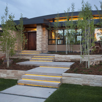
In order to meld with the clean lines of this contemporary Boulder residence, lights were detailed such that they float each step at night. This hidden lighting detail was the perfect complement to the cascading hardscape.
Architect: Mosaic Architects, Boulder Colorado
Landscape Architect: R Design, Denver Colorado
Photographer: Jim Bartsch Photography
Key Words: Lights under stairs, step lights, lights under treads, stair lighting, exterior stair lighting, exterior stairs, outdoor stairs outdoor stair lighting, landscape stair lighting, landscape step lighting, outdoor step lighting, LED step lighting, LED stair Lighting, hardscape lighting, outdoor lighting, exterior lighting, lighting designer, lighting design, contemporary exterior, modern exterior, contemporary exterior lighting, exterior modern, modern exterior lighting, modern exteriors, contemporary exteriors, modern lighting, modern lighting, modern lighting design, modern lighting, modern design, modern lighting design, modern design
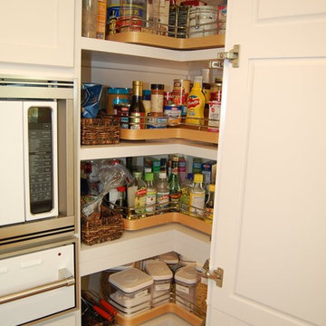
Asymmetrical corner pantry cabinet for more storage in a tight space. Photos by Laurie Burke
Example of a trendy kitchen design in Los Angeles
Example of a trendy kitchen design in Los Angeles
Stepping stones lead you to...
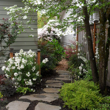
Photo of a small traditional partial sun backyard stone garden path in Portland for spring.
Photo of a small traditional partial sun backyard stone garden path in Portland for spring.
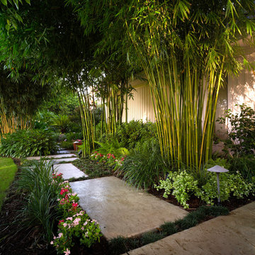
the bamboo is a clumping variety called Bambusa eutuldoides viridi-vittata , Asian lemon bamboo. This variety is a clumper and you do not need to contain it, however, do allow an 8'by 10' area for its ultimate growth. Bamboo does require constant maintenance and you will need to do some research for the specific variety you choose. Once planted, it will become a beautiful focal point and add a stunning tropical accent. Photo Credit: Sherwood Cox
Foley Fiore Architecture
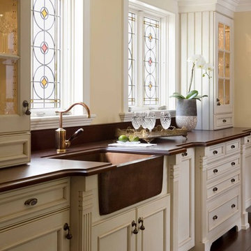
Example of a classic kitchen design in Boston with recessed-panel cabinets, a farmhouse sink, wood countertops, beige cabinets and brown countertops
Example of a classic kitchen design in Boston with recessed-panel cabinets, a farmhouse sink, wood countertops, beige cabinets and brown countertops
Nantucket Architectural Photography
Bathroom - large coastal master white tile and ceramic tile light wood floor bathroom idea in Boston with white walls
Bathroom - large coastal master white tile and ceramic tile light wood floor bathroom idea in Boston with white walls
Sponsored
Over 300 locations across the U.S.
Schedule Your Free Consultation
Ferguson Bath, Kitchen & Lighting Gallery
Ferguson Bath, Kitchen & Lighting Gallery
Originally a nearly three-story tall 1920’s European-styled home was turned into a modern villa for work and home. A series of low concrete retaining wall planters and steps gradually takes you up to the second level entry, grounding or anchoring the house into the site, as does a new wrap around veranda and trellis. Large eave overhangs on the upper roof were designed to give the home presence and were accented with a Mid-century orange color. The new master bedroom addition white box creates a better sense of entry and opens to the wrap around veranda at the opposite side. Inside the owners live on the lower floor and work on the upper floor with the garage basement for storage, archives and a ceramics studio. New windows and open spaces were created for the graphic designer owners; displaying their mid-century modern furnishings collection.
A lot of effort went into attempting to lower the house visually by bringing the ground plane higher with the concrete retaining wall planters, steps, wrap around veranda and trellis, and the prominent roof with exaggerated overhangs. That the eaves were painted orange is a cool reflection of the owner’s Dutch heritage. Budget was a driver for the project and it was determined that the footprint of the home should have minimal extensions and that the new windows remain in the same relative locations as the old ones. Wall removal was utilized versus moving and building new walls where possible.
Photo Credit: John Sutton Photography.
Denash Photography, Designed by Jenny Rausch
Kitchen view of angled corner granite undermount sink. Wood paneled refrigerator, wood flooring, island wood countertop, perimeter granite countertop, inset cabinetry, and decorative accents.

Convert a small space to a polished eye-catching and functional home office. We used white painted maple wood veneers and solid wood painted doors, moldings and trims to give the space a formal style. This home office boasts under cabinet LED lighting, doors with glass inserts, upper cabinets surrounded by wrap around shelving for books and accent pieces and sturdy maple wood drawers for storing office supplies or filing important documents.
The renovation of the Woodland Residence centered around two basic ideas. The first was to open the house to light and views of the surrounding woods. The second, due to a limited budget, was to minimize the amount of new footprint while retaining as much of the existing structure as possible.
The existing house was in dire need of updating. It was a warren of small rooms with long hallways connecting them. This resulted in dark spaces that had little relationship to the exterior. Most of the non bearing walls were demolished in order to allow for a more open concept while dividing the house into clearly defined private and public areas. The new plan is organized around a soaring new cathedral space that cuts through the center of the house, containing the living and family room spaces. A new screened porch extends the family room through a large folding door - completely blurring the line between inside and outside. The other public functions (dining and kitchen) are located adjacently. A massive, off center pivoting door opens to a dramatic entry with views through a new open staircase to the trees beyond. The new floor plan allows for views to the exterior from virtually any position in the house, which reinforces the connection to the outside.
The open concept was continued into the kitchen where the decision was made to eliminate all wall cabinets. This allows for oversized windows, unusual in most kitchens, to wrap the corner dissolving the sense of containment. A large, double-loaded island, capped with a single slab of stone, provides the required storage. A bar and beverage center back up to the family room, allowing for graceful gathering around the kitchen. Windows fill as much wall space as possible; the effect is a comfortable, completely light-filled room that feels like it is nestled among the trees. It has proven to be the center of family activity and the heart of the residence.
Hoachlander Davis Photography
Showing Results for "Inside Corner Steps Ideas"
Sponsored
Delaware, OH
Buckeye Basements, Inc.
Central Ohio's Basement Finishing ExpertsBest Of Houzz '13-'21
Free ebook, Creating the Ideal Kitchen. DOWNLOAD NOW
Our clients and their three teenage kids had outgrown the footprint of their existing home and felt they needed some space to spread out. They came in with a couple of sets of drawings from different architects that were not quite what they were looking for, so we set out to really listen and try to provide a design that would meet their objectives given what the space could offer.
We started by agreeing that a bump out was the best way to go and then decided on the size and the floor plan locations of the mudroom, powder room and butler pantry which were all part of the project. We also planned for an eat-in banquette that is neatly tucked into the corner and surrounded by windows providing a lovely spot for daily meals.
The kitchen itself is L-shaped with the refrigerator and range along one wall, and the new sink along the exterior wall with a large window overlooking the backyard. A large island, with seating for five, houses a prep sink and microwave. A new opening space between the kitchen and dining room includes a butler pantry/bar in one section and a large kitchen pantry in the other. Through the door to the left of the main sink is access to the new mudroom and powder room and existing attached garage.
White inset cabinets, quartzite countertops, subway tile and nickel accents provide a traditional feel. The gray island is a needed contrast to the dark wood flooring. Last but not least, professional appliances provide the tools of the trade needed to make this one hardworking kitchen.
Designed by: Susan Klimala, CKD, CBD
Photography by: Mike Kaskel
For more information on kitchen and bath design ideas go to: www.kitchenstudio-ge.com
Bright and fun bathroom featuring a floating, navy, custom vanity, decorative, patterned, floor tile that leads into a step down shower with a linear drain. The transom window above the vanity adds natural light to the space.
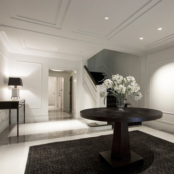
Transitional foyer expresses hints of traditional design mixed with the look of contemporary design.
Foyer - contemporary marble floor foyer idea in Chicago with white walls
Foyer - contemporary marble floor foyer idea in Chicago with white walls
1