


Houzz Tours
Houzz Tour: Two Small New York Apartments Become One
An architect combines a one-bedroom and an adjacent studio apartment to create a colorful and functional home

When the studio behind this couple’s one-bedroom apartment in Brooklyn became available, they snapped it up. But then they were confounded as to how to join the two into one cohesive home. A cluster of two small kitchens and two small bathrooms occupied the center of the long and narrow space. They hired architect Andrew Mikhael to give it a pleasing flow and to make it functional, beautiful and able to accommodate overnight guests. In addition, the couple’s favorite destination in the world is Morocco, and they wanted to bring some of the saturated colors and artistry of that country into their New York home.
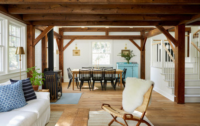
The architect came up with a great solution to give the living room flexibility. Now two oversize pocket doors can close the space off when overnight guests use the pullout sofa, affording privacy. In this photo, the doors are partially open, but most of the time they’re open all the way, enhancing flow.
Browse sleeper sofas in the Houzz Shop
Browse sleeper sofas in the Houzz Shop
Here’s the view from the living room out to the dining room and entry door on the left and the kitchen on the right.
Giving overnight guests their own full bathroom was also a goal. The door on the left leads to the guest bathroom, which also serves as the couple’s powder room.
“My clients had a lot of books and objects from their travels that they wanted to display,” Mikhael says. So he designed built-ins to run along the side of the dining room. These built-ins include lights at the top and closed storage along the bottom. “Wall space was at a premium in here, and this was the right space for bookshelves,” Mikhael says.
“My clients had a lot of books and objects from their travels that they wanted to display,” Mikhael says. So he designed built-ins to run along the side of the dining room. These built-ins include lights at the top and closed storage along the bottom. “Wall space was at a premium in here, and this was the right space for bookshelves,” Mikhael says.
The 38-square-foot second bathroom mostly serves as a powder room. Because it’s next to the living room that doubles as a guest space, Mikhael found a way to squeeze a shower in here. “It’s so much nicer for your guests to have their own bathroom space rather than having them have to walk through the apartment to use the primary bathroom,” he says.
To fit a shower into the compact space, Mikhael utilized a wet-room strategy. This means the shower doesn’t have an enclosure or curtain. Striking Moroccan tile marks the stall. The floor slopes slightly toward a drain in the shower, and the walls that aren’t covered in tile are covered in tadelakt. “This is a waterproof plaster that has been used for centuries in Morocco,” Mikhael says. He matched it to one of the colors in the tile, and the dark hue makes the colorful tiles pop.
Hire a local tile professional
Rooms in apartments have to perform multiple functions. In the dining room, Mikhael added a dry bar and made room for the couple’s piano.
Before: So far, we’ve explored one end of this long, narrow apartment. It’s a good moment to pause and get oriented. Look to the bathroom in the center of the floor plan: The door above it led to the studio apartment. The door below it led to the couple’s original apartment. Both apartments’ bathrooms and kitchens were clustered in the center of the plan.
After: Mikhael knew his clients loved to cook and entertain. So he placed a reconfigured kitchen in the center of the apartment. He moved the couple’s bedroom into the studio apartment, seen here at the top. Then he expanded the footprint of the studio’s original bathroom into an adjacent closet. He also crafted an office anteroom between the primary bedroom and bathroom, using cabinetry and a pocket door to make the most of the space.
Moving down the plan, he took over the small kitchens from both apartments and the couple’s original bathroom for the kitchen space. Then he added a second bathroom next to the primary bathroom. He placed the dining room where the couple’s bedroom had been and added the large doors to the existing living room. To make room for a functional kitchen, he moved the entry door to the dining room wall.
Moving down the plan, he took over the small kitchens from both apartments and the couple’s original bathroom for the kitchen space. Then he added a second bathroom next to the primary bathroom. He placed the dining room where the couple’s bedroom had been and added the large doors to the existing living room. To make room for a functional kitchen, he moved the entry door to the dining room wall.
The kitchen, living room and dining room now are within view of one another. Previously, the kitchen was a small area on one wall, and it didn’t have a vent hood. “They used to have to fan the air toward the windows whenever they cooked,” Mikhael says. Luckily, he discovered an existing unused roof penetration where he was able to run a duct vent to a powerful kitchen hood. Having a functional and well-ventilated space was a dream come true for the couple.
“When you have an open kitchen, it just feels nicer to make it look not so kitchen-y,” Mikhael says. This is the view of the kitchen through the living room’s pocket doors. The dark colors on the cabinetry and backsplash let the more “kitchen-y” elements fade into the background. Meanwhile, the bright yellow wall draws the eye.
Although the colors are dark, the skylight floods the room with natural light. “The existing skylight provided a shaft of light. I suggested stretching it out,” Mikhael says. “There was a lot of space between the ceiling and the roof. I was able to shape it and create a large rectangle. The sunlight bounces off the angled ceiling around the skylight in different ways.”
He also added lights to the ceiling around the large rectangle, including a light that washes down the art on the wall. Additional lights under the upper cabinets provide good illumination for cooking and prepping.
“They had lots of colors they knew they wanted to use in the apartment,” Mikhael says. “Knowing they liked black, I knew soapstone would be good for the counter, backsplash and ledge. It’s a very versatile material and has a natural feel to the touch.”
The soapstone sink is integrated for a seamless flow of stone down from the countertop. And the architect integrated the electrical outlets beneath the upper cabinets to keep the backsplash uninterrupted. This monolithic look is clean and pleasing to the eye.
A tall stepladder folds flat and hangs on the dark kitchen wall for easy access to items in the high cabinets. The yellow kitchen wall connects to the office off the primary bedroom, and the office side of the wall provided a good spot to hang art.
Mikhael designed cabinetry to serve the office and hide things like printers, files and other supplies.
The angled wall shows the shape of the building’s mansard roof. The architect added a ledge in lieu of a headboard.
The homeowners love Marrakech and wanted to bring the essence of it home. “They wanted to do that in the primary bath without resorting to kitsch,” Mikhael says. “They loved the subtle texture, color blocking and high ceilings found in the architecture of this Moroccan imperial city.”
The tile on the floor and bathtub surround is colorful, varied and color-blocked in a way inspired by the architecture in Marrakech. And it was handmade in Marrakech by Popham Design. The pink walls are tadelakt.
Because space was tight, the homeowners opted for a tub-shower combo and a floating vanity. Mikhael also saved space by installing a wall-mounted toilet, which has its tank hidden behind the wall.
This room also has a skylight that brings in natural light. Mikhael stretched the opening beneath this one just as he did in the kitchen.
Wall-mounted faucets also save space. Mikhael continued the marble on a ledge over the faucets so his clients could place necessities and accessories on it. The mirrored medicine cabinet provides additional storage.
The marble on the sink is Breccia Capraia. “This marble has a beautiful pink to it,” Mikhael says.
The marble on the sink is Breccia Capraia. “This marble has a beautiful pink to it,” Mikhael says.
Mikhael concealed pipes by designing both the ledge and this niche next to them to look like intentional architecture. Both the niche and cabinet provide storage. The niche also has an outlet for hair appliances, shavers and toothbrushes.
More on Houzz
Tour more apartments
Hire a local design pro
Shop for your home
More on Houzz
Tour more apartments
Hire a local design pro
Shop for your home


House at a Glance
Who lives here: A couple
Location: Brooklyn, New York
Size: 850 square feet (79 square meters)
Architect: Andrew Mikhael Architect
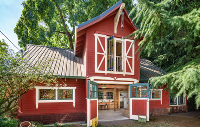
The building is a landmark structure in Brooklyn with a mansard roof. The apartments were back to back, so the newly configured space is long and narrow. On this end, there’s a living room, seen here, and a dining room.
The living room is one space that remained in its original spot with the same footprint. “Like lots of New Yorkers, this couple had lots of people who would come stay with them,” Mikhael says. “But they didn’t want to dedicate space to a room that would just be a guest room.”
Find a local architect on Houzz