


Houzz Tour: Once-Bland Rental Now a Welcoming Home
A designer found on Houzz transforms a plain city apartment using color, texture and space planning

This 15-year-old apartment in London’s Canary Wharf had previously been rented out. The decor needed a post-rental refresh to revive the space and tailor it to the tastes of the owners — a couple who live abroad but visit frequently, and their daughter, who lives there full-time.
The family approached Gabby Juzeliunaite of Claudia Dorsch Interior Design after seeing her firm’s work on Houzz. Juzeliunaite transformed the apartment without moving any walls or making any significant layout changes. Instead, careful zoning of the living, dining and cooking space, plus new flooring, cabinetry, wall coverings, colors and furniture worked wonders.
The family approached Gabby Juzeliunaite of Claudia Dorsch Interior Design after seeing her firm’s work on Houzz. Juzeliunaite transformed the apartment without moving any walls or making any significant layout changes. Instead, careful zoning of the living, dining and cooking space, plus new flooring, cabinetry, wall coverings, colors and furniture worked wonders.
Before: When Juzeliunaite first saw the apartment it was not in great shape. “The floors, furniture, cabinetry and carpets were worn,” she says.
The open-plan area also felt like one large room rather than the zoned, multifunctional space Juzeliunaite created, as seen in the previous photo.
The open-plan area also felt like one large room rather than the zoned, multifunctional space Juzeliunaite created, as seen in the previous photo.
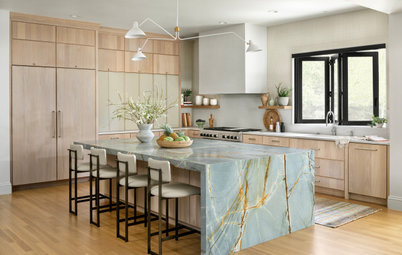
Before: The old kitchen was a little smaller. The cabinets had worn doors and hinges, and a glossy white finish.
After: The new cabinetry blends in with the rest of the room. “I do like a glossy surface, but it’s not always very practical — it can chip quickly,” Juzeliunaite says.
The updated kitchen also has a new breakfast bar.
The updated kitchen also has a new breakfast bar.
The kitchen’s layout remained the same, other than the breakfast bar, which has seating for two. The new cabinets are painted anthracite and off-white, and there’s a new quartz countertop.
New to home remodeling? Learn the basics
New to home remodeling? Learn the basics
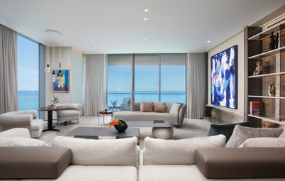
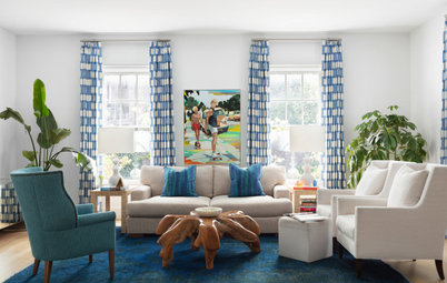
Juzeliunaite’s plan for this large room focused on zoning. “It was important so areas didn’t feel lost. I did this by giving each space a clear function,” she says.
From here, you can see the areas she created for dining and lounging.
From here, you can see the areas she created for dining and lounging.
At the other end of the room, there’s also a reading nook and a bar area.
The key to the transformation was Juzeliunaite’s idea to commission thick, comfy cushions that turn the window ledges into two seating areas, with a bar and display zone between them.
“The owners absolutely love this,” Juzeliunaite says. “It’s a practical way to max the space when you have floor-to-ceiling windows. In fact, a few neighboring tenants said they love it too and had not seen this done in their 15 years of living in the building.”
Before: The same space seen as it was before the renovation shows just how cozy and inviting Juzeliunaite has made the apartment.
This gives you a good view of the original bamboo flooring, which, Juzeliunaite says, was in poor condition. The clients originally wanted to restore the planks, and Juzeliunaite brought in two experts to assess the job.
“The top layer was very thin so [re-sanding] would have removed all the bamboo. That’s why it’s important to ensure you have a thick top layer of engineered flooring. It means you can sand them over the years, whereas if there’s only 2mm, you can only sand them once.”
Before: The new window seats were also important in helping to make more of the views.
After: The seats provide a great vantage point, as well as framing the cityscape beyond the windows. The new engineered flooring is a white-washed oak finish.
Designing to maximize space is an art and doubling up functionality is a key tool. The yellow chairs on the balcony are a perfect example. They’re weatherproof so can live out there, but they also work well indoors.
“We bought them to go with the interior,” Juzeliunaite says. “When the dining table is extended, it seats six people, so these chairs double up as spare dining chairs. It’s a clever idea, as the apartment is too small to store spare chairs indoors.”
The coffee table is equally space-saving — it has a spare seat tucked underneath.
The sofa is also multifunctional, as it converts into a bed. The couple’s daughter often has friends stay over, so Juzeliunaite chose a generously proportioned design.
“It’s a nice casual place to sit, but also a spare bed,” she says. “Each seat is made out of two pieces — a base and a wall cushion. It’s a very comfy sofa that can be converted into two or three sleeping spaces.”
“It’s a nice casual place to sit, but also a spare bed,” she says. “Each seat is made out of two pieces — a base and a wall cushion. It’s a very comfy sofa that can be converted into two or three sleeping spaces.”
Behind the sofa is cabinetry containing all the bedding that can be accessed when the sofa is moved. The open shelving is painted with a spray lacquer to match the walls.
The space to the left is the hallway.
Wall and cabinet paint: Fuji, Paint & Paper Library
The space to the left is the hallway.
Wall and cabinet paint: Fuji, Paint & Paper Library
Before: This photo shows the hallway pre-renovation. The entrance to the apartment is around the corner, top left.
The look, Juzeliunaite says, reflects the feel of the whole apartment before work began. “It had a bland developer’s finish with no personality at all,” she says. “We wanted to make the hallway striking to give it a wow effect.”
The look, Juzeliunaite says, reflects the feel of the whole apartment before work began. “It had a bland developer’s finish with no personality at all,” she says. “We wanted to make the hallway striking to give it a wow effect.”
Juzeliunaite chose a defiantly non-bland paper. “The owners didn’t have any artworks to put here,” she says. “We thought, ‘We can’t have plain walls with no artwork so let’s have a striking wallpaper that takes your breath away instead.’”
Black baseboards define the separation between walls and floor.
Wallpaper: Harlequin; ceiling light: Flos
Black baseboards define the separation between walls and floor.
Wallpaper: Harlequin; ceiling light: Flos
Before: This is the primary bedroom before Juzeliunaite worked her magic. “It felt lifeless and cold,” she says. “The owners wanted color and something more homey and inviting.”
The cushions on the window ledge were Juzeliunaite trying out the idea of a seat here using the old sofa cushions.
The cushions on the window ledge were Juzeliunaite trying out the idea of a seat here using the old sofa cushions.
Chinoiserie was something the owners really wanted to incorporate into the decor. There wasn’t the budget for a traditional silk-based wallpaper, so Juzeliunaite instead had this fabric-covered headboard made, which gives a nod to the look.
“The clients love blues and greens and we have a massive library in our studio all sorted by color,” she says. “We took out the green and blue drawers and picked out this.”
Juzeliunaite adds that the entire theme for the apartment comes back to this fabric. “It’s a centerpiece, and it dictated the colors around the apartment.”
Curtain fabric: Kvadrat; wall paint: Slate l, Paint & Paper Library
Juzeliunaite brought the window seat idea to life. “The owners wanted to have it as a reading nook too so we moved the curtains a bit further back from the window, so they can enclose themselves in it to create a nice hideaway with a view,” she says.
Bench fabric: Studiotex
Bench fabric: Studiotex
This bedroom has an en suite bathroom, with storage flanking the corridor that connects the two rooms. Previously, the closet tracks for the sliding doors had begun malfunctioning and had ruined the carpet. “We decided to replace them with opening doors that also had more character,” Juzeliunaite says.
The whole area looks crisper and warmer, thanks to more of the deep blue used throughout, as well as aged brass hardware.
Juzeliunaite also refurbished the pocket door, which was damaged and a little bit damp. The bathroom was retiled, but the layout stayed the same. Juzeliunaite also kept the sink, which is marble, but had it repolished to remove scratches and watermarks.
Juzeliunaite also refurbished the pocket door, which was damaged and a little bit damp. The bathroom was retiled, but the layout stayed the same. Juzeliunaite also kept the sink, which is marble, but had it repolished to remove scratches and watermarks.
Before: The guest bedroom had the same beige-on-beige finish.
Juzeliunaite layered soft neutrals to create a cozier feel. Pink and teal touches warm things up.
She also had a new closet door made. “The space is quite small, so we didn’t want the closet to stand out too much, but we didn’t want it to be plain either,” she says. The solution was a textured wallpaper to work with the color of the walls. “Space expands with texture,” Juzeliunaite says. “You can see it, but it doesn’t disturb the eye. Rather, it blends in.”
Wall paint: Slate lll, Paint & Paper Library
Taking another cue from the idea of chinoiserie, Juzeliunaite chose this wallpaper for a feature wall behind the bed.
To take in the wallpaper and the small niche on the back wall, Juzeliunaite ran the custom headboard full width to make the relatively small room feel larger. “The fewer corners you have, the more unified and streamlined something will feel,” she says.
Wallpaper: Rebel Walls; headboard fabric: Jim Thompson


Apartment at a Glance
Who lives here: A business couple from Singapore when they’re in London and their student daughter
Location: Canary Wharf, London
Size: Two bedrooms and two bathrooms
Designer: Gabby Juzeliunaite of Claudia Dorsch Interior Design
“They wanted something bright and informal, with a contemporary and colorful style and blue and green accents,” Juzeliunaite says.
The furniture needed to be robust too. “They didn’t want anything super high end but also didn’t want to buy things that would break quickly, so they asked for midrange but good-quality furnishings that would last a long time,” she says.
The owners also wanted to capture the apartment’s dramatic views of the skyline and maximize the open-plan space.
Find a designer near you