


A Light, Bright Basement Inspired by Midcentury Design
Designers create an organic and airy feel in this underground space in Toronto

This Toronto couple wanted to transform their partially finished basement into a big hangout for entertaining and for their kids to enjoy. Their wish list included a TV lounge, office space, a full kitchen and a full remodel for the existing 1970s bathroom. The creative team of Luca Campacci and Vinh Le gave them a clean, contemporary space, inspired by midcentury modern design and warmed by organic textures and colors.
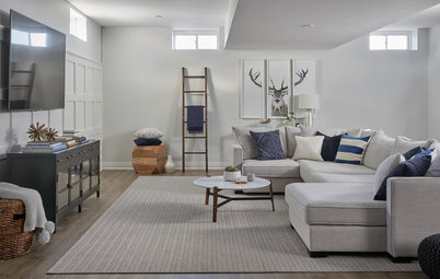
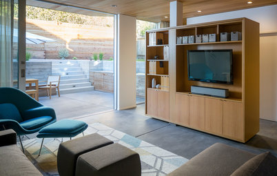
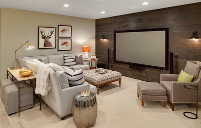
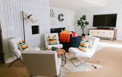
TV Lounge
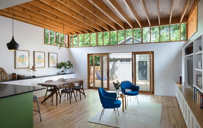
“One of the goals was to bring nature down to the space so that it wouldn’t feel like a basement,” Le says. The soft green velour sofa, ledgestone wall and marble-topped coffee table have an organic feel.
Another goal was to make the space as light and bright as possible. White walls and ceilings bounce the ample artificial light around, and the rug has an almost metallic sheen to it. The open plan makes the space feel expansive. Keeping it open and bright helped with a third goal: making the low ceilings feel higher.
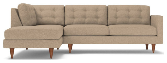
Browse green sectionals in the Houzz Shop
“One of the goals was to bring nature down to the space so that it wouldn’t feel like a basement,” Le says. The soft green velour sofa, ledgestone wall and marble-topped coffee table have an organic feel.
Another goal was to make the space as light and bright as possible. White walls and ceilings bounce the ample artificial light around, and the rug has an almost metallic sheen to it. The open plan makes the space feel expansive. Keeping it open and bright helped with a third goal: making the low ceilings feel higher.
Browse green sectionals in the Houzz Shop
“We wanted to add something that would have a lot of texture but also would reflect light,” Campacci says of the stacked ledgestone wall. “And it’s a midcentury-modern-inspired look.” The electric fireplace occupies the center of this accent wall.
“We shy away from the TV-over-the-fireplace thing. We wanted it to be a space where they could curl up and read a book by the fireplace without the TV dominating that wall,” Le says. As for those awkward bulkheads, the pair incorporated the one on the left side of the room into the design beautifully. They mounted the TV on a wall under it and added a media cabinet beneath the TV. To the right of the TV they installed built-in shelves. Tucking the 55-inch screen into the nook created by the shelves and bulkhead makes the lowered portion of the ceiling look intentional.
Electric fireplace: Dimplex
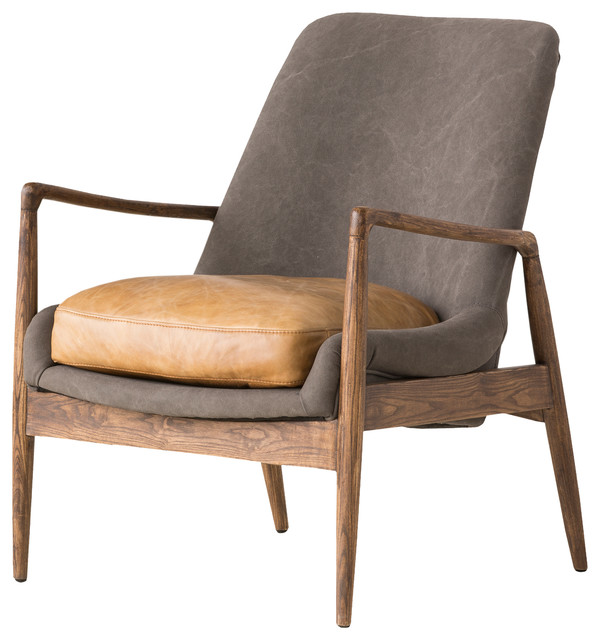
A midcentury modern-inspired armchair brings style and some walnut wood into the space. The designers chose lighter pieces like this one throughout the space to avoid clunking it up.
They arranged the lighting in layers. “We wanted to give them versatility so that they could adjust the light for different moods,” Campacci says. All of the pot lights are on dimmers and there are table lamps, pendant lights and sconces throughout the space, as well as a chandelier.
They arranged the lighting in layers. “We wanted to give them versatility so that they could adjust the light for different moods,” Campacci says. All of the pot lights are on dimmers and there are table lamps, pendant lights and sconces throughout the space, as well as a chandelier.
Crisp black-and-white accents contrast with the nature-inspired palette. And the designers balanced all of the crisp, clean lines throughout the space with some curved elements, like the black-and-white-striped globe lamp.
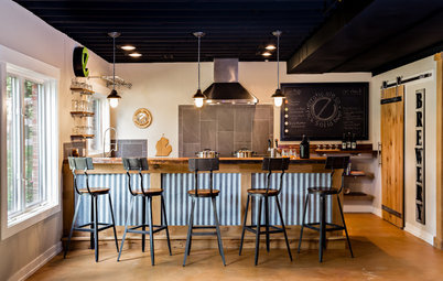
Kitchen
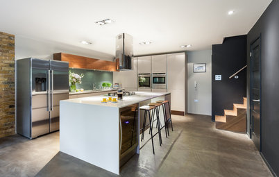
“We took inspiration from Scandinavian principles like using simple, clean materials and tiles that reflect the light,” Le says. “And we didn’t anchor the walls down with upper cabinets.” Because this is a second kitchen, the family did not need lots of storage. They also kept things light by using clear glass globe pendants. Keeping the space over the island this visually clear makes the ceilings feel higher.
“We brought in midcentury modern style with walnut wood,” Campacci says. The walnut cabinetry also adds contrast, warmth and another texture with an organic feel. Oversize subway tile laid out in a grid pattern and clean-edged countertops also nod to midcentury modern style.
Hire a cabinet pro
The designers cleverly used the bulkhead on the right to define the kitchen space. “We increased the size of the columns to match the proportions of the bulkheads and centered the island between them,” Campacci says. The structural posts are wrapped in drywall, beefing them up to 12-by-12-inch columns.
They designers pushed for a large island because they knew it would function well and serve as “the heart of the space.” “People always gravitate towards an island,” Le says.
Shop for glass globe pendant lights
They designers pushed for a large island because they knew it would function well and serve as “the heart of the space.” “People always gravitate towards an island,” Le says.
Shop for glass globe pendant lights
The flooring used throughout the basement is luxury vinyl tile (LVT). “The LVT was basically glued right onto the concrete floor. It works well in a basement, particularly in places where the floor slopes down to a drain,” Campacci says. “And it’s only a centimeter thick.” In a space with low ceilings, every centimeter counts — there’s no reason to bring the floor up any closer to the ceilings than necessary.
Dining Space
Across from the island is this dining space, which meets all of the goals — midcentury modern-inspired style, lightness and brightness, natural materials and colors, and a few curves.
The table base and chairs are walnut and have a midcentury modern look. The designers were vigilant about keeping things uncluttered. So the chair backs are low-slung to make the ceilings feel higher, and they found a set that didn’t have crossbars on the bases. “This makes the chairs seem more transparent,” Le says. The transparent oval glass tabletop allows for a better flow around it, introduces more curves and reflects the light.
The seat cushions and artwork bring green into the dining area. The chandelier has an updated midcentury modern Sputnik look, and like the kitchen pendant lights, it doesn’t occupy too much visual space or bring the ceiling down.
Behind this wall is the staircase to the main level of the house, and behind that there is an office space. To create some texture-filled artwork, the partners gave new life to the 4-by-4-inch samples of architectural glass and flooring that vendors send them. They arranged them in a grid to create an art piece and flanked them with a pair of sconces. “The homeowners have told us that it’s the first thing their guests gravitate toward in the basement,” Le says. “And we gave them another set to use as coasters.”
“The moment we saw this wallpaper we knew instantly it would make the bathroom stand out without being too different from the rest of the basement,” Campacci says. “It’s green, it’s playful and it’s unexpected. The homeowners told us it wows their guests.” The cheerful green palm fronds carry the natural theme into the bathroom. Other motifs the designers brought into the room include the curves of the oval mirror and the walnut veneer on the vanity.
The mirror’s reflection reveals one of a pair of tall cabinets that provide storage for mops, brooms, cleaning supplies and towels.
The mirror’s reflection reveals one of a pair of tall cabinets that provide storage for mops, brooms, cleaning supplies and towels.
The designers made the bathroom bright with light colors and layers of light — the pot light in the shower, a white flush-mount light in the ceiling and sconces flanking the mirror.
The clear glass shower enclosure also keeps the space feeling open and light. The tiles are 12-by-24-inch rectangles in a taupe-y gray that tones down all the brightness just enough.
Takeaways
More on Houzz
Browse photos of basements
Tour more basements
Hire a local general contractor
The clear glass shower enclosure also keeps the space feeling open and light. The tiles are 12-by-24-inch rectangles in a taupe-y gray that tones down all the brightness just enough.
Takeaways
- Warm up contemporary style with textures and colors found in nature.
- Find clever ways to integrate bulkheads and structural elements into a basement’s layout. Here they help delineate different areas within the open plan.
- Make ceilings feel higher by painting them white, using transparent light fixtures and choosing low-slung furniture.
- Use reflective finishes on items like tile, countertops and tabletops to bounce light around.
More on Houzz
Browse photos of basements
Tour more basements
Hire a local general contractor

Basement at a Glance
Who uses it: A young family
Location: Toronto
Size: 1,000 square feet (93 square meters)
Designers: Luca Campacci and Vinh Le of Level Studio
Before. This is a familiar basement sight for many homeowners. The floors and half the walls were concrete, the ceilings were unfinished, and although the bathroom was finished, it needed an update from its 1970s look. There were also awkward bulkheads and structural posts and beams they needed to work into the design gracefully.
The designers got to know their clients’ style by looking at images of rooms they liked and assessing the style of the rest of their home. They determined they liked clean-yet-warm contemporary style inspired by midcentury modern design.
Find an interior designer on Houzz