


Houzz Tour: Family Says No to Relocating in Favor of Remodeling
An architect helps a family in Rome bring light, color and natural materials into their apartment

The owners of this 1970s apartment — a couple with two children — first contacted architect Maurizio Giovannoni because they were planning to buy a bigger place with bright, spacious rooms where each of the children could have their own bedroom. However, the purchase never materialized, and so, after getting Giovannoni’s advice, the owners made the decision to renovate the home they were already living in instead.
By following biophilic design principles, such as increasing daylight and choosing natural materials, the apartment has been transformed. The result is a home that’s colorful, yet simple and minimal.
By following biophilic design principles, such as increasing daylight and choosing natural materials, the apartment has been transformed. The result is a home that’s colorful, yet simple and minimal.
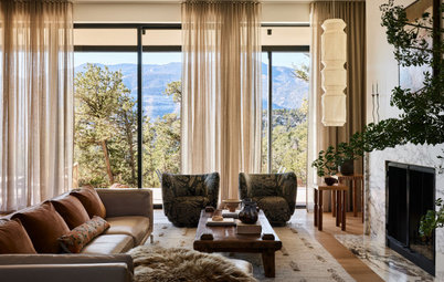
The front door is located to the right in this photo. As soon as you walk in, you’re welcomed by a chill-out zone that faces onto the office — two spaces designed in line with the concept of biophilia, where people and nature are at the very heart. These two rooms lead on to the living area.
“I reduced the entrance by 6 feet to carve out a space that embraces the concepts of biophilia, prioritizing natural light and the presence of green and warm materials,” Giovannoni says.
The study is fitted with custom cabinetry.
“I reduced the entrance by 6 feet to carve out a space that embraces the concepts of biophilia, prioritizing natural light and the presence of green and warm materials,” Giovannoni says.
The study is fitted with custom cabinetry.
The bench in the chill-out zone is made from natural oak slats and surrounded by wallpaper, chosen for its natural-inspired design. “I wanted for whoever is working in the office to be able to glance through the porthole and feel as if they’re looking out onto a garden,” Giovannoni says.
A porthole separates the chill-out zone and the office, helping the flow of natural light. The color green was chosen as a nod to nature. The porthole was custom-made by a blacksmith.
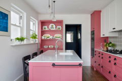
The kitchen is to the left of the front door. “I chose to remove the walls dividing the spaces to make the apartment brighter, and instead to separate the kitchen from the other rooms with sliding glass doors,” Giovannoni says.
“There are guide rails running along the top, inside the plasterboard. The glass doors can simply be detached, twisted round and packed flat against the wall,” he says. “The result is a clean, simple aesthetic. I also wanted to bring out the feeling of continuity.”
“There are guide rails running along the top, inside the plasterboard. The glass doors can simply be detached, twisted round and packed flat against the wall,” he says. “The result is a clean, simple aesthetic. I also wanted to bring out the feeling of continuity.”
The kitchen measures 107 square feet. The red section along the side houses an open shelving area and a storage area.
The space in general is bright and colorful. “The whole apartment is punctuated by different shades. The owners wanted a home dominated by color,” Giovannoni says. “We worked hard to choose the best tones, which, when placed next to each other, would create a welcoming, harmonious space.”
Shop for kitchen and dining products on Houzz
Shop for kitchen and dining products on Houzz
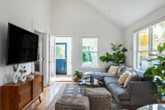
The artworks on the wall are actually trays. Beyond the dining table, you can see the living area.
The sideboard in the living area already belonged to the family.
“I chose to illuminate the sofa area with a black track lighting fixture to add some character. I don’t like lowering the ceiling if I don’t have to,” Giovannoni says.
New to home remodeling? Learn the basics
“I chose to illuminate the sofa area with a black track lighting fixture to add some character. I don’t like lowering the ceiling if I don’t have to,” Giovannoni says.
New to home remodeling? Learn the basics
The TV cabinet was already owned by the family too. “I covered it in oak slats to create one single unit with an integrated bench,” Giovannoni says.
This image shows the corridor that runs alongside the kitchen and leads to the bedrooms.
In the main bedroom, Giovannoni has used more oak slats. “We created a wooden storage unit alongside a chill-out corner with wallpaper in dark and light blue tones and a dusky pink armchair. The owners wanted a romantic area where they could relax and read,” he says.
The main bathroom measures 48 square feet.
This photo shows the balcony, which is accessed from the main bedroom. Before, it was an outside storage area. “I used the same tiles for the corner of the room from which the outside area is accessed,” Giovannoni says. “I also covered the column that houses all the electrical wires and installed a small closet.”
For the girl’s room, they went for Scandinavian style, refreshing the entrance with a woodland design,.
For the corresponding bathroom, Giovannoni opted for light pink and powder blue. “It’s an unusual pairing, but one that worked in this case. The black hardware reinforces the combination,” he says.
This photo shows the boy’s room. To the right you can just see an alcove with built-in shelving.
The adjoining bathroom.


Who lives here: A young family with two children
Location: Rome
Size: 1,184 square feet (110 square meters); three bedrooms, two bathrooms
Architect: Maurizio Giovannoni
The owners asked the designer to create an additional bedroom and a study and to bring more natural light into what was previously quite a dark space.
“We redesigned the living area,” Giovannoni says. “We couldn’t do anything with the bedroom area, as this would have involved the difficult task of changing the layout of the bathrooms. However, we did manage to move one of the walls to carve out two separate bedrooms for the children.
Find an architect near you