


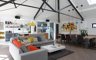
Houzz Tour: White and Brick Walls a Backdrop for Travel Treasures
A converted Victorian grain store in east London gets reconfigured for better flow and light

Despite being in the heart of London’s buzzing Shoreditch district, this apartment was anything but cool when James Davies of Paper House Project was asked to redesign it. “It had been refurbished around 15 years ago, but really badly,” he says. “The layout didn’t work with the building, so it was a complete ‘rip out and start again’ job.”
The position of existing windows and the narrow width of the apartment, a former grain store, dictated the final configuration to some degree. But otherwise Davies was free to change it, with the aim of making the most of every inch of space and celebrating its bright look.
The position of existing windows and the narrow width of the apartment, a former grain store, dictated the final configuration to some degree. But otherwise Davies was free to change it, with the aim of making the most of every inch of space and celebrating its bright look.
The apartment was gutted and completely redesigned. “We took all the partitions out,” Davies says. The aim was to be smart about using all the available area.
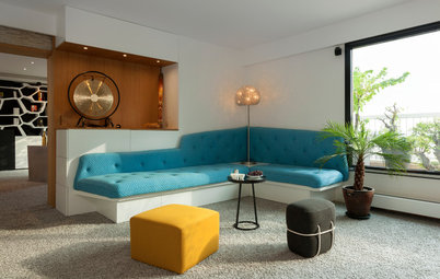
There was a lot of circulation space in the original configuration that’s now incorporated in the living area. “We also maintained the height of the door openings, and fitted large pocket doors to the kitchen and bathroom,” Davies says. “This was tricky because of all the services within the kitchen wall, but it was important to create clean visual lines down the flat.”
There was a lot of circulation space in the original configuration that’s now incorporated in the living area. “We also maintained the height of the door openings, and fitted large pocket doors to the kitchen and bathroom,” Davies says. “This was tricky because of all the services within the kitchen wall, but it was important to create clean visual lines down the flat.”
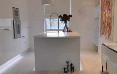
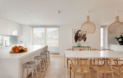
The owner is widely traveled and has a large collection of pieces picked up overseas. Space to socialize was more relevant to him than room to cook, so Davies chose simple white cabinets for the kitchen that seem to blend into the wall. “We didn’t want the kitchen to be too prominent,” he says.
BEFORE: This is a view of the kitchen before the space was redesigned.
AFTER: The owner’s midcentury dining table and chairs stand out beautifully against the pale floor, which is A-grade faced plywood, chosen because it’s hard-wearing. “It also becomes more interesting with age,” Davies says. “The grain begins to come through. It changes with time, which is quite nice.”
The large boards mean that there are hardly any visible joins, giving the floor the look of poured rubber or concrete. “It’s pale, too, so it reflects light and keeps the space feeling bright,” he adds.
The large boards mean that there are hardly any visible joins, giving the floor the look of poured rubber or concrete. “It’s pale, too, so it reflects light and keeps the space feeling bright,” he adds.
The floor plan shows the new layout of the apartment, with its two bedrooms at the rear of the property, where it’s wider.
The living area is fairly narrow, about 16 feet wide, but the apartment takes up the whole floor and extends a long way back, via a dog-leg corridor, to the two bedrooms at the rear. Numerous windows with new wood sashes keep it light.
Simple cabinets and doors have been modified so that every pocket of kitchen space is effectively used. “The corner unit is often underused and inaccessible, for example, but here we’ve fitted the washing machine into it, which you access from the hallway,” Davies says. The countertop is made from laminated plywood.
Kitchen: Howdens Joinery Co.; Praise 1 sink: Cooke & Lewis via B&Q; Eurosmart mono kitchen faucet in chrome: Grohe via Taps UK; countertop: Matt Antrobus
Kitchen: Howdens Joinery Co.; Praise 1 sink: Cooke & Lewis via B&Q; Eurosmart mono kitchen faucet in chrome: Grohe via Taps UK; countertop: Matt Antrobus
It was impossible to move plumbing pipes and the heating duct, and these determined the configuration of the bathroom. “We also couldn’t have the loo against the kitchen wall, as this would clash with the pocket door and all the kitchen services housed in there,” Davies says.
Tabor bathtub: Better Bathrooms
Tabor bathtub: Better Bathrooms
“We tried to keep everything uniform to help the space feel ordered and open,” Davies says. He chose large-format tiles for the bathroom. “They’re easier to lay and get right than small tiles or mosaics, especially if you have a tricky space with a lot to fit in,” he says. “It’s always easier to have big tiles in a complex layout, and it’s also cheaper to lay them than cutting lots of smaller tiles.”
Porcelain tiles: Tile Mountain; Vero sink: Duravit; Concetto wall-mounted, two-hole faucet: Grohe via QS Supplies; Euphoria Cosmopolitan 180 shower head: Grohe via PlumbNation; pocket door: Häfele
Porcelain tiles: Tile Mountain; Vero sink: Duravit; Concetto wall-mounted, two-hole faucet: Grohe via QS Supplies; Euphoria Cosmopolitan 180 shower head: Grohe via PlumbNation; pocket door: Häfele
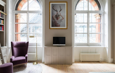
The master bedroom is at the back of the property, which is quieter. Walls are painted plain white throughout the apartment as a simple backdrop for the owner’s finds and artworks.
The closets act as the dividing partition between this room and the adjoining second bedroom. “We were trying to make as much use of space as possible,” Davies says.
The closets act as the dividing partition between this room and the adjoining second bedroom. “We were trying to make as much use of space as possible,” Davies says.
The apartment originally had just one bedroom and a separate, badly designed office space, but the owner wanted to create two bedrooms, with the second one doubling as a study for when he works from home.
The desk is made with a floating subframe clad in solid oak, with floating shelves above.
Browse more homes by style: Apartments | Barn Homes | Colorful Homes | Contemporary Homes | Eclectic Homes | Farmhouses | Floating Homes | Guesthouses | Homes Around the World | Lofts | Midcentury Homes | Modern Homes | Ranch Homes | Small Homes | Townhouses | Traditional Homes | Transitional Homes | Vacation Homes


Houzz at a Glance
Who lives here: A single man who works in the film industry
Location: Shoreditch, east London
Size: 915 square feet (85 square meters); two bedrooms, one bathroom
Designer: James Davies of Paper House Project
“We wanted to create a sense of space and openness here,” Davies says. “It’s a cool building with so many windows and lots of light flooding in. We tried to retain as many original features as we could, including the exposed brick, as a reminder of its former use.”
Hammered nickel pendant lights: Heal’s